Premium Restaurant Software Professional Website Template
Ticket is a split-screen restaurant help desk landing page template built for multi-unit operators who need every issue logged, routed, and resolved fast. With a dark Data Command aesthetic, violet-glow accents, and a live-dashboard header, it presents your ticketing platform as the nerve center of restaurant operations across hundreds of locations.
by Rocket studio
Quick summary
Ticket is a single-page, split-screen (50/50) landing page template for restaurant help desk and ticketing platforms. It targets multi-unit operators and franchise directors who manage equipment failures, point-of-sale crashes, and food-safety alerts across hundreds of locations. The design is dark, data-driven, and built to push qualified visitors straight into a live demo.
Who this template is for
This template speaks directly to operations professionals who run restaurants at scale. It is built for people who measure success in resolved tickets, not in aesthetics.
- Multi-unit restaurant operators managing dozens or hundreds of locations simultaneously
- Franchise operations directors and regional facilities managers tracking equipment, compliance, and service uptime
- Restaurant software companies that need a high-converting landing page to showcase a ticketing or help desk platform
What problem this template solves
Running multiple restaurant locations means constant exposure to small emergencies that quietly destroy revenue. A broken fryer at peak service, a walk-in cooler creeping past safe temperature, a point-of-sale system offline mid-shift: each one costs money if it sits unresolved. Most operators lack a single screen that captures all of it.
- Ticket logs and routes every issue before it escalates into a lost cover or a failed inspection
- The page communicates platform credibility using operational data and evidence rather than generic product claims
- It removes friction by skipping forms entirely and sending qualified prospects directly to an interactive demo
What you get with this template
This template delivers a fully structured, single-page layout with a clear narrative arc. The scroll reads like a classified operations brief, escalating from minor maintenance requests to critical food-safety incidents.
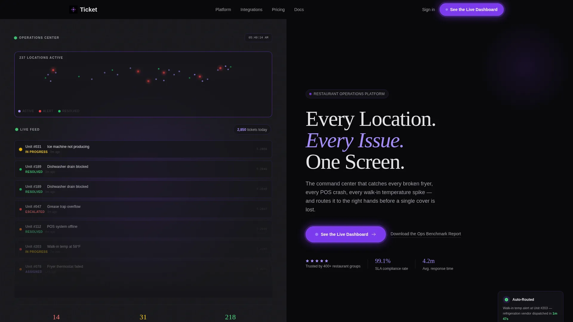
- A dark full-bleed header with a violet glow, a live-style dashboard showing ticket volume across 200-plus restaurant locations, and a bold phantom-white headline
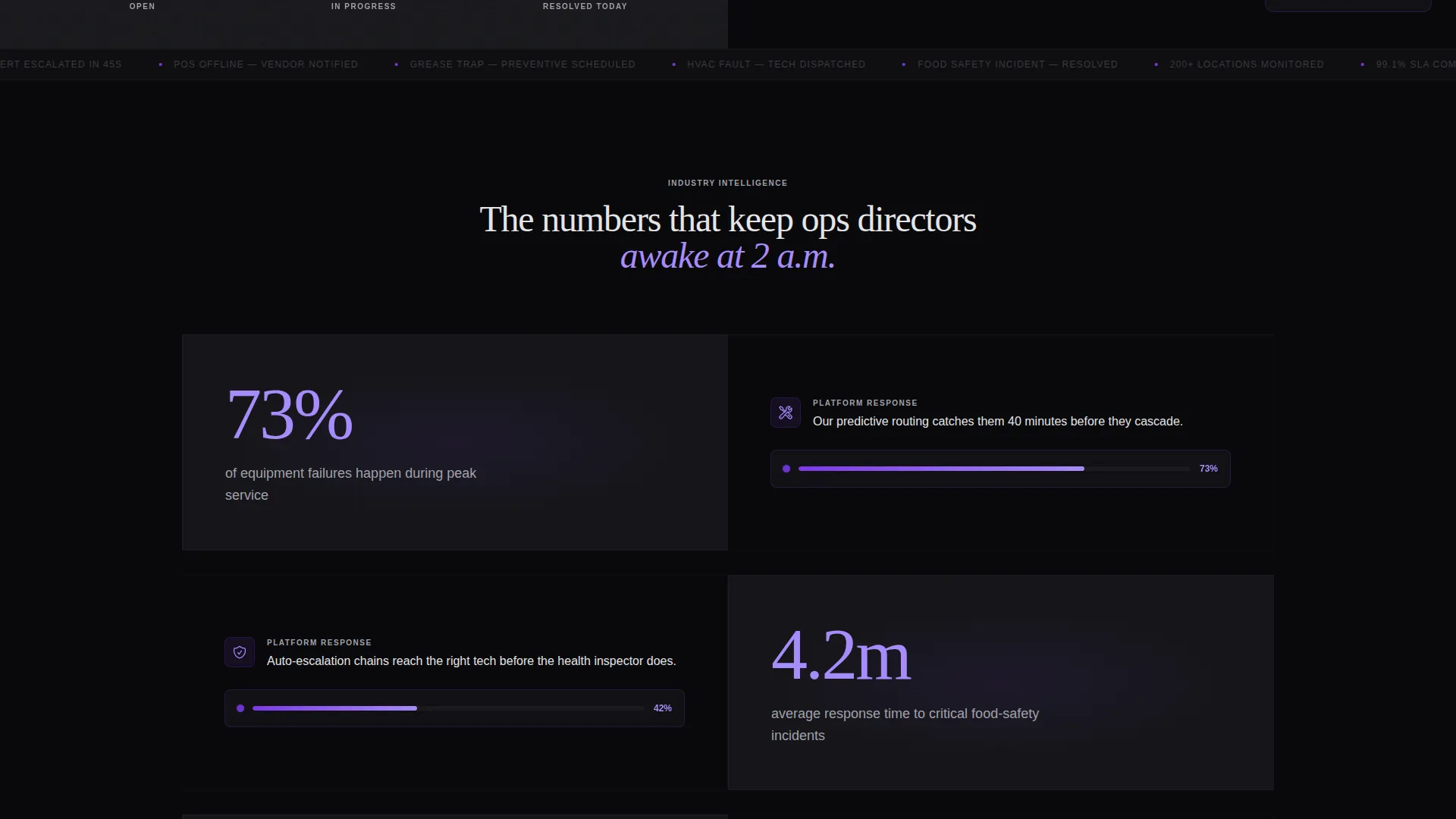
- Split-screen section pairs that place stark operational statistics on the left and platform responses on the right
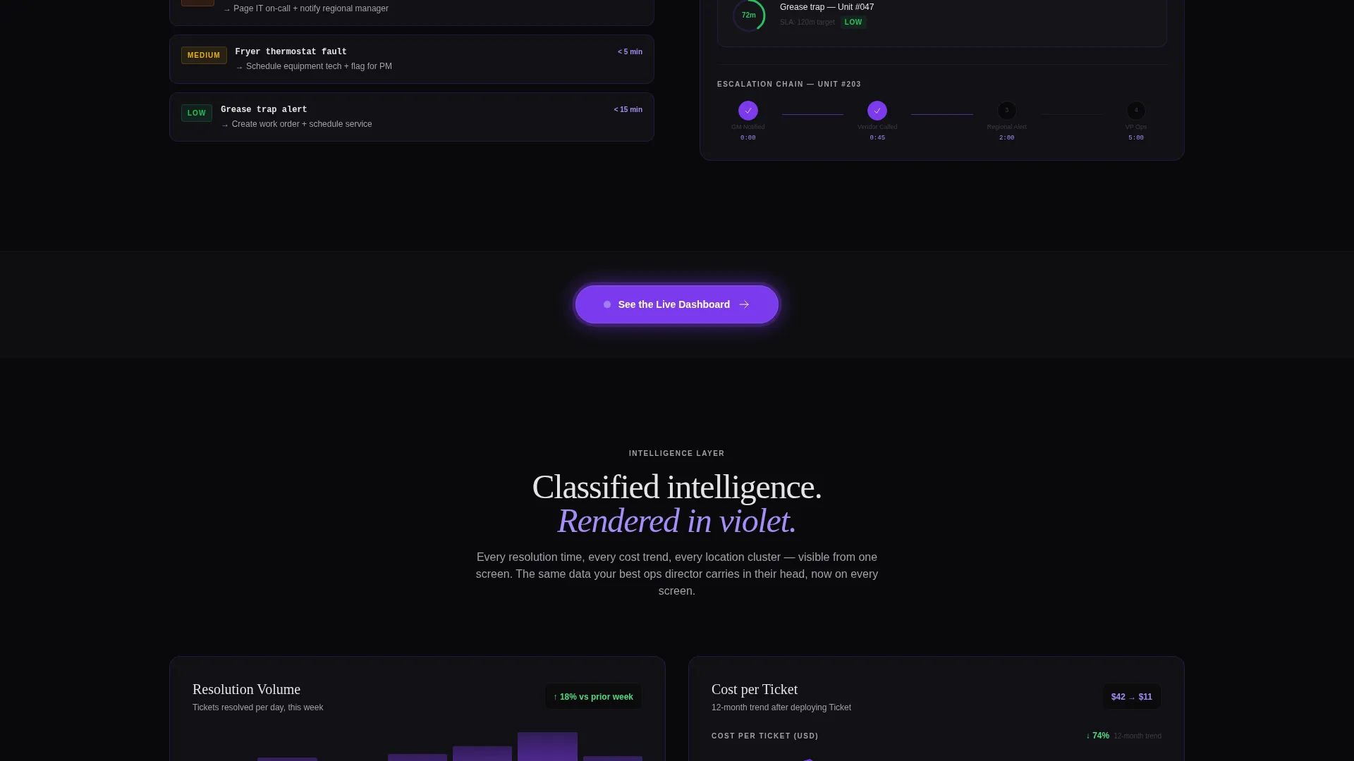
- Data visualizations rendered in violet-on-void, including resolution-time histograms, cost-per-ticket trend lines, and location heat maps
Feature list
This section outlines the core design and layout capabilities delivered in the Ticket template.
Live-Style Dashboard Header
The header is a dark full-bleed frame with a violet glow radiating from center. It displays a live-style map of 200-plus restaurant locations, each one a faintly pulsing dot. Real-time-style ticket cascades show status updates like escalations and resolutions, making the platform feel active before the visitor reads a single word.
Split-Screen Section Layout
Every content section uses a strict 50/50 split. The left panel presents oversized statistics in electric violet type. The right panel responds with the platform feature that addresses that exact problem, from auto-routing rules to escalation chains. The pairing creates a cause-and-effect rhythm that holds attention through the full scroll.
Data Visualizations in Void and Violet
Charts and graphs are rendered in the violet-on-void palette throughout. Resolution-time histograms, cost-per-ticket trend lines, and location heat maps are styled to look like classified intelligence reports. They reinforce platform credibility without relying on stock photography or generic user interface screenshots.
Repeating Violet-Glow call to action Button
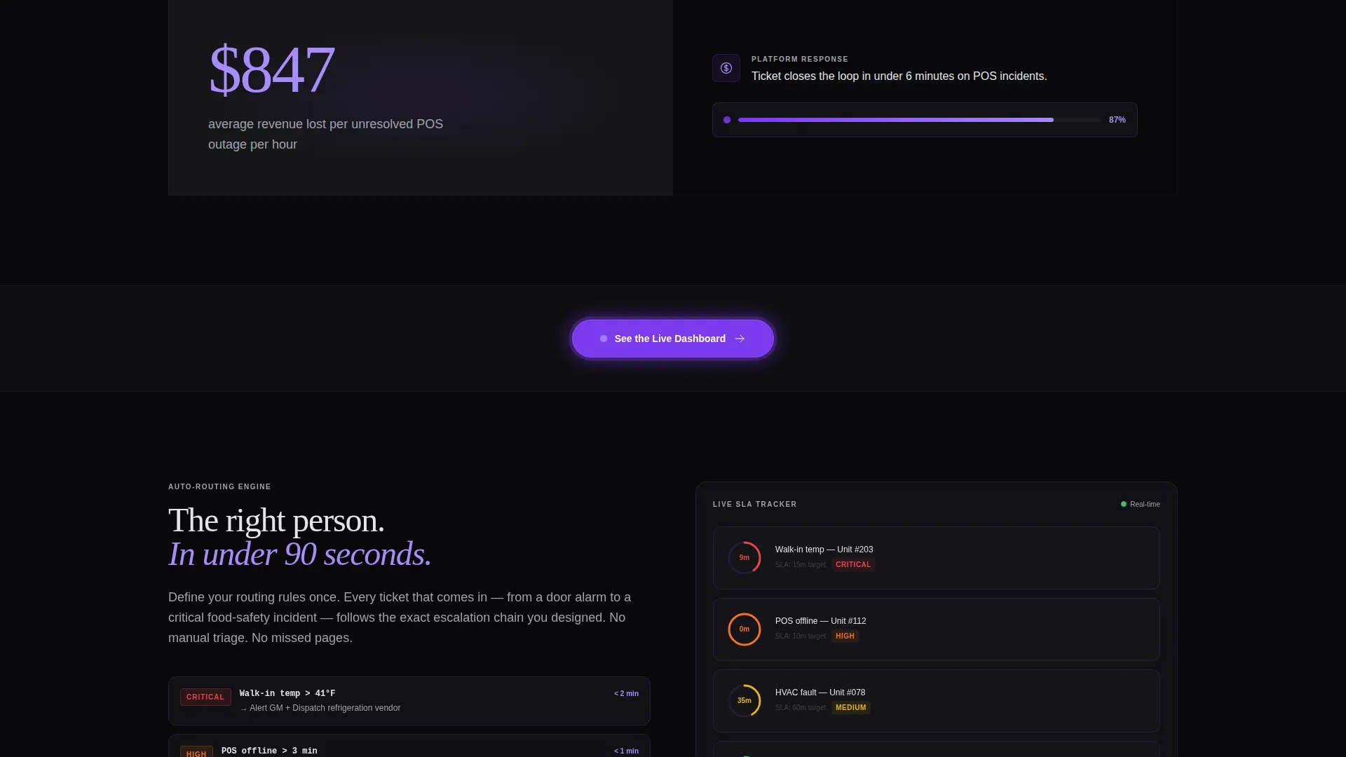
The primary call to action, "See the Live Dashboard," appears in the header and repeats at every section break. Each instance uses a subtly pulsing violet-glow button styled like a heartbeat monitor. This rhythm keeps the conversion path visible without interrupting the content flow.
Secondary Lead-Capture Text Link
A secondary text link, "Download the Ops Benchmark Report," appears alongside the primary call to action. It trades a downloadable PDF of the industry statistics shown on the page for an email address, capturing leads who are not yet ready to book a demo.
Severity Spectrum Storytelling
The page scroll moves deliberately from minor maintenance tickets to critical food-safety incidents. This escalation structure proves the platform handles the full range of operational urgency. Each section raises the stakes, so by the end the visitor understands the platform's depth without needing a sales call.
Page sections overview
| Section | Purpose |
|---|---|
| Full-Bleed Header | Establish platform authority with a live-style dashboard, pulsing location map, and primary call to action |
| Stats versus. Platform | Pair operational failure statistics with the platform feature that solves each one |
| Auto-Routing Rules | Show how tickets are assigned to the right team without manual intervention |
| SLA Countdown Timers | Demonstrate time-sensitive issue tracking and service-level accountability |
| Escalation Chain View | Illustrate how unresolved tickets move up the chain before a cover is lost |
| Heat Map Visualization | Display location-level ticket density across a multi-unit portfolio |
| Resolution Histograms | Present resolution-time data as credibility evidence in violet-on-void charts |
| Cost-Per-Ticket Trends | Quantify operational savings with trend-line data visualizations |
| Food Safety Incidents | Prove the platform handles critical severity tickets, not just maintenance requests |
| Benchmark Report call to action | Capture email leads with a downloadable PDF of the ops statistics on the page |
| Footer call to action Block | Close the page with a final "See the Live Dashboard" prompt and secondary link |
Design & branding system
The visual identity follows a Data Command theme. Every color, type choice, and layout decision is built to feel like the inside of a network operations center late at night: screens active, information breathing, nothing decorative.
- Void and Violet color system: absolute void black (#09090B) for backgrounds, deep console gray (#16161A) for panels, electric violet (#7C3AED) for every glow and interactive accent, and cool phantom white (#E4E4E7) for all typography and data labels
- No stock photography or lifestyle imagery anywhere on the page; visual proof comes entirely from data, charts, and the live-style dashboard
- Oversized violet statistics, pulsing dot maps, and violet-glow buttons create a consistent language of urgency and precision across every section
Mobile & speed optimization
The template is structured for clean rendering on any screen size. The 50/50 split layout adapts gracefully so the operational narrative stays intact whether a visitor is on a desktop monitor or a mobile device.
- Split-screen sections stack vertically on smaller screens, keeping the stat-and-response pairing readable without horizontal scrolling
- The dark palette and vector-style data visualizations are lightweight by design, avoiding heavy image assets that would slow the page
- The repeating call to action button remains visible and tappable at every section break, preserving the conversion path on mobile
How this template helps you convert
The Ticket template is built as a click-through landing page with one job: move qualified operations professionals into the live demo environment. Every structural decision supports that goal.
- The pulsing violet-glow "See the Live Dashboard" button appears in the header and at each section break, so a visitor who is ready to convert at any point always has a clear next step without scrolling back to the top.
- The Industry Report creative direction builds trust through evidence rather than persuasion, presenting proprietary-feeling statistics and data visualizations that make the platform feel proven before the visitor ever clicks.
- The secondary "Download the Ops Benchmark Report" link captures email addresses from leads who need more time, turning a single page visit into a two-track conversion funnel without adding a form to the main flow.
Other information about this template
This template is part of a restaurant software category designed for technology-forward platforms in the restaurant operations space. It is a strong fit for companies selling help desk or ticketing tools to the multi-unit and franchise segment.
- The template style is Split Screen (50/50), making it easy to adapt the left-panel statistics and right-panel responses to any specific platform feature set
- The click-through landing page direction means there is no embedded form on the page; the primary conversion event is the outbound click to the demo environment
- The creative direction is Industry Report, which pairs naturally with platforms that have real operational data to share as social proof
- The template is built for the restaurant help desk and ticketing niche within the broader restaurant software category, targeting buyers with operational authority rather than technical buyers
Theme
Data Command
Creative direction
Industry Report
Color system
Void & Violet
Style
Split Screen (50/50)
Direction
Click-Through
Page Sections
Live-style Dashboard Header
50/50 Split-screen Sections
Violet-on-void Data Visualizations
Pulsing Call to Action Button Rhythm
Severity Spectrum Narrative Flow
Secondary Benchmark Report Link
Related questions
Does this template include a contact form or sign-up form?
Can I replace the statistics and charts with my own platform data?
Who is this landing page template built for?
What does the split-screen layout accomplish?
Is there any lifestyle photography or stock imagery in this template?



