Entertainment Software & SaaS Reviews Website Template
Discover is a vibrant entertainment landing page template built for consumer mobile apps in the event discovery space. It opens with a live-coded API terminal, flows into an interactive Tonight Planner tool, and closes with animated comparison tables and social proof. The glassmorphic dark design targets urban audiences ready to turn a restless evening into a real plan.
by Rocket studio
Quick summary
Discover is a single-page template built for entertainment mobile apps that help users find nearby events tonight. It leads with a typewriter-style API terminal, moves into an interactive mood and budget planner, and then earns trust with scroll-animated comparison tables and a mosaic of real user screenshots. The whole flow ends at one tap: download the app.
Who this template is for
This template is built for teams launching or marketing a consumer event discovery app. It suits founders, product marketers, and developers who want a landing page that demonstrates the product before asking for the install.
- Mobile app teams in the entertainment or urban lifestyle space
- Marketers promoting event discovery tools to an urban 20s and 30s audience
- Developers who want a high-interactivity, dark-theme landing page ready to customize
What problem this template solves
Most app landing pages describe features without ever showing the product in action. Visitors read bullet points, feel uncertain, and bounce before tapping the download button. This template flips that order entirely.
- It puts an interactive planner tool above the fold so visitors experience the app's value immediately
- It replaces generic feature claims with a side-by-side comparison table showing real behavioral differences
- It removes form friction by routing visitors directly to the correct app store with a single tap
What you get with this template
You get a complete, single-page layout with every section pre-built and wired for high interactivity. The design system, animations, and copy structure are all included and ready to adapt.
- A terminal hero with auto-typing API output and a fade-in tagline
- An interactive Tonight Planner with mood, group size, and budget inputs that render matched event cards
- Scroll-triggered comparison tables, an asymmetric bento feature grid, and a social proof mosaic
Feature list
This template includes five major interactive and visual systems, each designed to move a restless visitor toward a confident app download.
Auto-Typing Terminal Hero
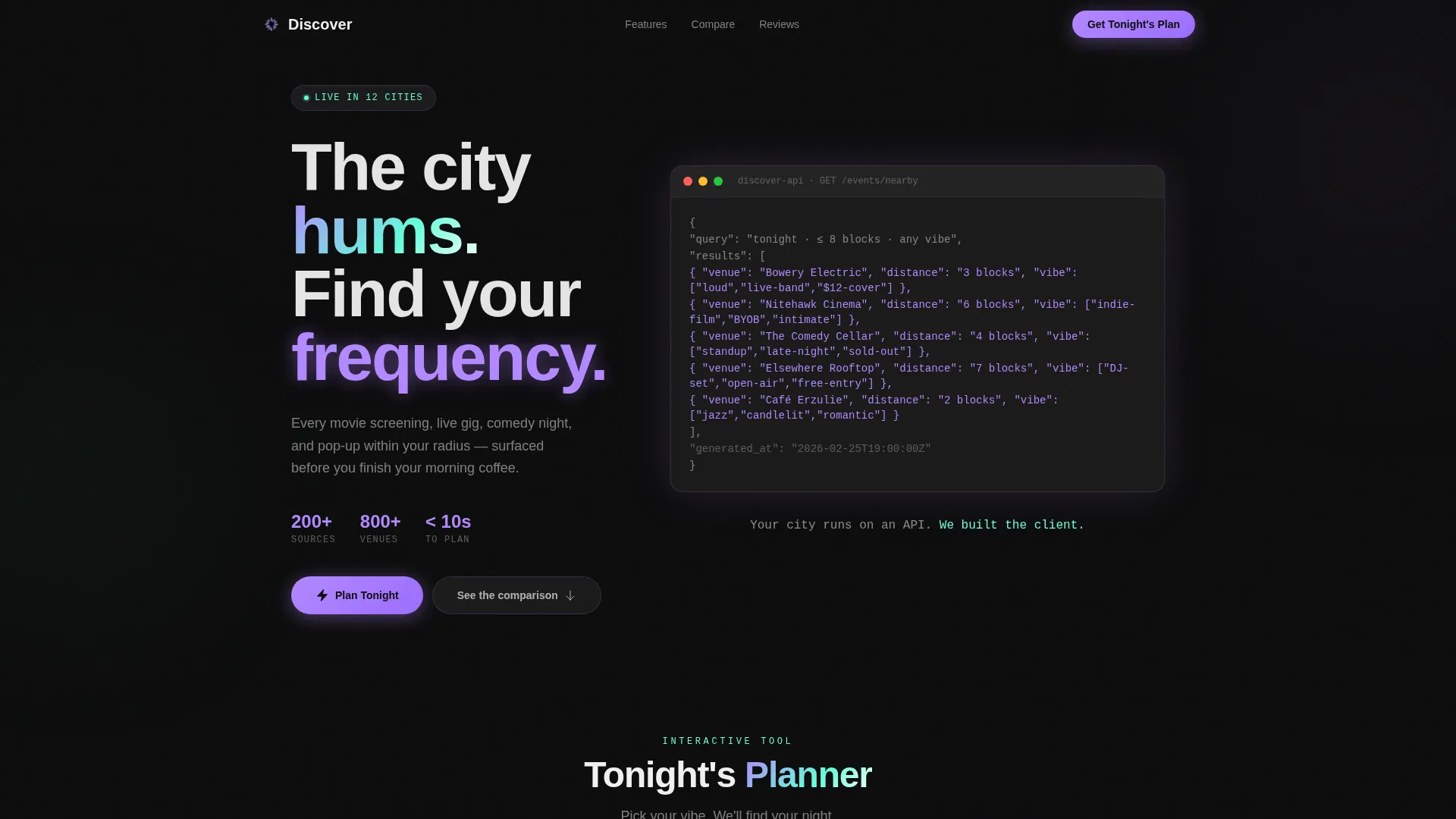
The header opens with a styled code block that types out a live-looking API response line by line. Each event object resolves with a seafoam flash, making the technology feel transparent and the data feel real. A single tagline fades in below once the sequence completes.
Interactive Tonight Planner
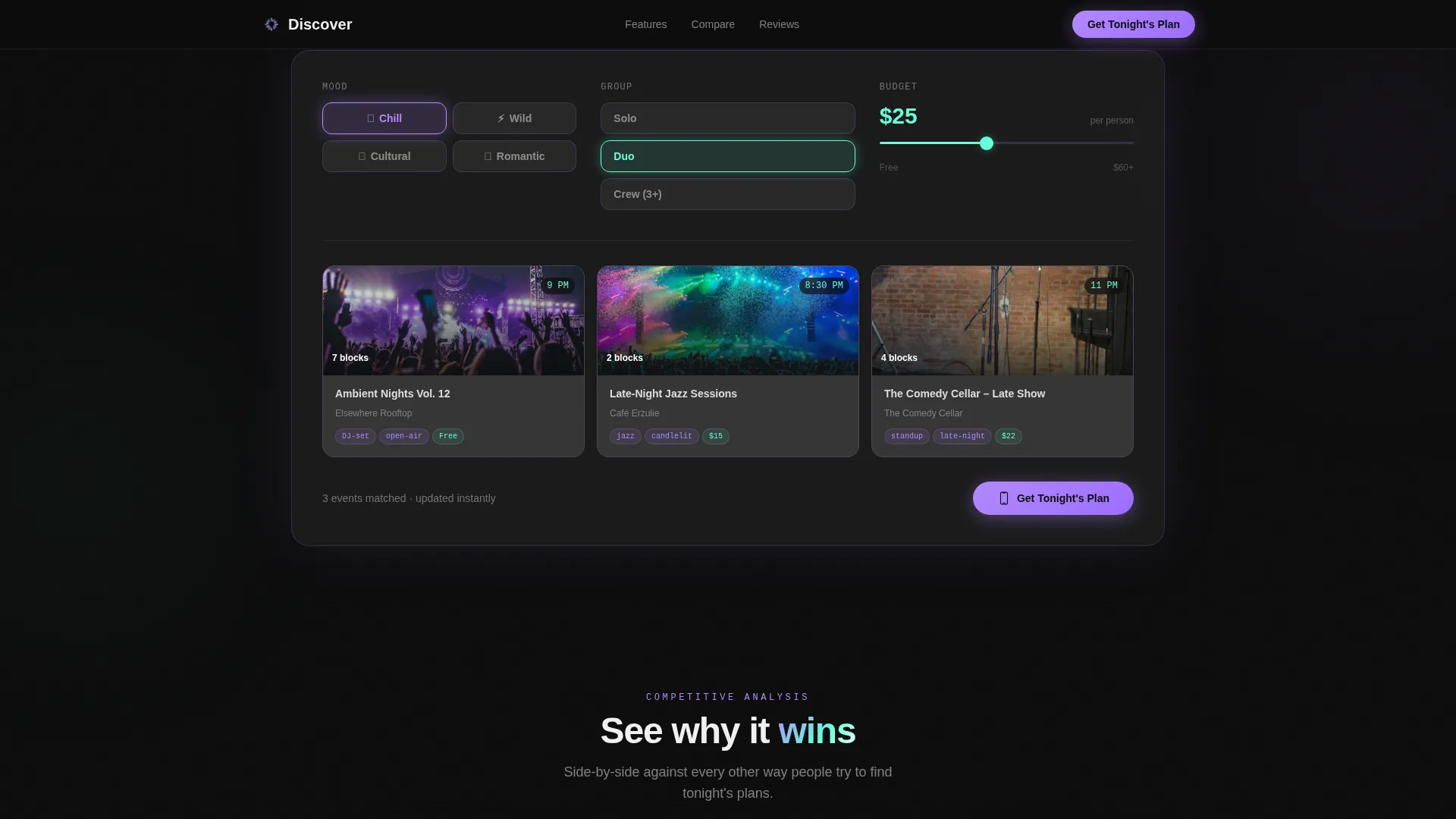
Visitors pick a mood (chill, wild, cultural, or romantic), a group size, and a budget range using an inline slider. The tool immediately renders a frosted glass card stack of matched events. The primary call to action, "Get Tonight's Plan," sits inside this tool so the first moment of value and the conversion trigger are the same moment.
Scroll-Animated Comparison Table
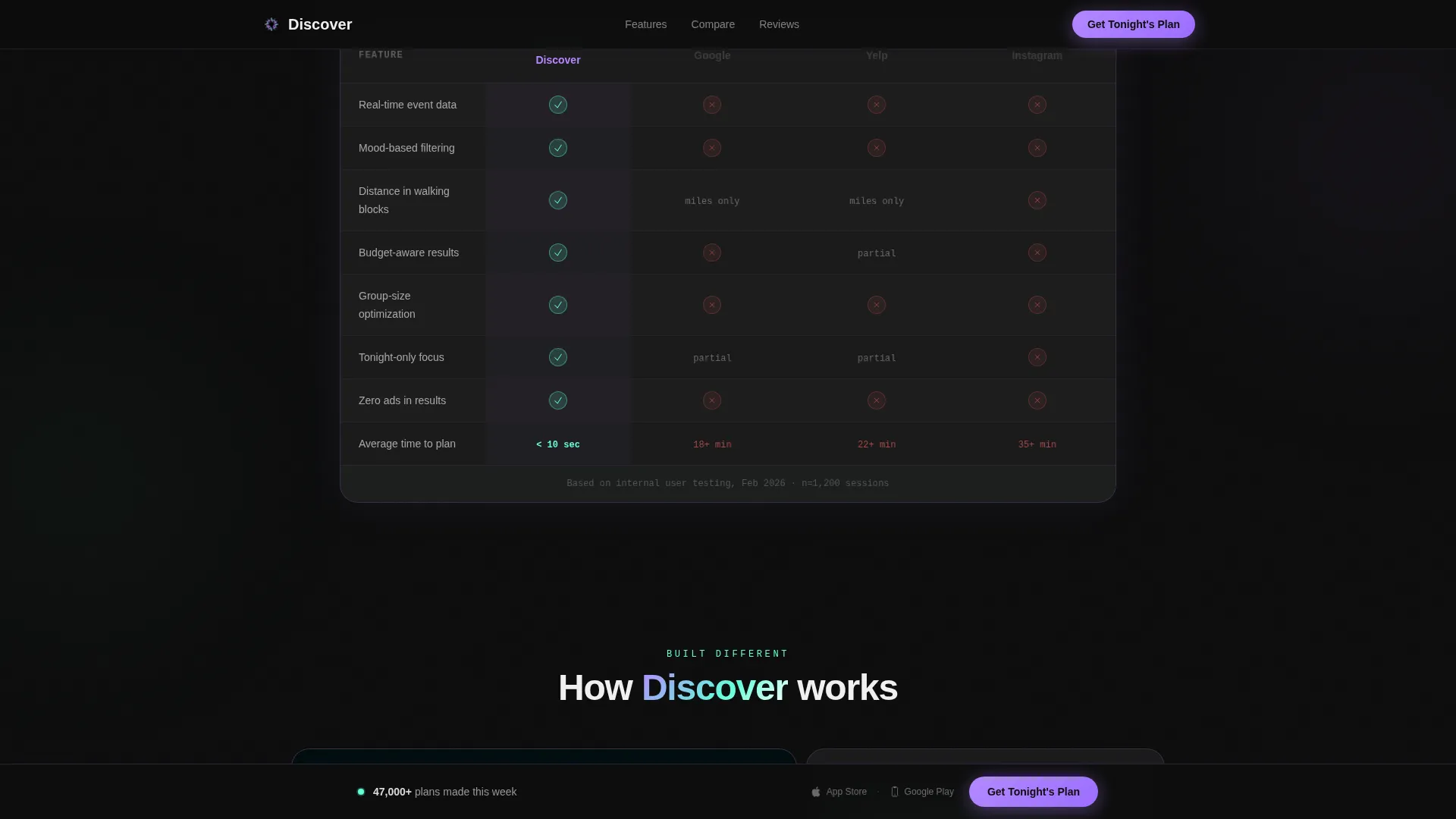
The template includes a benchmarking table that puts the app alongside manual search alternatives. Each row animates into view on scroll, with checkmarks blooming in seafoam and competitor cells dimming. This section shifts the narrative from product demo to confident competitive positioning.
Asymmetric Bento Feature Grid
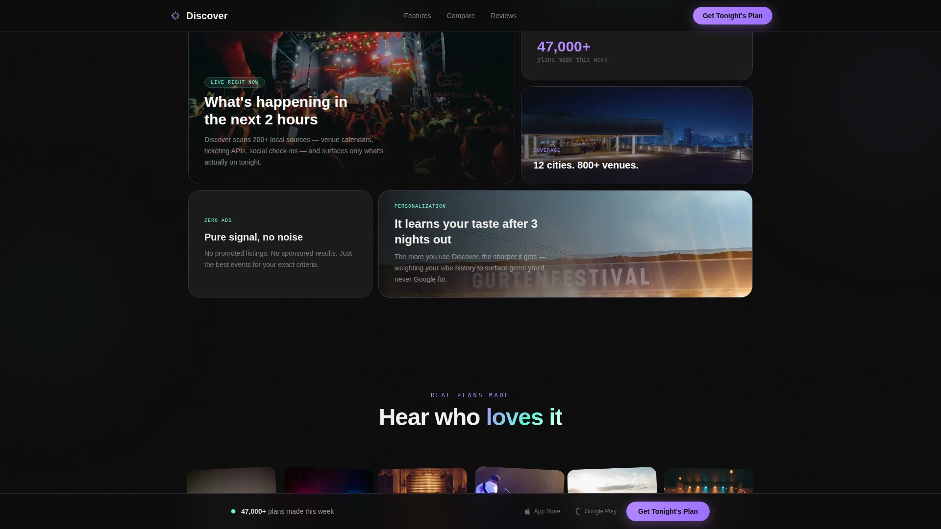
Five feature cards are laid out in a varied bento grid with depth-effect hover states. Card sizes differ intentionally to create visual rhythm and guide the eye toward the most important capabilities without a numbered list.
Social Proof Mosaic and Sticky Call to Action
A rotated photo mosaic shows real user screenshots alongside testimonial quotes and a "47,000+ plans made this week" metric. A sticky bottom bar reappears after the comparison section, carrying the same download call to action flanked by minimal app store badges.
Page sections overview
| Section | Purpose |
|---|---|
| Terminal Hero | Opens with auto-typed API response and fade-in tagline |
| Tonight Planner Tool | Interactive mood, group, and budget inputs with matched event cards |
| Comparison Table | Animated rows benchmarking app speed, personalization, and coverage |
| Bento Feature Grid | Five asymmetric cards with hover depth showing core app capabilities |
| Social Proof Mosaic | User screenshots, testimonial quotes, and weekly plans metric |
| Footer | Single-row dark footer with minimal layout |
Design & branding system
The visual identity follows a glassmorphic dark aesthetic built to feel like neon city light seen through rain-streaked glass. Every layer is intentional, from the obsidian base to the frosted cards floating above it.
- Color palette: deep obsidian base (#0D0D0D), frosted panel white at 12% opacity, neon lilac (#B388FF) for primary accents, and soft seafoam (#64FFDA) for hover and active states
- Typography: DM Sans for headlines and body copy, JetBrains Mono for the terminal and code block sections
- Frosted glass cards use faint lilac borders, while seafoam pulses on hover states and active filter selections throughout the planner tool
Mobile & speed optimization
The template is designed with the primary user in mind: someone on their phone at 7 PM looking for something to do tonight. Every layout decision prioritizes that small-screen, fast-decision context.
- Mobile-first layout with a polished desktop experience also included
- IntersectionObserver drives scroll-triggered animations so they fire only when elements enter the viewport
- Critical path CSS structure keeps the initial render lean, and OS detection logic routes the call to action to the correct app store automatically
How this template helps you convert
The conversion strategy is built into the page sequence itself. There is no form, no email gate, and no paywall before the value moment. The visitor uses the product before they are ever asked to install it.
- The Tonight Planner puts the core app experience in the browser first, so the visitor feels the value before seeing any download prompt
- The comparison table arrives only after the visitor has already engaged, making the "see why it wins" argument land with context rather than cold persuasion
- The sticky bottom bar with app store badges reappears at the exact moment a visitor has finished reading the strongest sections, catching them at peak intent
Other information about this template
This template was built with a Directory and Discovery theme and uses a Calculator and Tool First creative direction. The header concept is a live Code Snippet. The primary landing page direction is App Download, targeting both iOS and Android users through OS detection logic. Mock data references US cities including New York, Los Angeles, Chicago, and Austin to ground the demo in a familiar urban context. The social proof section includes a weekly activity metric and real-looking user screenshots to reinforce credibility. The template style is a Comparison Table layout within the Entertainment Software and SaaS subcategory.
- Built under the Technology category with an Entertainment Mobile App niche focus
- Designed for B2C consumer audiences, urban demographics in their 20s and 30s
- All animations use high-interactivity patterns: typewriter sequencing, scroll-triggered row reveals, and bento hover depth effects
Theme
Directory & Discovery
Creative direction
Calculator/Tool First
Color system
Glassmorphic
Style
Comparison Table
Direction
App Download
Page Sections
Auto-typing Terminal Hero
Interactive Tonight Planner Tool
Scroll-animated Comparison Table
Asymmetric Bento Feature Grid
Social Proof Mosaic with Sticky Call to Action
Related questions
Does this template require a real API to work?
Can I change the mood and budget options in the Tonight Planner?
Is the comparison table easy to edit?
What does the sticky bottom bar include?
Who is this landing page template designed for?



