Construction Software & SaaS Comparison Website Template
Dispatch is a split-screen landing page template built for construction crew scheduling platforms. It uses a dark cockpit visual system to compare the old way, whiteboards, group texts, spreadsheets, against dispatch software that gives superintendents and ops managers full visibility over crew assignments, certifications, and shift coverage before the first truck rolls at 5 AM.
by Rocket studio
Quick summary
This is the Dispatch crew scheduling comparison landing page template, a single-page, split-screen layout designed for field service and construction workforce platforms. The page places the old scheduling process on the left and dispatch software capabilities on the right, row by row, making the gap impossible to ignore. Dark instrument-panel visuals, amber calls to action, and teal confirmation states frame every versus moment with sharp clarity.
Who this template is for
This template is built for B2B SaaS companies selling scheduling software to the construction industry. If your platform helps dispatchers, superintendents, or ops managers assign jobs and track crew availability across multiple active sites, this layout is built for your audience.
- General contractors running eight to fifteen active pads who currently schedule via whiteboard or group text
- Specialty sub-contractors, concrete, electrical, steel, managing crew members across rotating high-rise sites
- Field service software companies that need a high-trust landing page to convert skeptical, time-pressed operations managers
What problem this template solves
Scheduling and dispatching in construction is still done with whiteboards, spreadsheets, and constant calls in far too many companies. The cost is real: missed certifications, double bookings, and shift gaps that delay the first truck. Visitors landing on a typical product page see features. Visitors landing on this page see their own broken process reflected back at them.
- Ops teams losing control of crew availability across multiple sites have no single screen to check
- Dispatchers scrambling to avoid scheduling conflicts end up buried in phone calls and text threads
- Platforms selling dispatch software struggle to communicate value quickly without showing the contrast live
What you get with this template
You get a fully structured, single-page layout built around the Spec Sheet versus creative direction. Every section is designed to accumulate pressure on the old way while building confidence in the new one. The template includes six comparison rows, a hero with a glowing dashboard mockup, social proof, and a demo call to action form.
- A split 50/50 layout where the left panel stays deliberately static (the old way) and the right panel carries micro-animations for dispatch software features
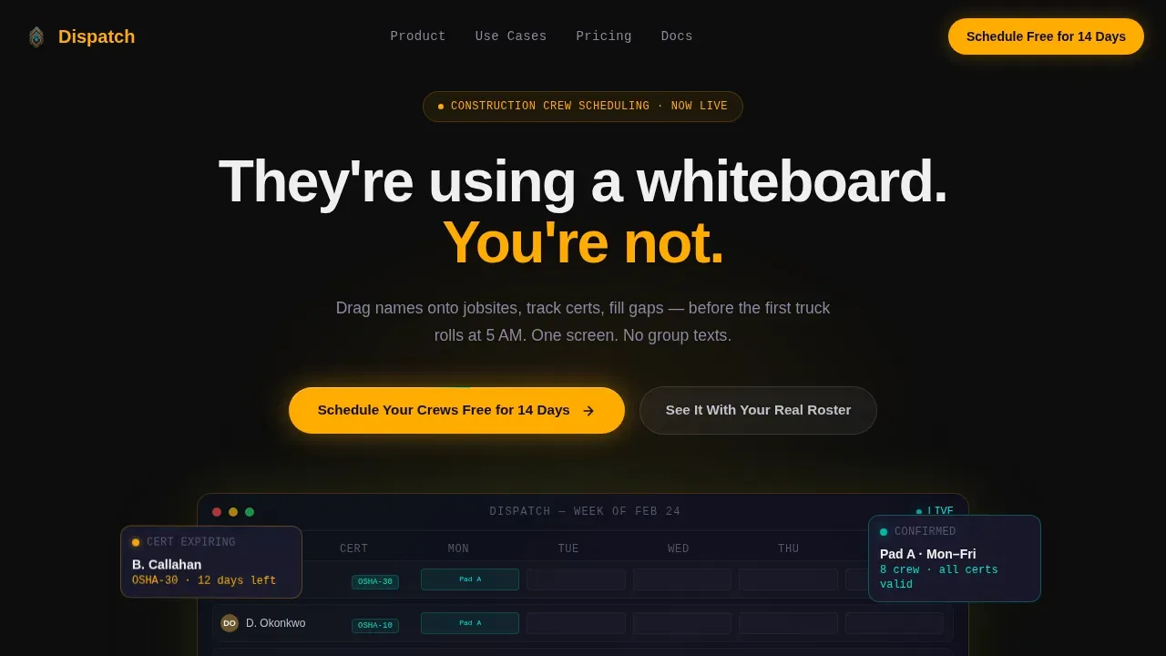
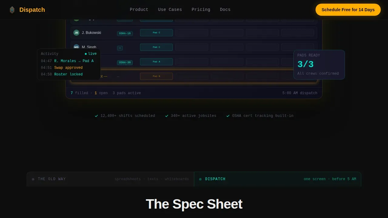
- A hero section with a glowing user interface mockup showing crew members slotted across jobsites, OSHA-30 certification badges, and a pulsing amber empty time slot
- A social proof strip with metric callouts and testimonial cards, plus a demo booking form collecting jobsite count, average crew size, and current scheduling method
Feature list
This template is built around a specific set of design and layout capabilities. Each feature reflects what is explicitly described in the brief.
Glowing Dashboard Hero Section
The hero is a full-bleed dark screen at #0D0D0D with a central user interface mockup of a crew scheduling dashboard. Amber and teal highlights bleed outward from active cells. A Monday column shows eight crew members slotted across three jobsites, with one empty time slot pulsing amber to signal an unfilled shift. The headline fades in above: "They're using a whiteboard. You're not."
Split-Screen Spec Sheet Versus Layout
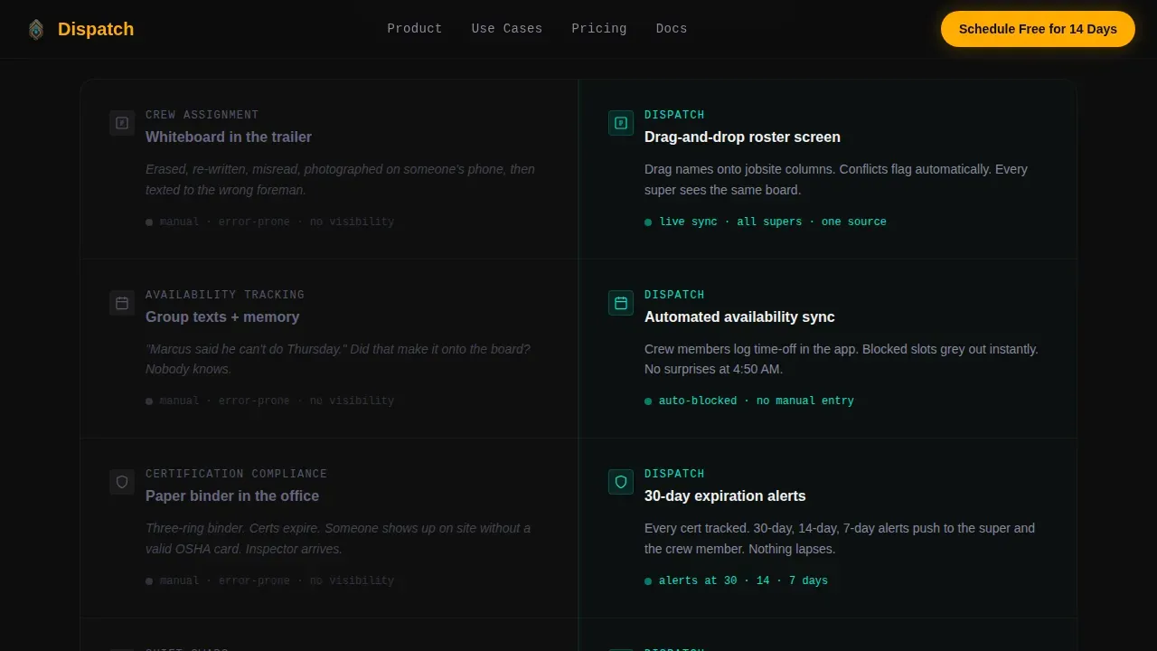
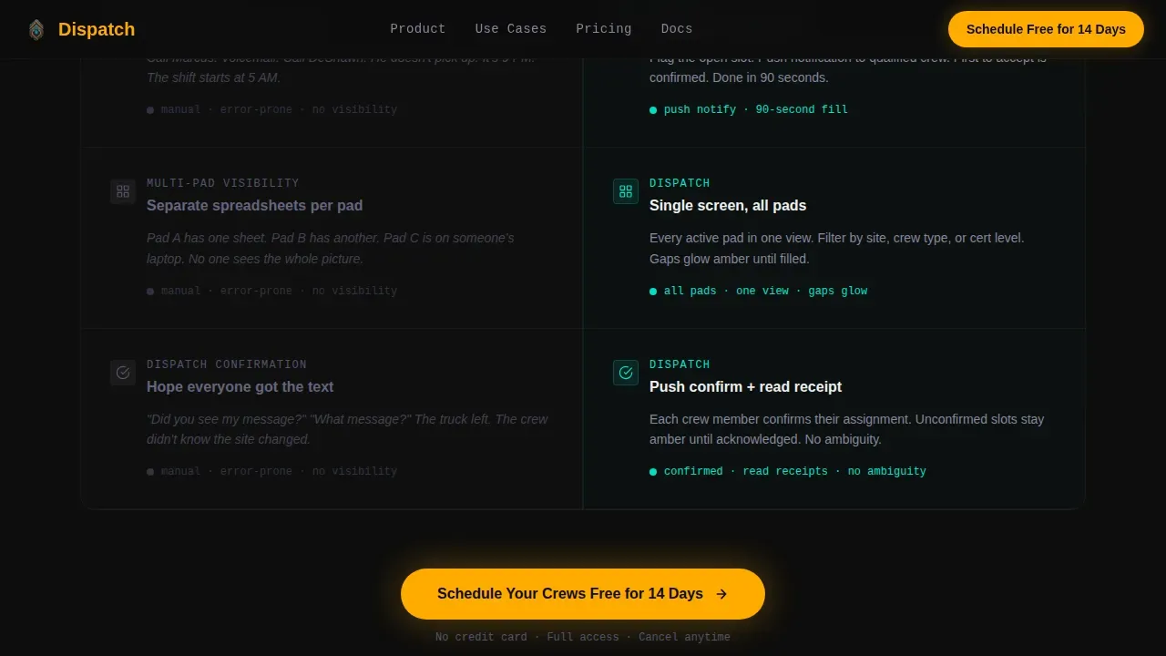
The core of the template is a 50/50 split layout running six comparison rows. Each row is a versus moment: for example, manual time-off tracking versus automated availability sync, or paper cert binders versus expiration alerts with 30-day countdowns. Left-panel content stays static and lifeless. Right-panel content animates on scroll, cards slide into place, status dots blink live, reinforcing the contrast between old practices and dispatch software capabilities.
Animated Right-Panel Micro-Interactions
Right-panel elements carry high-intensity micro-animations that fire on scroll entry. Cards slide into their time slots, confirmation states light up in teal, and status indicators blink to signal a shift filled or a certification current. These animations are scoped to the right panel only, keeping the left side deliberately inert to sharpen the contrast.
Social Proof Metrics Strip and Testimonials
Below the sixth spec row, a metrics strip displays specific numbers: pads managed, certifications tracked, shifts filled. Two to three testimonial cards follow, each attributed to named superintendents or ops managers at real companies. This section gives dispatchers and managers the peer validation they need before committing to a trial.
Demo Booking Call to Action Form
The secondary conversion path is a "See It With Your Real Roster" form. It collects three fields: number of active jobsites, average crew size, and current scheduling method via dropdown (spreadsheet, whiteboard, text or calls, other software). This gives the sales team detailed information before the demo call and signals to the visitor that the demo is tailored, not generic.
Sticky Mobile Call to Action Bar
On mobile, the primary call to action, "Schedule Your Crews Free for 14 Days", persists as a sticky bottom bar throughout the scroll. This keeps the conversion path accessible for field teams checking the page on a tablet or phone at 4:45 AM, without interrupting the versus flow on desktop.
Page sections overview
| Section | Purpose |
|---|---|
| Hero Dashboard | Glowing mockup and headline set the contrast frame immediately |
| Spec Row 1 | Compares manual time-off tracking with automated availability sync |
| Spec Row 2 | Compares paper cert binders with 30-day expiration countdown alerts |
| Spec Row 3 | Compares phone-call shift swaps with one-tap reassignment and push confirmation |
| Spec Rows 4 to 6 | Continue the punch-list accumulation of versus moments |
| Social Proof Strip | Metrics and testimonials from superintendents and ops managers |
| Demo call to action Form | "See It With Your Real Roster" form with jobsite and crew fields |
| Footer | Linear single-row footer pattern |
Design & branding system
The visual identity follows a Dashboard Pro theme using a Carbon Fiber color system. The palette is inspired by the instrument panel of heavy equipment at night, dark surfaces with glowing status indicators. Typography uses Manrope for bold headings and JetBrains Mono for data labels and field identifiers.
- Background: deep cockpit black (#0D0D0D) dominates all page surfaces; crosshatch graphite (#1A1A2E) defines card surfaces and section dividers
- Interactive elements and calls to action use safety-vest amber (#FFAB00); teal (#00E5CC) signals confirmation states, a shift filled, a cert current, a crew confirmed
Mobile & speed optimization
The template is desktop-first by design, matching how superintendents access dispatch tools on tablets or laptops before 5 AM. Mobile is handled through a responsive layout and a sticky call to action bar that keeps conversion accessible on any screen size. Mobile-first design principles ensure field teams can access schedules and review job details on the go without losing the core versus experience.
- The sticky amber call to action bar on mobile keeps "Schedule Your Crews Free for 14 Days" visible at all times during scroll
- Static left-panel sections use server-rendered components for speed; animated right-panel rows are isolated as client components to keep the page load clean and the interactions sharp
How this template helps you convert
This template converts by making visitors feel the problem before they read the solution. Each scroll section is a versus moment that widens the gap between old practices and modern dispatch software. The copy earns the click by turning the visitor's own broken process into the case for switching.
- The hero pulsing amber slot and glowing dashboard show exactly what full visibility over crew assignments looks like, before a single word of pitch copy appears, the product speaks for itself.
- The six spec rows function like a punch list: each comparison makes the old scheduling process more recognizable and more absurd, building pressure toward the "Schedule Your Crews Free for 14 Days" call to action placed after row six.
- The demo form removes friction for high-intent visitors who are not ready to commit to a trial, it offers a tailored path with just three fields, making the switch feel manageable rather than risky.
Other information about this template
This template is purpose-built for field service and construction dispatch software companies that need better results from their landing pages. It follows practices proven in high-converting SaaS comparison pages: demonstrating complex dispatch capabilities through simple, high-trust visual hierarchies rather than technical descriptions. The layout is designed to give dispatchers and managers immediate clarity about what the platform does and why it matters.
- Tying dispatch to a clear visual contrast, static left, animated right, is the core conversion mechanic; the design makes the scheduling software's value self-evident without requiring the visitor to imagine it
- The billing process and work order workflows shown in the spec rows can be customized to reflect your platform's specific field operations capabilities, including how you assign jobs, track certifications, or handle one-time jobs alongside recurring routes
- The template supports the practices of effective dispatch landing pages: interactive product previews in the hero, GPS-verified tracking callouts for operational transparency, and conversion-focused calls to action placed at the header, mid-page, and as a sticky mobile bar
- Leadpages and Unbounce are common platforms used to host and split-test comparison landing pages like this one; Carrd is a lightweight option for teams that need to launch a mobile-responsive dispatch page quickly
- The feedback loop built into the demo form, collecting scheduling method, crew size, and jobsite count, gives your team the data needed to personalize every demo call and improve the overall service quality of your sales process
- Managers and dispatchers who compare this template against generic product pages consistently find that the versus layout communicates dispatch software capabilities faster and with more persuasive control
Theme
Dashboard Pro
Creative direction
Spec Sheet
Color system
Carbon Fiber
Style
Split Screen (50/50)
Direction
Comparison/Versus
Page Sections
Glowing Hero Dashboard Mockup
Split-screen Spec Sheet Versus Rows
Right-panel Micro-animations
Social Proof Strip and Testimonials
Demo Booking Form with Roster Fields
Sticky Mobile Call to Action Bar
Related questions
Who is this landing page template designed for?
Can I customize the six spec rows to match my platform's features?
Does this template include the demo booking form?
What makes the animated versus layout effective for conversions?
Is this template optimized for mobile users?



