Consumer App & Platform Professional Website Template
Dispatch is a split-screen landing page template built for real-time ride sharing platforms. It pairs a live API code panel with an animated map view, guiding developers and city operators through every step of a rideshare launch. The design runs on a void-black and iridescent color palette, creating a dark ops center feel that earns attention before it asks for a click.
by Rocket studio
Quick summary
Dispatch is a single-page, split-screen landing page template designed for ride sharing platform builders. The left panel shows a live API terminal; the right panel renders the matching result as an animated map. Every scroll section advances like a system booting up, moving developers and fleet operators from curiosity to commitment without a single on-page form.
Who this template is for
This landing page template is built for the people who actually run ride sharing services, not just design them. It speaks to technically fluent builders and business operators at the same time.
- City operations managers who need to spin up new ride sharing markets fast and prove the dispatch system is ready on day one.
- Growth leads running referral loops and demand campaigns in college towns or high-surge corridors who need a landing page that loads fast and converts.
- Fleet partners tracking per-mile margins across multiple vehicles who want to see live metrics before signing any partnership agreement.
What problem this template solves
Most ride sharing landing pages make a promise. Dispatch makes a demonstration. Generic templates for ride sharing platforms struggle to show technical credibility alongside business value. This template solves that gap by putting the API call and the animated map result side by side, so both developers and operators see proof before they are asked to sign up.
- Developers evaluating ride sharing platforms have no patience for vague marketing copy. They want to see the request, the response, and the ride data in one view.
- Fleet operators watching vehicles across a city need to see fleet metrics, surge pricing zones, and demand heatmaps before committing. This template displays those widgets as live dashboard demonstrations.
- City launchers need social proof from peers, not from a brand. Push-notification testimonial cards from real market operators provide that peer signal at scroll speed.
What you get with this template
This template delivers a full click-through landing page structured around demonstration, not description. Every section is a working visual argument for the platform.
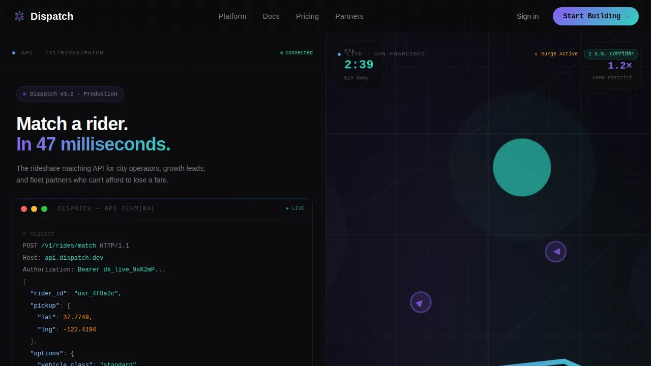
- A 50/50 split-screen hero with a syntax-highlighted API terminal on the left and an animated ride map on the right, including a car icon tracking toward a pulsing rider pin with an ETA countdown.
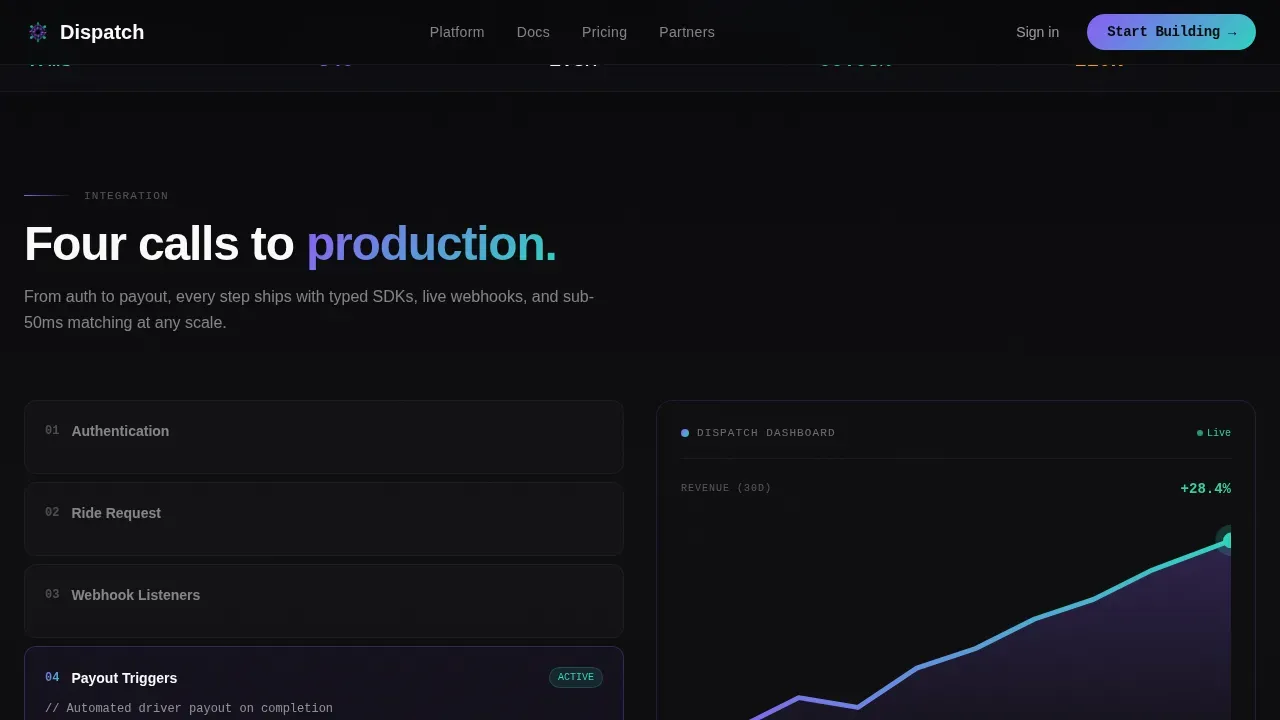
- A scrolling integration flow section where the left panel cycles through authentication, ride request setup, webhook listeners, and payout triggers, while the right panel snaps in corresponding dashboard widgets.
- A dual-path call-to-action system: "Start Building" targets developers and links to the developer portal; "Launch Your Market" targets city operators and fleet partners, linking to a partnership overview.
Feature list
This landing page template is built with a dense set of purpose-specific components. Each one reflects the real system design demands of a production-grade ride sharing app.
Split-Screen API Hero Panel
The hero divides the viewport into two equal halves. The left side displays a formatted API call to the ride match endpoint, syntax-highlighted in holographic violet and prismatic teal on a near-black terminal background. The cursor blinks at the end of the JSON response, which includes driver object data, estimated travel time in seconds, surge pricing multiplier, and vehicle coordinates. The right side renders the live result of that call: a car icon gliding along a polyline route on an animated map, moving toward a pulsing rider pin while the ETA counts down in real time.
Scrolling Integration Flow
Below the hero, the landing page runs a scroll-driven integration sequence. The left panel cycles through each step a developer would take: authentication, ride request configuration, webhook listener setup, and payout trigger logic. As each step loads, the right panel snaps in a matching dashboard widget. Widgets include a real-time ride feed, a demand heatmap of surge zones, and a revenue graph climbing upward. The pacing accelerates section by section, building a sensation that the platform is booting up around the visitor.
Asymmetric Bento Grid Stats Section
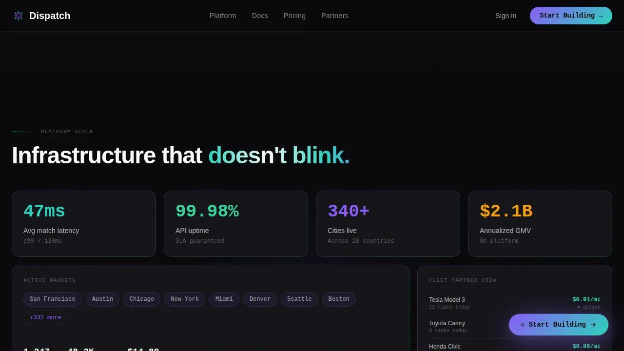
A platform stats section uses an asymmetric bento grid layout to display fleet metrics, location data visualizations, and ride sharing performance figures. Drivers, vehicles, cities, and uptime are shown as live-feeling data blocks. The grid uses faint violet-teal gradient card borders to lift each metric off the void-black background. This section helps fleet operators and city managers quickly assess system scale and reliability at a glance.
Push-Notification Testimonial Cards
Social proof appears between scroll sections as push-notification style testimonial cards. Each card flashes like an app alert, displaying a short quote from a city launcher. These cards display real operational context, referencing cities, ride volumes, and quick driver arrival, making the social proof feel live rather than static. Riders expect fast and fair pickups; seeing peer operators confirm that expectation removes hesitation.
Dual-Path Persistent Call-to-Action
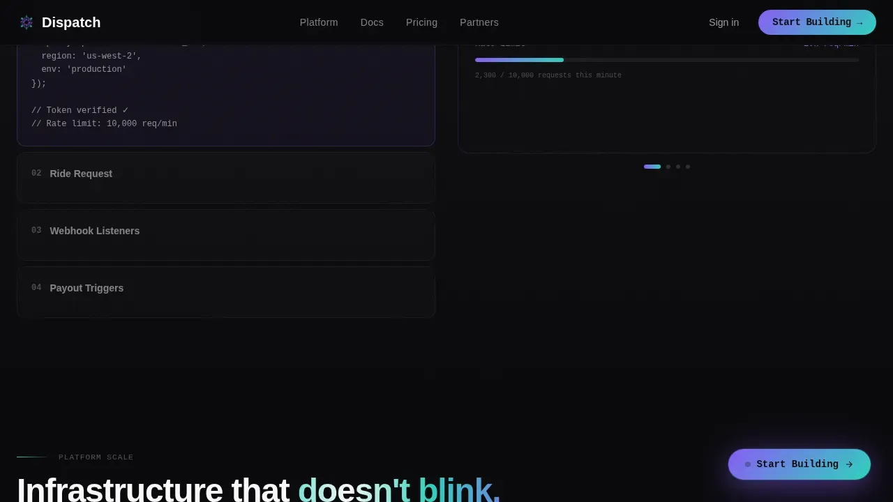
The primary call to action, "Start Building," appears first inside the terminal code panel, styled as a command the developer would actually type. After the second scroll section, it reappears as a persistent floating button that stays visible as the user scrolls. A secondary path, "Launch Your Market," targets fleet partners and city managers with a separate click carrying operator-specific context into the next destination. No form is required on the landing page itself.
Countdown-Paced Scroll Animation System
The template uses GSAP ScrollTrigger and CSS keyframes to drive a countdown-style scroll experience. Each section transition is faster than the last, matching the urgency of a live dispatch system. The animated car icon, blinking cursor, cycling integration steps, and pulsing rider pin all use GPU-accelerated transforms to keep the motion fluid. The result is a landing page that feels less like a static site and more like a system coming online.
Page sections overview
| Section | Purpose |
|---|---|
| Hero Split Screen | Display API call and animated ride map side by side |
| Integration Flow | Cycle through backend setup steps with live dashboard widgets |
| Platform Stats Grid | Show ride sharing metrics in an asymmetric bento layout |
| Social Proof Cards | Flash push-notification testimonials from city operators |
| Dual-Path Call to Action | Route developers and fleet operators to separate sign destinations |
| Footer Row | Linear single-row footer with minimal navigation links |
Design & branding system
The visual identity for this landing page runs on the AI Iridescent color system inside the Dashboard Pro theme. Every surface, card, and interactive element is calibrated to feel like a GPU-rendered map in a dark ops center.
- Color palette: void black (#09090B) for all backgrounds, holographic violet (#8B5CF6) and prismatic teal (#2DD4BF) for syntax highlighting, data labels, and shimmer accents, with signal white (#FAFAFA) for primary body text. Cards lift with faint violet-teal gradient borders. Interactive elements pulse with an iridescent glow on hover.
- Typography: JetBrains Mono handles all code panels and terminal user interface elements; DM Sans handles all interface copy, headings, and body text. The contrast between a monospace code font and a clean sans-serif creates a clear developer-plus-operator reading mode.
- Creative direction follows the Launch Energy framework: the scroll experience is paced like a countdown sequence, each section faster than the last, each data visualization denser, building urgency through motion rather than copy.
Mobile & speed optimization
This template is built desktop-first, reflecting how city operations managers and fleet partners typically work, reviewing live data on large-screen dashboards. The layout still supports a mobile-responsive fallback for growth leads and riders checking the site from a smartphone.
- Animation architecture uses GPU-accelerated CSS transforms only, keeping the scroll-driven motion fluid without heavy rendering overhead on lower-power devices.
- The server and client component split keeps the initial page load lean. Static sections render on the server; interactive elements like the animated map, blinking cursor, and cycling integration panels load as client components.
- Fast load behavior is a design constraint, not an afterthought. The template keeps the landing page lightweight so that mobile users reach the first scroll section before abandonment risk rises.
How this template helps you convert
This landing page is click-through optimized. There is no form to fill out. The page earns the click by proving the API works before asking anyone to use it.
- The hero panel puts a live API call and its map result side by side, so developers can evaluate the system design of the ride matching logic without reading a single marketing claim. The request, the JSON response, and the animated car on the map tell the whole story above the fold.
- The scrolling integration flow turns the landing page into a guided walkthrough. Each step in the left panel corresponds to a dashboard widget on the right, so operators and developers simultaneously see the backend logic and the front-end result. By the time the call to action reappears as a persistent floating button, the visitor has already watched the platform perform.
Other information about this template
This section covers additional practical details that help developers, operators, and designers evaluate the Dispatch template before they sign up or import it into their workflow.
- The template is structured to support ride sharing platform system design conversations. Sections reference concepts like fault tolerance, fallback mechanisms, strong consistency in ride request handling, and the ability to scale horizontally as ride demand grows and the platform needs to spin up more instances across regions.
- A spatial index approach underlies the animated map visualization logic. The map panel simulates how eligible drivers are identified from a pool of nearby drivers using location data, giving developers a working mental model of the matching algorithm.
- The landing page uses a fair first-in-first-out dispatch queue concept to demonstrate how rider requests are handled in sequence. When a rider enters a pickup request, the next driver in the eligible pool is surfaced on the map. This helps city operators understand the system design without reading technical documentation.
- Geofencing concepts are woven into the heatmap stats section, showing how location tracking determines eligible drivers in surge zones, airport queues, and late-night corridors. The template can support conversations about robust monitoring of fleet vehicles across multiple instances of a regional dispatch service.
- The push-notification testimonial cards are designed to display search-friendly social proof. Each card references a real operational context, such as a city launcher tracking ride based performance in a new market, a fleet partner watching vehicle utilization, or a growth lead managing ride sharing referral campaigns.
- Open Graph and SEO metadata are pre-structured for the landing page so teams can import the template and update destination links, copy, and metrics without rebuilding the data layer.
- The Dispatch landing page template is a useful reference for teams evaluating what a well-structured ride sharing landing should include before they commit to a full build. It functions as both a marketing asset and a system design demonstration in one scroll session.
- Google Maps-style animated polyline routes are used in the hero and integration flow sections to visualize driver location relative to the rider. The map panel references Google Maps conventions for route display, car icon movement, and current location pin styling, making it immediately readable to users already familiar with consumer ride sharing apps.
- Teams can open a free account on the platform to access this template, preview the full landing page user interface, and save a copy before customizing colors, copy, and call-to-action destinations.
Theme
Dashboard Pro
Creative direction
Launch Energy
Color system
AI Iridescent
Style
Split Screen (50/50)
Direction
Click-Through
Page Sections
Split-screen API Terminal and Live Map Hero
Scroll-driven Integration Flow with Dashboard Widgets
Asymmetric Bento Grid for Platform Metrics
Push-notification Style Testimonial Cards
Dual-path Persistent Call-to-action System
GSAP and CSS Keyframe Animation Architecture
Related questions
Who is this landing page template designed for?
Does this template include an on-page booking or signup form?
Can I update the colors, copy, and call-to-action destinations?
How does the animated map in the hero section work?
Is there a free way to try or access this template?



