Dispatch — Field Ops Landing Page Template
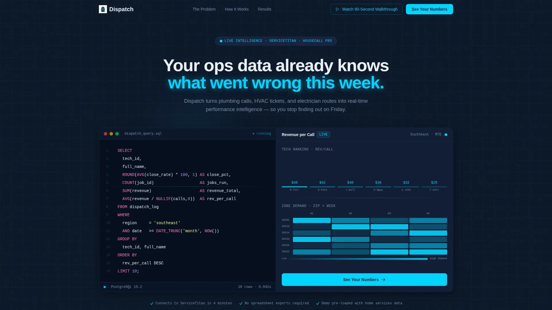
Dispatch is a split-screen landing page template built for home services AI analytics dashboards. It pairs a live syntax-highlighted code block on the left with a real-time performance dashboard on the right. Using a Midnight Blue color system and a Problem to Solution arc, it drives operators toward a click-through demo with one clear call to action: "See Your Numbers."
by Rocket studio
Quick summary
Dispatch is a single-page, split-screen landing page template designed for home services AI analytics platforms. The left half runs a live code query. The right half shows the output as a living dashboard. The scroll tells a Problem to Solution story, naming each operational blind spot before revealing the answer. Every section ends with a push toward the interactive demo.
Who this template is for
This template is built for founders, product marketers, and growth teams behind AI-powered analytics tools targeting the home services industry. It speaks directly to operators running fleets of service trucks who want data without the Friday spreadsheet ritual.
- SaaS teams selling AI analytics to HVAC, plumbing, or electrical service companies
- Operators and product leads who need a demo-first landing page with zero form friction
- Builders who want a technically credible page that earns trust before asking for a click
What problem this template solves
Home services analytics tools face a hard sell. The buyer already lives inside dispatching software all day and still exports data to spreadsheets every Friday. A generic SaaS landing page does not speak that language. Dispatch does.
- Operators do not trust dashboards they have not seen move with real data
- Most analytics landing pages lead with features, not the specific pain the buyer feels every week
- A demo-gated page with no social proof needs to earn the click through credibility, not persuasion
What you get with this template
You get a fully structured, single-page layout built around a Problem to Solution scroll arc. Every section is designed with a specific job to do, from the opening code animation to the final call to action.
- A split-screen header with a syntax-highlighted SQL or Python code block on the left and a live dashboard output panel on the right
- A repeating problem-and-answer scroll pattern, each pair closing with a "See Your Numbers" call-to-action button
- A persistent ghost button in the navigation for a secondary call to action tied to a 90-second walkthrough video
Feature list
This section covers the core built-in capabilities that define the Dispatch template layout and interaction design.
Split-Screen Header with Live Code Block
The header divides the viewport into two equal halves. The left side displays a syntax-highlighted query written in a monospaced font, with characters typing themselves onto the screen and a blinking cursor. The right side materializes the query output as a bar chart and heat map panel, showing technician rankings and service zone performance at a glance.
Problem to Solution Scroll Arc
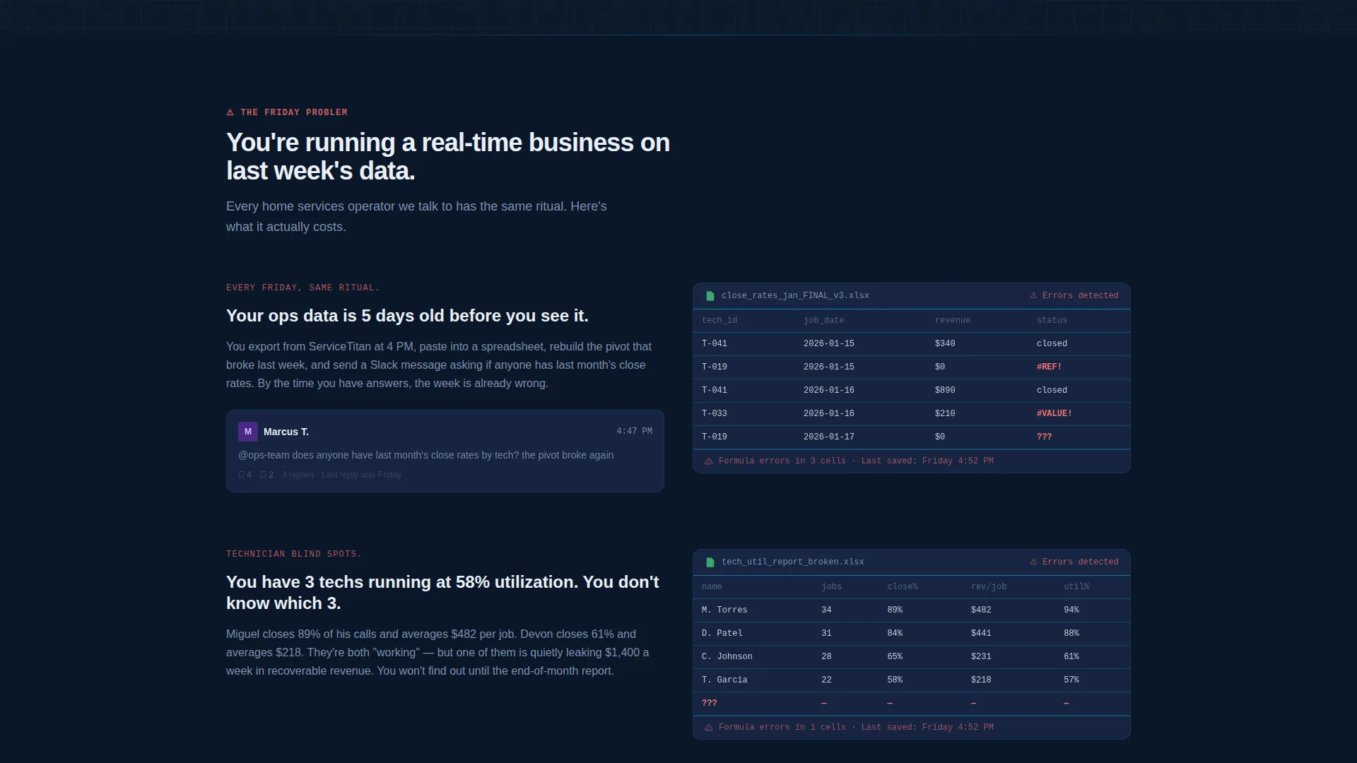
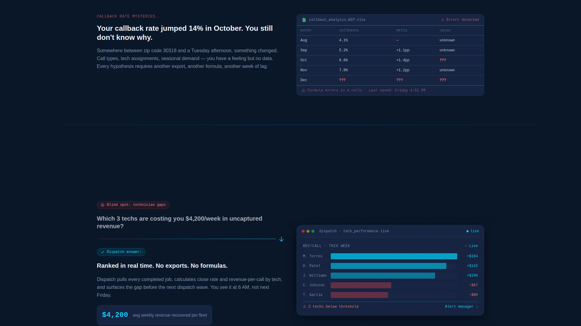
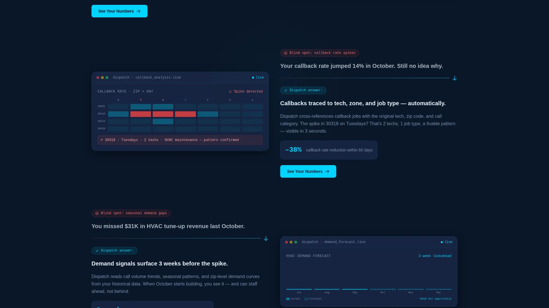
Each scroll step opens with a named operational pain point on the left panel. The right panel responds with the dashboard view that answers it. Problems covered include technician utilization gaps, callback rate mysteries, and missed seasonal demand signals. This rhythm of tension and relief is baked into the section order.
Click-Through Call-to-Action System
The primary call to action, "See Your Numbers," appears at the header fold and repeats after every problem-solution pair. No form is present on the page. Each button links through to a sandbox demo environment pre-loaded with sample home services data.
Persistent Secondary Navigation Button
A ghost-style secondary call to action, "Watch the 90-Second Walkthrough," floats in the navigation bar throughout the scroll. It gives hesitant visitors an alternative path without disrupting the primary conversion flow.
Dark Dispatch Visual Theme
The entire page uses a terminal-inspired Midnight Blue color system. Deep navy backgrounds, slate card surfaces, electric cyan data accents, and signal white typography combine to create a user interface that feels like a live ops screen rather than a marketing page.
No-Photography Design System
The template uses no stock photography and no illustrated assets. All visual credibility comes from the code block, the dashboard output shapes, and the color system. This keeps load weight low and the technical tone consistent throughout.
Page sections overview
| Section | Purpose |
|---|---|
| Split-Screen Header | Opens with live code query and matching dashboard output |
| Problem Callout One | Names technician utilization gaps as the first blind spot |
| Solution Panel One | Shows dashboard view resolving technician utilization |
| call to action Break One | "See Your Numbers" button after first problem-solution pair |
| Problem Callout Two | Surfaces callback rate mystery as the second blind spot |
| Solution Panel Two | Reveals callback rate dashboard answer |
| call to action Break Two | "See Your Numbers" button after second problem-solution pair |
| Problem Callout Three | Identifies missed seasonal demand as the third blind spot |
| Solution Panel Three | Displays demand forecasting dashboard view |
| call to action Break Three | "See Your Numbers" button closing the scroll arc |
| Persistent Nav Button | Floating "Watch the 90-Second Walkthrough" ghost button |
Design & branding system
The Dispatch template follows a Startup Velocity theme expressed entirely through a Midnight Blue color system. Every visual decision reinforces the feeling of a live dispatch screen glowing in a dark ops room before dawn.
- Primary background in deep terminal navy (#0A1628), card surfaces in slate command-line gray (#1B2A4A), and data accents in electric cyan (#00D4FF)
- Typography in signal white (#EAF0F7) using a monospaced font for code blocks and a clean sans-serif for body and heading copy
- No stock images, no illustrations; visual weight comes entirely from the code block, dashboard output shapes, bar charts, and the heat map panel glowing cyan on dark navy
Mobile & speed optimization
The split-screen layout is structured to adapt across screen sizes without losing the core visual logic of code-left and dashboard-right. The no-photography design system keeps asset weight minimal by default.
- The 50/50 split collapses gracefully on smaller screens so the code block and dashboard panel stack vertically without losing context
- No heavy image assets means the page starts fast and stays responsive as visitors scroll through each problem-solution section
- The persistent navigation ghost button remains accessible throughout the scroll on both desktop and mobile viewports
How this template helps you convert
Dispatch is engineered around a single conversion goal: get the right visitor into the demo environment. Every structural decision supports that goal.
- The opening code block signals technical credibility in the first three seconds, so the operator feels the tool thinks in their language before reading a single line of copy.
- The Problem to Solution scroll arc names specific pain points the target buyer feels every week, building enough trust that clicking "See Your Numbers" feels like a natural next step rather than a risk.
- The no-form click-through model removes all friction between interest and the demo, so visitors who are ready can act immediately while those who need more time have the 90-second walkthrough as a low-commitment alternative.
Other information about this template
Dispatch is built for the intersection of home services operations and AI-driven analytics tooling. A few additional details help clarify where it fits and how it can be deployed.
- The template is category-tagged under Technology with a subcategory of AI for Home Services, making it relevant for platforms that serve dispatching and field service management workflows
- The demo-first, no-form architecture works well for teams whose buyers evaluate tools inside software environments like ServiceTitan or Housecall Pro before committing to a sales conversation
- The Startup Velocity theme and Midnight Blue color system are ready to use as delivered, and the color variables are straightforward to update to match a specific brand palette
- The SQL query shown in the header references a realistic home services dataset structure, reinforcing technical authenticity with buyers who can read a query and recognize whether the logic is genuine
Theme
Startup Velocity
Creative direction
Problem→Solution Arc
Color system
Midnight Blue
Style
Split Screen (50/50)
Direction
Click-Through
Page Sections
Split-screen Header with Live Code Block
Problem to Solution Scroll Arc
Click-through Call-to-action System
Persistent Ghost Button in Navigation
No-photography Visual System
Related questions
Does this landing page include an actual working dashboard?
Can I link the 'See Your Numbers' button to my own demo environment?
Is there a lead capture form included on this page?
Can the Midnight Blue color system be updated to match my brand?
Who is the intended buyer this landing page is designed to reach?



