Specialist Fleet & Transportation Management Professional Website Template
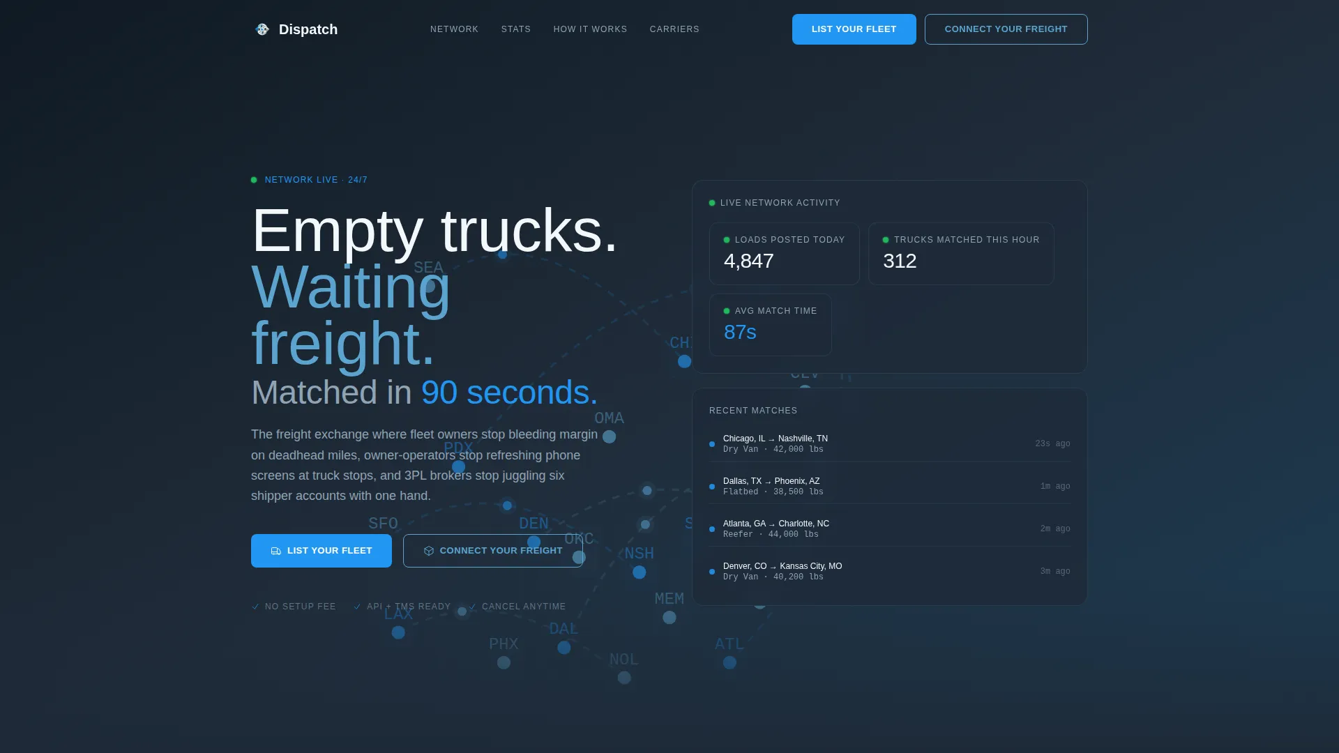
Dispatch is a single-page freight matching landing page template built for load board and freight exchange platforms. It targets fleet owners, independent owner-operators, and logistics brokers with a stats-first modular card grid, an animated infographic header, and dual conversion paths for carriers and shippers. The design uses a dark Slate and Sky palette that communicates urgency and scale at a glance.
by Rocket studio
Quick summary
Dispatch is a high-impact freight matching landing page template designed for load board platforms connecting carriers with cargo. It pairs an animated continental map header with a modular stats-first card grid, a workflow comparison strip, and dual calls to action for both carriers and shippers. The result is a page that proves network scale before asking for a single click.
Who this template is for
This template is built for logistics and supply chain businesses that need to attract both sides of a freight transaction from one focused page. It speaks directly to the people who move freight and the people who need freight moved.
- Fleet owners running fleets of thirty to three hundred trucks who want to reduce deadhead miles
- Independent owner-operators looking for faster load matching at truck stops and terminals
- Third-party logistics brokers managing multiple shipper accounts who need a credible platform presence
What problem this template solves
Traditional freight brokerage relies on phone calls, hold times, and manual check-ins that burn hours a dispatcher does not have. Empty trucks returning from a delivery represent pure margin loss, and slow matching compounds that cost across every lane.
- Carriers struggle to find return loads quickly, leaving trucks running empty and cutting into profit
- Shippers and brokers waste time on manual outreach when cargo sits waiting for a match
- Platforms without a strong first impression fail to convince either side that the network is large enough to be worth joining
What you get with this template
You get a fully structured, single-page layout that builds trust through data before asking for commitment. Every section is designed to be scanned in under five seconds, matching the attention span of a working dispatcher.
- An animated infographic header with a live-load map, pulsing location dots, and real-time counters for loads posted and trucks matched
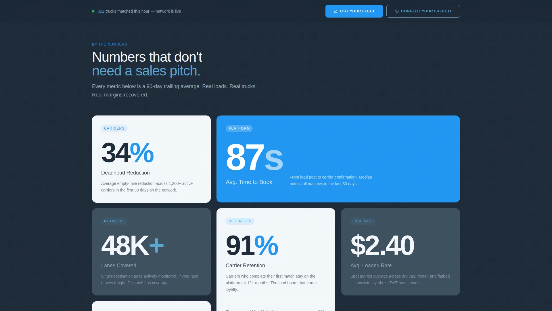
- A modular card grid where each card leads with an oversized metric before explaining the feature beneath it
- A dual call-to-action system with a "List Your Fleet" button for carriers and a "Connect Your Freight" button for shippers, plus a sticky bottom bar repeating both
Feature list
This template includes a focused set of components built specifically for freight exchange and load board positioning. Each one serves the core goal of converting cold visitors into registered carriers or shippers.
Animated Infographic Header
A full-width header displays a simplified map of the continental United States with pulsing dots for live loads and available trucks. Thin arcing lines connect origins to destinations in real time, while a live counter in the upper right ticks upward showing loads posted today, trucks matched this hour, and average match time in seconds.
Stats-First Modular Card Grid
Each card in the grid leads with a single oversized metric such as deadhead reduction percentage, average time-to-book, lanes covered, or carrier retention rate. The feature explanation appears beneath the number, so visitors absorb the proof before reading the pitch.
Workflow Comparison Strip
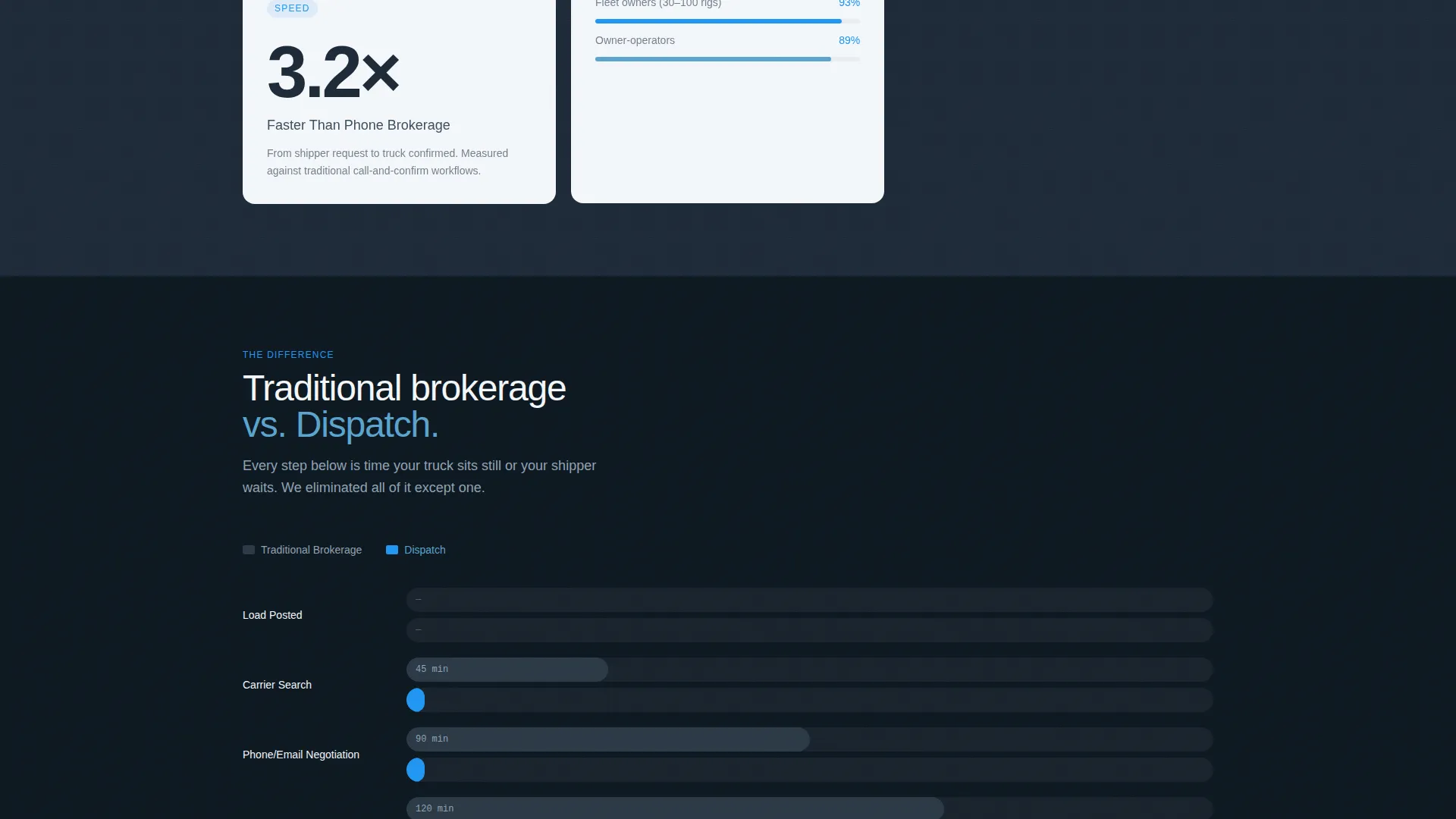
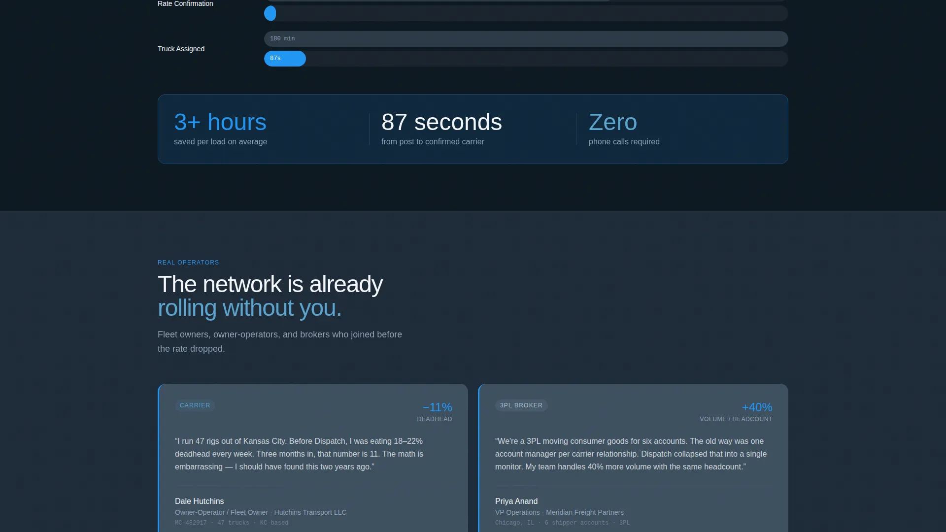
A horizontal mid-page section contrasts traditional phone-tag brokerage steps against the platform's automated matching timeline. The comparison renders as a simple bar chart, making the time difference between legacy and modern workflows immediately visible.
Dual Conversion Call-to-Action System
Two parallel primary buttons, "List Your Fleet" and "Connect Your Freight," appear in the header and repeat on a sticky bottom bar. Each button opens a two-step form capturing company details, registration numbers, and integration preferences.
Two-Step Registration Form
Step one of the form collects company name, Motor Carrier (MC) or Department of Transportation (DOT) number, and fleet size or average monthly shipment volume. Step two asks for a primary contact and preferred integration method, offering API connection, a Transportation Management System (TMS) plugin, or manual entry.
Service Utility Visual Theme
The Slate and Sky color system uses dispatcher-screen charcoal for the background, asphalt slate for card surfaces, open-highway sky blue for structural elements, and high-visibility signal blue for live data points and clickable elements. Clean white card faces keep data readable against the dark layout.
Page sections overview
| Section | Purpose |
|---|---|
| Animated Map Header | Prove live network scale before copy loads |
| Live Stats Counter | Show loads posted, matches made, and match speed |
| Stats Card Grid | Lead each feature with a hard metric |
| Workflow Comparison Strip | Contrast old brokerage time against platform speed |
| Carrier call to action Block | Drive fleet owners to the "List Your Fleet" form |
| Shipper call to action Block | Drive shippers to the "Connect Your Freight" form |
| Two-Step Form | Capture company, registration, and integration details |
| Sticky Bottom Bar | Keep both calls to action visible throughout the scroll |
Design & branding system
The visual identity follows a Service Utility theme built around contrast and data clarity. The palette is inspired by the view through a truck cab windshield at dawn on a long-haul interstate route.
- Core colors: dispatcher-screen charcoal (#1E2A38), asphalt slate (#3D4F5F), open-highway sky (#5BA4CF), high-visibility signal blue (#2196F3), and clean white card surfaces (#F4F7FA)
- Signal blue is reserved exclusively for live data points and interactive elements, creating a clear visual hierarchy between static content and actionable items
- No stock photography or human faces appear anywhere on the page; the infographic header and stat cards carry the entire visual weight
Mobile & speed optimization
The modular card grid layout is inherently responsive, allowing cards to reflow from a multi-column desktop arrangement into a single-column stack on smaller screens. The sticky bottom bar keeps both conversion buttons accessible at every scroll depth on any device.
- Card grid reflows cleanly for tablet and mobile viewports without losing the stats-first reading order
- The sticky bottom bar with dual calls to action ensures conversion access is never more than one tap away on a phone screen
- The header infographic is designed as a visual component rather than a media-heavy asset, keeping the page light enough for users on cellular connections at truck stops
How this template helps you convert
Every design decision in this template points toward one outcome: getting both carriers and shippers to submit their details. The page earns that action before asking for it.
- The animated map and live counters prove that the network is already active, removing the "empty exchange" hesitation that kills sign-ups on new platforms
- The stats-first card grid builds a cumulative argument as the visitor scrolls, with each metric reinforcing the last until the numbers feel undeniable
- The dual call to action system with a sticky bar means neither carriers nor shippers have to scroll back to find the action they came to take
Other information about this template
This template is a strong fit for any freight exchange or load board platform that needs to recruit both sides of the marketplace simultaneously. It is built as a single-page layout, making it fast to deploy and easy to maintain.
- The template suits platforms operating in the full truckload (FTL) and less-than-truckload (LTL) freight segments where lane-based matching is the core value proposition
- The two-step form structure keeps the entry barrier low while still collecting the data needed to qualify carriers and shippers before onboarding
- The layout can support a digital freight brokerage, a carrier network, or a shipper portal depending on how the copy and call to action labels are customized during setup
Theme
Service Utility
Creative direction
Stats-First Impact
Color system
Slate & Sky
Style
Card Grid (Modular)
Direction
Partnership/B2B
Page Sections
Animated Infographic Header
Stats-first Modular Card Grid
Workflow Comparison Strip
Dual Call to Action with Sticky Bottom Bar
Two-step Registration Form
Service Utility Color System
Related questions
Who is the Dispatch template designed for?
Can I customize the call to action labels for my specific platform?
What does the two-step registration form collect?
Does the template include the live map animation?
Is this template suitable for a less-than-truckload freight platform?