Last-Mile & Delivery Directory Website Template
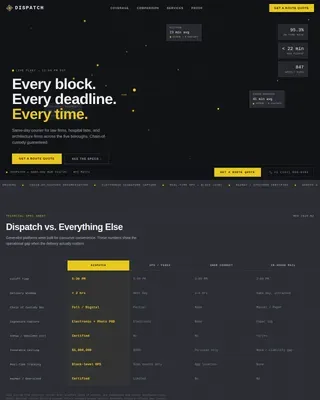
Dispatch is a high-performance drone delivery landing page template built for autonomous last-mile logistics companies. It uses a dark Carbon Fiber visual identity, flip-card spec metrics, a full-width comparison table, and a sticky route analysis form to convert fulfillment managers, pharmacy logistics directors, and emergency logistics coordinators into qualified leads.
by Rocket studio
Quick summary
Dispatch is a modular card grid landing page template for drone delivery businesses targeting B2B logistics buyers. It builds a data-driven case for autonomous delivery by stacking performance metric cards against ground-delivery equivalents, locking them in a side-by-side comparison table, and driving visitors toward a route analysis form or a gated PDF download.
Who this template is for
This template is designed for drone delivery operators and autonomous last-mile fulfillment platforms that sell to serious operational buyers. The layout speaks the language of cost-per-parcel, transit time, and failed-delivery rate rather than aspirational headlines.
- Regional e-commerce fulfillment managers tracking last-mile cost erosion
- Pharmacy logistics directors managing time-critical prescription delivery windows
- Emergency logistics coordinators supplying rural clinics with medical units
What problem this template solves
Convincing a fulfillment manager to switch from ground delivery requires more than a clean design. It requires verifiable numbers, visible methodology, and a clear path from "I believe this" to "I want to run my own route analysis." Generic logistics templates do not provide that structure.
- Buyers arrive skeptical and leave without a lead capture if the data is not front and center
- Internal stakeholders need a shareable asset, like a cost comparison PDF, before approving a vendor call
- Standard templates do not support the comparison-first conversion flow that B2B logistics decisions require
What you get with this template
Dispatch gives you a fully structured, single-page conversion layout organized around proof and comparison. Every section earns its place by moving a cautious buyer one step closer to the primary call to action.
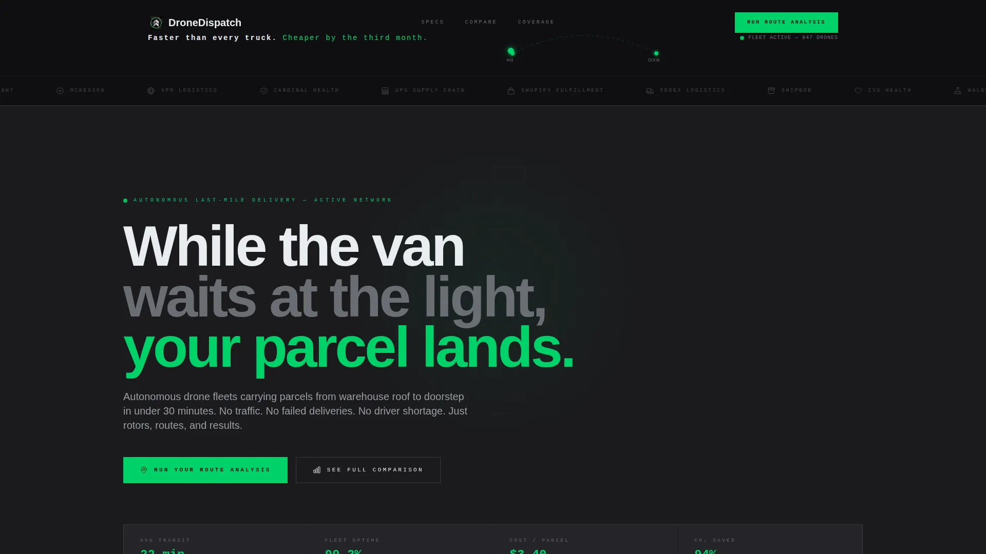
- A hero Logo Bar section with animated parabolic delivery arc and a provocative anchor headline
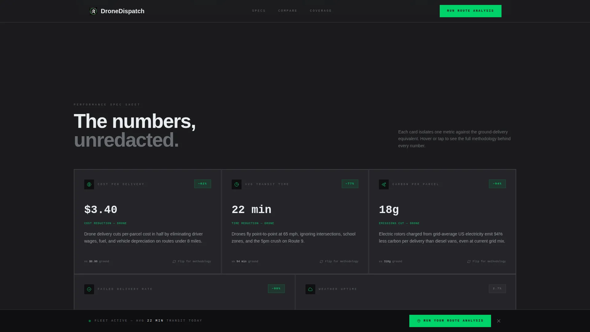
- Five modular flip-cards isolating drone versus ground performance metrics with hover-reveal methodology
- A full-width side-by-side comparison table, a route analysis form, and a secondary PDF download gate
Feature list
This template is built around high interactivity and data-forward design. Each feature below reflects a deliberate structural choice tied to the Comparison/Versus conversion goal.
Animated Parabolic Delivery Arc
A looping two-second SVG arc traces a delivery path from warehouse to doorstep inside the hero section. It reinforces the core value proposition visually without relying on words alone.
Flip-Card Spec Grid
Five modular cards each isolate one performance metric and display the drone-versus-ground equivalent on the front face. On hover, each card flips or expands to reveal the methodology behind the number, building trust with data-literate buyers.
Full-Width Comparison Table
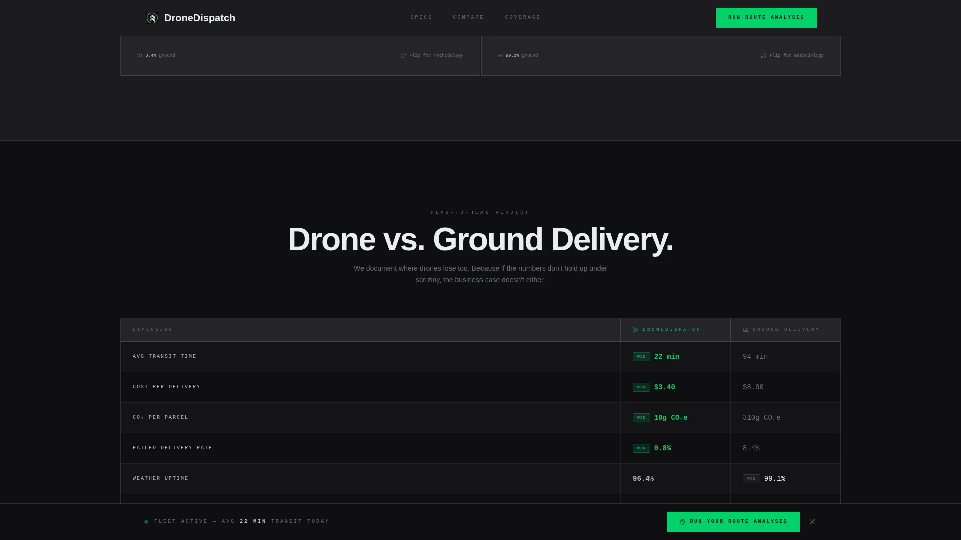
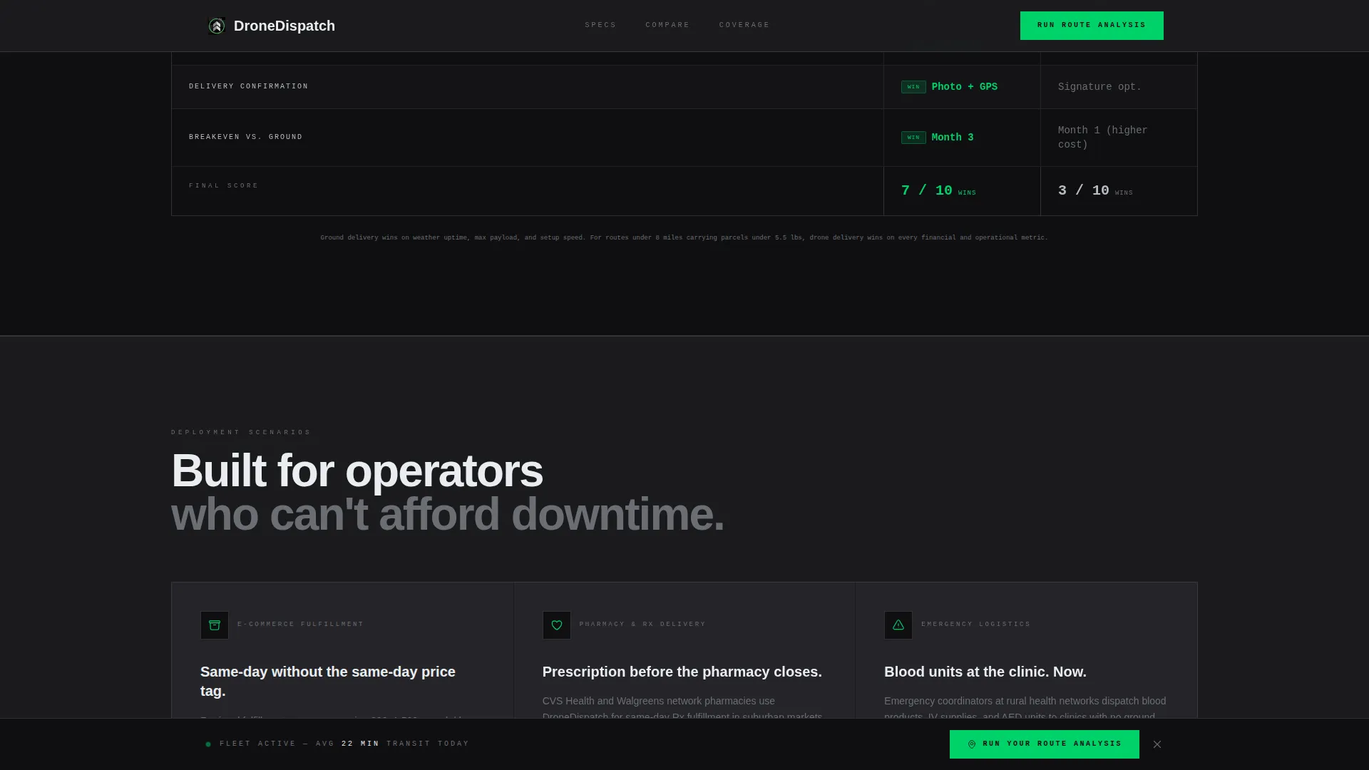
A dedicated full-width section locks drone delivery and ground delivery in two side-by-side columns. Buyers who want a fast verdict get it here without scrolling through individual cards.
Route Analysis Lead Form
The primary call to action form collects average daily delivery volume, primary delivery radius in miles, and a ZIP code for coverage verification. It appears after the comparison table and repeats on a sticky bottom bar throughout the page.
Gated PDF Download
A secondary conversion path offers a downloadable cost comparison PDF in exchange for a business email address. This catches buyers who need internal buy-in before committing to a discovery call.
Sticky Bottom Call-to-Action Bar
A persistent bar anchored to the bottom of the viewport repeats the "Run Your Route Analysis" call to action. Visitors who scroll past the form section are never more than one tap away from converting.
Page sections overview
| Section | Purpose |
|---|---|
| Hero Logo Bar | Display partner logos, animated arc, and anchor headline |
| Spec Card Grid | Compare drone versus. ground metrics across five flip-cards |
| Full-Width Table | Side-by-side verdict for fast-scanning decision makers |
| Route Analysis Form | Capture delivery volume, radius, and ZIP code |
| PDF Download Gate | Secondary lead capture for internal-approval buyers |
| Sticky call to action Bar | Persistent conversion prompt anchored to viewport bottom |
| Footer | Single-row linear footer with essential navigation links |
Design & branding system
The visual identity follows a Service Utility theme modeled on a flight operations center at dawn. Every color choice is functional. Nothing is decorative.
- Carbon black (#1B1B1E) as the primary background, titanium mid-gray (#6B6E73) for secondary text and borders, and runway white (#EAEDF0) for body copy
- Status-green (#00D26A) applied exclusively to live indicators, call-to-action surfaces, and active state elements
- DM Sans for headings and body copy, JetBrains Mono for metric figures and data labels, reinforcing the spec-sheet utility aesthetic
Mobile & speed optimization
The template is built desktop-first to match the workflow of fulfillment managers operating on ops dashboards. Responsive breakpoints ensure the layout remains clean and functional on smaller screens.
- Server Components handle static content sections to keep initial load fast without client-side overhead
- Client Components isolate animations and the form, so interactive elements load independently without blocking readable content
- GSAP ScrollTrigger powers card reveals and the marquee partner strip, keeping motion tied to scroll position rather than running on page load
How this template helps you convert
Dispatch is structured around a Comparison/Versus conversion flow. Each section removes a layer of buyer hesitation before the call to action appears.
- The hero Logo Bar uses carrier and pharmacy partner logos to establish credibility before a single metric is shown, so skeptical buyers do not bounce before reading the data.
- The flip-card grid and comparison table stack evidence progressively, making ground delivery look indefensible by the time the route analysis form appears mid-scroll.
- The sticky bottom bar and gated PDF create two distinct conversion paths, one for buyers ready to engage and one for buyers who need internal approval first.
Other information about this template
Dispatch is localized for the United States market. Delivery radius inputs use imperial miles, forms request ZIP codes, and all use-case copy references US pharmacy and logistics operational contexts.
- The template style is Card Grid (Modular), meaning each content block is independently structured and can be visually reordered without breaking the page layout
- Animation complexity is high, including GSAP ScrollTrigger section reveals, a looping parabolic SVG arc, card flip transforms, and a marquee partner logo strip
- The footer uses a Pattern 1 Linear Single-Row layout, keeping the bottom of the page clean and focused on the primary conversion goal
Theme
Service Utility
Creative direction
Spec Sheet
Color system
Carbon Fiber
Style
Card Grid (Modular)
Direction
Comparison/Versus
Page Sections
Animated Parabolic Delivery Arc
Flip-card Spec Metric Grid
Full-width Comparison Table
Route Analysis Lead Form
Gated PDF Download
Sticky Bottom Call to Action Bar
Related questions
Who is the Dispatch template designed for?
What lead capture options does this template include?
Can I customize the performance metrics on the flip-cards?
What animations are built into this template?
Does the template support both desktop and mobile layouts?