Dispatch — Home Services Landing Page Template
Dispatch is a split-screen landing page template built for home services help desk and ticketing platforms. It combines a live-metrics header, a before-and-after chaos-to-clarity visual flow, and a tap-to-download call to action path. The design uses a precision-tooled Monochrome Steel palette to signal operational control from the very first fold.
by Rocket studio
Quick summary
Dispatch is a high-impact, single-page landing page template designed for home services ticketing and dispatch software. It opens with an animated stats wall, moves through four proof-driven folds, and closes every scroll with a persistent app download bar. The template is built for speed, clarity, and one goal: getting field operations teams to tap "download."
Who this template is for
This template speaks directly to the people managing the chaos behind every service call. It is built for teams where every missed job costs real money and real trust.
- Operations managers running multiple technicians across a metro service area
- Office administrators handling callbacks, rescheduling, and job status updates
- Franchise owners who need a single view of open jobs across multiple locations
What problem this template solves
Home services businesses lose jobs to disorganization, not lack of demand. Sticky notes, group texts, and verbal handoffs create gaps that frustrate customers and burn out staff. This template gives a dispatch platform the right stage to show it solves exactly that.
- Communicates the shift from chaotic, manual coordination to clean, trackable ticket management
- Shows the app solving real dispatcher pain points before a visitor reads a single feature bullet
- Removes friction from the download path by keeping the call to action visible at every scroll position
What you get with this template
You get a fully structured, single-page layout built around four conversion folds, each designed to earn trust before asking for the download. The visual system is production-ready and built around a specific color palette and typographic tone.
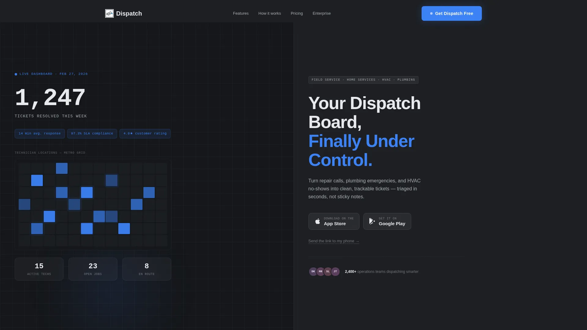
- A Stats/Metrics header section with an animated counter, heat map, and three key performance indicator pills
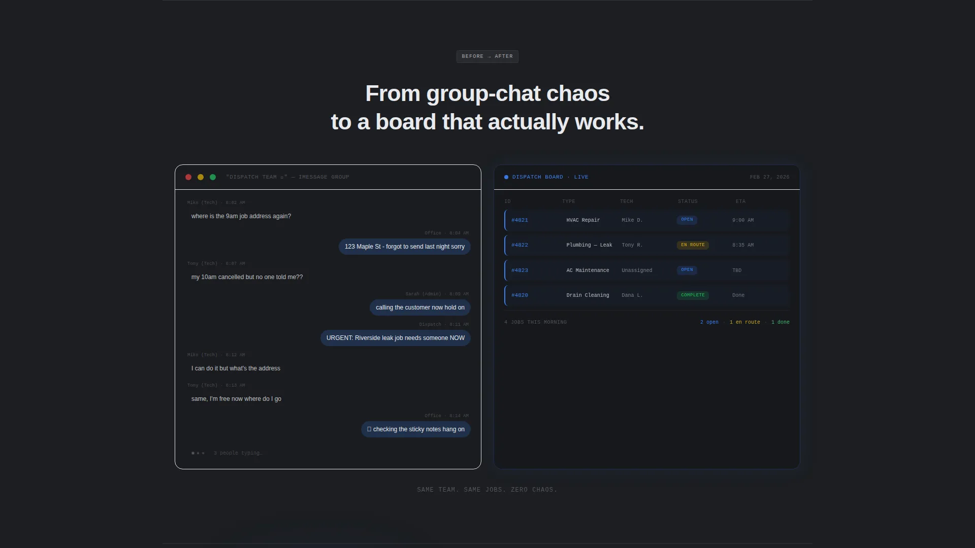
- A before-and-after split section showing a messy group text thread morphing into a clean ticket timeline
- A persistent bottom bar with iOS and Android download badges that stays pinned after the first scroll
Feature list
This template is built around purposeful layout decisions. Every section earns its place by delivering a proof point, not padding.
Animated Metrics Header
The header opens with a live-feel stats wall. A large counter ticks upward from mid-count for two seconds on load, landing on "1,247 tickets resolved this week." Three key performance indicator pills display average response time, service-level agreement compliance rate, and customer rating alongside a mini technician location heat map.
Split-Screen Chaos-to-Clarity Section
The second fold uses a 50/50 split layout to contrast a cluttered group text thread on the left with a clean, structured ticket timeline on the right. This visual proof point communicates the platform's core value without a single paragraph of explanation.
Phone Mockup Notification Fold
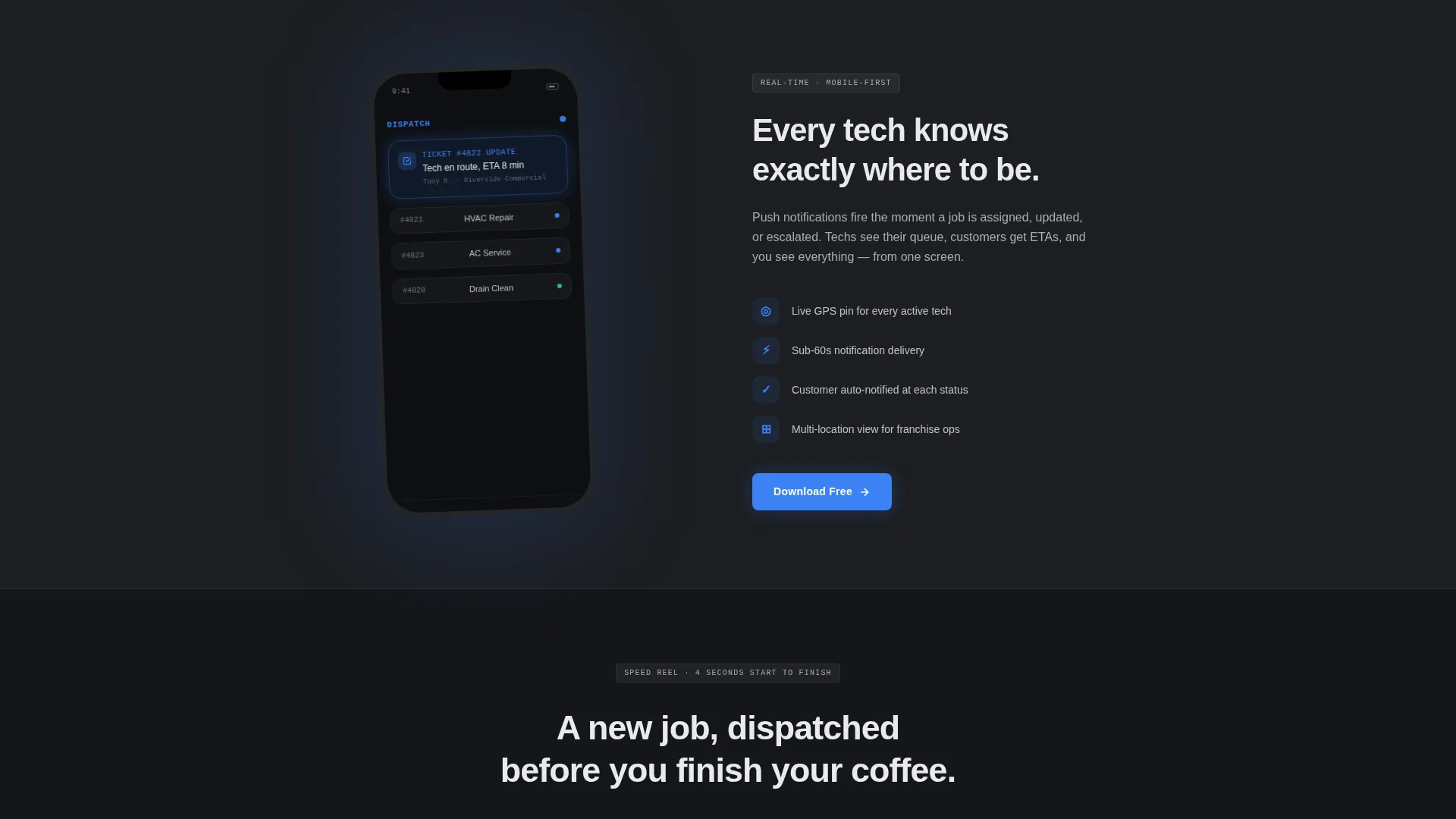
The third fold places a phone mockup mid-notification, showing "Tech en route, ETA 8 min" as the key message. A single-line value proposition sits beside it, keeping the section punchy and fast to read.
Auto-Playing App Speed Reel
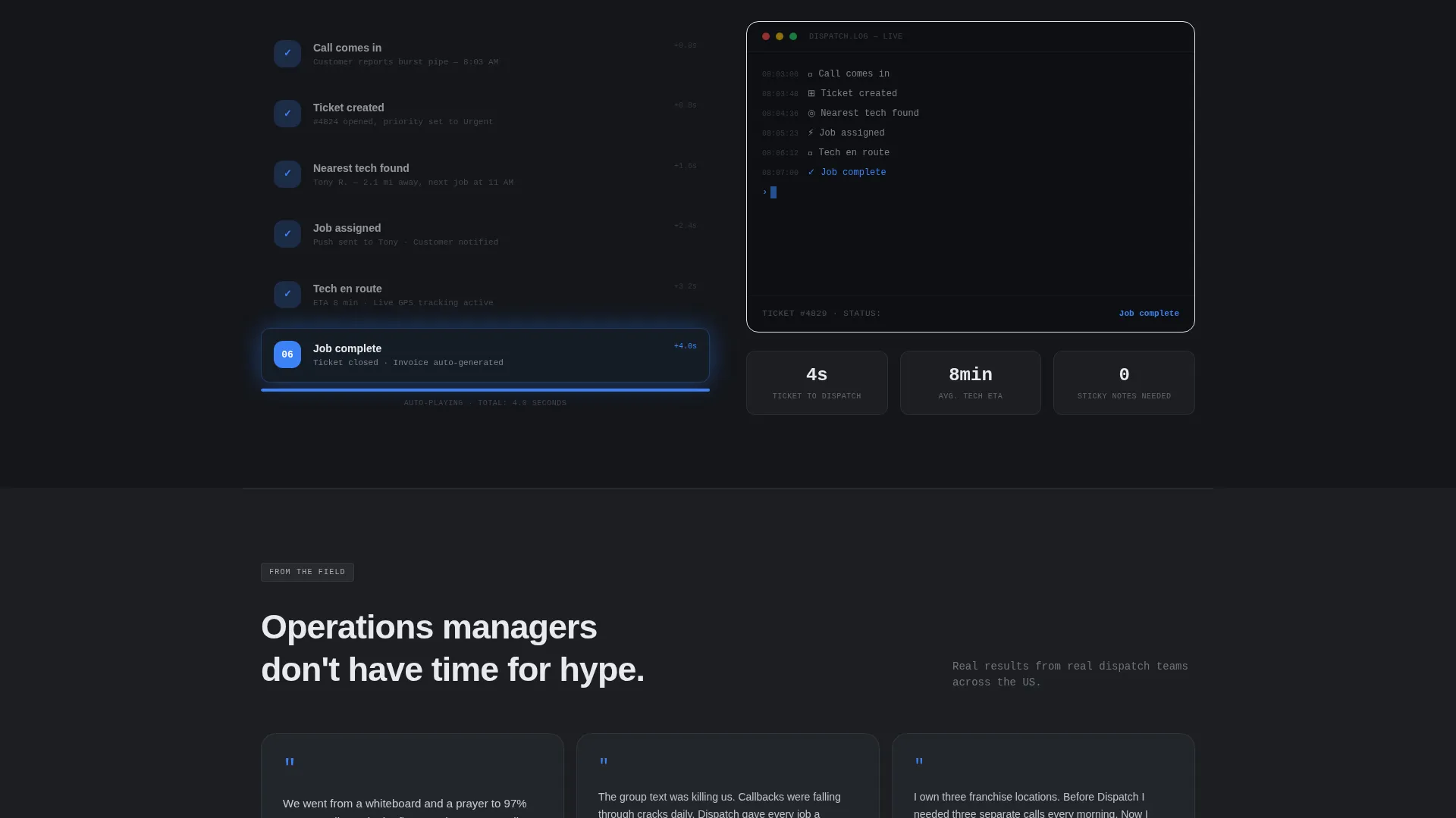
The fourth fold features a silent, auto-playing video reel of the app in use. It shows a full ticket creation flow completed in under four seconds, demonstrating speed through action rather than claims.
Persistent App Download Bar
After the first scroll, a slim bottom bar with the primary call to action "Get Dispatch Free" stays pinned. It includes paired iOS and Android badges and a secondary text link that opens a single phone-number field for SMS delivery of the download link.
No-Form Primary Download Path
The main conversion path requires zero form fields. Visitors tap directly to the app store from the landing page, reducing drop-off at the most critical moment in the funnel.
Page sections overview
| Section | Purpose |
|---|---|
| Stats Metrics Header | Opens with live-feel KPI data to establish platform credibility immediately |
| Chaos versus. Clarity Split | Contrasts a messy group text with a structured ticket timeline side by side |
| Phone Mockup Fold | Shows an in-app notification beside a focused single-line value proposition |
| App Speed Reel | Auto-plays a silent ticket creation demo in under four seconds |
| Persistent Download Bar | Keeps the app store call to action pinned at the bottom after the first scroll |
Design & branding system
The visual identity follows the Startup Velocity theme using a Monochrome Steel color system. Every color choice serves a functional role, and no surface is decorative without purpose.
- Forge-dark charcoal (#1C1E22) as the primary background, brushed aluminum (#A8ADB3) for secondary surfaces and divider lines, and machined chrome (#E8EAED) for card faces and body text
- Arc-weld blue (#3B82F6) used exclusively for live data indicators, active states, and every call-to-action element
- A tooled-precision aesthetic throughout: no warm tones, no organic shapes, just structured layout geometry that mirrors the operational clarity the product promises
Mobile & speed optimization
The layout is designed with a mobile-first download flow in mind. The template structure prioritizes the tap-to-store path on small screens where most app discovery happens.
- The persistent bottom bar call to action is slim and thumb-friendly, staying accessible without blocking content during scroll
- The auto-playing speed reel is silent by design, meaning it plays without requiring user interaction or permission prompts on mobile
- The SMS delivery option reduces friction further by letting users send the download link directly to their phone without leaving the page
How this template helps you convert
This template is built around a deliberate sequence. Each fold earns the next scroll before asking for the download.
- The animated metrics header establishes credibility in the first two seconds, showing real operational numbers before a visitor reads a headline.
- The before-and-after split and phone mockup fold demonstrate the app solving specific problems, so the visitor already trusts the product by the time they reach the third fold.
- The no-form download path and persistent call to action bar remove every barrier between intent and action, keeping the tap-to-store conversion step as simple as possible.
Other information about this template
This template is part of a broader home services software category and is suited to platforms targeting field service teams, multi-location franchise operators, and dispatch-heavy operations. It is built for teams where the download decision happens fast and on mobile.
- The Launch Energy creative direction keeps every section short, visual, and proof-driven rather than text-heavy
- The template style is a true 50/50 Split Screen layout, used consistently across the chaos-to-clarity and phone mockup folds
- The header concept is a Stats/Metrics wall, a layout pattern well-suited to software platforms that want to lead with performance data rather than brand copy
Theme
Startup Velocity
Creative direction
Launch Energy
Color system
Monochrome Steel
Style
Split Screen (50/50)
Direction
App Download
Page Sections
Animated Metrics Header with KPI Pills
Split-screen Chaos-to-clarity Layout
Phone Mockup Notification Section
Silent Auto-playing App Speed Reel
Persistent No-form Download Bar
Related questions
Who is this landing page template designed for?
Does this template require a form to capture leads?
Can I customize the color palette and copy in this template?
Is this template suitable for a multi-location home services business?
What makes the metrics header feel live on page load?



