Certified Directory & Marketplace Platforms Provider Directory Website Template
Dispatch is a single-page contractor finder landing page template built around a Data Command theme. It guides visitors from raw problem statistics through a sharp comparison table, then into a three-step progressive sign-up form. The Monochrome Steel palette and dashboard-style header make the page feel like a professional dispatch console, not a generic directory listing.
by Rocket studio
Quick summary
Dispatch is a focused contractor and handyman finder landing page template. It opens with a live-looking dashboard preview, moves visitors through a Problem-to-Solution arc backed by real statistics, and closes with a freemium sign-up flow. Signal green drives every actionable element. The result is a page that feels operational, credible, and built to convert.
Who this template is for
This template is designed for teams launching a contractor matching or home repair directory platform. It speaks directly to the people who need a fast, trustworthy way to find vetted help.
- First-time homeowners facing an unexpected repair and unsure where to start
- Property managers handling maintenance requests across multiple rental units
- Remote landlords who need to dispatch a trusted contractor without being on site
What problem this template solves
Finding a reliable contractor is slow, stressful, and full of risk. Homeowners lose hours to phone calls, review sites, and unanswered messages. This template frames that pain in measurable terms and immediately positions your platform as the solution.
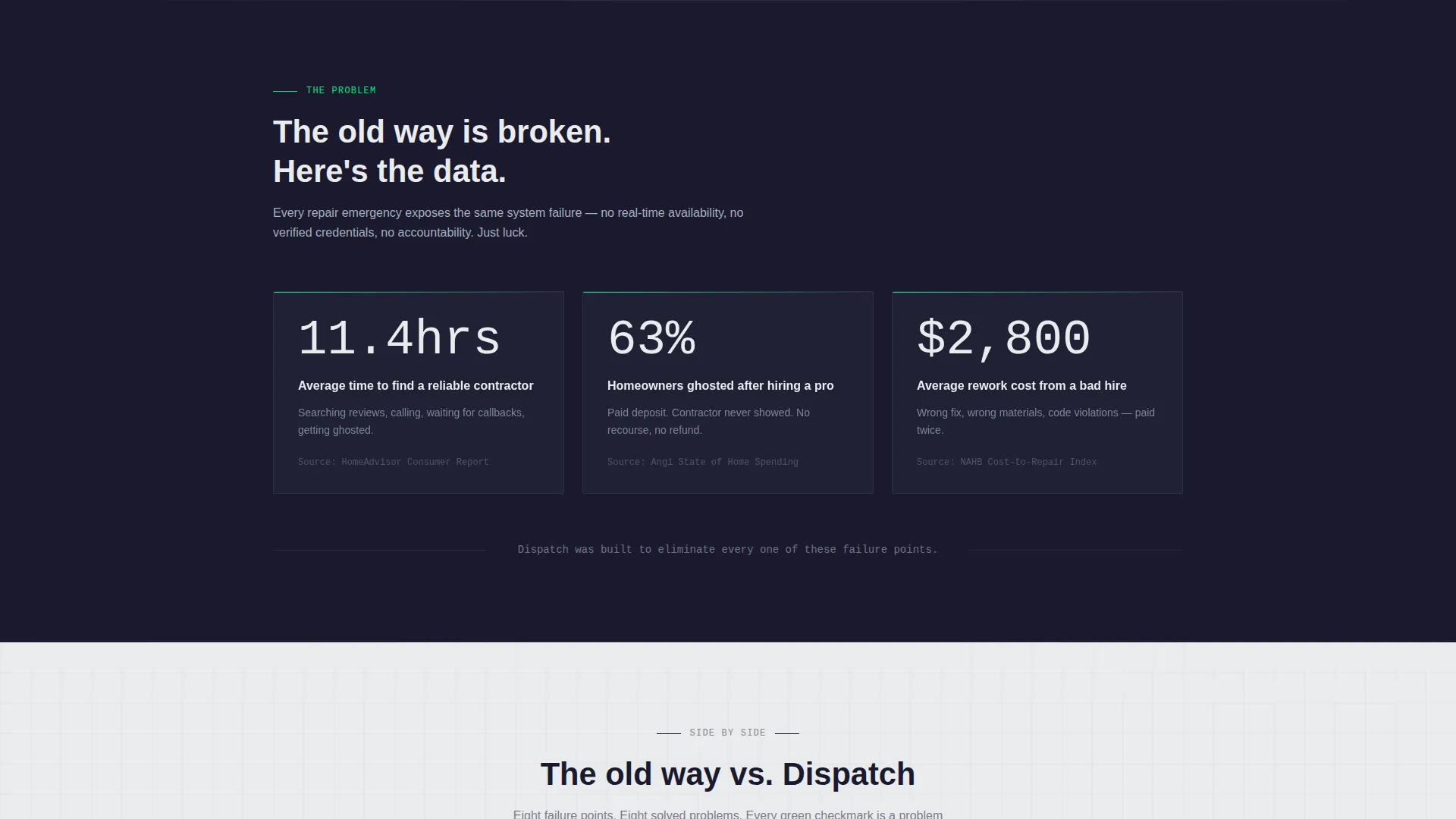
- Average search time of 11.4 hours is turned into a single matched result in minutes
- The 63 percent ghosting rate and $2,800 average rework cost are used as conversion levers
- Side-by-side comparison tables replace vague claims with row-by-row proof
What you get with this template
You get a complete, section-led landing page designed around a contractor dispatch use case. Every layout decision supports the goal of moving a stressed homeowner toward a free sign-up.
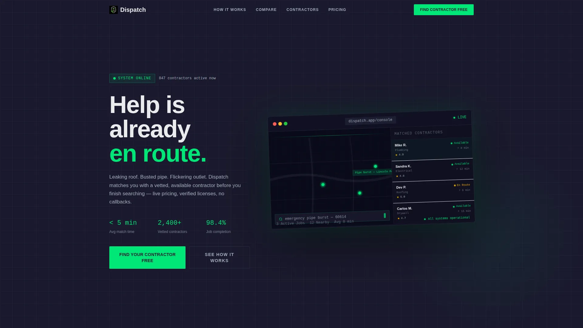
- A dashboard-style hero with a floating contractor dispatch screen and signal green job pins
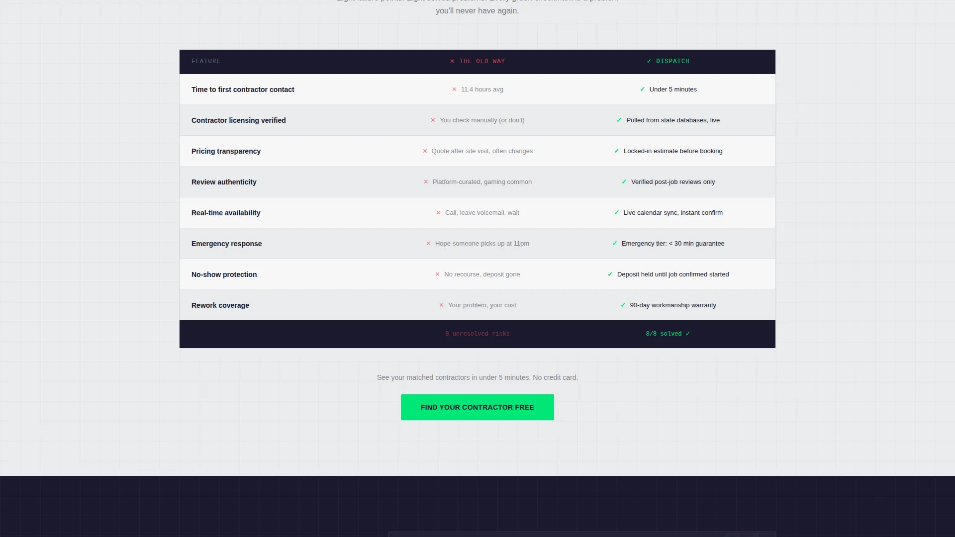
- A full comparison table section pitting the old search process against the platform
- A three-step progressive form collecting job type, urgency, and contact details
Feature list
This template ships with purpose-built layout blocks. Each one is designed to address a specific moment in the visitor's decision.
Dashboard Hero with Dispatch Preview
The header renders a pixel-accurate screenshot of a contractor dispatch interface. It shows a map with three active job pins in signal green, a contractor sidebar with star ratings and response times, and a pre-filled search bar. The entire screen floats at a slight angle over carbon black with an aluminum glow beneath it, creating a sense that the system is live.
Problem Arc with Hard Statistics
The first scroll section leads with three verifiable pain-point figures: 11.4 hours average search time, 63 percent ghosting rate, and $2,800 average rework cost. These numbers are displayed as raw data blocks rather than marketing copy, which builds credibility before the solution is presented.
Side-by-Side Comparison Tables
The core conversion section uses structured grids to compare the traditional contractor search process against the platform approach. Each row covers a specific friction point. Signal green checkmarks appear exclusively in the platform column, creating a consistent visual rhythm that reinforces value without requiring extra copy.
Live Match Feed
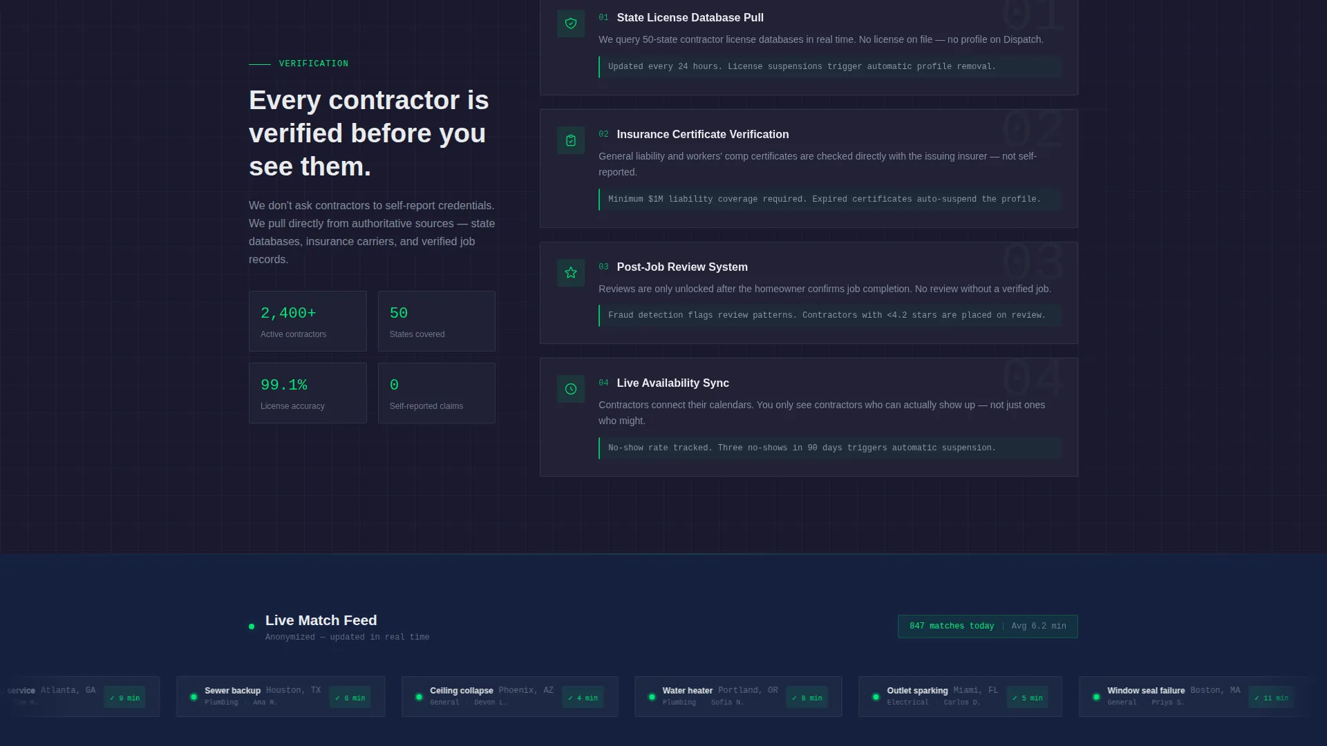
A scrolling feed section shows anonymized recent contractor matches with location, job type, and match time. Sample entries like "Roof leak in Austin matched in 4 min" signal that the system is active and working right now, which reduces sign-up hesitation.
Three-Step Progressive Sign-Up Form
The primary call to action opens a lightweight form split into three steps: job category selection, urgency level, and zip code with phone number. No credit card or account creation is required. The free tier delivers three matched contractor profiles, and the upgrade path to premium is shown only after the visitor has seen their results.
Sticky Mobile Call-to-Action Bar
On mobile viewports, a fixed bottom bar keeps the primary "Find Your Contractor Free" call to action visible throughout the entire scroll. It uses signal green on carbon black to stay immediately recognizable without interrupting the page layout.
Page sections overview
| Section | Purpose |
|---|---|
| Dashboard Hero | Introduces the platform with a live-style dispatch screen preview |
| Pain Point Stats | Presents three hard statistics that frame the core problem |
| Comparison Table | Compares old methods against the platform row by row |
| Live Match Feed | Shows anonymized recent matches to prove real-time activity |
| Primary call to action Block | Places the "Find Your Contractor Free" action after the tables |
| Progressive Sign-Up Form | Collects job type, urgency, and contact details in three steps |
| Sticky Mobile Bar | Keeps the call to action accessible on smaller screens throughout scroll |
Design & branding system
The visual identity follows a Data Command theme built on a Monochrome Steel color system. Every color choice serves a functional role, and the palette deliberately avoids warmth or decoration.
- Carbon black (#1A1A2E) and cold white (#EAECEE) alternate as section backgrounds, with aluminum gray (#A4B0BD) handling body text on dark panels
- Signal green (#00E676) is reserved strictly for availability indicators, checkmarks, and call-to-action states, making every green element feel live and actionable
- No lifestyle photography or illustrative decoration appears anywhere; the page relies entirely on the dispatch interface screenshot and structured data layouts
Mobile & speed optimization
The template is structured for small-screen usability without sacrificing the visual weight of the dashboard hero. Layout decisions reflect how stressed homeowners actually browse.
- The comparison tables reflow cleanly on narrow viewports so each row remains readable without horizontal scrolling
- The sticky bottom bar surfaces the primary call to action on mobile without covering key content during reading
- The floating dashboard hero scales proportionally on smaller screens, preserving the dispatch-screen illusion at any size
How this template helps you convert
Every section in this template is sequenced to reduce doubt and lower the barrier to the first free action. The conversion logic follows a tight arc.
- The hero and statistics section establishes urgency and credibility before asking for anything, so the visitor arrives at the comparison table already primed to compare options.
- The comparison table resolves the remaining objections row by row, and the signal green checkmarks make the platform's advantages feel systematic rather than promotional.
- The three-step form removes friction at the moment of commitment by asking for only what is needed to deliver the first free result, with the premium upgrade surfaced only after value has been demonstrated.
Other information about this template
This template is categorized under Technology, specifically within the Directory and Marketplace Platforms subcategory, and it is purpose-built for the contractor and handyman finder niche. It is well-suited for founders, product teams, and agencies building platforms that connect homeowners with verified service professionals.
- The freemium and trial conversion model is built directly into the page layout, with no credit card requirement and a clear upgrade path shown post-match
- The template style is a comparison table landing page, making it a strong fit for platforms that need to overcome entrenched user habits like calling friends or scrolling general review sites
- The Data Command theme and Monochrome Steel palette can be adapted to other on-demand service verticals that benefit from a tool-like, high-trust visual identity
Theme
Data Command
Creative direction
Problem→Solution Arc
Color system
Monochrome Steel
Style
Comparison Table
Direction
Freemium/Trial
Page Sections
Dashboard Hero with Dispatch Preview
Problem Arc with Hard Statistics
Side-by-side Comparison Tables
Live Match Feed Section
Three-step Progressive Sign-up Form
Sticky Mobile Call-to-action Bar
Related questions
Does this template require a credit card to offer the free tier?
Can the comparison table rows be edited to match a different service category?
What makes the signal green color significant in this template?
Who is the primary audience this landing page is designed to convert?
Is the dashboard hero a live interface or a designed visual?



