Dispatch - Intelligent Caregiving Landing Page Template
Dispatch is a single-page, card grid landing page template built for elder care scheduling software. It opens with an animated API code snippet, guides visitors through a Problem-to-Solution arc, and closes with a lead-capture form. The layout targets operations directors, franchise owners, and nursing coordinators who manage high-volume caregiver scheduling.
by Rocket studio
Quick summary
Dispatch is a modular card grid landing page template designed for elder care booking and caregiver scheduling platforms. It follows a Data Command visual theme, uses a Midnight Blue color system, and drives visitors toward a qualification form. Every section is built to reflect the real operational pain of high-volume home care scheduling.
Who this template is for
This template speaks directly to the people running caregiver scheduling at scale. It is designed for operators who feel the weight of every uncovered shift.
- Operations directors at home care agencies managing 200 or more weekly visits
- Franchise owners scaling caregiver coverage across multiple zip codes
- Nursing coordinators at assisted living facilities who still assign shifts via whiteboards or group texts
What problem this template solves
Scheduling software often looks like generic calendar tools. The real challenge is convincing busy operations professionals that your platform understands their specific crisis points. This template closes that gap by showing the visitor their own pain before asking for anything.
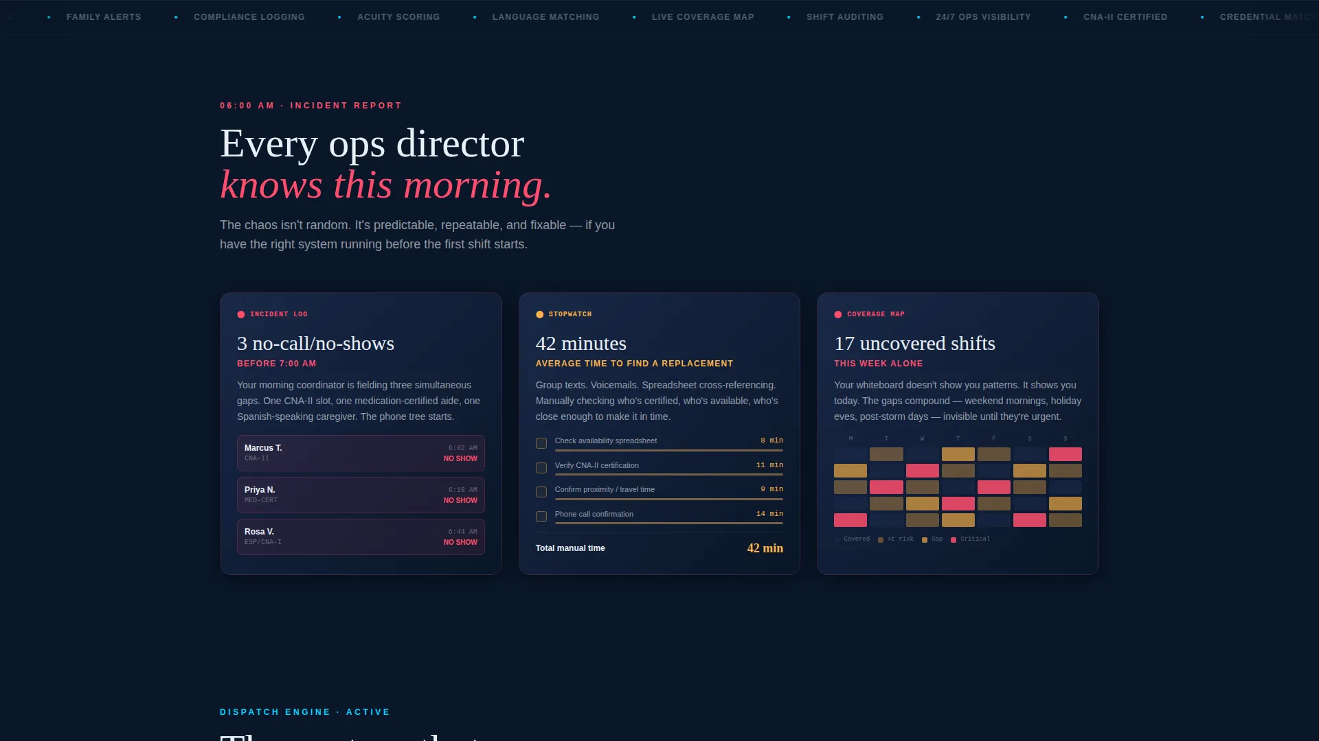
- No-call/no-show emergencies, 40-plus-minute replacement hunts, and heatmaps of uncovered shifts are presented as recognizable wounds
- Visitors see matching solution cards immediately after each problem, building trust row by row
- The lead form only appears after the visitor has already seen their daily reality reflected in data
What you get with this template
You get a fully structured, single-page layout that moves visitors from recognition to action. Every section is pre-built and purpose-assigned inside a modular card grid system.
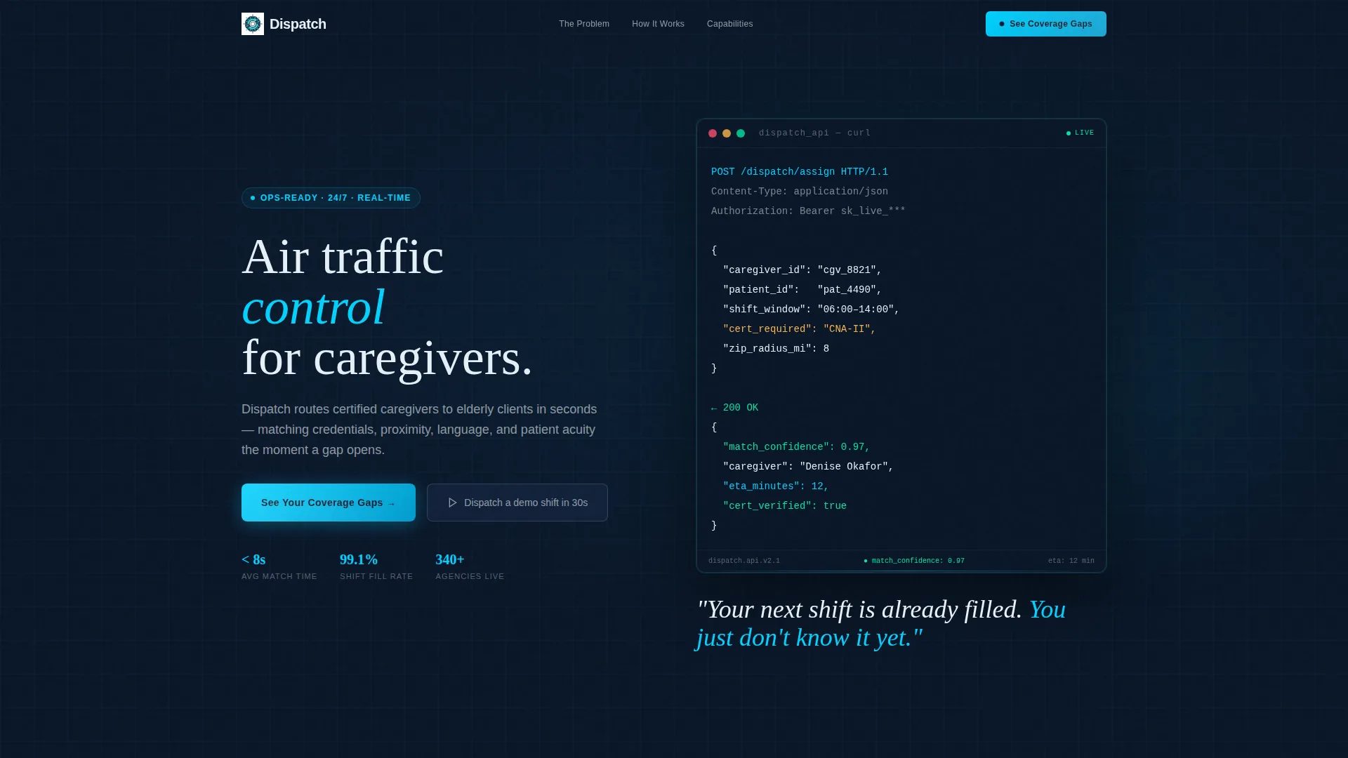
- An animated code snippet header featuring a live-typed API call with a JSON payload and a 200 OK response
- A scrollable Problem-to-Solution card arc covering no-shows, replacement time, credential matching, GPS confirmation, compliance logging, and family notification
- A dual-path conversion section with a primary qualification form and a secondary sandbox demo link
Feature list
This template includes several purpose-built components that work together to earn visitor trust and drive qualified leads.
Animated API Code Snippet Header
The header opens with a syntax-highlighted block showing a real-looking POST /dispatch/assign call. The JSON payload includes fields like caregiver_id, patient_id, shift_window, and cert_required set to "CNA-II". The response returns a match_confidence score and eta_minutes value. Each line appears as if typed live, with a blinking cursor, before the headline fades in below.
Problem-to-Solution Card Arc
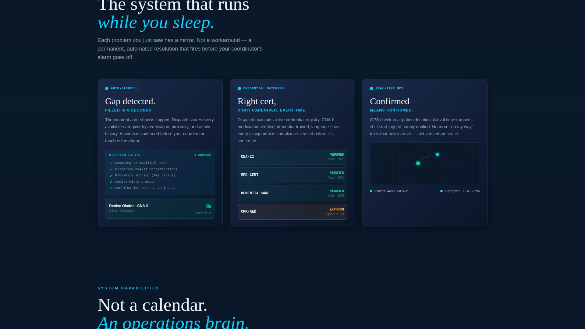
The first card row surfaces three crisis scenarios: three no-call/no-shows before 7 AM, a 42-minute average replacement time, and a heatmap of uncovered shifts. The next row mirrors each problem with a solution card covering auto-backfill routing, credential-aware matching, and real-time GPS confirmation. Cards continue to reveal deeper system layers as the visitor scrolls.
Progressive Depth Card Grid
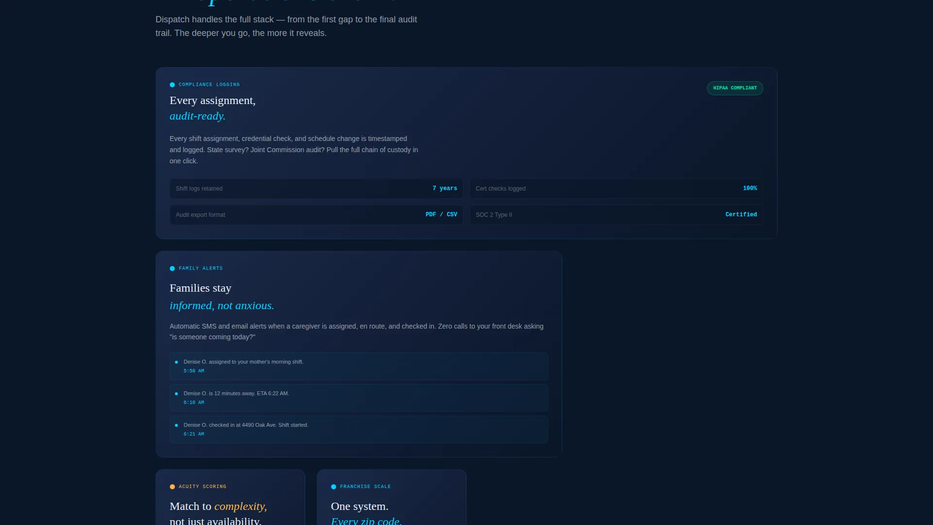
Each subsequent card row builds the case for a more sophisticated platform. Coverage moves from scheduling through compliance logging to family notification. The modular grid layout allows each capability to be shown as its own card without overwhelming the visitor with a wall of text.
Dual-Path Lead Conversion Section
The primary call to action reads "See Your Coverage Gaps" and opens a short qualification form. Fields include agency name, weekly visit volume (dropdown with four ranges), current scheduling method (dropdown with three options), and work email. A secondary path offers a sandbox demo link so technical buyers can interact with the system before speaking to sales.
Data Command Visual Theme
The layout uses deep operations-floor navy as the primary background and tactical slate for card depth. Pulse-monitor teal accents highlight live-data moments and interactive elements. Clinical white card surfaces keep content readable against the dark palette. The overall feel is a dispatch dashboard in a darkened operations center.
Page sections overview
| Section | Purpose |
|---|---|
| Animated Code Header | Opens with a live-typed API snippet and a single fading headline |
| Problem Cards Row | Shows three recognizable scheduling crises in data card format |
| Solution Cards Row | Mirrors each problem card with a matching resolution capability |
| Depth Reveal Grid | Progressively exposes compliance, GPS, and notification layers |
| Lead Capture Form | Qualifies visitors with agency size, volume, and scheduling method |
| Sandbox Demo Path | Offers a secondary entry point for technical buyers |
Design & branding system
The Midnight Blue color system creates an ops-center atmosphere that signals vigilance and real-time control. Every color choice is intentional and functional.
- Deep navy (#0A1628) for the base background, tactical slate (#1B2A4A) for card depth, pulse-monitor teal (#00D2FF) for live-data accents, and clinical white (#EAF0F7) for card surfaces
- Syntax-highlighted code blocks and animated typing behavior reinforce the technical authority of the platform
- The dark palette and teal accent system visually distinguish this template from typical healthcare software marketing
Mobile & speed optimization
The modular card grid layout is structured to reflow naturally on smaller screens. Each card is a self-contained unit, which simplifies responsive stacking.
- Card grid columns can stack vertically on mobile without breaking the Problem-to-Solution narrative flow
- The qualification form fields are sized for touch input and dropdown interaction on mobile devices
- The animated header is designed as a progressively revealed sequence, keeping the opening experience intact on any screen size
How this template helps you convert
This template earns the lead before asking for one. The conversion path is built around showing the visitor their own operational reality in data before any form appears.
- The Problem card row creates immediate recognition and emotional investment, making the visitor feel understood rather than sold to
- The mirrored Solution card row builds specific credibility by responding to each crisis point with a named capability, not a vague promise
- The dual-path call to action section serves both decision-ready buyers through the qualification form and exploratory technical buyers through the sandbox demo link
Other information about this template
This template is well-suited for elder care vertical SaaS products, home care agency software, and caregiver scheduling platforms at any growth stage.
- The template style is a card grid (modular) single-page layout built for lead generation
- The header concept, code snippet with animated typing, is especially effective for technical audiences who respond to proof of capability over marketing language
- The creative direction follows a Problem-to-Solution arc, a structure that works particularly well when the buyer already lives the problem daily
Theme
Data Command
Creative direction
Problem→Solution Arc
Color system
Midnight Blue
Style
Card Grid (Modular)
Direction
Lead Generation
Page Sections
Animated API Code Snippet Header
Problem-to-solution Card Arc
Progressive Depth Card Grid
Dual-path Lead Conversion Section
Data Command Visual Theme
Related questions
Can I edit the card content to match my platform's specific features?
Is the animated code snippet purely visual or does it need a developer to customize?
What does the qualification form collect from visitors?
Who is the secondary sandbox demo link designed for?
Can this template be used for a product that is still in early development?



