Event Tech Vertical SaaS Professional Website Template
Dispatch is a dashboard and data grid landing page template built for event tech management software. It shows a live command-center view of badge scans, session capacity, vendor check-ins, and real-time sentiment in one screen. Designed for conference producers, festival operations managers, and corporate event teams, it turns complex live-event data into a calm, readable signal.
by Rocket studio
Quick summary
Dispatch is a single-page landing page template for event tech management software. It puts every live-event signal, attendee check-ins, session capacity, vendor status, and real-time sentiment, into one animated dashboard preview. The layout reads like an industry report, guides visitors through forensic feature comparisons, and drives them toward a clear, confident sign-up decision.
Who this template is for
This template is built for event technology companies and software teams that serve professional event operations. It speaks directly to buyers who live inside the controlled chaos of a large-scale live event.
- Conference producers managing multi-speaker agendas and session capacity in real time
- Festival operations managers coordinating large vendor grids across multiple stages
- Corporate event teams reporting real-time attendee sentiment data to senior leadership
What problem this template solves
Most event operations teams make critical decisions during a live event with incomplete information. Spreadsheets, post-event survey PDFs, and siloed check-in tools leave operations directors guessing when it matters most. This template frames that problem sharply, then positions the software as the direct fix.
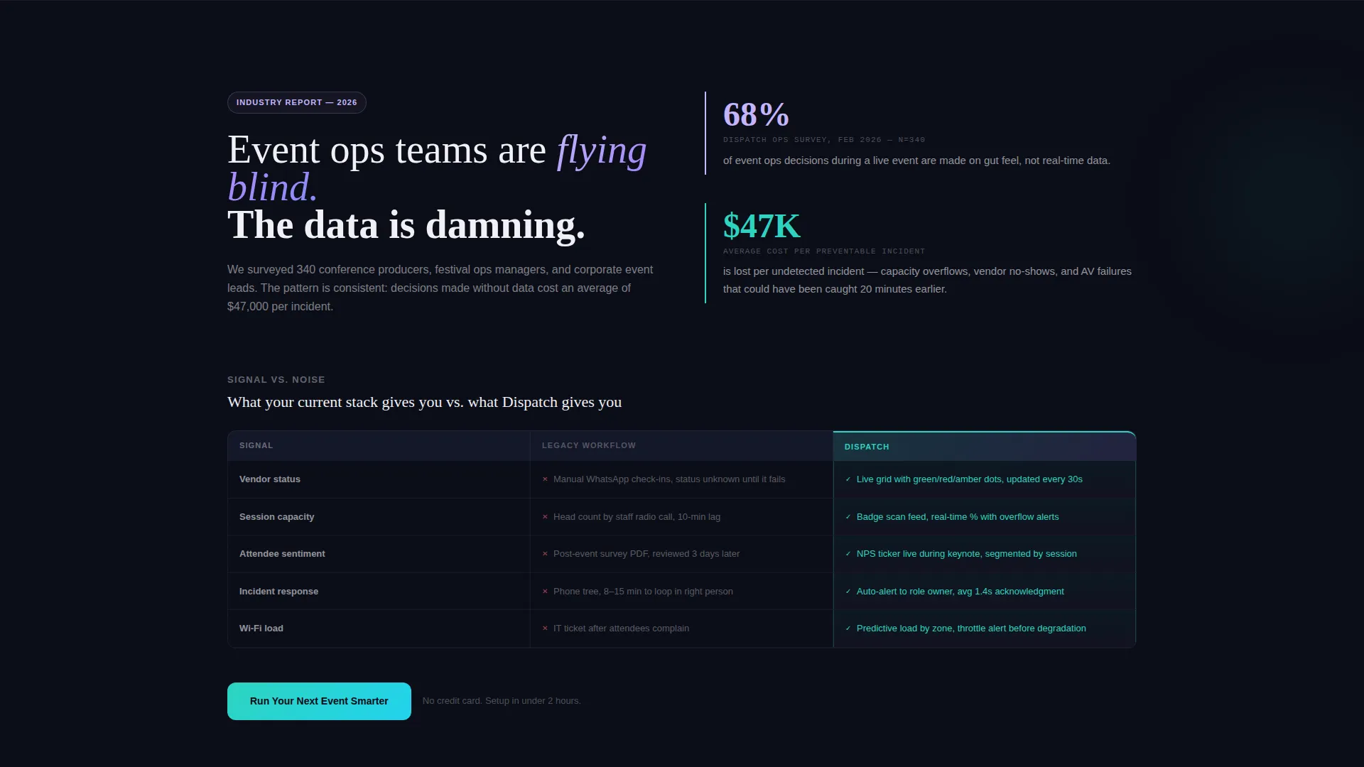
- It shows the cost of gut-feel decisions, citing that 68% of event ops decisions rely on intuition rather than live data
- It replaces abstract software claims with a breathing, mid-event dashboard preview that proves depth on first scroll
- It contrasts legacy workflows against the platform feature by feature, so the upgrade decision feels logical rather than risky
What you get with this template
The template ships as a complete, conversion-focused landing page layout built around a data grid and dashboard visual system. Every section is purposeful and ordered to move a skeptical operations professional from awareness to action.
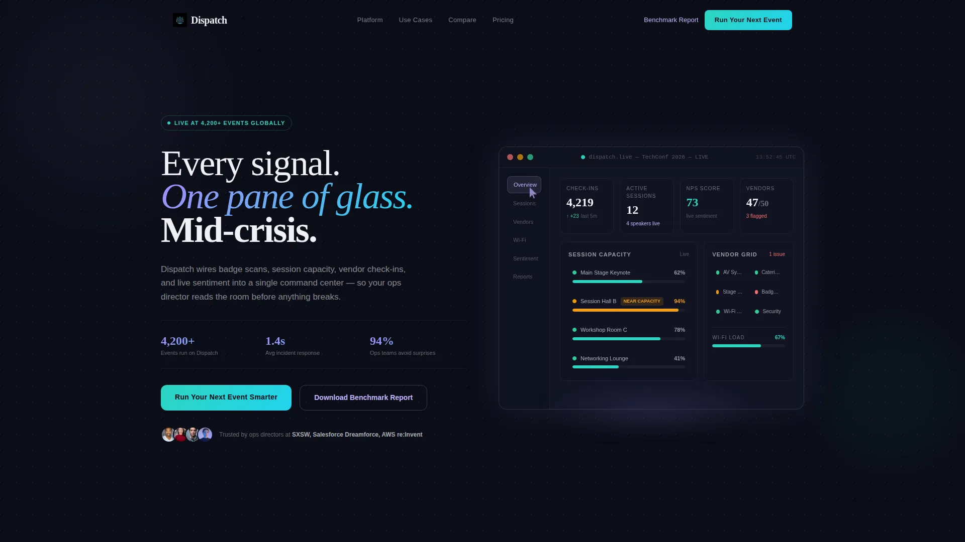
- An animated header dashboard preview showing a mid-event state with live check-in counters, session capacity bars, and vendor status dots
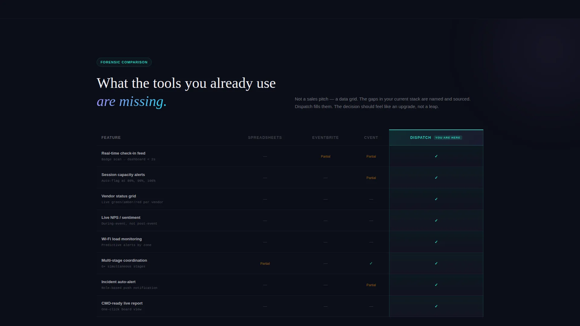
- Side-by-side comparison blocks that pit legacy tools against the platform in a forensic data grid format
- A dual conversion path with a primary call-to-action button and a gated benchmark report download form
Feature list
This template delivers a focused set of layout and interaction features designed specifically for an event tech management software landing page.
Animated Dashboard Header
The header renders a pixel-perfect replica of the product in a mid-event state. A check-in counter ticks upward, a session capacity bar inches toward its threshold, and a cursor ghost moves across the interface to expand a session tile. Visitors see the product working before they read a single word of copy.
Real-Time Data Display Panel
The dashboard panel surfaces specific live metrics: 4,217 attendees checked in, Session Hall B flagged at 94% capacity in amber, a real-time Net Promoter Score ticker at 72, and a vendor grid with color-coded green and red status indicators. These details make the interface feel operational, not decorative.
Forensic Comparison Tables
Each comparison block places legacy tools in muted gray columns alongside the platform in plasma teal columns. Named limitations appear on the competitor side; feature proof appears on the platform side. The format argues with data rather than with marketing language.
Floating Call-to-Action Bar
After the second scroll, a persistent floating bar keeps the primary call to action visible throughout the page. It activates after the visitor has seen enough evidence to act, without interrupting the reading experience.
Gated Benchmark Report Form
A secondary conversion path offers a downloadable benchmark report. The gate requires a work email address and an event-size selector with three tiers: under 500 attendees, 500 to 5,000 attendees, and 5,000 and above. This qualifies leads by event scale at the point of capture.
Industry Report Scroll Narrative
The page reads like a data-driven white paper. Each section opens with a sourced statistic, then immediately shows the platform response. The scroll flow guides the reader from problem awareness through evidence to a confident decision point.
Page sections overview
| Section | Purpose |
|---|---|
| Animated Dashboard Header | Opens with a live mid-event product preview to prove depth immediately |
| Stat-Led Problem Block | Drops a sourced statistic to frame the cost of gut-feel event decisions |
| Legacy versus. Platform Comparison | Contrasts spreadsheet workflows against live vendor grids in a data table |
| Session Capacity Comparison | Shows post-event survey PDFs versus real-time sentiment heatmaps side by side |
| Floating call to action Bar | Keeps the primary call to action visible after the second scroll |
| Benchmark Report Gate | Captures qualified leads via work email and event-size selector |
| Final Conversion Block | Closes the scroll with the primary call-to-action reinforced by summary proof |
Design & branding system
The visual identity uses an AI Iridescent color system applied to a dark, data-console aesthetic. The overall impression is light refracting through a prism onto a matte-black surface, controlled, intelligent, and alive at the edges where interaction happens.
- Core palette: void black (#0B0D17) as the base, holographic lilac (#C4B5FD) and plasma teal (#2DD4BF) for active data elements, and signal white (#F0F0F5) for data labels
- Iridescent gradient accents running from deep violet (#A78BFA) to electric cyan (#22D3EE) appear on hover states and active comparison cards
- The Directory and Discovery theme keeps layout structured and scannable, letting the data grid format carry visual weight rather than heavy illustration
Mobile & speed optimization
The template layout is designed to remain readable and navigable on smaller screens without losing the dashboard drama that makes the desktop experience compelling.
- The animated dashboard header scales gracefully, preserving the key live metrics and color-coded status indicators at reduced viewport widths
- Comparison tables reflow into vertically stacked card pairs on mobile so the forensic contrast remains clear without horizontal scrolling
- The floating call-to-action bar adapts to mobile screen height so it stays visible without obscuring the primary content
How this template helps you convert
The Dispatch landing page is engineered for the Comparison and Versus conversion pattern. Every structural decision pushes a qualified visitor toward a confident yes.
- The animated header shows the product mid-operation on the first visible screen, so visitors grasp the value proposition before they read the headline, reducing bounce from skepticism.
- The forensic comparison tables name the tools and limitations that the visitor is already using, making the decision feel like a natural upgrade rather than an unfamiliar leap.
- The dual conversion path captures both ready buyers through the primary call to action and research-stage prospects through the gated benchmark report, qualifying each group by event scale in the same visit.
Other information about this template
Dispatch fits naturally within the broader event technology software landscape, where operations teams are actively evaluating purpose-built platforms against general-purpose tools.
- The template style is Dashboard and Data Grid, which reflects the visual language familiar to event operations professionals who already work inside data-heavy tools
- The creative direction follows an Industry Report format, which builds trust with technical buyers who expect evidence before committing to a platform evaluation
- The template is suited for event tech vertical SaaS products competing against spreadsheet-based workflows, generic project management tools, and entry-level event management platforms
- It supports a gated content strategy through the benchmark report download form, allowing the software team to segment prospects by event size from the first interaction
- The iridescent gradient accent system creates a premium, forward-looking visual identity that differentiates the product from legacy event software interfaces
Theme
Directory & Discovery
Creative direction
Industry Report
Color system
AI Iridescent
Style
Dashboard/Data Grid
Direction
Comparison/Versus
Page Sections
Animated Live Dashboard Header
Real-time Metrics Display
Forensic Feature Comparison Tables
Floating Conversion Bar
Gated Benchmark Report Download
Industry Report Scroll Narrative
Related questions
What type of software is this landing page template designed for?
How does the forensic comparison table section work?
What is the floating call-to-action bar and when does it appear?
Can smaller event teams use this template effectively?
Does the animated dashboard header need custom development to update?



