Event Planning Digital Presence Specialist Cost Calculator Website Template
Dispatch is a hub-and-spoke landing page template built for an event planning email newsletter. It opens with an interactive ROI calculator that delivers instant cost-per-head benchmarks before a single scroll. Comparison sections expose the gap between existing methods and the newsletter, building an escalating case that ends with a two-field subscribe form.
by Rocket studio
Quick summary
Dispatch is a single-page newsletter landing page template designed for event planning professionals. It leads with a live-feel ROI calculator, then walks visitors through a series of versus-comparison sections that make the value case undeniable. The Carbon Fiber visual system gives every section a cockpit-dark, data-forward aesthetic that feels urgent and credible.
Who this template is for
This template is built for newsletter creators and operators who serve the event planning industry. It suits anyone who needs to convert skeptical, time-pressed professionals into committed subscribers.
- Agency producers who juggle multiple event activations at once
- Corporate event managers who defend budgets to finance leadership
- Freelance wedding planners who need accurate vendor pricing to protect deposits
What problem this template solves
Event planners are buried in scattered industry blogs, free alerts, and expensive consulting retainers. None of those sources deliver precise, timely data fast enough to protect margins or catch vendor price hikes early. This template frames the newsletter as the only tool that closes that intelligence gap.
- Visitors arrive skeptical and leave having already received benchmark value from the calculator
- The comparison sections dismantle every competing alternative before asking for an email address
- The two-field subscribe form removes friction at the exact moment proof has peaked
What you get with this template
You get a complete, ready-to-customize landing page built around a calculator-first conversion flow. Every design decision supports the goal of earning trust before asking for commitment.
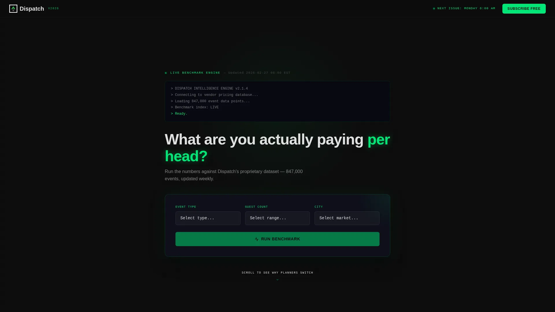
- A full-bleed dark header section housing the interactive ROI calculator with three inputs and instant output
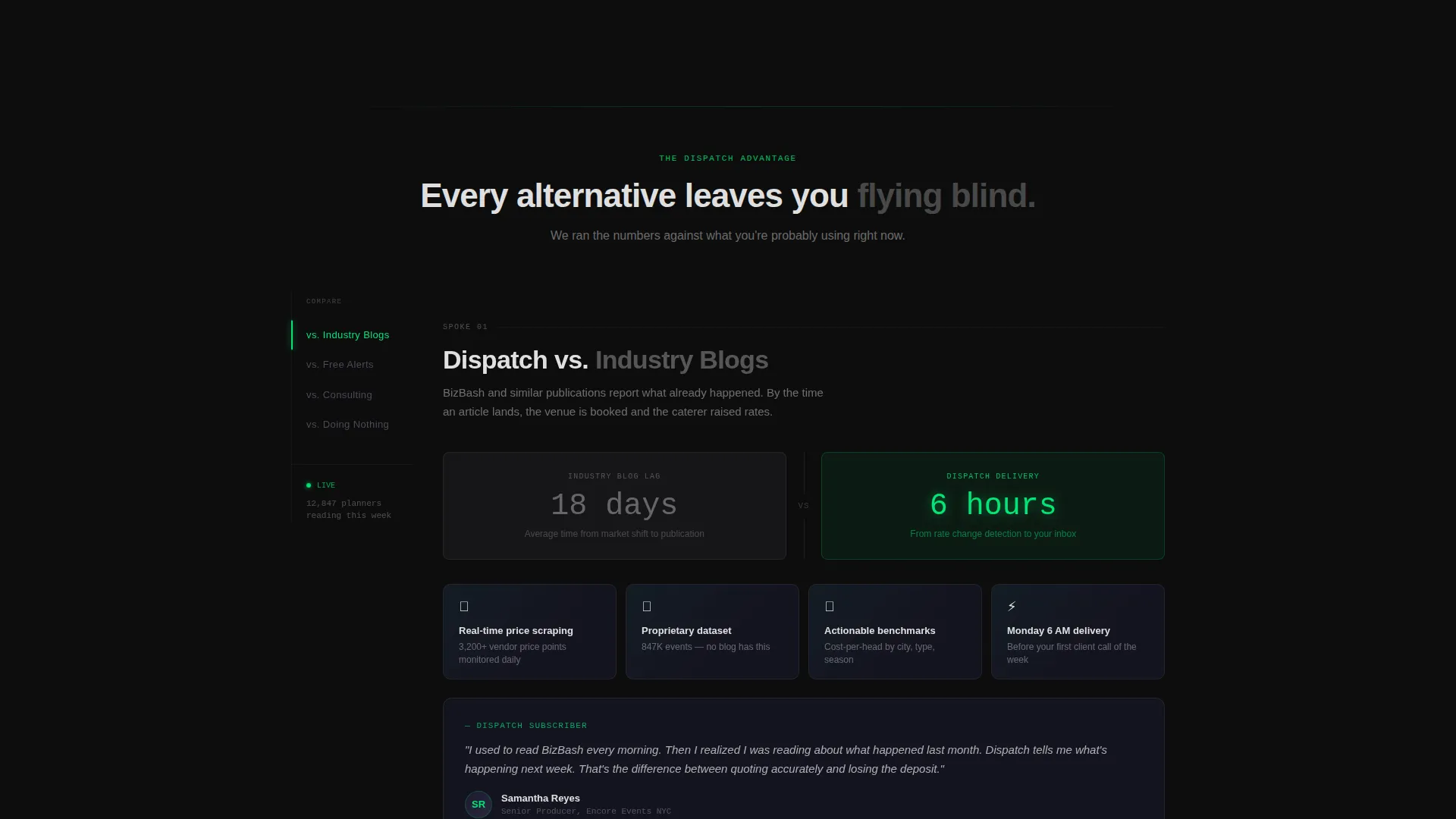
- A pinned left-rail anchor navigation linking to four versus-comparison spoke sections
- A two-field subscribe form and a secondary modal path for skeptics who want to read a sample issue first
Feature list
This template includes purpose-built components that support the Dispatch newsletter's intelligence-first positioning.
Interactive ROI Calculator Header
The header section contains a three-input calculator asking for event type, guest count, and city. It instantly returns a cost-per-head benchmark, a vendor availability score, and an overpaying comparison. Green digits animate upward as the calculation runs, giving the page immediate perceived value before any scroll.
Hub-and-Spoke Anchor Navigation
A left-rail anchor nav pins to the viewport as visitors scroll. Each nav item links to a dedicated comparison spoke, letting visitors jump to the alternative they currently rely on. The active indicator pulses in electric status-green so the reader always knows their position.
Versus Comparison Spoke Sections
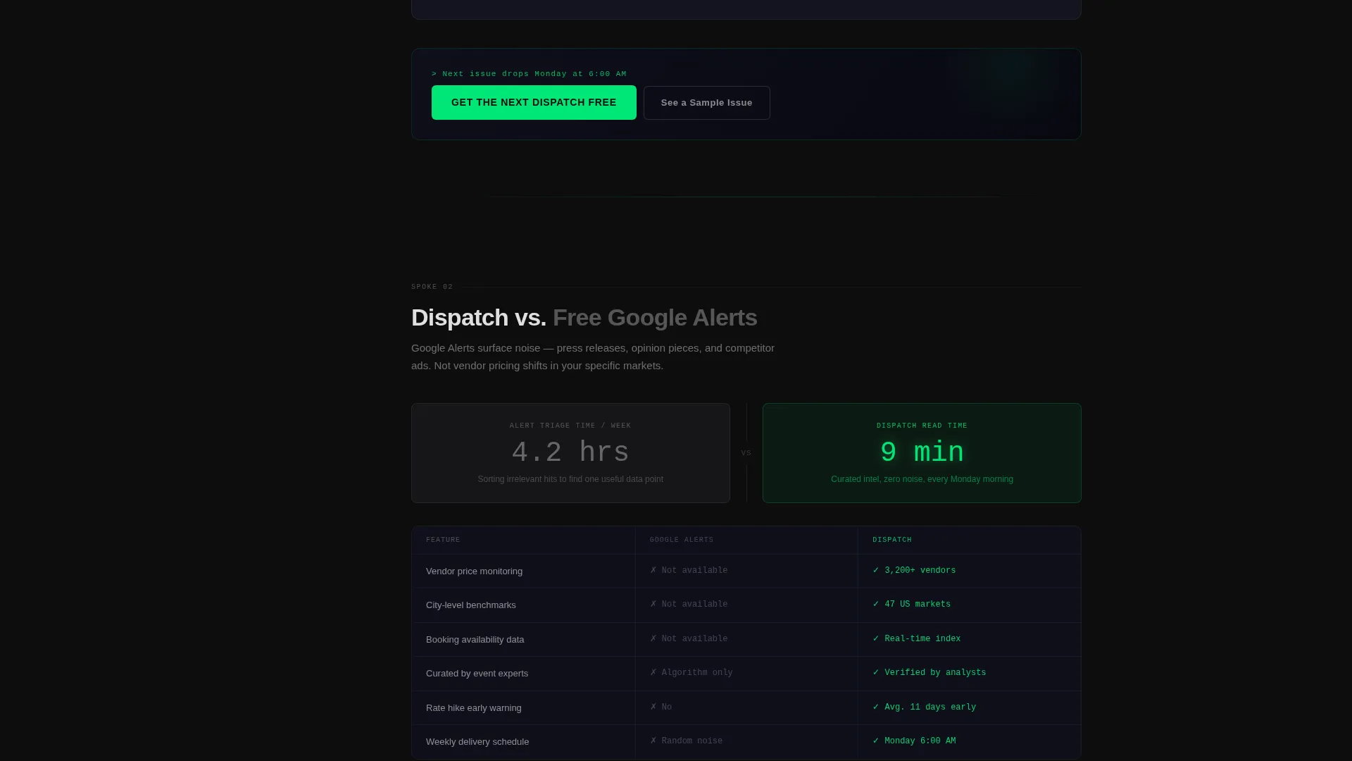
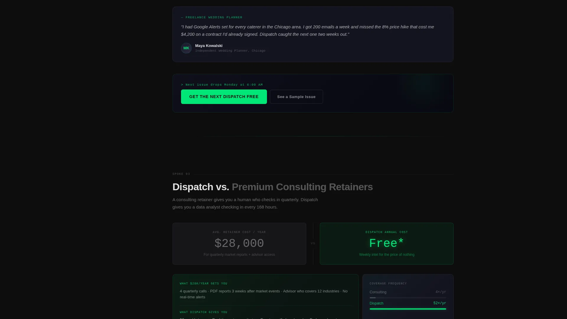
Four comparison sections each open with a split metric layout. The visitor's current method appears in muted graphite on the left. Dispatch's advantage appears in electric green on the right with scroll-triggered number animations. The sections build an escalating proof narrative from data gap, to time savings, to money saved, to real planner testimonials.
Contextual Call-to-Action Placement
The primary call to action, "Get the Next Dispatch Free," appears first inside the calculator results as a contextual unlock. It then repeats at the close of every spoke section. This placement ties the ask directly to the proof just delivered rather than interrupting the read.
Sample Issue Modal Preview
A secondary conversion path labeled "See a Sample Issue" opens a dark-mode email preview inside a modal overlay. Visitors can read a real newsletter issue before committing an email address, lowering the barrier for cautious or first-time visitors.
Two-Field Subscribe Form
The subscribe form asks only for a work email and annual event volume. One click submits. The minimal field count is intentional, removing every reason a qualified planner might hesitate at the final step.
Page sections overview
| Section | Purpose |
|---|---|
| Calculator Header | Delivers instant benchmark value and anchors the primary call to action inside the result |
| Anchor Nav Rail | Pins comparison spoke links to the left viewport edge for persistent navigation |
| Dispatch versus. Blogs | Compares the newsletter's real-time data against static industry blog content |
| Dispatch versus. Alerts | Shows the gap between free Google alerts and curated vendor-intelligence briefings |
| Dispatch versus. Consulting | Contrasts the newsletter's cost against premium consulting retainer pricing |
| Dispatch versus. Nothing | Escalates the risk of inaction using vendor price-hike timing data and planner testimonials |
| Subscribe Form | Collects work email and event volume in two fields with one-click submission |
| Sample Issue Modal | Opens a dark-mode newsletter preview so skeptics can read before subscribing |
Design & branding system
The visual identity follows a Carbon Fiber color system that pairs deep cockpit blacks with a single electric accent. Every interactive element, hover state, and active nav indicator uses the same green glow, creating a consistent pulse of activity across the page.
- Deep cockpit black (#0D0D0D) and woven graphite (#1A1A2E) form the background layer, making data the only thing that catches the eye
- Electric status-green (#00E676) drives all interactive states, animated digits, and the primary call-to-action button
- Signal white (#E0E0E0) handles all body text, keeping contrast readable against the dark surfaces without competing with the green
Mobile & speed optimization
The layout is structured to translate the cockpit-dark aesthetic cleanly to smaller screens. The anchor nav and calculator inputs are prioritized for thumb-friendly interaction.
- The left-rail anchor navigation collapses into a compact mobile format so spoke links remain accessible without consuming screen space
- Calculator inputs and the subscribe form use large tap targets, keeping the two-field entry fast on touch devices
- The split-metric comparison layout reflows to a stacked vertical arrangement on narrow viewports so both sides remain readable
How this template helps you convert
The conversion architecture is deliberate. Value is delivered before any ask is made, and every subsequent section deepens the reason to subscribe.
- The calculator produces a real, personalized benchmark the moment a visitor arrives, so the first experience is receiving intelligence rather than reading a pitch.
- Each versus-comparison section removes a specific objection, moving the visitor from awareness of the data gap to recognition that their current method is costing them time or money.
- The contextual call to action repeats at the close of each spoke, meeting the visitor at peak persuasion rather than forcing them to scroll back to a single top-of-page form.
Other information about this template
This template is categorized under Technology, with a sub-focus on event planning digital presence. It is built on the Startup Velocity theme using the Hub and Spoke (Anchor Nav) template style. The Calculator/Tool First creative direction and the Dark Full-Bleed and Glow header concept are core to the design specification. The Comparison/Versus landing-page direction structures all spoke content.
- The template style is Hub and Spoke with anchor navigation, suited for newsletters with a clear differentiation story
- The Startup Velocity theme supports the fast, data-first visual language the Dispatch brand requires
- This template fits within the event planning email newsletter template niche and is ready for customization to any newsletter brand using a similar intelligence-first positioning
Theme
Startup Velocity
Creative direction
Calculator/Tool First
Color system
Carbon Fiber
Style
Hub & Spoke (Anchor Nav)
Direction
Comparison/Versus
Page Sections
Interactive ROI Calculator Header
Hub-and-spoke Anchor Navigation
Versus Comparison Spoke Sections
Contextual Call-to-action Placement
Sample Issue Modal Preview
Two-field Subscribe Form
Related questions
Can I edit the calculator inputs to match my newsletter's data?
Does the template include the versus-comparison content, or do I write it?
How does the sample issue modal work?
Is this template suitable for a newsletter in a niche other than event planning?
What skill level is needed to customize this template?



