Dispatch - Intelligent Greeting Landing Page Template
Dispatch is a bold, data-driven landing page template built for SaaS holiday greeting email platforms. It combines a live ROI estimator, an industry benchmark report layout, and a head-to-head comparison table into one high-converting single-page experience. The template is designed for ops managers, customer success leads, and marketing directors who need to turn seasonal outreach into measurable pipeline results.
by Rocket studio
Quick summary
Dispatch is a dashboard-style landing page template that turns corporate holiday greeting software into a hard-numbers story. It opens with a live calculator, moves through an analyst-style benchmark report, and closes the argument with a scored comparison table. Every section is built to move a skeptical SaaS buyer from curiosity to conversion.
Who this template is for
This template is built for teams that manage client relationships at scale and need to justify every tool they adopt. It speaks directly to the people who feel the December crunch most sharply.
- Ops managers handling client lists of 2,000 or more who need a smarter send process
- Customer success leads who track relationship gaps and need proof that personalized outreach drives renewals
- Marketing directors who require open-rate data and pipeline attribution before approving a new platform
What problem this template solves
Most holiday outreach is clumsy. Mail merges break. Clients get forgotten. Generic templates land flat. The result is a soft-touch moment that produces no measurable outcome and leaves revenue on the table.
- Teams lack a structured way to show leadership that personalized greetings influence renewals
- Existing tools like manual send lists and bulk email tools offer no CRM sync, send-time logic, or reply tracking
- There is no single page that turns the idea of "being human at scale" into a credible, data-backed pitch
What you get with this template
You get a complete single-page layout that builds a business case for intelligent holiday outreach from the first scroll to the final call to action. The structure does the persuasion work so the copy does not have to.
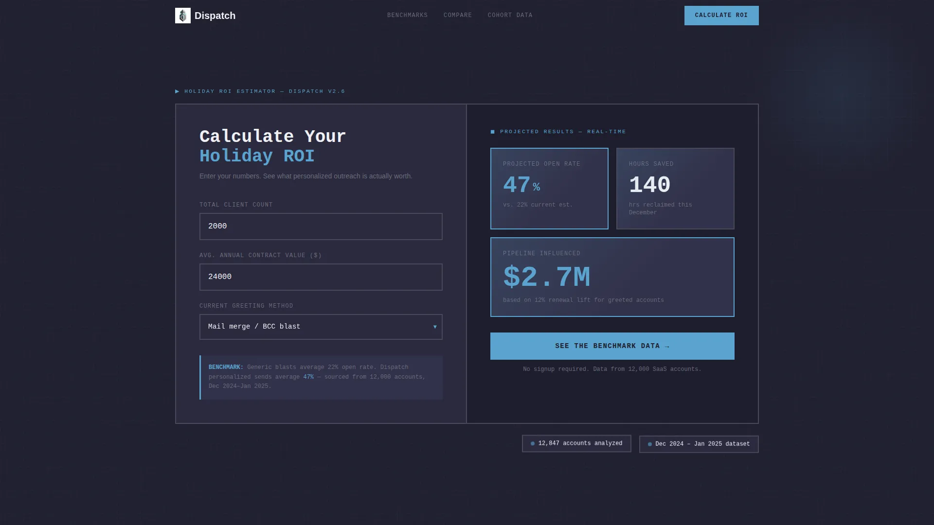
- A live estimator panel in the header that calculates open rates, hours saved, and pipeline influence in real time
- An industry report scroll experience with bar charts, a versus table, and a cohort analysis section
- Two conversion paths: a primary "Calculate Your Holiday ROI" call to action and a gated benchmark report download form
Feature list
This template is built around specific, functional design blocks that mirror how SaaS buyers evaluate tools.
Live ROI Calculator Panel
The header features a brutalist input panel with thick-bordered fields. Visitors enter their total client count, average deal size, and current greeting method from a dropdown. The panel instantly renders a data card showing projected open rates, estimated hours saved, and an estimated pipeline dollar figure, all updating as inputs change.
Industry Benchmark Data Grid
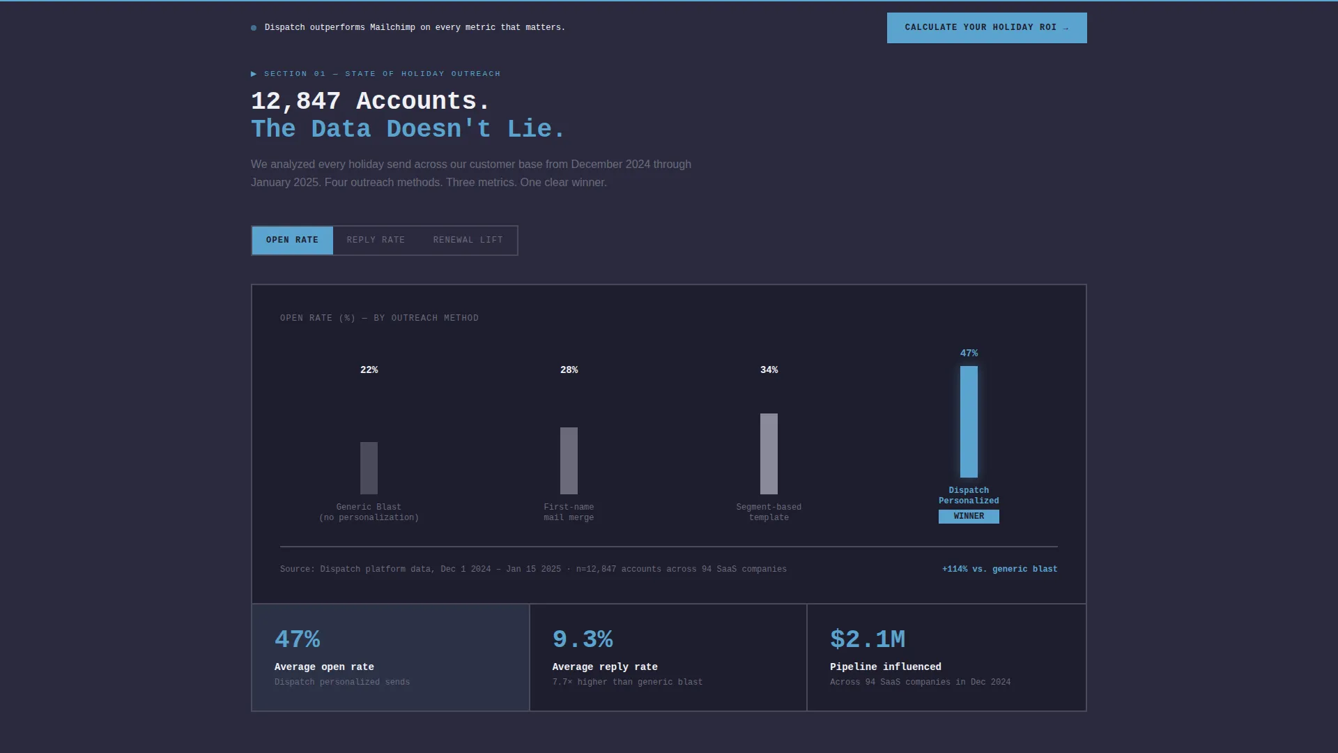
Scrolling past the estimator reveals a structured report layout styled like a SaaS analyst brief. Section one covers the state of holiday outreach, using bar charts to compare open rates of generic versus personalized greetings across 12,000 accounts. The layout makes benchmark data feel authoritative and easy to skim.
Head-to-Head Comparison Table
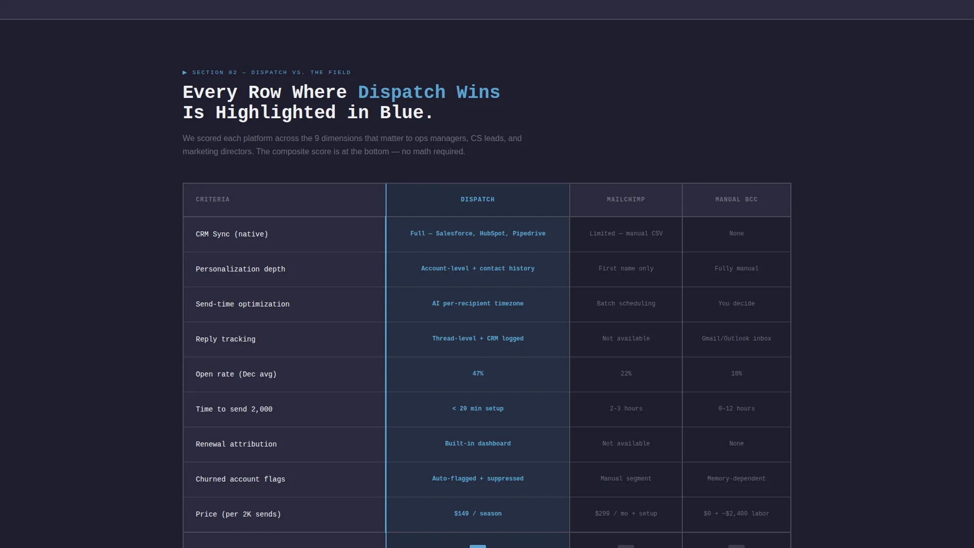
A color-coded versus table scores the platform against alternative approaches across four dimensions: personalization depth, CRM sync, send-time optimization, and reply tracking. Winning rows are highlighted in sky blue. Competitor gaps are left in bare slate. A composite score row at the bottom removes any ambiguity.
Cohort Renewal Analysis Section
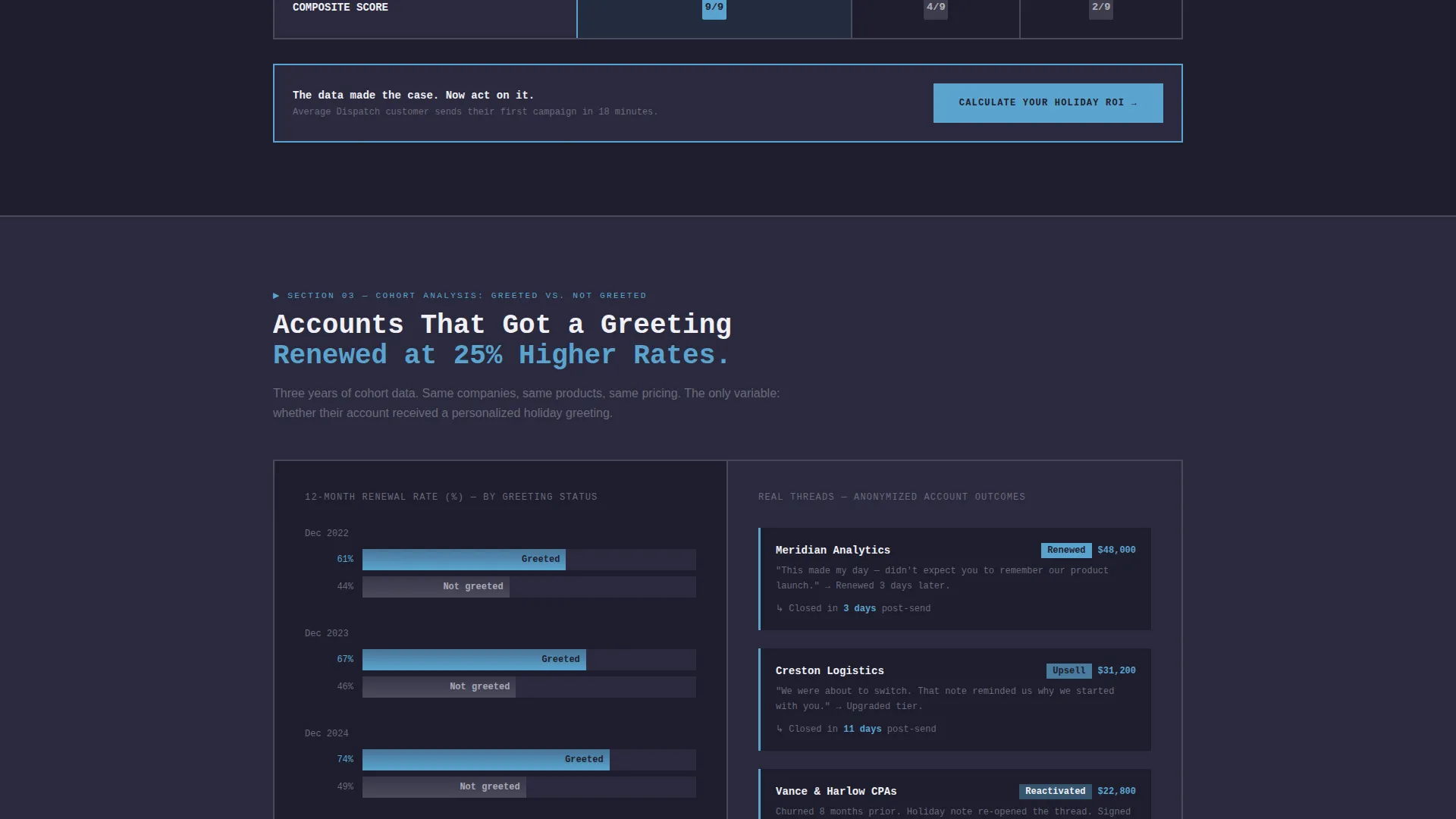
Section three of the report displays a cohort analysis comparing renewal rates for accounts that received a holiday greeting against those that did not. This section escalates the evidence from benchmarks to outcome data, making the business case concrete.
Gated Benchmark Report Form
A secondary conversion path lets visitors download the full benchmark report PDF. The gate uses a two-field form requiring only a work email and company size. This path captures leads who are not ready to try the platform but are actively researching the category.
Sticky Call-to-Action Bar
After the comparison table, a sticky bar anchors the primary call to action to the viewport. It repeats the "Calculate Your Holiday ROI" prompt so the visitor can act at any point without scrolling back to the top.
Page sections overview
| Section | Purpose |
|---|---|
| Header Estimator Panel | Calculates ROI inputs in real time |
| State of Outreach | Shows benchmark open-rate bar charts |
| Versus Comparison Table | Scores platform against alternatives |
| Cohort Renewal Analysis | Connects greetings to renewal outcomes |
| Benchmark Report Gate | Captures leads via downloadable PDF form |
| Sticky call to action Bar | Keeps primary conversion action visible |
Design & branding system
The visual identity follows a Bold Brutalist theme built on the Slate and Sky color system. The aesthetic feels like a concrete structure with a strip of winter sky overhead: industrial and focused, but calm where the blue appears.
- Background layers use deep graphite (#1E1E2E) and weathered slate (#4A4A5A) for card surfaces and dividers, while chalk white (#F0F0F5) handles all body text and negative space
- Open-sky blue (#5BA4CF) activates every interactive surface, including buttons, chart bars, toggles, and data highlights, so the eye always knows where to act
- Typography leans on oversized monospaced numerals for the calculator output, giving the data card a terminal-style authority that fits the brutalist frame
Mobile & speed optimization
The template is structured to remain scannable and functional on smaller screens. The data-heavy layout is organized into stackable sections that reflow cleanly without losing hierarchy.
- The estimator panel and its output data card are designed to remain legible and usable on mobile viewports
- The comparison table and benchmark sections are built to scroll smoothly, keeping the sticky call-to-action bar accessible throughout the page
How this template helps you convert
The page is engineered so that every section adds a new layer of proof before asking the visitor to act. Conversion is not pushed; it is earned through accumulated evidence.
- The live estimator creates immediate personal relevance by turning the visitor's own numbers into a business case, making the first call to action feel like acting on data they just generated themselves
- The versus table does the heavy comparison work for the buyer, highlighting wins in sky blue and leaving gaps in slate so the conclusion is visible without effort, then the sticky bar catches anyone ready to convert at that exact moment
Other information about this template
This template is categorized under Technology and the SaaS Email Templates subcategory, targeting the SaaS holiday greeting email niche. It is suited for teams that want a credible, conversion-focused landing page without building the case architecture from scratch.
- The template's dashboard and data grid layout style makes it adaptable beyond holiday greetings to any SaaS category where benchmark data and competitive positioning drive purchase decisions
- The Bold Brutalist theme and Slate and Sky palette are cohesive out of the box, reducing the design decisions needed before launch
- The two-path conversion structure, one direct and one research-led, supports both high-intent visitors ready to sign up and mid-funnel prospects still building their internal business case
Theme
Bold Brutalist
Creative direction
Industry Report
Color system
Slate & Sky
Style
Dashboard/Data Grid
Direction
Comparison/Versus
Page Sections
Live ROI Calculator Header
Industry Benchmark Report Layout
Color-coded Comparison Table
Cohort Renewal Analysis Block
Gated PDF Lead Capture Form
Sticky Conversion Bar
Related questions
What kind of business is this landing page template designed for?
Can I adapt the estimator fields for a different use case?
Does the template include the actual chart and table data?
How does the two-path conversion structure work?
Is this template suitable for a team with no dedicated design resources?



