Consulting Firm Software Professional Website Template
Dispatch is a dark-themed, modular card grid landing page built for consulting firms and operations teams that manage purchase orders at scale. It presents a single command-center view where every order has a visible status, every vendor is accountable, and approval bottlenecks disappear. The page is structured to convert visitors into free pilot signups through a show-first, prove-second flow.
by Rocket studio
Quick summary
Dispatch is a consulting firm order management landing page that trades spreadsheet chaos for a calm, backlit command screen. The modular card grid layout walks visitors from raw pain to clear solution, then earns the trial signup with real metrics and a low-friction three-field form. Every design choice reinforces one idea: your orders are visible, moving, and under control.
Who this template is for
This landing page is built for teams where lost purchase orders cost real money and delayed approvals cost real time. It speaks directly to operators who manage orders daily and need a faster way to surface the right information at a glance.
- Operations managers who track purchase orders across spreadsheets and need a single screen to manage orders without context switching
- Procurement leads at mid-market manufacturers juggling hundreds of vendors and needing clear order status at every stage
- Consulting partners who bill by engagement and need to protect margin by eliminating fulfillment chaos for their customers
What problem this template solves
The dispatch process breaks down when purchase orders live in spreadsheets, approvals circulate in email chains, and vendor follow-ups happen in scattered Slack threads. Teams lose visibility, customers wait longer, and operations managers spend hours each week searching for order details that should be one click away.
- Approval bottlenecks slow the entire dispatch process, creating delays that ripple across customer delivery windows
- No single orders list means teams search multiple systems to find basic order status, wasting time on tasks that a unified view would eliminate
- Duplicate orders, missed vendor responses, and untracked shipments quietly drain cost efficiency and leave customers dissatisfied
What you get with this template
You get a complete, conversion-ready landing page designed around the command-center experience. The page is structured to display the product immediately, prove the value with side-by-side before and after cards, and close with a low-commitment trial form. Every section is a modular tile that slots into a clean card grid.
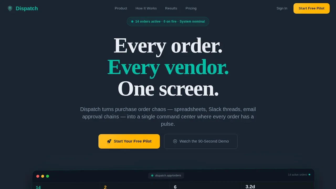
- A hero section featuring a rotated dashboard screenshot with ambient teal glow, real purchase order data labels, and a primary amber call-to-action button
- A six-card before-and-after grid that maps chaos scenarios to dispatch solutions, each card animating in sequence like systems coming online
- A scroll-triggered metrics strip, a three-field pilot trial form, and a sticky bottom call-to-action bar that appears after the second scroll
Feature list
This section covers the core features built into the Dispatch landing page template as described in the source brief.
Live Dashboard Hero with Order Pipeline Preview
The header section displays a pixel-perfect product screenshot showing an active order pipeline. Visitors can see real data labels such as order number, vendor name, value, and ship date. The screenshot sits at a slight angle on a dark field with a soft ambient glow beneath it, giving the impression the dashboard is projecting light onto the desk. This approach lets the user understand the product before reading a single line of body copy.
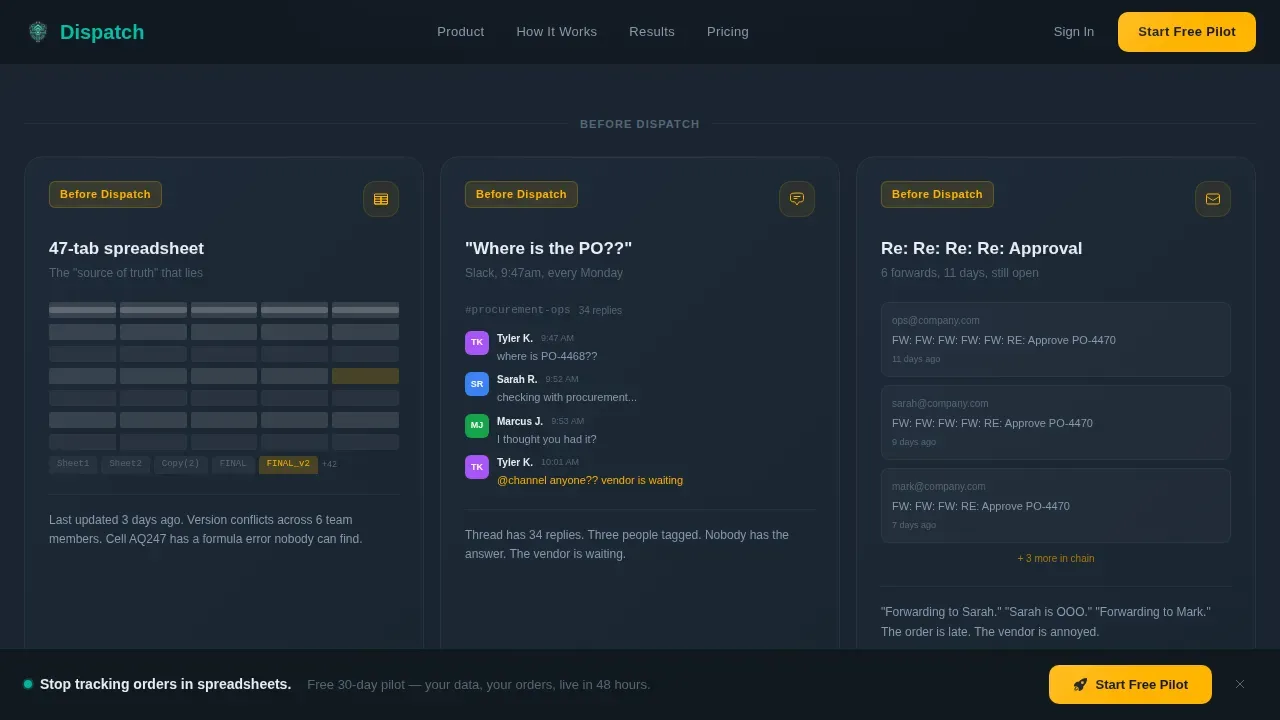
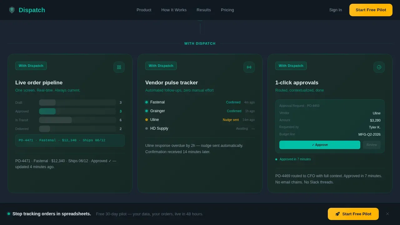
Before and After Modular Card Grid
Six cards are arranged in two rows of three. The first row shows chaos: a 47-tab spreadsheet, a Slack thread asking where the purchase order is, and a six-email approval chain. The second row mirrors each card with the same workflow resolved inside the platform. Cards load in a staggered sequence, animating like systems coming online. This structure makes the value of the dispatch system immediately tangible.
Scroll-Triggered Metrics Strip
Three count-up numbers animate on scroll: 62 percent faster approval cycles, 3.1 hours saved per manager per week, and zero dollars in duplicate orders last quarter. Each metric is self-contained and displayed as a bold stat tile. The strip gives the team a proof section that builds confidence without requiring the visitor to read a case study.
Three-Field Pilot Trial Form
The conversion form asks only for a work email, a company size selection, and an optional open text field labeled "Biggest order headache?" The optional field doubles as qualification data for the sales team. The form is intentionally short to reduce friction and make the ask feel like a pilot, not a contract.
Sticky Call-to-Action Bar
After the visitor scrolls past the hero section, a sticky bottom bar appears carrying the primary call-to-action. The bar keeps the trial offer visible while the visitor scrolls through pain cards, metrics, and social proof. The amber color of the bar draws the eye without competing with the dashboard content above it.
Inline 90-Second Demo Video Modal
A ghost-button secondary path labeled "Watch the 90-Second Demo" opens an inline video modal. The video ends with the same trial call-to-action, closing the loop for visitors who are not ready to commit on the first view. This feature ensures that undecided visitors have a low-commitment next step that still moves them toward conversion.
Page sections overview
| Section | Purpose |
|---|---|
| Hero Dashboard Preview | Display the product and primary call-to-action above the fold |
| Before Chaos Cards | Surface the three core pain points as recognizable scenarios |
| After Dispatch Cards | Show each pain point resolved inside the platform |
| Metrics Strip | Prove value with count-up stats that animate on scroll |
| Pilot Trial Form | Capture work email, company size, and optional pain qualifier |
| Sticky call to action Bar | Keep the trial offer visible throughout the full scroll |
| Demo Video Modal | Offer a low-commitment path for visitors not ready to sign up |
| Footer | Single-row linear footer with company links and legal text |
Design & branding system
The visual identity uses the Teal Catalyst color system layered onto a Dashboard Pro theme. The overall feel is a cockpit at cruising altitude: dark, calm, and backlit just enough to read everything at a glance. Color carries meaning deliberately, with amber reserved exclusively for moments that require action.
- Deep command-screen charcoal (#1B2431) forms the base background, cool slate (#394B59) surfaces every card, and primary teal (#00BFA6) signals healthy order status indicators and active elements throughout the page
- Electric amber (#FFB300) appears only on call-to-action buttons, alert badges, and notification indicators, ensuring the user's eye is drawn to action exactly when needed
- Typography pairs DM Sans for interface labels and data details with Fraunces for hero headline impact, creating a clear visual hierarchy between functional text and brand voice
Mobile & speed optimization
The template is designed desktop-first, reflecting the reality that operations managers and procurement leads work primarily at workstations. The layout still provides a clean mobile fallback so the page remains navigable for managers and drivers in the field. Fast loading is treated as a functional requirement, not a visual preference, because delays in a dispatch context have real operational cost.
- Static sections use server components to keep initial loading fast, while animations and the trial form use client components to stay responsive and interactive
- Scroll-triggered animations, the sticky call-to-action bar, and the inline video modal are all handled client-side to preserve the page's command-center energy without blocking the initial render
- The card grid collapses cleanly on smaller screen sizes, keeping the orders list and metric tiles readable without requiring horizontal scrolling
How this template helps you convert
This landing page is engineered around a show-first, prove-second, ask-third conversion sequence. The design earns the click by building trust before making any request. Each scroll event tightens the sequence, building momentum from problem recognition to product confidence to low-friction action.
- The hero dashboard screenshot establishes product credibility immediately, letting the visitor see real order data and active status indicators before reading any marketing copy, which reduces skepticism and encourages deeper scroll
- The before-and-after card grid makes pain personally recognizable and the resolution visually concrete, so by the time the visitor reaches the metrics strip and trial form, the decision to begin a free pilot feels like a natural next step rather than a sales ask
Other information about this template
The Dispatch landing page template covers a wide range of operational and design details worth noting for teams evaluating it for their consulting firm or procurement platform.
- The page is localized for English (US) with USD currency formatting and MM/DD/YYYY date display, making it ready for North American mid-market customers out of the box
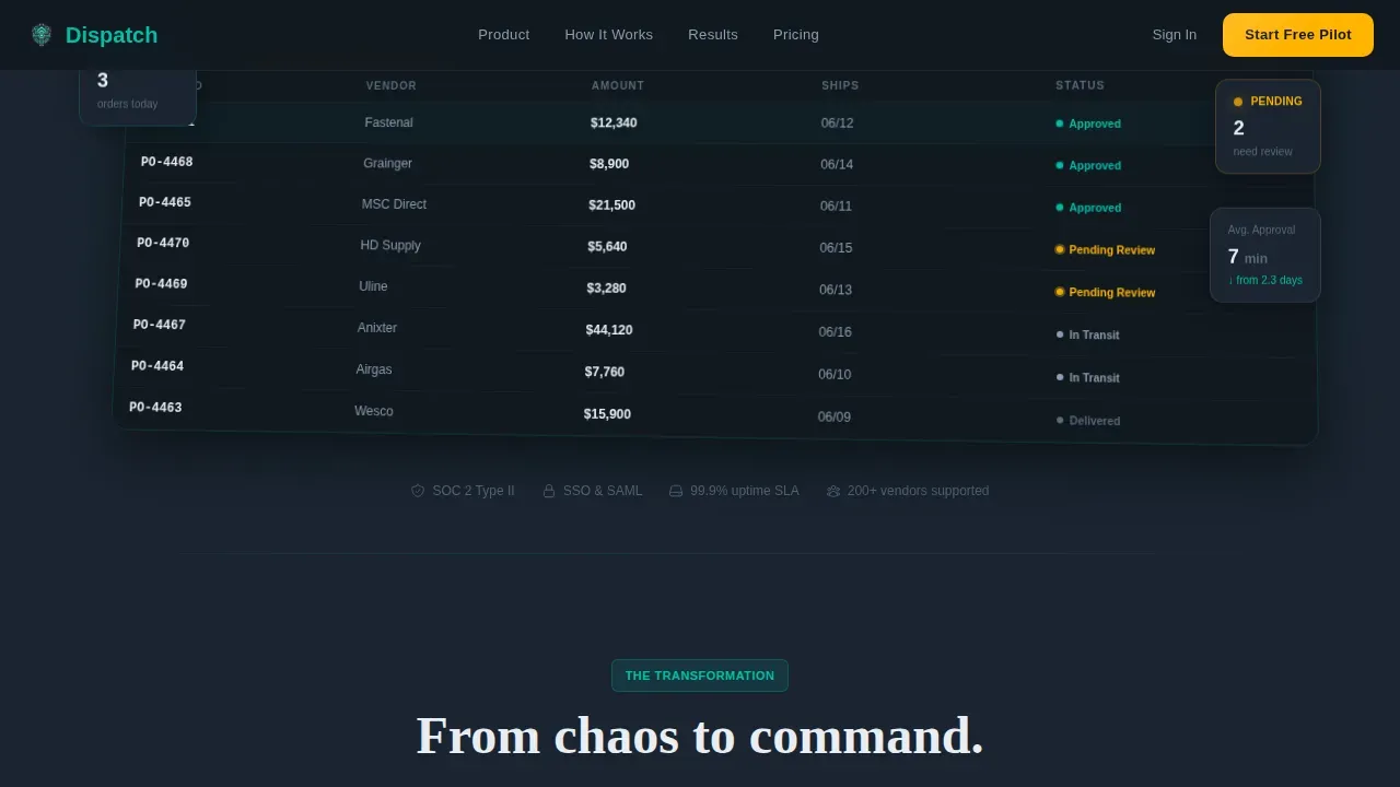
- The orders list within the dashboard mockup displays real-format purchase order data including order ID, vendor name, dollar value, and ship date, giving visitors a realistic window into what the platform tracks
- The interactive map view concept referenced in dispatch system best practices is reflected in the dashboard screenshot, which shows order pipeline stages rather than a geographic fleet map, keeping the template honest to its consulting firm order management use case rather than a field fleet dispatch system
- Key best practices for effective dispatch landing pages include using intuitive visual hierarchies, integrating live tracking indicators, and implementing clear actionable buttons for swift dispatch actions; all three principles are applied throughout this template
- The template supports the dispatch process from first vendor contact through final delivery confirmation, with each card module addressing a specific stage of the order lifecycle
- An automated notification center concept is represented in the dashboard preview through pulsing amber status indicators and a vendor response countdown timer, giving the visitor a sense of the system's real-time alert capability
- Teams can customize the metrics strip, edit the card copy, and modify the call-to-action label to match their company's specific service language and customer pain points
- The page is built so that users can navigate the full conversion journey, from dashboard preview through trial signup, without leaving a single scroll window
- Data analytics and route optimization details referenced in dispatch system best practices can be addressed by teams who customize the dashboard screenshot to reflect their own order data and delivery planning workflows
- The schedule and planning details within each order card can be edited to reflect the date formats, vendor categories, and equipment types relevant to a specific company's operations
- Cross-departmental teams benefit from the template's clear visual separation between pending tasks and approved orders, which mirrors best practices for coordinated delivery scheduling across shared inventory data
- The template assigns a clear visual count to each order stage, making it easy to monitor the total number of orders in each status column at a glance
- Filter and search functionality represented in the orders list area of the dashboard mockup communicates that the system enables users to find any order through a contextual search bar without scrolling through a long table
- Businesses looking to assess dispatch efficiency will find the metrics strip section particularly useful as a reference point for monitoring order processing time and dispatch accuracy rates in their own operations
Theme
Dashboard Pro
Creative direction
Launch Energy
Color system
Teal Catalyst
Style
Card Grid (Modular)
Direction
Freemium/Trial
Page Sections
Live Dashboard Hero with Order Pipeline
Before and After Modular Card Grid
Scroll-triggered Metrics Strip
Three-field Pilot Trial Form
Sticky Call-to-action Bar and Demo Modal
Related questions
Who is this landing page template designed for?
Can I edit the card content and metrics to match my company?
Does the template include the actual order management software?
How does the conversion flow work for first-time visitors?
Is the template optimized for desktop or mobile use?


