Dispatch - Powerful Booking Landing Page Template
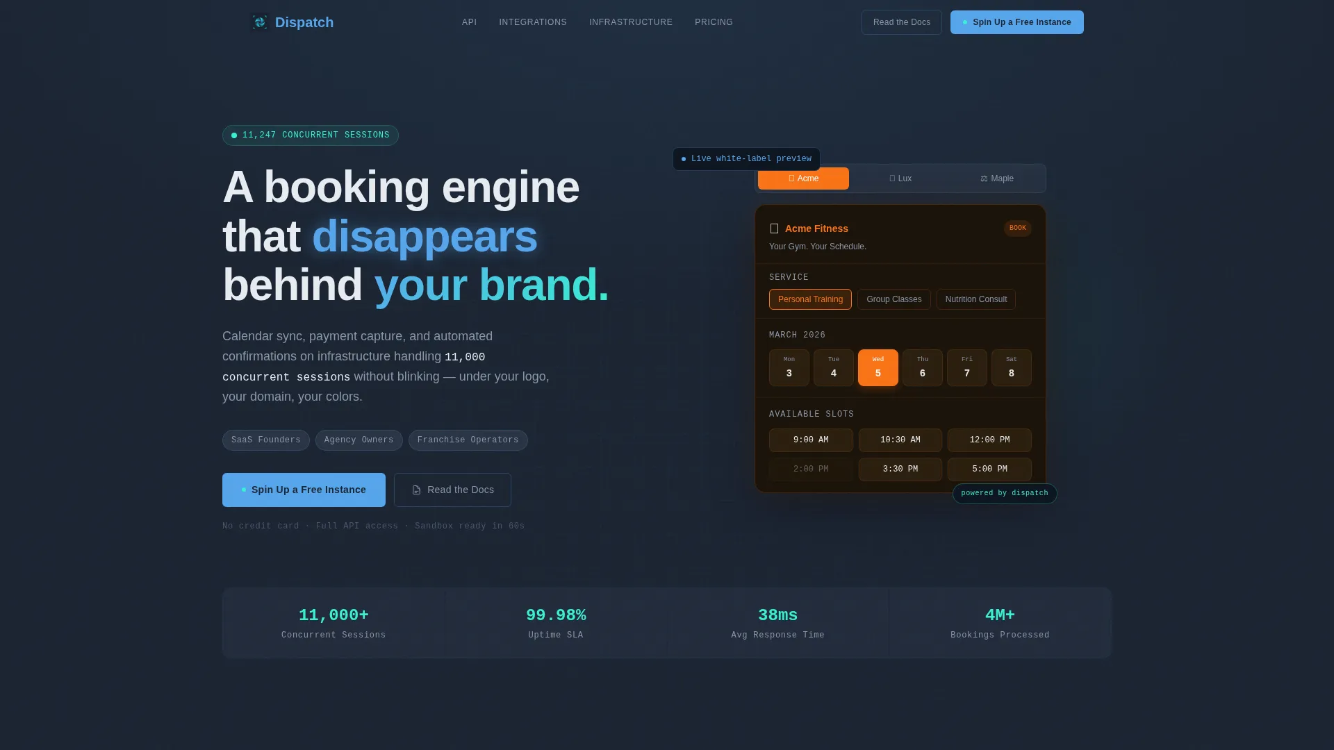
Dispatch is a hub-and-spoke landing page template built for white-label booking platforms. It leads with an interactive booking widget preview, walks technical buyers through five anchor-nav sections covering the API, customization, integrations, infrastructure, and pricing, and closes with a freemium call to action. No credit card required to get started.
by Rocket studio
Quick summary
Dispatch is a single-page template designed for white-label booking platforms targeting SaaS founders, agency owners, and franchise operators. Its Data Command visual theme and Spec Sheet creative direction turn dense technical detail into a scannable, confidence-building experience. Visitors leave with every objection answered and a clear path to spinning up a free instance.
Who this template is for
This template is built for technically minded sellers who need to convince equally technical buyers. It speaks directly to people launching or reselling a booking engine under their own brand.
- SaaS founders who need to bolt scheduling capabilities into an existing product
- Agency owners reselling an appointment booking tool under a private label
- Franchise operators managing multiple locations from a single dashboard
What problem this template solves
Most booking platform landing pages either oversimplify the product or bury its depth in walls of text. Dispatch solves that tension by presenting the platform exactly as a developer or operations director would want to evaluate it.
- Visitors cannot immediately grasp white-label flexibility without a hands-on demo
- Technical stakeholders need concrete proof of infrastructure reliability before committing
- Conversion stalls when engineers must leave the page to find API documentation
What you get with this template
You get a fully structured, anchor-navigated landing page with a live interactive header preview and five detailed spoke sections. Every section is designed to eliminate a specific objection before the visitor reaches the call to action.
- An interactive booking widget in the header that recolors and rebrands in real time
- Five anchor-nav spoke sections covering API, Customization, Integrations, Infrastructure, and Pricing
- A freemium conversion flow with a single-step signup form and a tier comparison table
Feature list
This template covers the full buyer journey from first impression to signup, using layout patterns built specifically for technical and semi-technical audiences.
Interactive White-Label Widget Preview
The header features a functioning booking widget with a brand-name selector above it. Choosing a different brand instantly recolors the widget, swaps the logo, and changes the typography. The visitor understands white-labeling in seconds without reading a single line of copy.
Anchor Navigation with Five Spokes
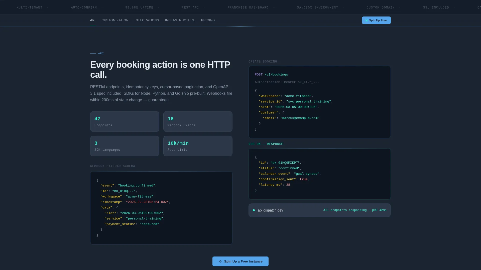
A sticky anchor nav pins to the top of the page after the header. It links to five dedicated sections: API, Customization, Integrations, Infrastructure, and Pricing. Each section reads like technical documentation styled for editorial presentation.
Spec Sheet Section Design
Each spoke section uses syntax-highlighted code blocks, animated latency counters, and uptime figures that tick from zero to 99.98 percent as they scroll into view. The format is dense enough for a technical lead to screenshot and share internally.
Freemium Signup Flow
The primary call to action, labeled "Spin Up a Free Instance," appears in the sticky nav and at the close of every spoke section. Clicking it opens a single-step form requesting a work email, a platform name, and a sandbox-or-production toggle. No credit card field is included.
Tier Comparison Table
A pricing comparison table sits just above the final call to action. It displays the free tier's generous limits alongside paid tiers, making an upgrade feel like a natural next step rather than a forced decision.
Secondary Documentation Path
A "Read the Docs" link runs alongside the primary call to action throughout the page. It routes engineers directly to full API documentation, keeping technically cautious visitors engaged rather than lost.
Page sections overview
| Section | Purpose |
|---|---|
| Header Interactive Preview | Demonstrates white-label widget rebranding live in the header |
| Sticky Anchor Nav | Pins to top and links visitors to each of the five spoke sections |
| API Spoke | Shows endpoint examples in syntax-highlighted code blocks |
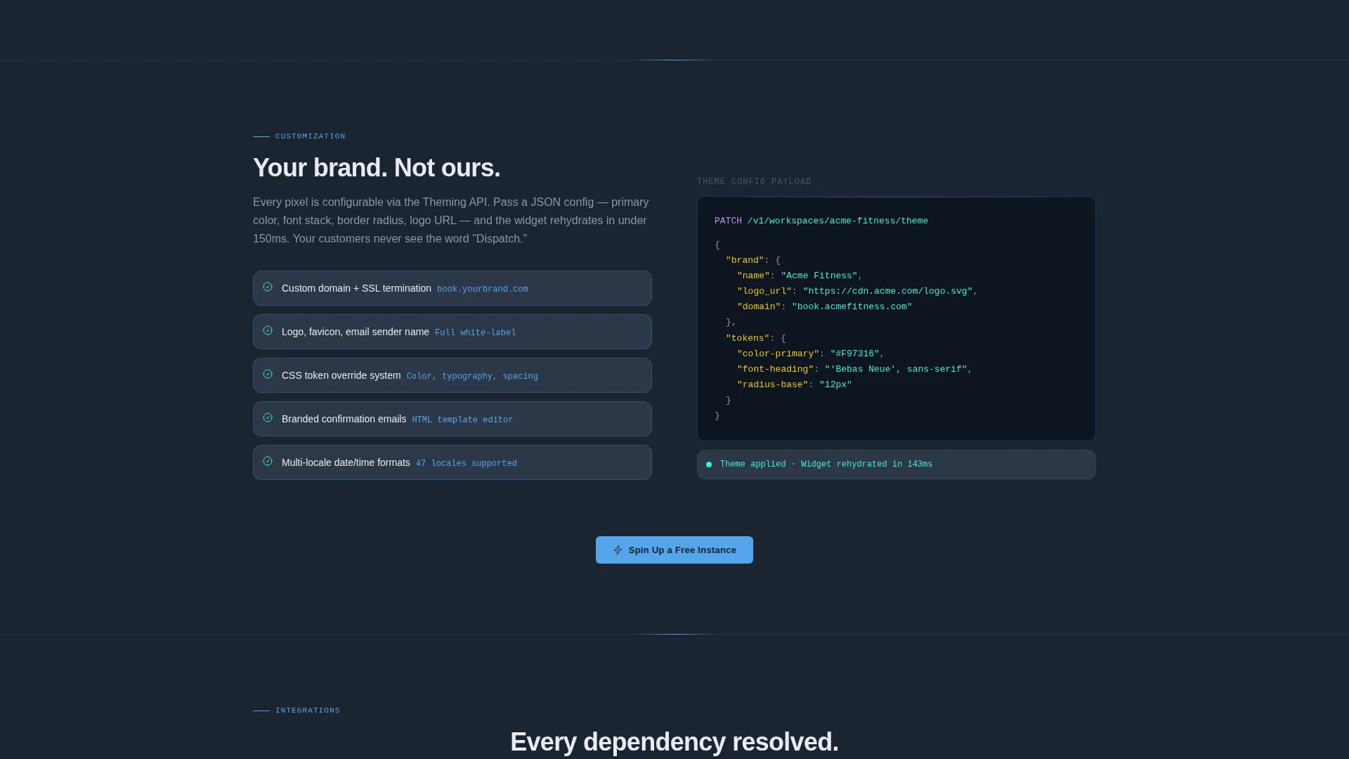
| Customization Spoke | Covers brand control options including colors, logos, and domain |
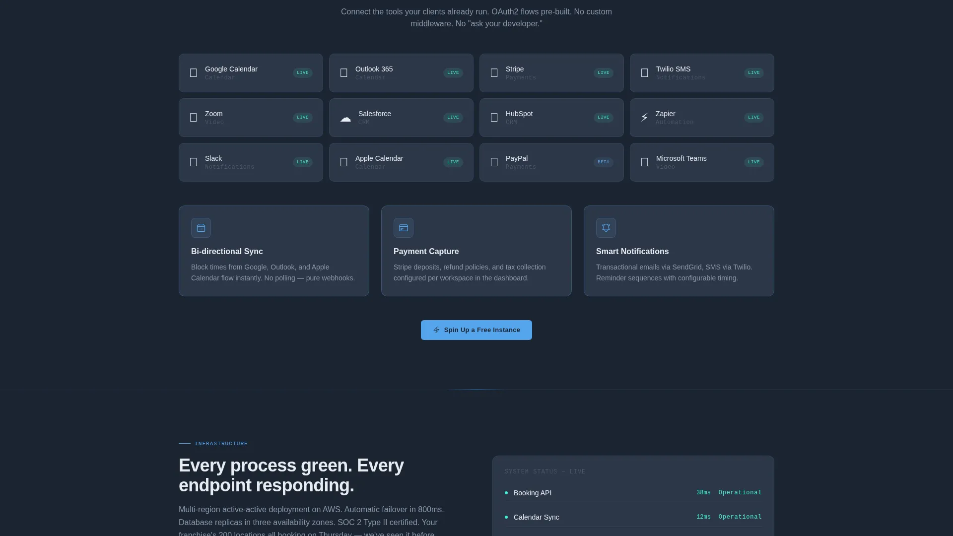
| Integrations Spoke | Details calendar sync, payment capture, and confirmation workflows |
| Infrastructure Spoke | Presents uptime figures and concurrent session capacity benchmarks |
| Pricing Spoke | Displays tier comparison table and clarifies free tier limits |
| Final call to action Block | Closes the page with the freemium signup form and secondary docs link |
Design & branding system
The visual identity follows a Data Command theme built around the Slate and Sky color system. Dark backgrounds absorb visual noise so live data elements and interactive states feel brighter and more intentional.
- Deep terminal slate (#1B2432) and mid-panel graphite (#2D3748) form all background surfaces
- Status-bar sky (#56A5EC) and success ping cyan (#38F1D3) are reserved for clickable elements, active states, and hover interactions
- Typography runs in cool white (#E8ECF1) across all body and heading text, maintaining contrast without harshness
Mobile & speed optimization
The template is structured with a linear scroll flow that naturally adapts from desktop to narrower screens. The sticky anchor nav and widget preview are designed to reflow cleanly without losing their functional behavior.
- The anchor navigation collapses gracefully on smaller viewports while keeping all five spoke links accessible
- Code blocks and animated counters in the spoke sections are contained in scrollable panels to prevent horizontal overflow on mobile
- The single-step signup form is minimal by design, reducing friction for visitors converting on any device
How this template helps you convert
Dispatch is built around objection elimination. Each section removes a specific barrier before the visitor reaches the signup prompt, so the final call to action feels like a natural conclusion rather than a sales push.
- The interactive widget preview in the header proves white-label flexibility instantly, removing the need to describe it in words and building immediate trust with product-minded buyers
- The five spoke sections address technical concerns in the order a developer or operations lead would raise them, each closing with the "Spin Up a Free Instance" call to action while the objection is still fresh
- The tier comparison table just above the final call to action makes the free tier's value obvious, so visitors sign up on confidence rather than hesitation
Other information about this template
Dispatch is part of a category of high-intent platform landing pages designed for the technology and consumer app space. It is built for products where the buyer is evaluating infrastructure as much as features.
- The template style is Hub and Spoke with Anchor Navigation, making it easy to deep-link a prospect directly to the Pricing or API section
- The header concept is classified as Interactive Preview, a pattern that replaces static screenshots with live demonstration
- The freemium and trial conversion model is native to the layout, with the primary and secondary calls to action placed at every natural exit point
- The template fits the white-label booking platform niche and the broader category of developer-facing SaaS marketing pages
Theme
Data Command
Creative direction
Spec Sheet
Color system
Slate & Sky
Style
Hub & Spoke (Anchor Nav)
Direction
Freemium/Trial
Page Sections
Interactive White-label Widget Preview
Five-spoke Anchor Navigation
Spec Sheet Section Design
Freemium Single-step Signup Form
Tier Comparison Table
Secondary API Documentation Path
Related questions
Can I change the widget brands shown in the header preview?
Does the template include the actual booking engine backend?
Is the signup form connected to a backend by default?
Can the anchor nav sections be reordered or renamed?
Who handles the destination for the Read the Docs link?



