Micro-SaaS & Developer Tools Complete Professional Website Template
Dispatch is a dark, high-impact landing page template built for chatbot builder platforms. It follows a Bold Brutalist aesthetic with a Midnight Blue color system, Stats-First creative direction, and a hub-and-spoke anchor navigation structure. The layout is designed to convert support-focused buyers by leading with hard metrics and dismantling every alternative through comparison spoke sections.
by Rocket studio
Quick summary
Dispatch is a single-page, anchor-nav landing page template built for chatbot builder platforms targeting support and ops teams. It opens with a glowing command-center header, leads every scroll stop with a bold stat, and routes visitors through five comparison spoke sections. The design is Bold Brutalist, dark, and built for conversion.
Who this template is for
This template is built for founders and marketers promoting conversational AI tools to operational buyers. It speaks directly to people drowning in support queues and looking for a faster path than hiring or patching legacy tools.
- Heads of support at mid-market software-as-a-service companies managing high volumes of repetitive first-level tickets
- Operations leads at e-commerce brands scaling through peak seasons without adding headcount
- Agency founders building and white-labeling chatbot solutions for client retainers
What problem this template solves
Most chatbot builder landing pages bury the proof. They lead with feature lists and make buyers work to understand why the product beats the alternatives. Dispatch flips that structure entirely.
- Buyers land and see hard performance numbers before any feature copy loads
- Each comparison spoke removes a competing option with structured head-to-head grids and cost breakdowns
- The two-field signup form keeps friction low while qualifying leads by ticket volume
What you get with this template
Dispatch gives you a fully structured, single-page layout that does the selling before the demo call. Every section is purpose-built around a specific conversion moment.
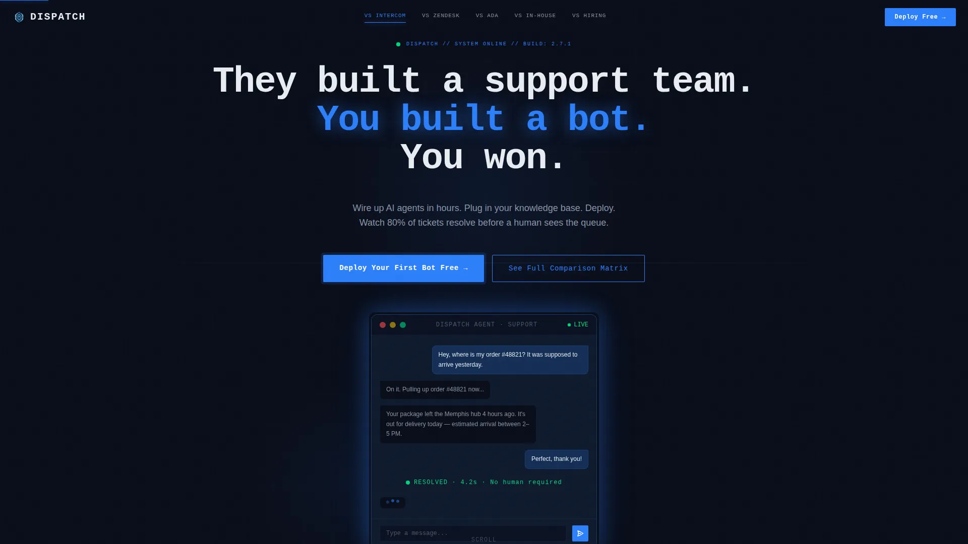
- A dark full-bleed header with a glowing chatbot interface mockup showing a live conversation mid-flow
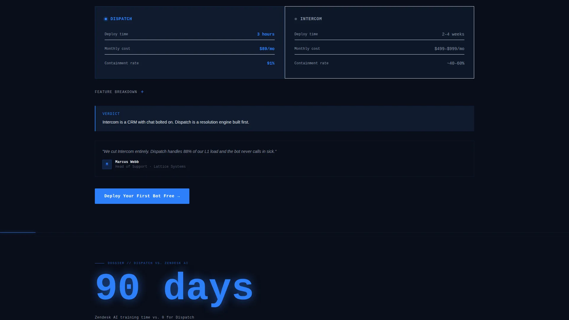
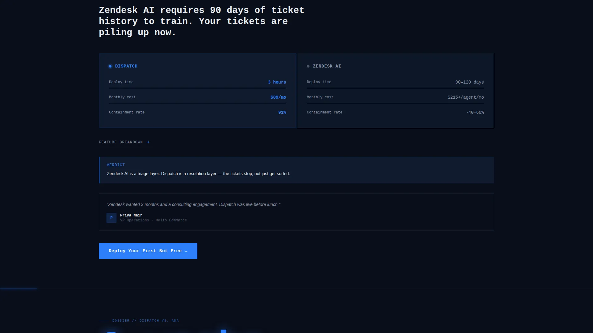
- Five comparison spoke sections, each with feature grids, cost breakdowns, and deployment timelines
- A sticky bottom bar with a persistent primary call-to-action and an expandable full comparison matrix
Feature list
Dispatch is packed with purpose-built layout sections and visual components drawn directly from the product brief. Each one serves a specific role in the conversion flow.
Stats-First Scroll Stops
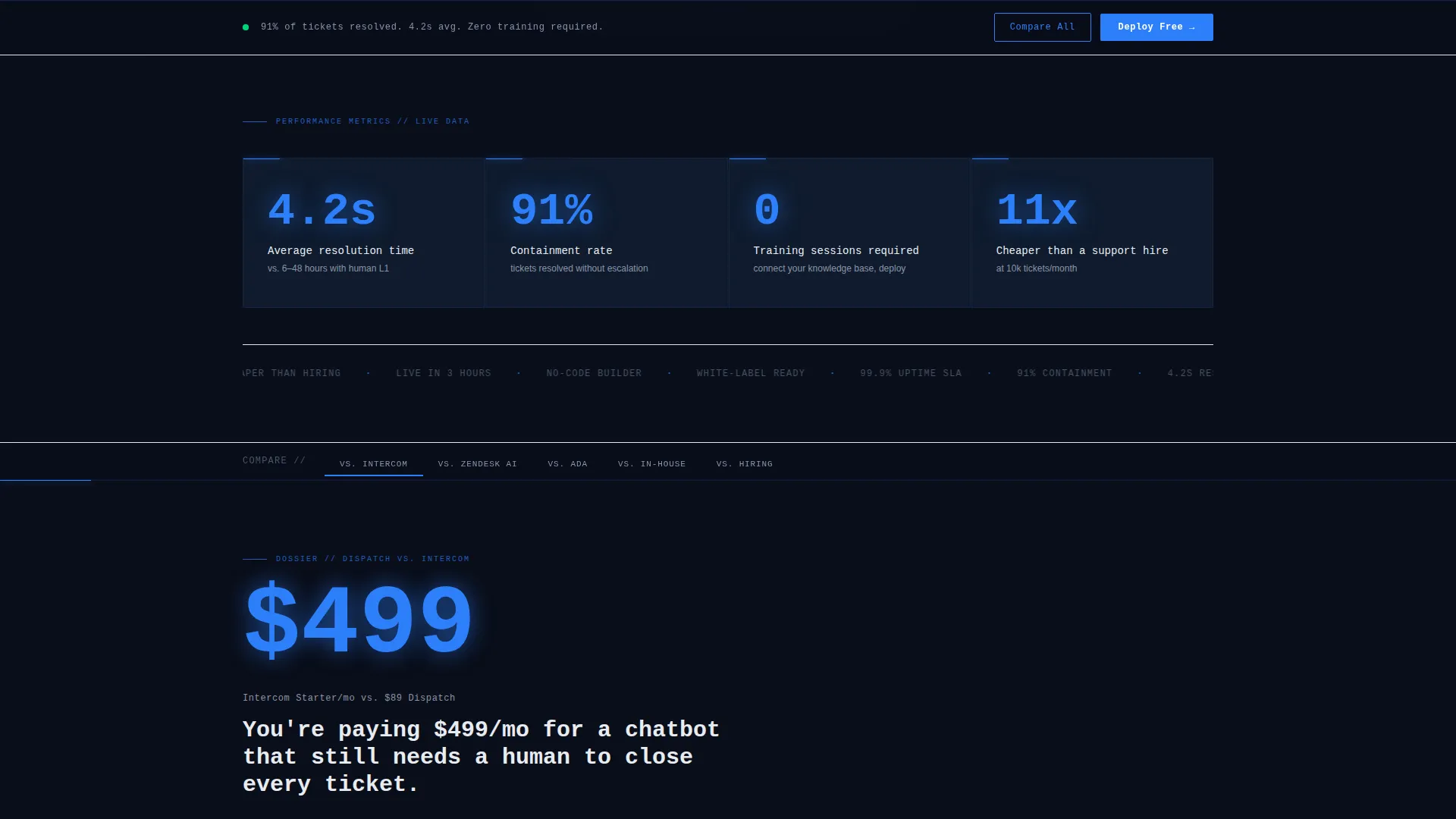
Every major scroll stop opens with an oversized cobalt numeral before any explanation appears. Numbers like resolution time, containment rate, and zero-training claims hit first. Supporting copy and comparison context follow beneath, giving data-driven buyers immediate proof before they read a word.
Hub-and-Spoke Anchor Navigation
The page uses a sticky anchor navigation bar linking to five distinct comparison spokes. Each spoke is a self-contained argument against a specific alternative. Visitors can jump directly to the comparison most relevant to their current situation.
Head-to-Head Comparison Spokes
Five dedicated spoke sections each target a competing path: alternative support tools, build-in-house approaches, and hiring. Each spoke contains a feature grid, cost breakdown, and deployment timeline. The layout is structured like a classified dossier, making the case systematically.
Interactive Comparison Matrix Toggle
A secondary call-to-action expands a full comparison matrix. Visitors toggle competitors and watch columns of checkmarks and crossed-out marks populate in real time. This gives analytical buyers a single surface to evaluate every option at once.
Glowing Chatbot Interface Mockup
The header centers a floating chatbot interface mockup emitting a soft cobalt glow against a void-black canvas. The mockup shows a real conversation: a customer asking about order status, the bot resolving it in three messages, and a pulsing "resolved" tag. This is not an illustration; it is a proof-of-concept visual.
Two-Field Qualification Form
The signup form asks only for work email and monthly ticket volume. Two fields, no friction. The second input doubles as a qualification signal, letting teams understand lead quality without adding form steps.
Page sections overview
| Section | Purpose |
|---|---|
| Dark Header Hero | Anchors attention with glowing mockup and brutalist headline |
| Sticky Anchor Nav | Lets visitors jump directly to any comparison spoke |
| Stats Impact Row | Leads with oversized performance numbers before copy |
| versus. Alternative One | Head-to-head feature grid and deployment timeline |
| versus. Alternative Two | Cost breakdown and structured comparison dossier |
| versus. Alternative Three | Feature grid targeting a third competing tool |
| Build In-House Spoke | Argues against internal development with timeline data |
| Hiring Comparison Spoke | Breaks down headcount cost versus bot deployment cost |
| Comparison Matrix | Full interactive toggle table for all competitors |
| Primary call to action Close | Repeats deploy call-to-action with two-field form |
| Sticky Bottom Bar | Persistent deploy prompt visible after first scroll |
Design & branding system
The visual identity is Bold Brutalist with zero warmth and zero softness. Every color choice reinforces the live ops dashboard feeling the brief demands.
- Void-black (#0A0E1A) as the dominant canvas, deep tactical navy (#0F1B2D) for card surfaces and section breaks, electric cobalt (#2D7FF9) for buttons, stat counters, and active navigation indicators
- Raw terminal white (#E8ECF1) for all typography, creating phosphor-on-glass contrast across the entire layout
- No gradients, no illustrations, no decorative flourishes; only glow, oversized mono-weight type, and data-driven proof elements
Mobile & speed optimization
The template is structured for clean rendering across screen sizes. The hub-and-spoke layout and anchor navigation adapt naturally to narrower viewports without losing the command-center feel.
- Sticky navigation and bottom bar are designed to remain functional and visible on mobile screens
- The comparison spoke sections are built as self-contained blocks, making them easy to stack vertically on smaller displays
- The two-field form maintains its low-friction structure regardless of the device a visitor uses
How this template helps you convert
Dispatch is built around a single conversion goal: getting operational buyers to deploy their first bot before they talk to a competitor. Every layout decision serves that outcome.
- Stats-First scroll stops establish credibility in the first two seconds, before a visitor has read a single sentence of feature copy
- Five comparison spokes remove every credible alternative one by one, leaving the primary call-to-action as the only logical next step
- The sticky bottom bar and repeated "Deploy Your First Bot Free" prompt keep the primary action visible at every scroll depth, closing the loop on hesitant visitors
Other information about this template
Dispatch is a template in the Micro-SaaS and Developer Tools category, designed specifically for the chatbot builder niche. It is built for teams that need to launch a high-converting landing page fast, without starting from scratch.
- The template style is Hub and Spoke with anchor navigation, making it well-suited for products that compete across multiple buyer alternatives simultaneously
- The Bold Brutalist theme and Midnight Blue color system are purpose-matched to the dark, metrics-driven aesthetic that resonates with technical and operational buyers
- The creative direction is Stats-First Impact, meaning visual hierarchy always leads with proof before explanation
- The header concept is Dark Full-Bleed plus Glow, producing an immediate visual impact that signals a serious, high-performance product
- The landing page direction is Comparison and Versus, positioning the product against specific alternatives rather than selling features in isolation
Theme
Bold Brutalist
Creative direction
Stats-First Impact
Color system
Midnight Blue
Style
Hub & Spoke (Anchor Nav)
Direction
Comparison/Versus
Page Sections
Stats-first Scroll Stops
Hub-and-spoke Anchor Navigation
Head-to-head Comparison Spokes
Interactive Comparison Matrix
Glowing Chatbot Interface Mockup
Two-field Qualification Form
Related questions
Who is this template designed for?
How many comparison sections does the template include?
What does the signup form collect?
Is this a multi-page template or a single-page layout?
Can I adapt this template for a product outside the chatbot space?



