Dispatch - Powerful Education Landing Page Template
Dispatch is a split-screen education holiday greeting email landing page built for communications directors, superintendents, and college deans. It uses a Data Command visual theme, deep carbon blacks, woven graphite panels, and phosphor-green accents, to showcase a Problem-to-Solution scroll arc that turns a forgettable winter email into one your board chair forwards to the governor.
by Rocket studio
Quick summary
Dispatch is a single-page landing page template for an education holiday greeting email service. It targets K-12 districts, universities, and district offices. The design runs a 50/50 split-screen layout with a dark, mission-control aesthetic. The page guides visitors from a recognizable problem straight to a trial signup, no detours, no filler.
Who this template is for
This template is built for education communicators who need to reach thousands of people with one email that actually feels personal. It speaks to the professionals who carry that weight every December.
- Communications directors managing multiple platforms before noon
- Superintendents and college deans who want warmth without writing it themselves
- District office staff responsible for end-of-year outreach to large alumni or family audiences
What problem this template solves
Most holiday emails from schools and universities look like every other email in the inbox. They feel rushed, generic, and forgettable. This template is designed to make that problem visible and then immediately solve it on the same page.
- Generic templates that open rates sit flat at around 12 percent
- Reply-all disasters and cluttered inbox screenshots that erode trust
- No clear path from a bland draft to an email that gets forwarded up the chain
What you get with this template
You get a fully structured, single-page landing page layout built around a scrolling Problem-to-Solution narrative. Every section earns the next click by showing a transformation, from a tired draft to a polished, personalized education holiday greeting email.
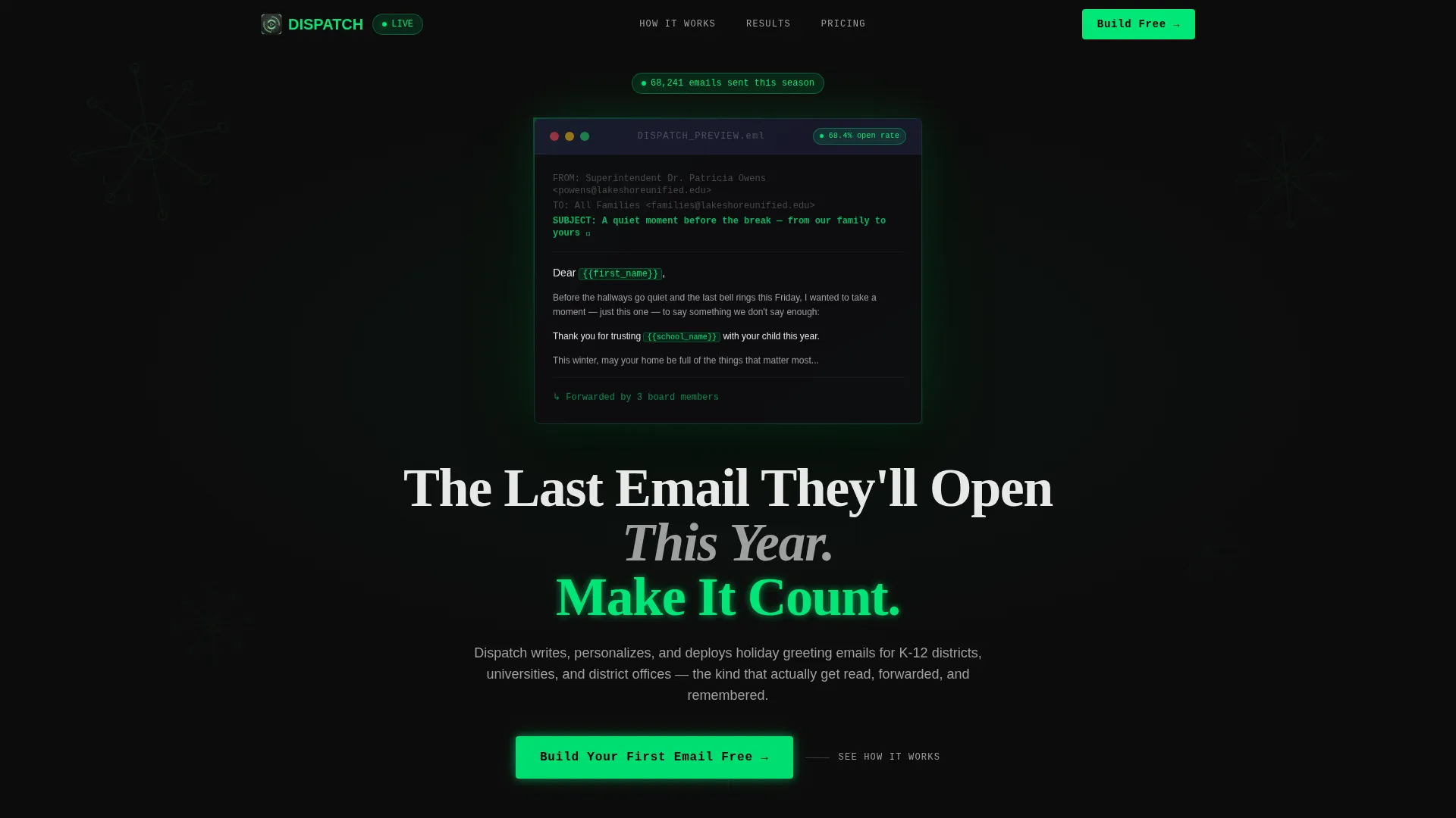
- A dark full-bleed header with a glowing email preview, a pulsing open-rate badge, and a geometric snowflake wireframe background
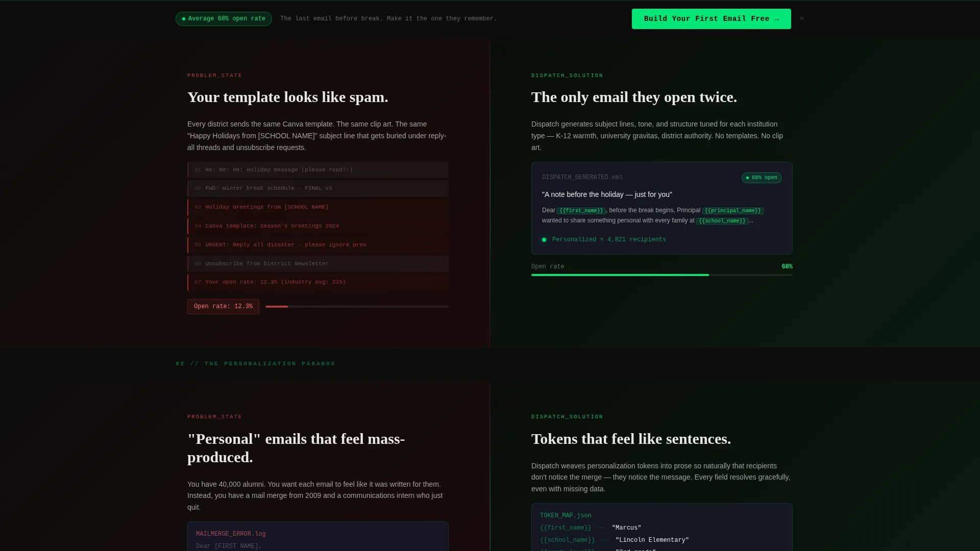
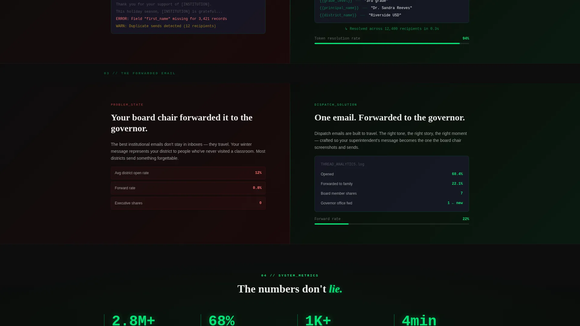
- Three Problem-to-Solution panel pairs that escalate from "looks like spam" to "forwarded to the governor"
- A freemium call-to-action flow with a primary form, an institution-type selector, and a live district preview path
Feature list
This template delivers a focused set of layout and interaction components drawn directly from the brief. Each one serves the conversion goal without clutter.
Glowing Email Preview Header
The header section floats a single rendered email against a pure carbon black background. The subject line is visible, and an open-rate badge pulses softly in phosphor green. Thin geometric snowflake wireframes sit in the background, understated and atmospheric.
Split-Screen Problem and Solution Panels
Each scroll section places the problem on the left and the solution on the right simultaneously. Left panels show cluttered inbox views, flat open-rate gauges, and generic template examples. Right panels reveal clean rendered emails with personalization tokens glowing green and gauges climbing toward 68 percent.
Escalating Narrative Scroll Arc
The page follows a deliberate three-stage arc. Stakes rise with each panel pair, moving from "your template looks like spam" to "your board chair forwarded it to the governor." By the time visitors reach the call to action, they have already seen three emails transform.
Freemium Conversion Form
The primary call-to-action block appears after the third Problem-to-Solution pair. It asks for a work email first, then institution type, K-12, Higher Education, or District Office, then enrollment size. The form flow is minimal and purposeful.
Live District Preview Path
A secondary conversion path lets visitors enter their district name and see a generated email preview in real time. This "See a Sample for Your District" option lowers the barrier to engagement before any commitment is made.
Sticky Bottom Call-to-Action Bar
The "Build Your First Email Free" call to action persists as a sticky bar at the bottom of the page. It stays in phosphor green on carbon black throughout the scroll, always visible, never disruptive.
Page sections overview
| Section | Purpose |
|---|---|
| Full-Bleed Header | Introduces the product with a glowing email artifact and headline |
| Problem Panel One | Shows generic templates and flat open rates as the starting pain |
| Solution Panel One | Reveals clean, personalized email output with rising engagement |
| Problem Panel Two | Escalates with inbox clutter and reply-all failure scenarios |
| Solution Panel Two | Shows personalization tokens and improved deliverability visuals |
| Problem Panel Three | Peaks with "your email looks like spam" narrative tension |
| Solution Panel Three | Resolves with the forwarded-to-the-governor outcome visual |
| Primary call to action Block | Freemium signup form with institution type and enrollment fields |
| District Preview Path | Secondary path for live sample generation by district name |
| Sticky call to action Bar | Persistent bottom bar repeating the free trial call to action |
Design & branding system
The visual identity uses a Data Command theme built entirely on the Carbon Fiber color system. The palette evokes the inside of a mission control console: matte, textured, and precise. A single electric accent color carries all the energy.
- Deep carbon black (#0D0D0D) and woven graphite (#1A1A2E) form the dark surface layers, with faint crosshatch texture on panel backgrounds
- Signal white (#E8E8E8) handles all body text and labels for legibility against dark backgrounds
- Phosphor green (#00E676) drives every live element: button fills, hover states, pulsing badges, and open-rate counters
Mobile & speed optimization
The split-screen layout is built to restack cleanly on smaller screens. The two-column panels collapse to a single-column scroll without breaking the narrative arc or losing the visual hierarchy.
- Left and right problem-solution panels reflow into sequential stacked blocks on mobile
- The sticky call-to-action bar and the primary form remain accessible and functional at all viewport widths
- Phosphor-green pulse animations are subtle by design, keeping visual weight manageable across devices
How this template helps you convert
The page is structured so that trust is built before any commitment is asked. Visitors do not arrive at a form cold, they arrive having already watched the product work.
- The Problem-to-Solution scroll arc shows three concrete transformations before the call-to-action form appears, so visitors feel the value before they see the ask.
- The live district preview path lets visitors generate a personalized sample using their own institution name, making the product feel real and immediately relevant.
- The sticky "Build Your First Email Free" bar ensures the conversion entry point is never more than one tap or click away, no matter how far down the page a visitor has scrolled.
Other information about this template
Dispatch is built as a single, section-led landing page, not a multi-page site. Everything from the first scroll to the final form lives on one continuous canvas. This keeps the experience focused and removes navigation friction for busy education professionals.
- The template style is Split Screen (50/50), with the layout direction set by the Data Command theme and Carbon Fiber color system
- The creative direction follows a Problem-to-Solution Arc, a format well suited to service landing pages where showing beats telling
- The landing page direction is Freemium and Trial, meaning the primary conversion goal is a no-cost first step rather than an immediate purchase
- The header concept is Dark Full-Bleed with Glow, using a luminous floating email artifact instead of photography or illustration
Theme
Data Command
Creative direction
Problem→Solution Arc
Color system
Carbon Fiber
Style
Split Screen (50/50)
Direction
Freemium/Trial
Page Sections
Glowing Email Preview Header
Split-screen Problem and Solution Panels
Escalating Narrative Scroll Arc
Freemium Conversion Form
Live District Preview Path
Sticky Bottom Call-to-action Bar
Related questions
Who is this landing page template designed for?
What does the split-screen layout do on this page?
How does the live district preview feature work?
Can this template support both Higher Education and K-12 use cases?
What is the primary call to action on this landing page?



