Dispatch - Powerful Education Management Landing Page Template
Dispatch is a bold brutalist landing page template built for education field service management platforms. It uses a scroll-reveal, industry-report structure to surface district maintenance data, expose reactive-versus-preventive cost gaps, and drive high-intent leads. The design feels like a district command center, raw, functional, and built for facilities professionals who need answers before the first bell rings.
by Rocket studio
Quick summary
Dispatch is a single-page, scroll-reveal landing page template for education field service management platforms. It opens with a full-width dispatch dashboard screenshot, then unfolds like an industry report, each section surfaces a new data finding and pairs it with a product screenshot. The page ends with a progressive three-step lead capture form designed to convert facilities directors and operations managers.
Who this template is for
This template is built for field service platforms that sell into K-12 school districts and charter networks. It speaks directly to the people who carry radios, manage spreadsheets, and get called before sunrise when a boiler fails.
- Facilities directors managing large building portfolios with small technician teams
- Operations managers at charter networks inheriting disorganized maintenance workflows
- CFOs who need hard data to justify preventive maintenance budgets over reactive repairs
What problem this template solves
Most field service platforms pitch features. Dispatch pitches reality. It walks the visitor through cost-per-emergency-call data, reactive-versus-preventive budget drain, and inspection compliance gaps, then shows the product solving each problem. The result is a page that earns trust before asking for contact details.
- Generic SaaS landing pages fail to speak the language of school district operations
- Visitors leave when they see feature lists instead of proof that the platform understands their specific pain
- Lead forms placed too early capture curiosity, not intent
What you get with this template
You get a fully structured, scroll-reveal landing page built around an industry-report creative direction. Every section is purposeful, sequenced for progressive trust-building, and designed to feel like a district command center at operational tempo.
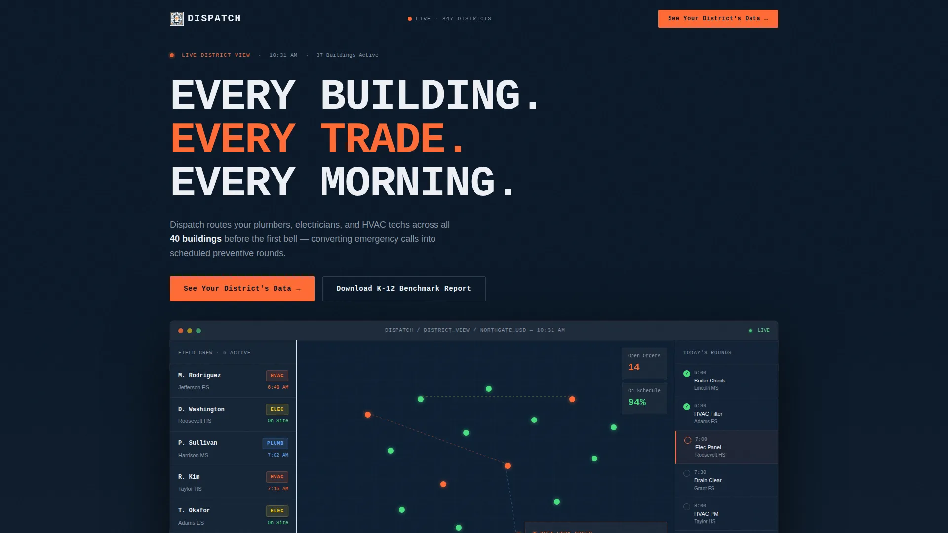
- A product screenshot hero with a brutalist headline, district map, and live work order display
- Three data-finding scroll reveals, each paired with a supporting product screenshot
- A progressive three-step lead capture form plus a secondary gated PDF download path
Feature list
This template is built around six core structural and design capabilities that work together to move high-intent visitors toward conversion.
Full-Width Dashboard Hero
The header section fills the viewport with a pixel-sharp product screenshot showing a real district map with 37 building pins, a trade-coded technician sidebar, and an open work order. The brutalist headline "Every building. Every trade. Every morning." is set in oversized mono type and anchors the top-left corner. There is no lifestyle photography or illustration, the interface is the hero.
Scroll-Reveal Industry Report Structure
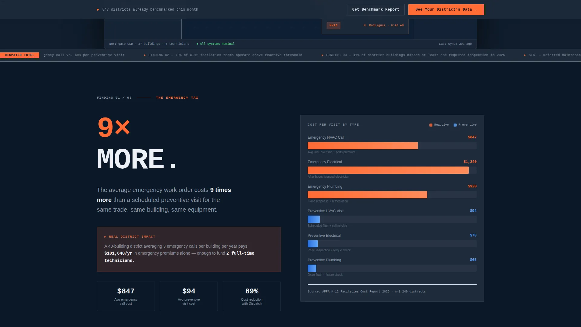
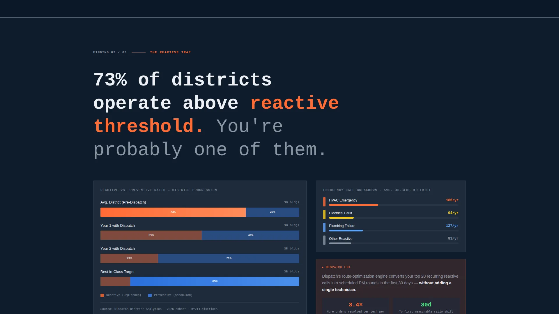
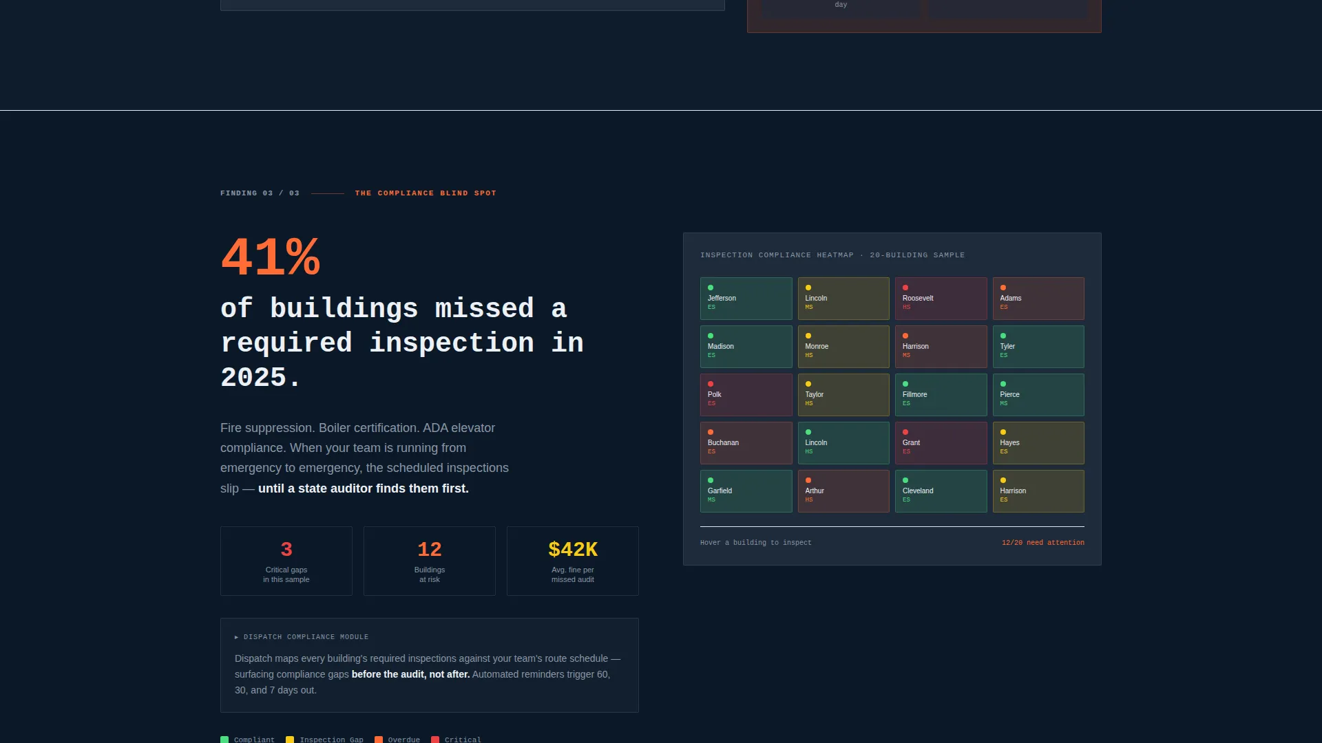
Each scroll reveal surfaces one data finding, cost-per-emergency-call, reactive-versus-preventive ratio, or compliance heatmap, followed immediately by a product screenshot proving the platform addresses that exact issue. The sequence creates a reading rhythm that keeps visitors engaged through the full page.
Progressive Three-Step Lead Form
The primary lead capture is a three-step form that collects district name and state first, then technician count and primary trades, then work email and phone. The form is designed to feel like onboarding has already begun, reducing friction at each step.
Gated PDF Secondary call to action
Visitors not ready to book a demo can download a gated K-12 Maintenance Benchmark Report. This path captures email and role title only, keeping the barrier low and the pipeline warm for future nurture.
Pinned Bottom Navigation call to action
After the second scroll reveal, the primary call-to-action "See Your District's Data" pins to the bottom navigation bar and stays visible for the remainder of the page. This ensures the conversion path is always one tap or click away without interrupting the report reading experience.
Brutalist Midnight Blue Design System
The color palette uses deep terminal navy, exposed-steel charcoal, fluorescent corridor white, and emergency-exit orange reserved strictly for calls-to-action and live-status indicators. The system is designed to be legible under harsh lighting and immediately signal operational authority to a facilities professional audience.
Page sections overview
| Section | Purpose |
|---|---|
| Dashboard Hero | Opens with full-width product screenshot and brutalist headline |
| Emergency Cost Reveal | First scroll reveal: cost-per-emergency-call data finding |
| Reactive Budget Drain | Second scroll reveal: reactive-versus-preventive ratio chart |
| Compliance Gap Map | Third scroll reveal: inspection compliance heatmap by building |
| Primary Lead Form | Progressive three-step form triggered after second reveal |
| Gated PDF Offer | Secondary download path for benchmark report |
| Pinned Nav call to action | Persistent bottom bar call to action active from second reveal onward |
Design & branding system
The visual identity is Bold Brutalist, industrial, undecorated, and built for operational clarity. The Midnight Blue color system draws from boiler room control panel aesthetics. Every color choice is purposeful and role-specific within the layout.
- Deep terminal navy (#0B1929) and exposed-steel charcoal (#1E2A3A) form the primary surface and panel colors
- Fluorescent corridor white (#EDF0F5) handles all body text and data labels for maximum contrast
- Emergency-exit orange (#FF6B35) is used exclusively for calls-to-action and live-status indicators, never decoratively
Mobile & speed optimization
The scroll-reveal structure and brutalist layout are designed to translate cleanly to smaller screens without losing the command-center atmosphere. The template prioritizes visual hierarchy that holds up whether viewed on a desktop in a district office or a tablet in a mechanical room.
- Full-width dashboard screenshot scales responsively, maintaining the district map and sidebar legibility
- Pinned bottom call to action adapts to mobile viewport height so it remains visible and tappable throughout the scroll
- Progressive form steps are structured for single-column display, reducing thumb travel and keeping each step focused
How this template helps you convert
Dispatch is built around a conversion architecture that earns the click rather than demanding it. The page sequences trust signals before asking for anything, and offers two separate capture paths to match different buyer readiness levels.
- The industry-report scroll structure builds credibility progressively, so by the time the lead form appears after the second reveal, the visitor already feels understood and is primed to engage.
- The two-path capture system, full demo form versus lightweight PDF download, ensures that even visitors who are not ready to book a call leave with their contact details captured and a branded benchmark report in their inbox.
Other information about this template
This template is purpose-built for the education field service management niche and carries design and structural decisions that reflect that specificity. It is not a general-purpose SaaS template adapted for education, every creative choice was made with K-12 district operations in mind.
- The NCES (National Center for Education Statistics) data auto-population reference in the form flow signals platform credibility to district buyers who recognize that data source
- The industry-report creative direction mirrors the type of content facilities directors and CFOs already consume when evaluating vendors
- The template is designed for single-page deployment with no multi-page navigation, keeping every visitor on a single conversion path
Theme
Bold Brutalist
Creative direction
Industry Report
Color system
Midnight Blue
Style
Scroll Reveal (Progressive)
Direction
Lead Generation
Page Sections
Full-width Dashboard Hero Section
Scroll-reveal Industry Report Flow
Progressive Three-step Lead Form
Gated Benchmark Report Download
Pinned Bottom Navigation Call to Action
Brutalist Midnight Blue Color System
Related questions
Who is this landing page template designed for?
What lead capture paths does this template include?
What does the scroll-reveal structure actually look like?
Is the dashboard screenshot customizable?
Can this template support a gated content strategy?



