Energy Software & SaaS Booking Website Template
Dispatch is a split-screen landing page template built for energy workforce scheduling platforms. It pairs a dark, SCADA-inspired visual system with a Spec Sheet scroll structure, walking operations managers through real scheduling scenarios and their platform solutions. The single call to action, "See Your Schedule Simulated," drives qualified demo leads with a focused two-step form.
by Rocket studio
Quick summary
Dispatch is a desktop-first, single-page lead generation template for energy staff scheduling software. It uses a 50/50 split-screen layout to contrast scheduling chaos with platform clarity. Every scroll section is a discrete capability card. The design draws from SCADA control-room aesthetics, using deep blacks, operational teal, and amber alerts to make each element feel purposeful.
Who this template is for
This template is built for B2B SaaS teams in the energy sector who need to demonstrate complex scheduling logic without overwhelming a busy operational audience. It speaks directly to the people responsible when the schedule breaks.
- Operations managers at regional utilities managing compliance and storm-response schedules
- Staffing coordinators at wind-farm operations and maintenance contractors
- HR directors at nuclear plants tracking certification gaps and overtime exposure
What problem this template solves
Workforce scheduling in the energy sector is high-stakes. A missed certification, a fatigue-rule violation, or a slow storm response can mean regulatory penalties, safety incidents, or both. Generic SaaS landing pages cannot communicate that urgency or build the kind of operational trust this audience demands.
- Visitors cannot connect abstract feature lists to the specific crises they actually face
- A cluttered or generic layout fails to build credibility with compliance-driven buyers
- There is no clear, low-friction path to a demo that feels relevant to their actual roster
What you get with this template
You get a fully structured, single-page lead generation layout designed around the energy workforce scheduling use case. Every section maps a real operational problem to a visible platform response, so the page earns trust before it asks for anything.
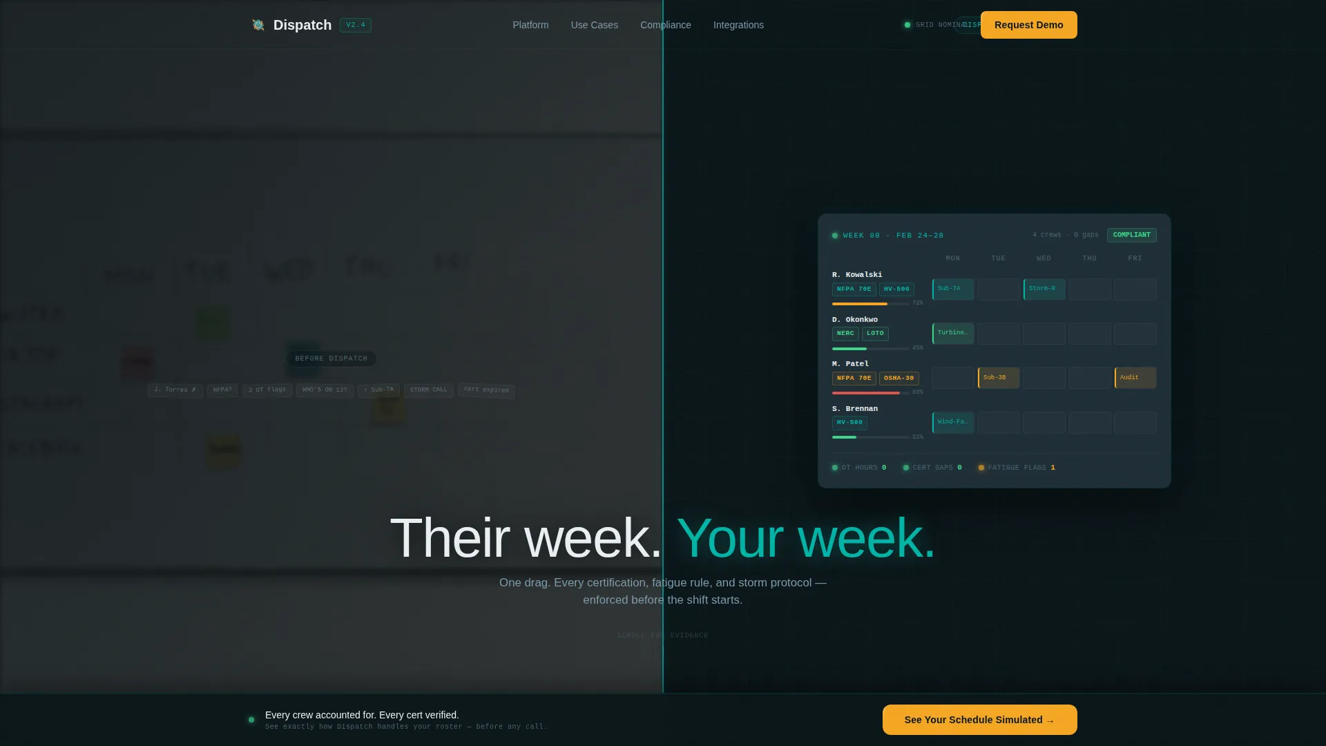
- A hero section with a 50/50 split showing whiteboard chaos versus a clean Gantt view
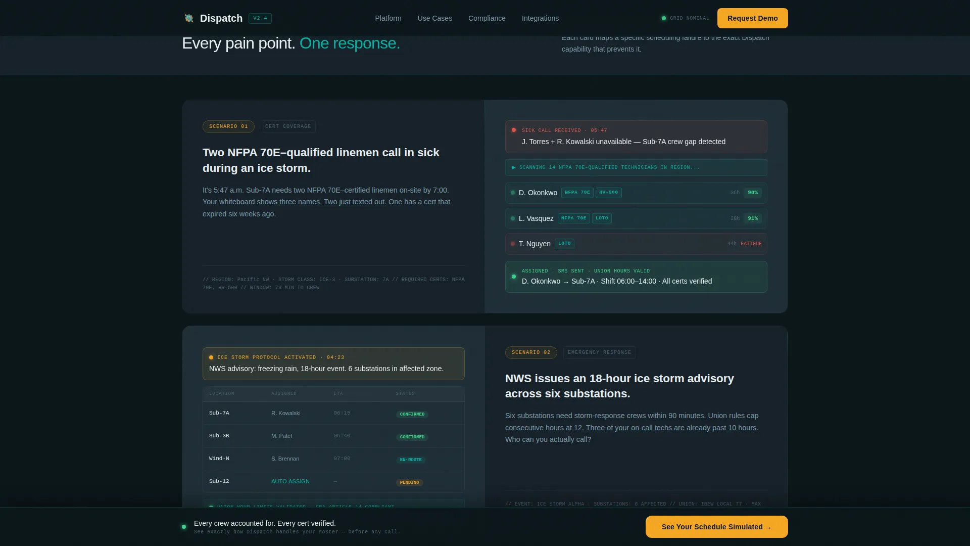
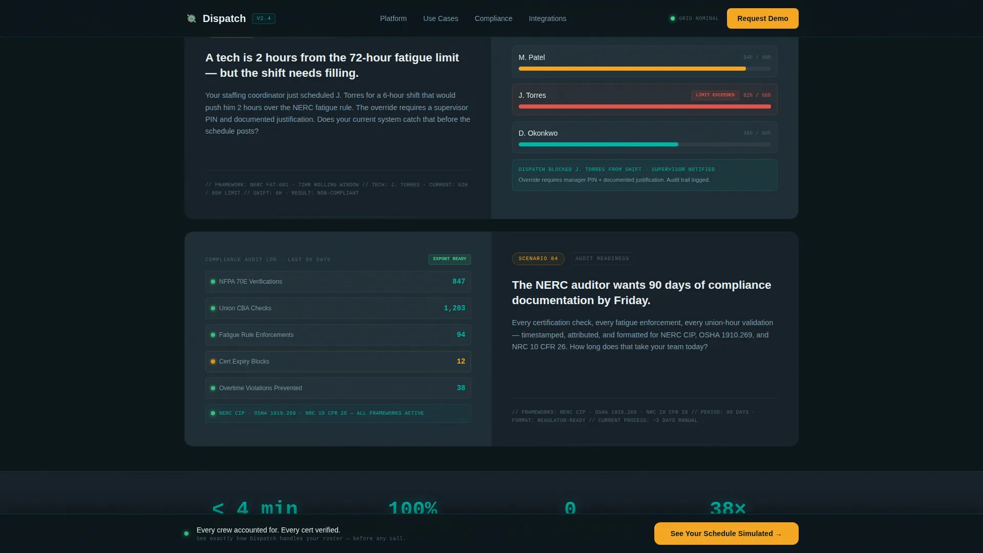
- Four scroll-triggered spec cards, each pairing a scheduling problem with an animated user interface response
- A sticky bottom bar with a two-step lead capture modal triggered after the third spec card
Feature list
This template includes purpose-built sections and interaction patterns matched to the energy scheduling sales context.
Split-Screen Hero with Teal Pulse Divider
The hero divides the viewport equally. The left panel shows a blurred whiteboard crew schedule covered in crossed-out names and sticky notes. The right panel renders the same week as a color-coded Gantt view with certification badges and fatigue counters visible on each row. A thin teal divider pulses once between them. The headline "Their week. Your week." fades in across both sides.
Scroll-Triggered Spec Cards
Each spec card is a 50/50 capability card. The left side presents a plain-language operational scenario in white text on dark glass. The right side shows an animated user interface snippet of the platform response. Four scenarios are included: a certification gap during a sick call, an ice storm emergency with SMS confirmations and union-hour validation, a fatigue-rule violation with a real-time counter and override workflow, and a compliance audit trail with automated documentation export.
Sticky Lead Generation Bar and Two-Step Modal
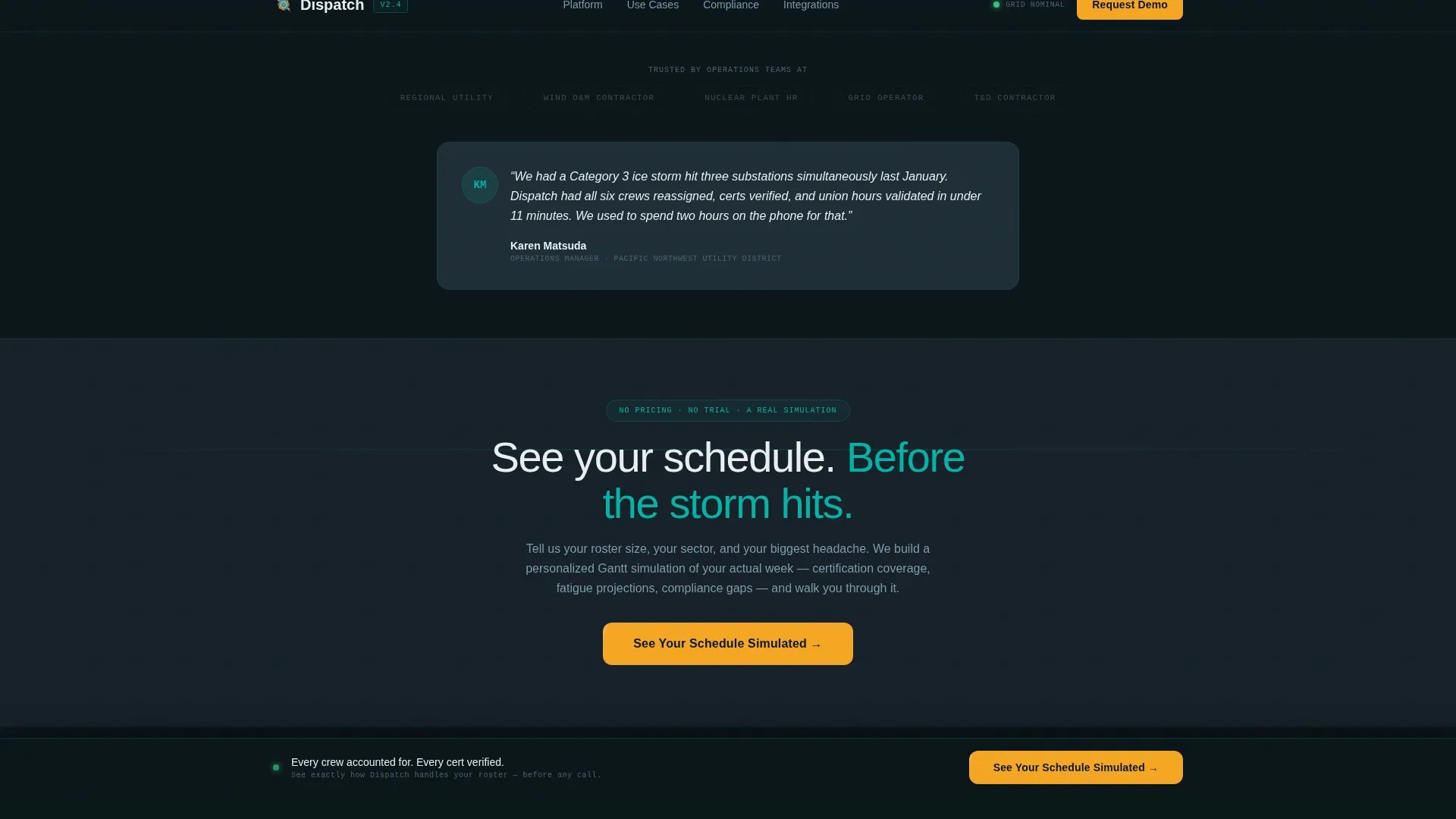
A sticky bottom bar activates after the visitor passes the third spec card. Clicking the "See Your Schedule Simulated" call to action opens a two-step modal. Step one captures company name, fleet size from a dropdown, and energy sector. Step two asks for the visitor's biggest scheduling challenge and preferred demo week. No pricing, no free trial prompt.
Sector-Specific Social Proof
The template includes designated blocks for sector-specific metrics. These are framed around certifications tracked, hours saved, and storm-response performance, connecting proof directly to the operational concerns of utility and energy audiences.
SCADA-Inspired Dark user interface System
The visual system uses a control-room palette with deep black backgrounds, teal status indicators, slate panel surfaces for cards, and amber reserved exclusively for alerts, calls to action, and hover states. Typography pairs DM Sans for headings with JetBrains Mono for data labels and operational readouts, reinforcing the dashboard feel throughout.
High-Interactivity Animation Layer
The template is built for high animation fidelity. Beam borders, a pulsing teal divider, Gantt row reveals, word fade-ins, and scroll-triggered spec card entrances are all specified. Hover states activate on every spec card, and the sticky call-to-action bar transitions smoothly into view based on scroll position.
Page sections overview
| Section | Purpose |
|---|---|
| Hero split screen | Contrast chaos with clarity |
| Spec Card One | Sick-call certification gap |
| Spec Card Two | Ice storm response flow |
| Spec Card Three | Fatigue rule violation |
| Spec Card Four | Compliance audit trail |
| Sticky call to action bar | Persistent demo trigger |
| Two-step modal | Qualified lead capture |
| Footer row | Single-row linear layout |
Design & branding system
The template follows a Data Command theme. Every color choice has operational meaning, mirroring the logic of a live SCADA dashboard where a bright pixel signals something real.
- Color palette: deep control-room black (#0B1519) for backgrounds, operational teal (#00B4A6) for primary elements and status indicators, slate panel gray (#1E2D36) for card surfaces, and catalyst amber (#F5A623) reserved strictly for alerts, calls to action, and hover states
- Typography: DM Sans handles all headings and body text for clean readability; JetBrains Mono is used for data labels, counters, and any code-style operational readouts
- Visual tone: dark, deliberate, and restrained, with every bright element earning its place by carrying meaning
Mobile & speed optimization
The template is designed desktop-first, reflecting how operations managers typically work at consoles and large screens. It is built to remain usable and readable on smaller viewports.
- Responsive layout ensures the split-screen structure adapts cleanly for tablet and mobile viewing
- GPU-accelerated CSS transforms and IntersectionObserver-driven animations are specified to keep scroll-triggered effects smooth without layout jank
- Scroll behavior is handled via native CSS scroll-behavior for lightweight, dependency-reduced performance
How this template helps you convert
The page is structured to build evidence progressively. Each section removes a doubt before the call to action appears, so the visitor arrives at the demo prompt already convinced.
- The hero immediately frames the core value: the platform replaces a chaotic whiteboard with a controlled, compliant schedule, setting the right expectation in the first three seconds.
- The four spec cards act as a structured proof sequence, matching every major scheduling pain point to a visible platform response before any commitment is requested.
- The sticky bar and two-step modal keep the conversion path frictionless and personalized. Offering a simulated schedule built around the visitor's own roster gives them a concrete reason to submit their details.
Other information about this template
This template is built for the energy staff scheduling niche and is optimized for the specific trust signals that operational buyers expect before agreeing to a demo conversation.
- Localization is set to English, United States date format (MM/DD/YYYY), and USD context
- The footer follows a linear single-row pattern, keeping the page end clean and uncluttered
- The template style is classified as Split Screen (50/50) within the Technology category, Energy Software and SaaS subcategory
- The Spec Sheet creative direction means sections are evidence-forward, not emotion-forward, which matches how utility and nuclear HR buyers evaluate software
- The Teal Catalyst color system and Dark Glass Panels header concept are designed as a matched pair for this data-command visual language
- Animation intensity is set to high throughout, covering beam borders, Gantt row reveals, and modal transitions, making the template suitable for showcasing a technically sophisticated product
Theme
Data Command
Creative direction
Spec Sheet
Color system
Teal Catalyst
Style
Split Screen (50/50)
Direction
Lead Generation
Page Sections
Split-screen Hero with Pulse Divider
Scroll-triggered Spec Cards
Sticky Call to Action Bar and Two-step Modal
Sector-specific Social Proof Blocks
Scada-inspired Visual System
High-fidelity Animation Layer
Related questions
Who is this landing page template designed for?
What is the conversion goal of this template?
Does this template include a pricing section?
Can the spec card scenarios be customized?
What design style does this template follow?



