Event Planning Digital Presence Directory Website Template
Dispatch is an event planning client portal landing page built around a Data Command theme. It features a live-feel dashboard with tabbed data views, real-time vendor notifications, a dual-role view toggle, and animated metrics. The page targets corporate event managers, wedding planners, and nonprofit directors who need to move prospects from spreadsheet chaos to a single command center.
by Rocket studio
Quick summary
Dispatch is a single-page event planning client portal template built for lead generation. It opens with an interactive tab switcher that simulates a live dashboard, then guides visitors through escalating capability reveals. The goal is simple: show busy event professionals exactly what their life looks like when every vendor, timeline, and budget item lives on one screen.
Who this template is for
This template is built for event professionals who manage complexity at scale. If your current system is a patchwork of spreadsheets, group chats, and sticky notes, this page speaks directly to your frustration.
- Corporate event managers coordinating multiple vendors across product launches and conferences
- Wedding planners handling overlapping family communication threads and real-time logistics
- Nonprofit directors running galas with mixed volunteer and vendor teams
What problem this template solves
Event planners lose control not because they lack skill, but because their tools fragment the picture. A vendor delay in one app, a budget update in another, a client question in a third tab, it all adds up to missed signals and slow responses.
- No single view that shows timeline, vendors, and budget together in real time
- Clients and planners seeing different, disconnected versions of the same event
- No visual proof of platform capability to convince skeptical prospects to sign up
What you get with this template
You get a fully structured, design-complete landing page that presents your event portal as a professional command center. Every section is purpose-built to demonstrate the product rather than describe it.
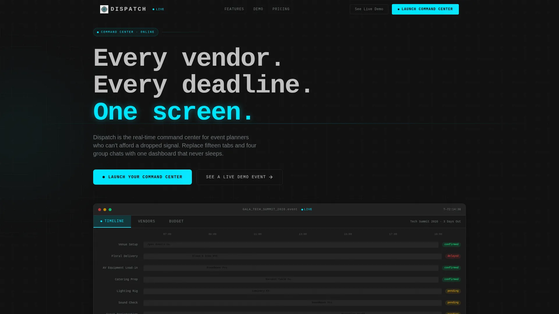
- A Feature Tab Switcher header with three interactive data views: Timeline, Vendors, and Budget
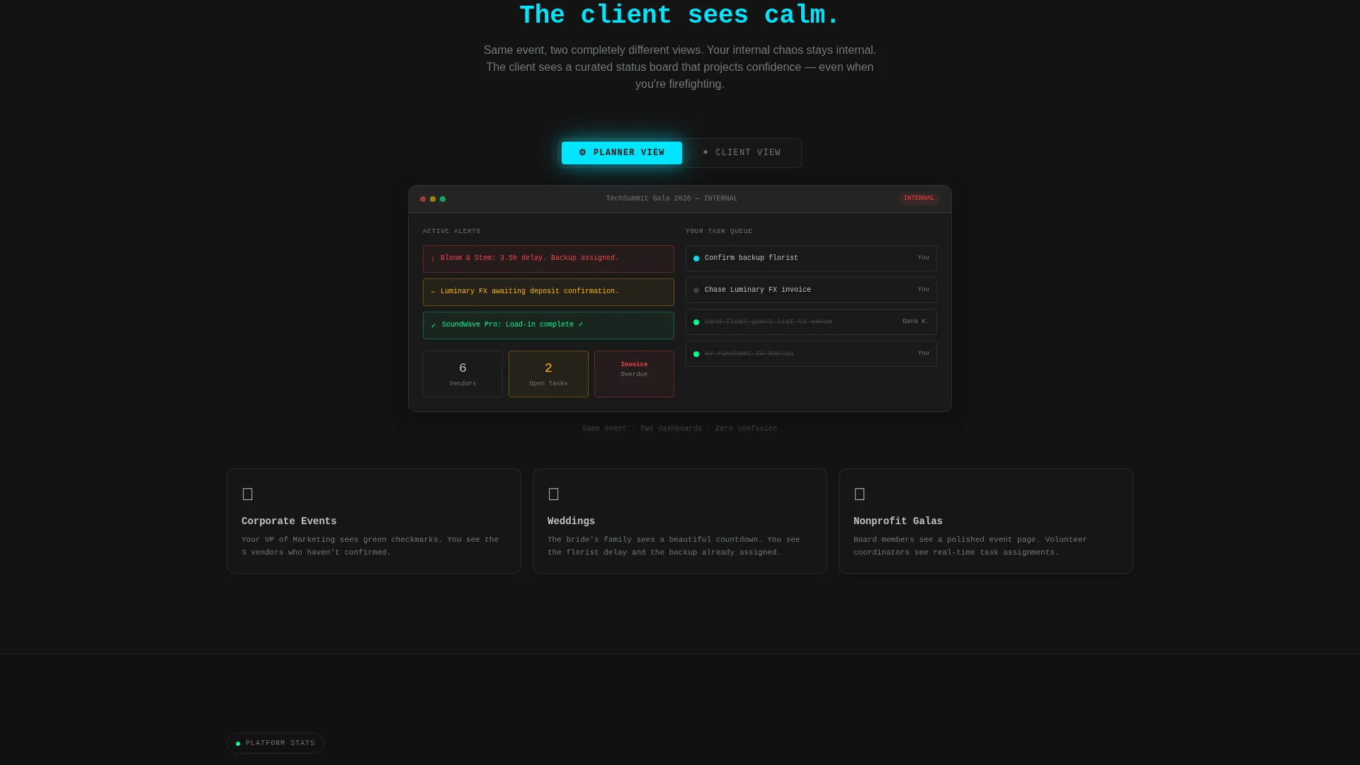
- A real-time notification simulation, a client-versus-planner view toggle, and an animated metrics panel
- A lead capture form and a secondary ghost-button conversion path to a live demo event
Feature list
This template includes purpose-driven components drawn directly from the brief. Each one plays a specific role in the conversion flow.
Interactive Feature Tab Switcher
The header presents a simulated dashboard viewport with three clickable tabs. Timeline shows a Gantt-style bar chart with task names like "Floral Delivery" and "Sound Check" color-coded by status. Vendors displays a card grid with confirmation badges and unread message counts. Budget renders a donut chart with a live ticker of recent line items.
Real-Time Notification Simulation
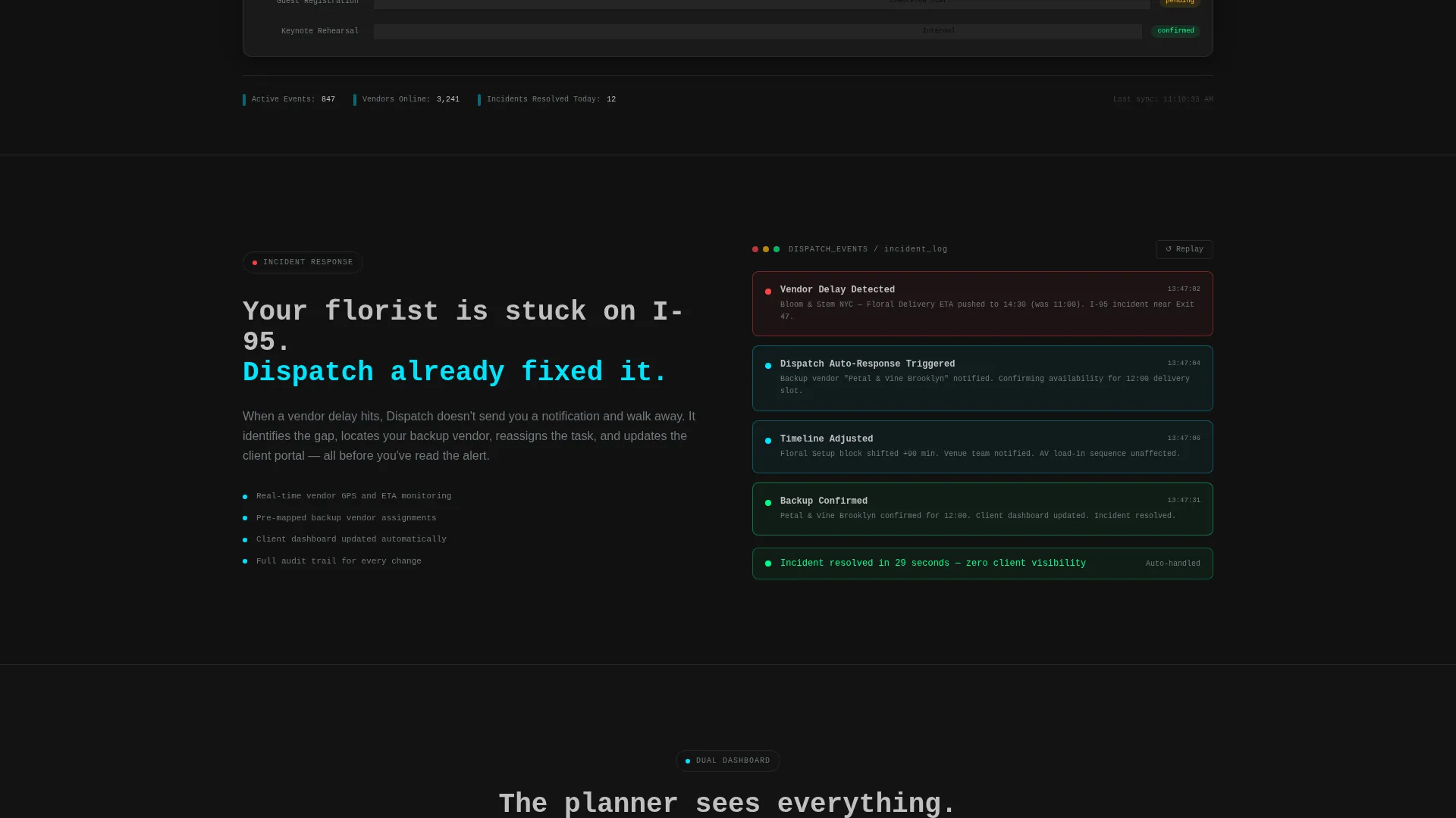
A dedicated section below the header shows a vendor delay auto-triggering a backup assignment. The data is fictional but specific enough to feel pulled from a real event three days out. This demonstrates platform responsiveness without requiring a live backend.
Dual-Role View Toggle
A client-facing view toggle lets visitors flip between the planner dashboard and the client dashboard for the same event. It makes the value of role-based access immediately tangible. No explanation needed; the side-by-side contrast does the work.
Animated Metrics Panel
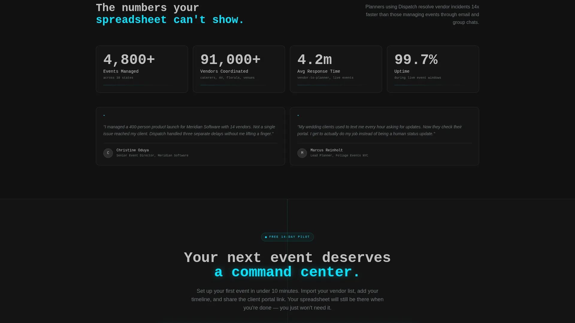
Three counters, Events Managed, Vendors Coordinated, and Average Response Time, spin up as the visitor scrolls into frame. The animation adds energy to the social proof section. Numbers feel earned rather than static.
Lead Capture Form Bar
A horizontal three-field form collects event type via dropdown, estimated guest count, and work email. Below the form, a single line reads "Free 14-day pilot, no card, no call, no commitment." This keeps the ask low and the barrier minimal.
Ghost-Button Demo Path
A secondary conversion path labeled "See a Live Demo Event" opens a read-only dashboard populated with sample data. Skeptical visitors can interact with the product before submitting any contact information. This dual-path approach serves both ready buyers and cautious researchers.
Page sections overview
| Section | Purpose |
|---|---|
| Tab Switcher Header | Hook attention with interactive dashboard views |
| Notification Simulation | Show real-time vendor delay and backup logic |
| View Toggle Panel | Contrast planner and client dashboard perspectives |
| Metrics Counter Panel | Build credibility with animated social proof numbers |
| Primary call to action Form | Capture leads with a low-friction three-field bar |
| Demo Ghost Button | Offer a no-email product preview for skeptical visitors |
Design & branding system
The visual identity follows a Data Command theme using a Monochrome Steel color system. The palette feels like the surface of a milled titanium instrument panel, precise, cold, and purposeful.
- Gunmetal base (#2D2D2D), brushed aluminum mid-tone (#71797E), and bright chrome highlight (#C0C0C0) form the structural layer
- A single electric cyan accent (#00E5FF) is reserved exclusively for live-state indicators, active tabs, and primary call-to-action elements
- Typography uses a monospaced or semi-mono face that reads like terminal output, reinforcing the command center aesthetic
Mobile & speed optimization
The layout is designed to stay functional and readable on smaller screens without losing the dashboard character that makes it distinctive.
- The tab switcher and data views are structured to reflow cleanly on mobile viewports
- Cards, form fields, and counters are sized for touch interaction and clear readability at smaller widths
- The single-page structure keeps the load path short, with no unnecessary page transitions or multi-route navigation
How this template helps you convert
Every section is sequenced to move a skeptical visitor from curiosity to action. The rhythm is fast, dense, and additive.
- The tab switcher creates immediate product engagement before the visitor reads a single headline, making the interface the pitch.
- The escalating capability reveals, notification simulation, view toggle, metrics panel, add a new reason to convert at every scroll stop.
- The dual conversion path (lead form plus demo button) captures both ready buyers and visitors who need more proof before sharing their email.
Other information about this template
This template is categorized under Technology with a subcategory focus on Event Planning Digital Presence. It is purpose-built for the event planning client portal niche.
- The template style is Dashboard and Data Grid, making it distinct from standard marketing landing pages
- The creative direction follows a Launch Energy approach: escalating stakes, fast pacing, and additive information density per scroll section
- The header concept is a Feature Tab Switcher, a pattern suited to software and portal products where showing beats telling
- The fixed top navigation repeats the primary call-to-action so it is always one click away regardless of scroll position
- No stock photography is used; the data visualizations and interface components are the visual product
Theme
Data Command
Creative direction
Launch Energy
Color system
Monochrome Steel
Style
Dashboard/Data Grid
Direction
Lead Generation
Page Sections
Interactive Feature Tab Switcher
Real-time Notification Simulation
Dual-role View Toggle
Animated Metrics Counters
Low-friction Lead Capture Form
Ghost-button Demo Path
Related questions
What kind of business is this template designed for?
Can I change the fictional data in the dashboard views?
Does the template require a real backend or live data feed?
What are the two conversion paths included in this template?
Is this template suitable for an early access or beta product launch?



