Dispatch - Powerful Field Services Landing Page Template
Dispatch is a split-screen landing page template built for home services point-of-sale software. It combines an interactive POS dashboard mockup, a feature matrix layout, and a single click-through call to action. The Tech Glass visual theme and Teal Catalyst color system give it the sharp, command-center feel that field service operators instantly recognize and trust.
by Rocket studio
Quick summary
Dispatch is a single-page, split-screen landing page template designed for home services point-of-sale platforms. It opens with a live interactive dashboard preview and guides visitors through a structured feature matrix before pushing them into a demo environment with one click and zero form fields.
Who this template is for
This template is built for software founders, product marketers, and agencies promoting scheduling, invoicing, and payment tools aimed at field service businesses. It speaks directly to the operators who buy those tools.
- Home services software companies targeting HVAC, plumbing, and electrical contractors
- SaaS teams who need a high-converting demo-first landing page without a lead form
- Agencies building campaign pages for field service point-of-sale products
What problem this template solves
Field service software is hard to explain in a static screenshot. Operators running 5-to-50-person crews need to feel the interface before they trust it. Most landing pages describe features in paragraph blocks, losing the buyer before they reach the call to action.
- No way to show scheduling, dispatching, invoicing, and payment flow in one coherent page view
- Generic SaaS layouts that feel nothing like the rugged, tablet-first tools field techs actually use
- Long sign-up forms that kill conversion before the visitor has seen the product work
What you get with this template
You get a fully structured, single-page layout that walks a visitor from first impression to demo click without a single form field. Every section is purpose-built around a specific stage of the buyer's decision.
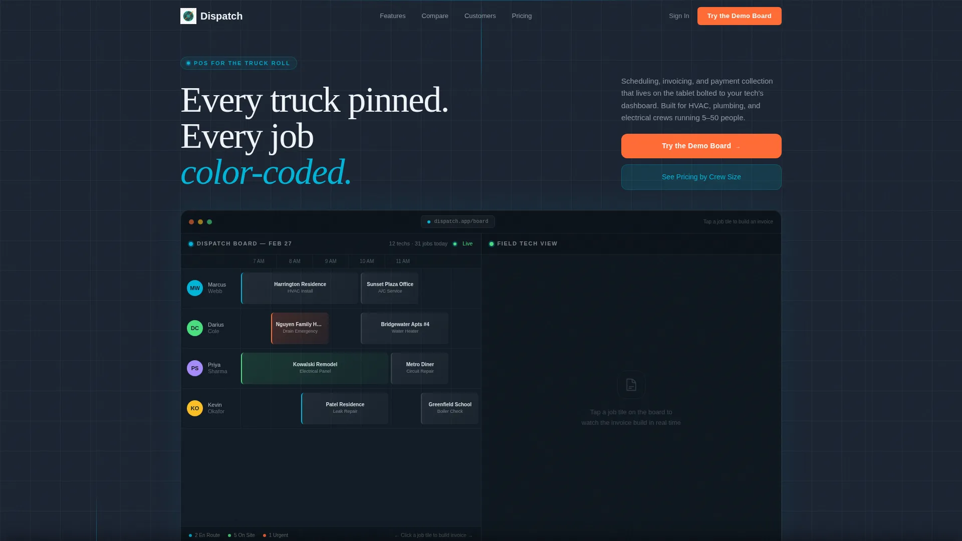
- An interactive split-screen header mockup with a dispatcher view and a field tech tablet view
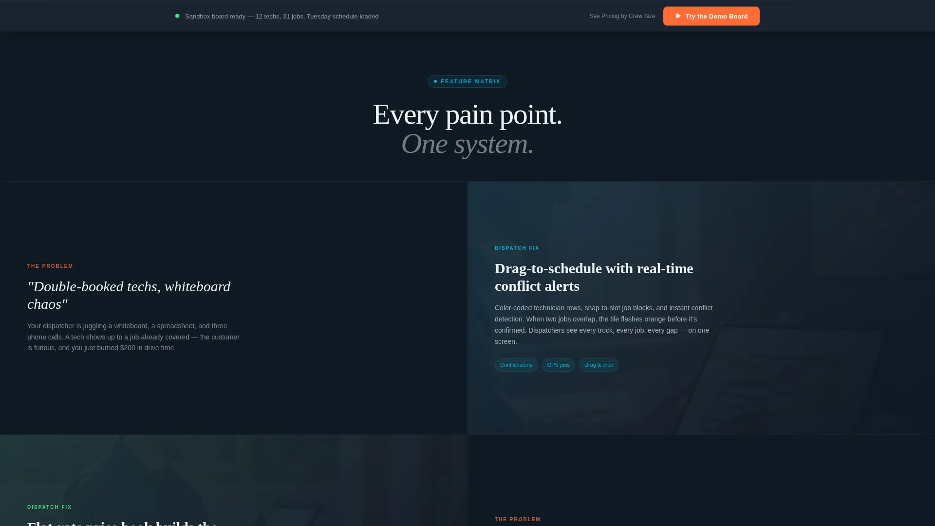
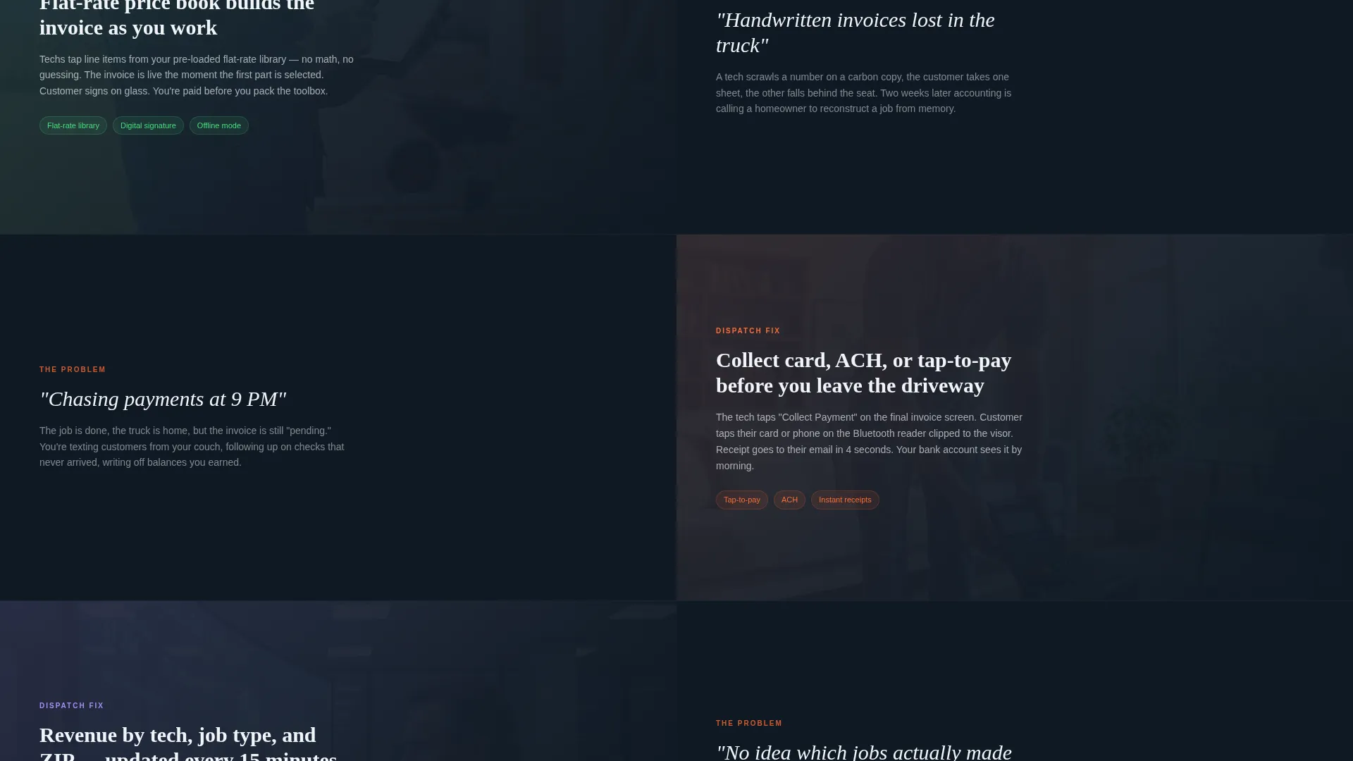
- A scrollable feature matrix pairing real pain points with cropped user interface panels and live-looking data
- A persistent floating call-to-action bar, a competitor comparison table, and a secondary pricing link
Feature list
This template delivers a focused set of layout components and interaction patterns drawn directly from the brief. Each one serves a specific conversion role on the page.
Interactive Split-Screen Header
The header divides the viewport 50/50. The left side shows a dispatcher's scheduling grid with draggable job blocks snapping into technician rows. The right side shows a field tech's tablet view with a live invoice building line by line. Visitors click job tiles and watch them populate on the tech's screen in real time. Teal status indicators pulse subtly to signal live activity.
Feature Matrix Scroll Sections
After the header, each scroll section splits the screen between a pain point on the left and a corresponding feature panel on the right. Sections cover scheduling, dispatching, invoicing, payment, and reporting in sequence. The pacing accelerates slightly with each section, mimicking the momentum of a well-run service day.
Competitor Comparison Table
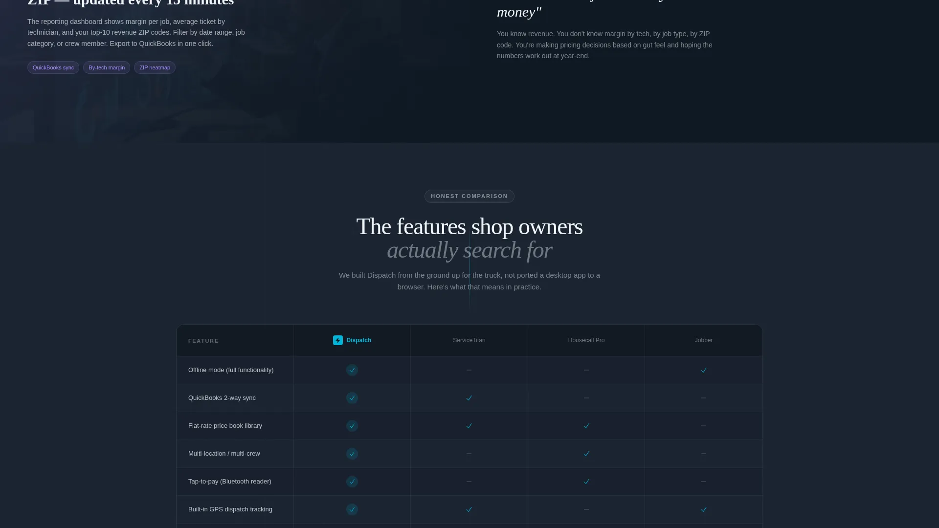
Midway through the page, a horizontal comparison table drops in after the split orientation flips. It shows the featured product against three competitors across metrics that shop owners actively research: offline mode, flat-rate pricing libraries, multi-location support, and accounting sync.
Click-Through Demo call to action System
The primary call to action reads "Try the Demo Board" and appears first as an embedded button inside the header preview. It repeats as a persistent floating bar after the second scroll section. There is no form on the page. One click delivers instant access to a sandbox dispatch board pre-loaded with a fictional 12-technician plumbing company's Tuesday schedule.
Secondary Pricing Link
A text link reading "See Pricing by Crew Size" sits below the primary call to action. It routes visitors who are further down the funnel to a calculator page without interrupting the demo-first flow for visitors who are still evaluating.
Tech Glass Visual Theme
The layout uses the Teal Catalyst color system: deep command-center charcoal (#1B2432), active-state teal (#00B4D8), interface white (#F0F4F8), and conversion-orange (#FF6B35). Orange is reserved exclusively for calls to action and urgent status badges. The result feels like a freshly booted tablet screen in a dim cab.
Page sections overview
| Section | Purpose |
|---|---|
| Interactive Header Preview | Hooks visitors with a clickable split-screen POS mockup |
| Scheduling Pain Point | Pairs double-booking problem with scheduling grid panel |
| Dispatching Pain Point | Shows dispatcher view solving real-time crew conflicts |
| Invoicing Pain Point | Contrasts handwritten invoices with live invoice builder |
| Payment Pain Point | Addresses late payment chasing with in-field payment panel |
| Reporting Pain Point | Closes feature matrix with end-of-day reporting view |
| Competitor Comparison Table | Benchmarks product against three rivals on key metrics |
| Floating call to action Bar | Persists after second section to capture ready-to-click visitors |
| Secondary Pricing Link | Routes funnel-aware visitors to a crew-size pricing calculator |
Design & branding system
The Teal Catalyst palette is intentionally narrow. It creates immediate visual hierarchy without relying on decorative elements. Every color has a defined role and does not cross into another section's function.
- Deep charcoal (#1B2432) as the base background, giving every element a backlit, command-center contrast
- Active teal (#00B4D8) for status indicators, interactive highlights, and interface accents that pulse on hover
- Conversion-orange (#FF6B35) used only for primary call-to-action buttons and urgent status badges, keeping it visually distinct
Mobile & speed optimization
The split-screen layout is designed with field-context users in mind. A contractor reviewing a vendor's page from a phone in a parking lot needs the same clarity as a desktop viewer in an office.
- The 50/50 viewport split collapses gracefully into a stacked single-column layout on smaller screens
- Interactive mockup elements are touch-friendly, maintaining the tablet-first feel of the product being marketed
How this template helps you convert
The conversion strategy is built around letting visitors experience the product before they are asked to do anything. This removes the trust gap that kills most SaaS landing pages.
- The interactive header preview turns passive scrollers into active participants within seconds of landing, creating a hands-on first impression that no static screenshot can replicate.
- The demo-first call-to-action flow removes all friction: no form, no email required, one click to a pre-loaded sandbox board that proves the interface is learnable in under a minute.
Other information about this template
This template is suited for teams building in modern front-end environments that support component-based layouts. The interactive mockup behavior described in the brief can be implemented using lightweight JavaScript interaction patterns without heavy dependencies.
- The fictional 12-technician plumbing company sandbox referenced in the brief provides immediate context for demo visitors, reducing the cognitive load of an empty interface
- The page structure supports A/B testing on call to action placement since the primary button appears both embedded in the header and in the persistent floating bar
- The competitor comparison table section can be updated independently of the rest of the scroll flow, making it easy to keep benchmark data current
- This template is well-suited for home services software products marketed under brand names common in the field service management and field service point-of-sale space
Theme
Tech Glass
Creative direction
Feature Matrix
Color system
Teal Catalyst
Style
Split Screen (50/50)
Direction
Click-Through
Page Sections
Interactive Split-screen Header Mockup
Scrollable Feature Matrix Layout
Competitor Comparison Table
Demo-first Call to Action System
Tech Glass Color System
Secondary Pricing Funnel Link
Related questions
Does this template include a lead capture form?
Can I update the competitor comparison table with different products?
Is the interactive header mockup connected to a live system?
Who is the intended visitor for this landing page?
Can the Teal Catalyst color system be customized?



