Franchise Digital Presence Reviews & Social Proof Website Template
Dispatch is a split-screen franchise email newsletter landing page template built for multi-unit operators who need every location sending on-brand emails without design chaos. It uses a deep Midnight Blue visual system, a product-screenshot header, and a spec-sheet scroll rhythm that proves each feature with real interface evidence. The primary call to action drives visitors straight into a guided demo.
by Rocket studio
Quick summary
Dispatch is a plug-and-play franchise email newsletter landing page template built for operators managing dozens of locations. The Midnight Blue color system and split-screen layout give it a command-center feel. Every scroll section pairs a bold capability claim with a user interface screenshot, building trust fast and funneling visitors toward a single, frictionless demo click.
Who this template is for
This template was designed for the people losing sleep over inconsistent franchise emails. It serves operators who need brand control at scale without hiring a designer for every unit.
- Multi-unit franchise owners managing ten, thirty, or fifty-plus locations
- Marketing directors at franchise headquarters tired of off-brand emails from individual units
- Emerging franchise brands scaling up quickly and losing inbox consistency as they grow
What problem this template solves
When every franchisee sends their own emails, brand drift is inevitable. Some units go off-script visually, others skip sends entirely, and headquarters has no clear view of what went out or when.
- Inconsistent email design across locations erodes brand trust with customers
- Franchise operators waste time manually correcting individual unit emails before each send
- Marketing teams have no easy way to preview, lock, or audit what each location is sending
What you get with this template
You get a fully structured, single-page landing page designed to showcase a franchise email newsletter platform. The layout is ready to populate with your product screenshots and copy.
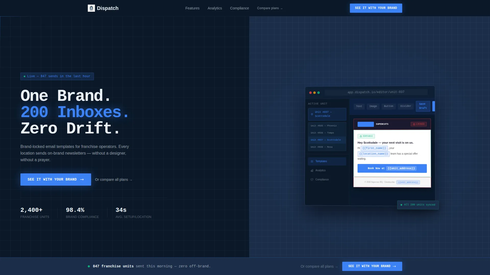
- A 50/50 split-screen header with a headline panel and a product screenshot panel
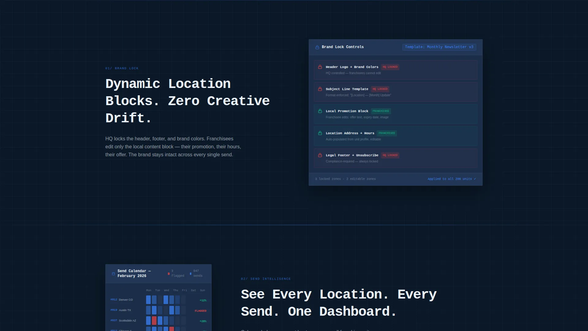
- A spec-sheet scroll body with three paired claim-and-proof sections covering brand lock, send calendars, and compliance
- A sticky bottom call-to-action bar that appears after the third feature section, plus a secondary text link beneath each primary button
Feature list
This landing page template is built around a tight set of purposeful components. Each one serves the core goal of showing the product working rather than just describing it.
Split-Screen Hero Header
The header divides the viewport evenly. The left panel holds an oversized mono-weight headline and the primary call-to-action button. The right panel displays a product screenshot angled at a subtle 2-degree tilt with a soft shadow, floating above a faint grid for depth.
Spec-Sheet Scroll Sections
Three feature sections follow the header in a claim-and-proof rhythm. Each section pairs a single bold capability label on the left with a matching interface screenshot on the right. The structure rewards skeptical visitors by showing the product in action at every scroll step.
Brand-Lock Controls Section
The first spec section showcases locked versus unlocked template zones. Visitors can see visually which parts of an email a franchise unit can edit and which parts headquarters has locked for brand consistency.
Send Calendar Heatmap Section
The second spec section displays a send-calendar heatmap with all franchise units color-coded by engagement level. This gives prospects an immediate sense of the scheduling and visibility features the platform provides.
Compliance Audit Panel Section
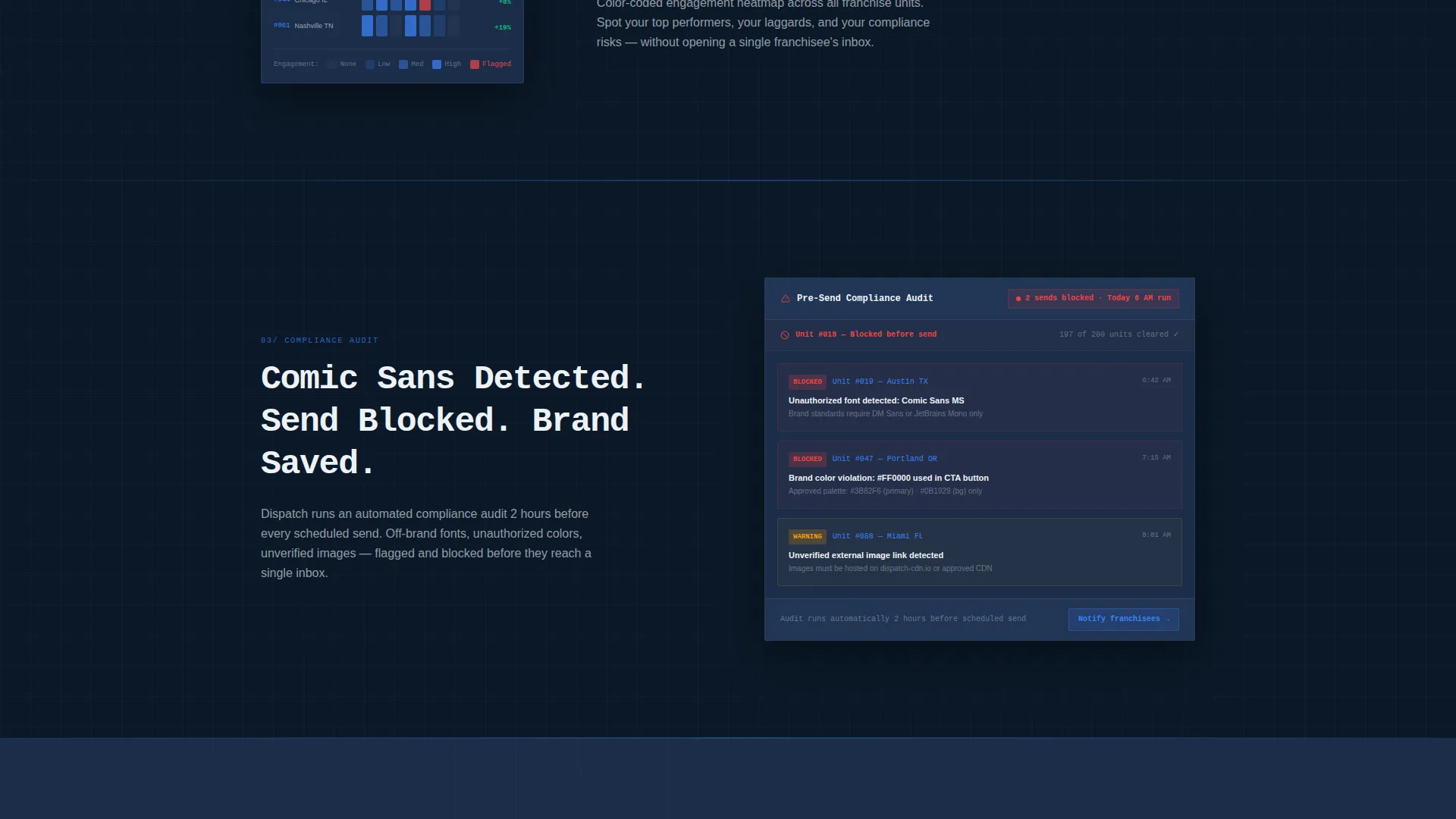
The third spec section shows a compliance panel flagging an off-brand email before it deploys. The visual proof makes the safety-net value immediately clear without requiring any explanatory text.
Sticky Call-to-Action Bar
After the third spec section, a persistent bottom bar carries the primary call-to-action forward. A secondary text link reading "Or compare all plans" sits beneath each primary button for visitors already further along in their decision.
Page sections overview
| Section | Purpose |
|---|---|
| Split-Screen Hero | Deliver the headline and product screenshot side by side |
| Brand-Lock Controls | Show locked versus editable template zones visually |
| Send Calendar Heatmap | Display franchise-wide scheduling and engagement color map |
| Compliance Audit Panel | Prove pre-send off-brand flagging with a user interface screenshot |
| Sticky call to action Bar | Reinforce the demo click after all three proof sections |
Design & branding system
The visual identity follows a Startup Velocity theme anchored in a Midnight Blue color system. The palette is built to feel like mission control: dark, precise, and purposeful, with every bright element earning its presence.
- Deep command-center navy (#0B1929) fills backgrounds; steel-panel blue (#1B2E4A) surfaces cards and section breaks
- Electric launch-blue (#3B82F6) fires across buttons and progress indicators to draw the eye exactly where action is needed
- Crisp terminal white (#EDF2F7) handles all body text and interface chrome for maximum contrast against the dark base
Mobile & speed optimization
The split-screen layout is structured to adapt cleanly when the viewport narrows. The 50/50 split collapses into a stacked single-column flow on smaller screens so neither panel crowds the other.
- The header panels stack vertically on mobile, keeping the headline and screenshot both fully visible
- The sticky call-to-action bar remains anchored at the bottom of the viewport across all screen sizes
- Section spacing and type sizing are set to stay readable without requiring the user to zoom or scroll sideways
How this template helps you convert
Every design and copy decision in this template is pointed at a single outcome: getting the visitor to click into the demo environment.
- The header puts the product screenshot front and center before a single word of body copy is read, so the value is visual and immediate.
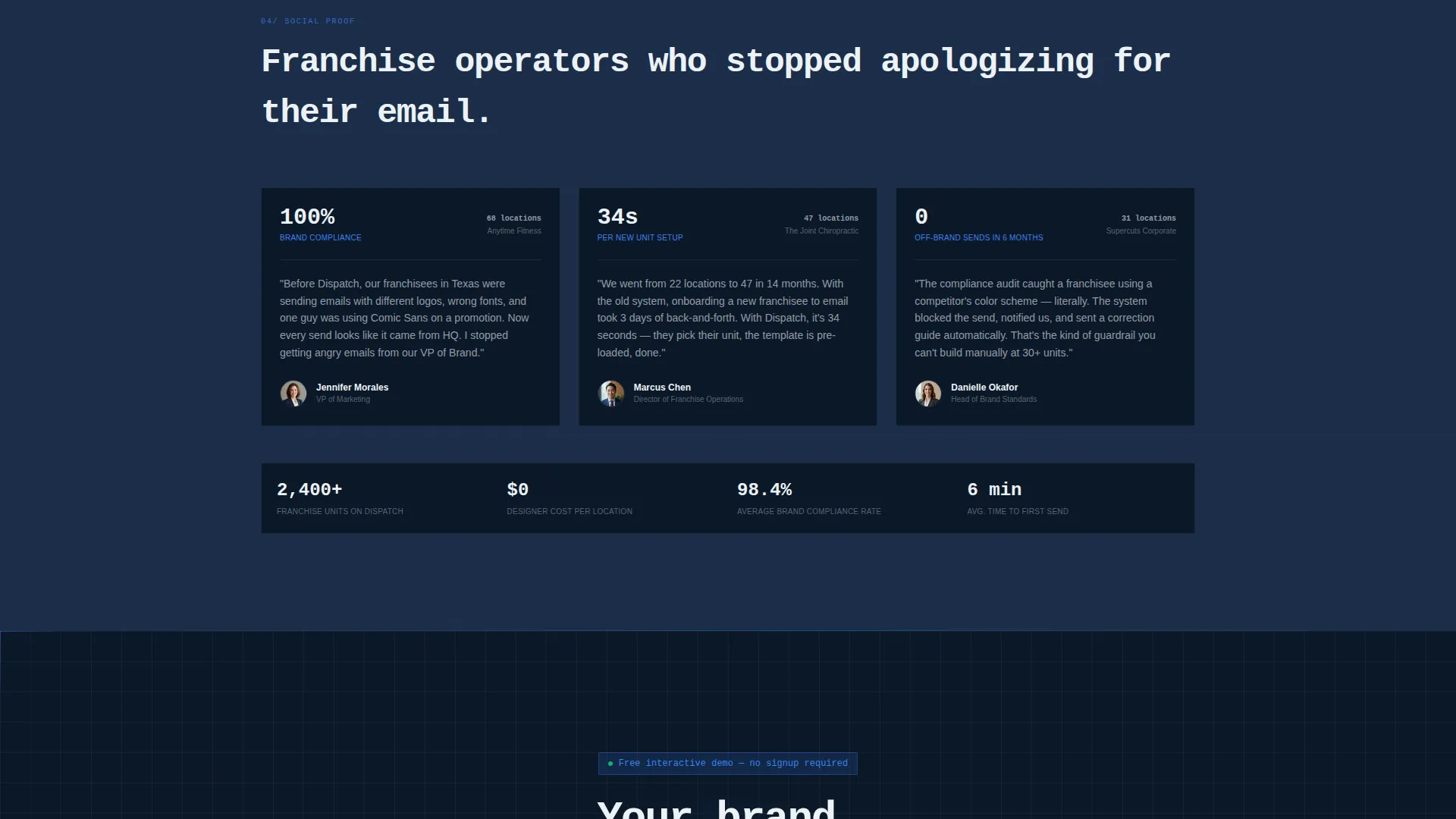
- The three spec sections build a cumulative proof chain, and the sticky call-to-action bar catches visitors the moment they are convinced, without making them scroll back to the top.
Other information about this template
This template is part of a broader category of franchise digital presence tools designed to help emerging and established brands maintain consistency across their unit networks.
- The "See It With Your Brand" call-to-action is designed to land visitors in a guided demo pre-loaded with a sample franchise, removing friction from the first meaningful product interaction
- No form is present on the page; the conversion path is a single click that bypasses lead-capture friction entirely
- The template is suited for franchise email newsletter platform providers, email marketing tool vendors targeting multi-unit operators, and franchise development teams building self-serve onboarding flows
- The Spec Sheet creative direction and Product Screenshot header concept make this layout equally useful for other software-as-a-service products that lead with visual proof over written description
Theme
Startup Velocity
Creative direction
Spec Sheet
Color system
Midnight Blue
Style
Split Screen (50/50)
Direction
Click-Through
Page Sections
Split-screen Hero Header
Claim-and-proof Scroll Sections
Brand-lock Controls Visual
Send Calendar Heatmap Visual
Compliance Audit Panel Visual
Sticky Call-to-action Bar
Related questions
Who is this landing page template built for?
Does this template include a lead-capture form?
Can I replace the product screenshots with my own images?
How many call-to-action placements does this template include?



