Healthcare Software Professional Website Template
Dispatch is a split-screen healthcare field service landing page template built for platforms that route biomedical engineers, mobile nurses, and equipment technicians to care facilities. With a Stats-First Impact layout, Dynamic Motion animations, and a dark Void & Violet color system, it turns field service data into a compelling lead generation experience.
by Rocket studio
Quick summary
Dispatch is a high-impact, single-page template designed for healthcare field service management platforms. It pairs hard operational metrics with live-feeling product visuals in a 50/50 split-screen layout. The dark Void & Violet palette and scroll-triggered animations create a sense of clinical urgency, guiding ops directors, medical device teams, and home health agencies straight toward a demo request.
Who this template is for
This template speaks directly to the people making real-time decisions about field operations in healthcare. If your platform manages technicians, nurses, or equipment service teams, this landing page was built for your sales motion.
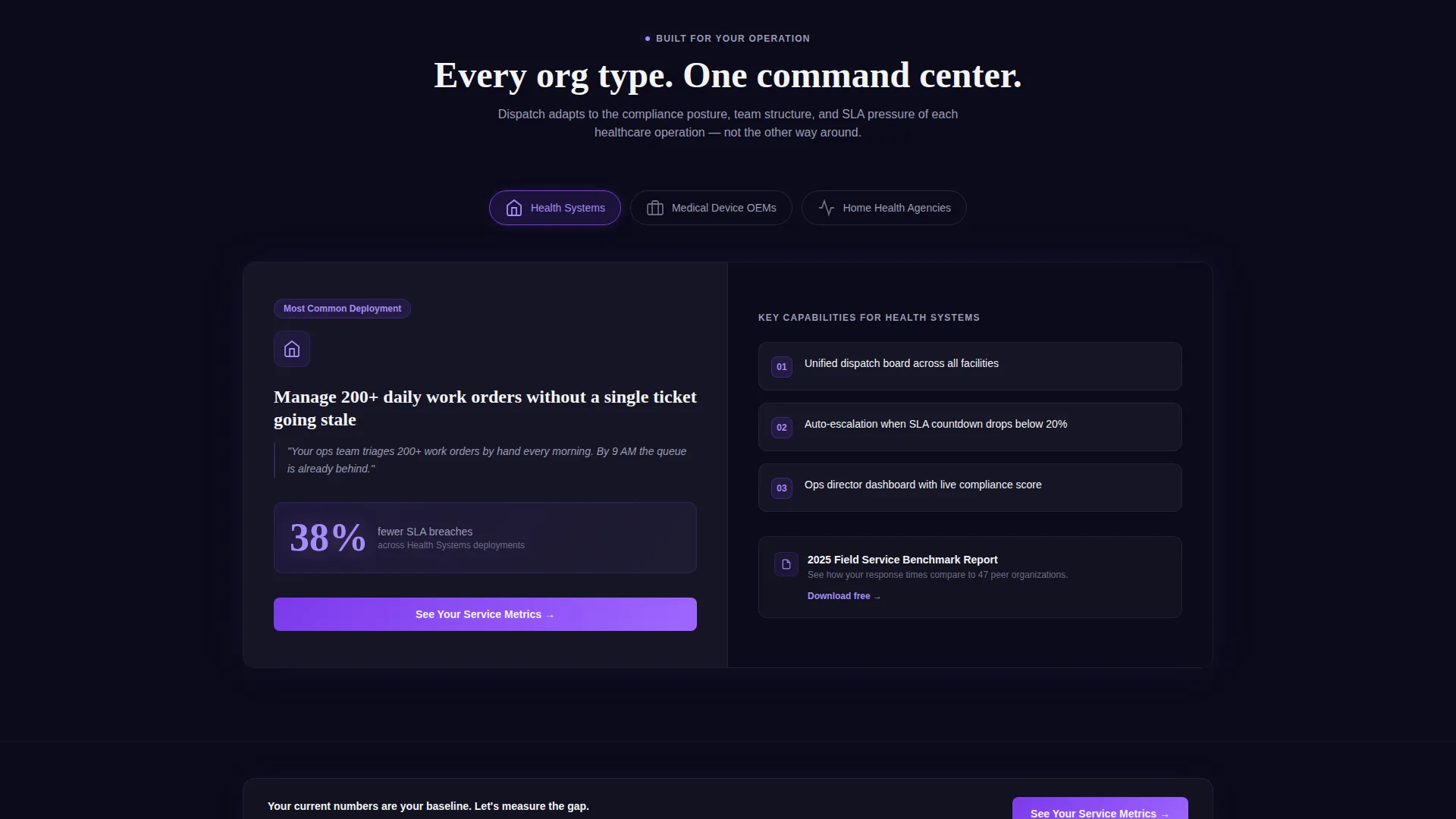
- Regional health system operations directors managing 200 or more daily work orders
- Medical device original equipment manufacturers (OEMs) coordinating field technicians across multiple states
- Home health agencies where late arrivals create compliance exposure, not just scheduling friction
What problem this template solves
Healthcare field service platforms face a trust problem. Buyers need to feel that your software is as fast, accurate, and reliable as the environments it serves. A generic product page with stock photography and vague benefit statements cannot carry that weight. Dispatch solves this by leading with proof and building credibility before the form ever appears.
- Visitors absorb six hard metrics before reaching a call to action, making their current numbers feel unacceptable
- The Stats-First Impact layout removes the gap between "interesting product" and "I need this now"
- Progressive qualification in the lead capture flow reduces form abandonment by matching ask size to visitor readiness
What you get with this template
Dispatch delivers a fully structured, visually complete landing page ready for healthcare field service use cases. Every section is purposefully ordered, and the lead capture flow is already built into the page architecture.
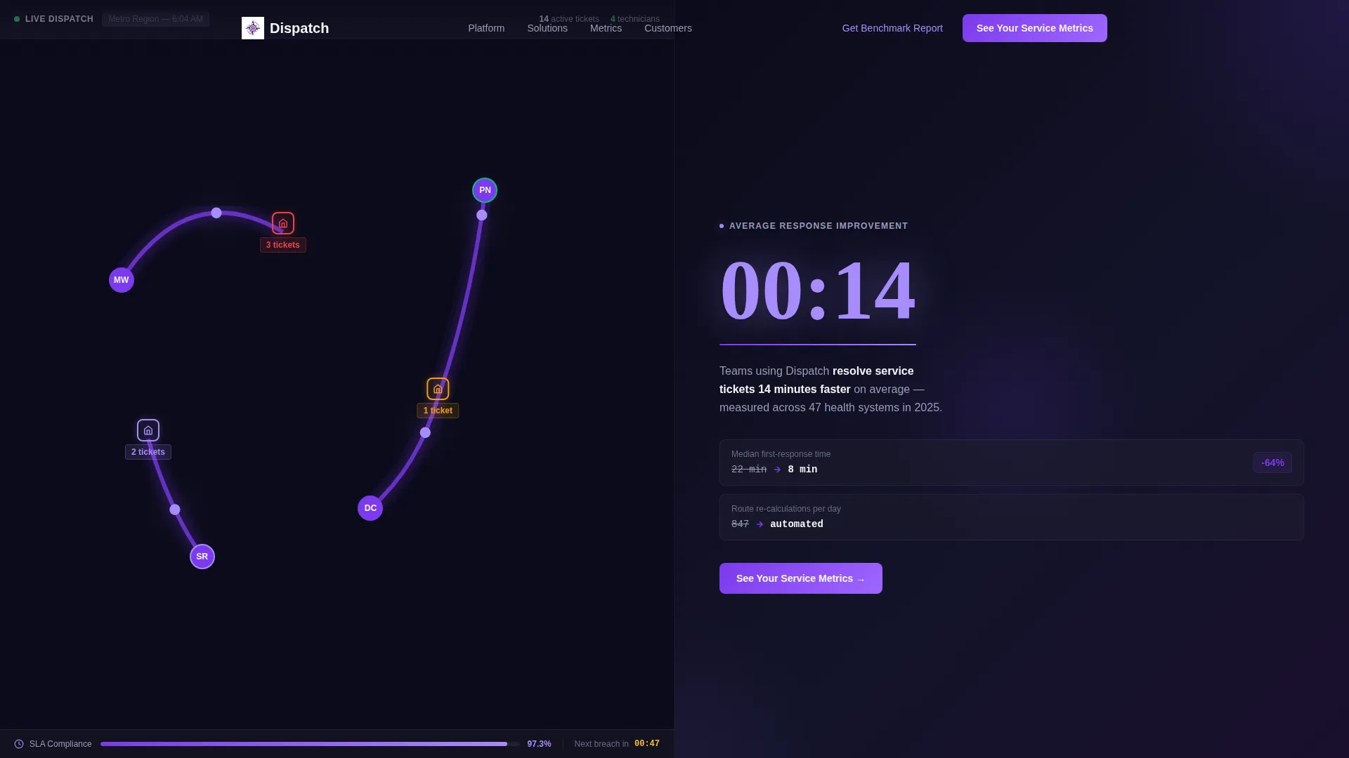
- A split-screen header featuring a live dispatch dashboard screenshot and an animated response-time stat
- Metric-first split sections pairing hard numbers with the product features that produce them
- A two-step lead capture form and a secondary downloadable benchmark report gate for softer conversions
Feature list
This template includes purpose-built components that match the operational urgency of healthcare field service platforms. Each feature below is grounded in the source brief.
Split-Screen Header with Animated Stat
The header divides into two equal panels. The left panel shows a live dispatch dashboard mid-action, with violet route lines branching across a metro map, a technician card in motion, and a real-time SLA countdown at 97.3%. The right panel displays "14-minute average response improvement" in oversized typography, with a number that ticks down like a stopwatch on page load.
Stats-First Section Architecture
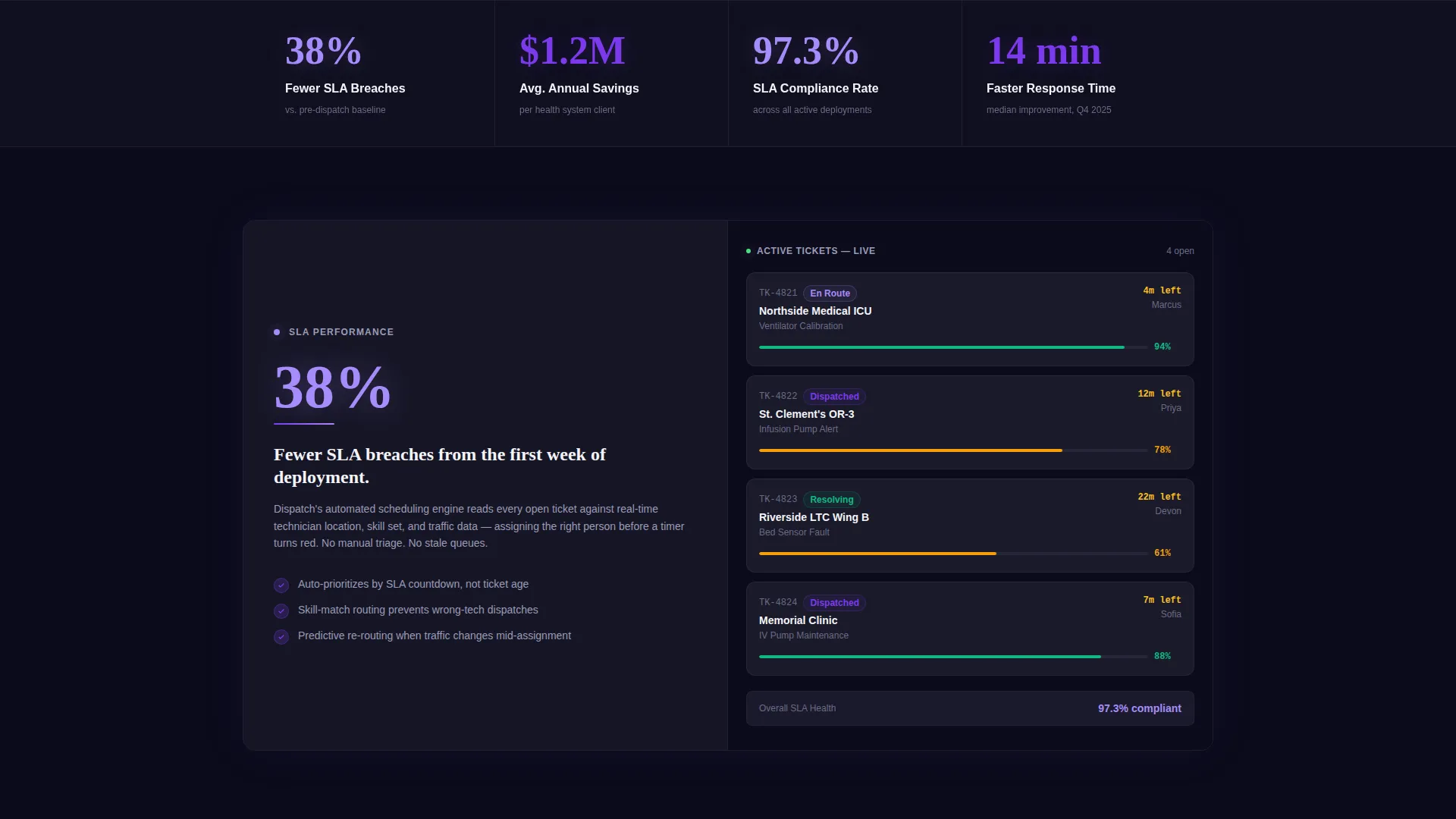
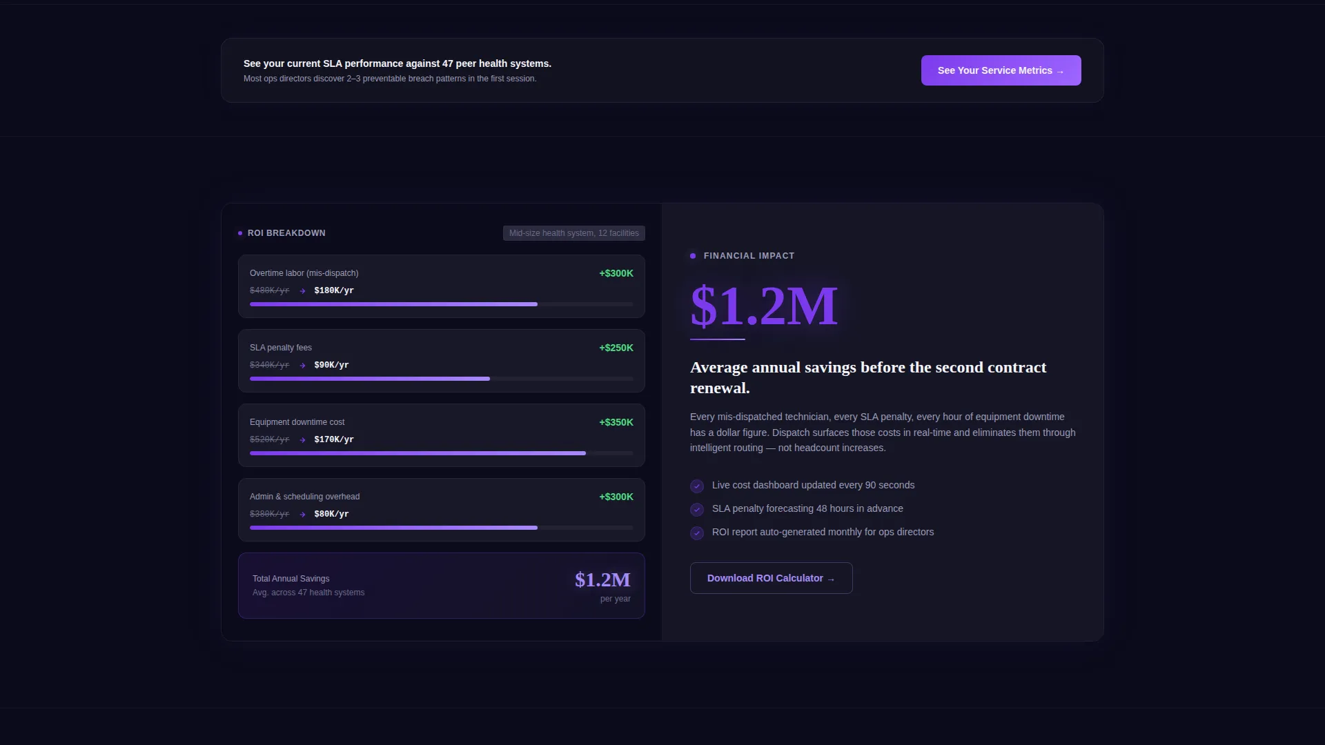
Every scroll depth opens with a metric before its explanation. Visitors see "38% fewer SLA breaches" before reading about automated scheduling, and "$1.2M average annual savings" before the return-on-investment calculator section loads. Each split section pairs a hard number on one side with the product capability that drives it on the other, connected by a violet accent line.
Scroll-Triggered Motion System
Counters animate when they enter the viewport. Route lines draw themselves across embedded map visuals. Technician avatars pulse when shown in an active state. Motion is constant but controlled, designed to feel like a live dispatch board rather than decorative animation.
Progressive Two-Step Lead Form
The primary call to action, "See Your Service Metrics," appears at the header and repeats after every third section. Clicking opens a two-step form. Step one captures organization type, fleet size range, and current average response time. Step two collects name, work email, and preferred demo window.
Secondary Benchmark Report Gate
A softer conversion path offers a downloadable "Field Service Benchmark Report" gated behind email-only capture. This accommodates visitors who are not yet ready to book a demo, keeping them in the funnel without forcing a hard commitment.
Void & Violet Dynamic Motion Theme
The full page uses a coordinated color and motion system. Void black dominates backgrounds, electric violet powers calls to action and progress indicators, clinical slate frames cards and panels, and sterile white carries body text. Soft lavender accents mark live-state elements like active technician cards and open ticket indicators.
Page sections overview
| Section | Purpose |
|---|---|
| Split-Screen Header | Anchor attention with a live dashboard visual and an animated response-time metric |
| Stats Impact Row | Lead with "38% fewer SLA breaches" before the scheduling feature explanation |
| Savings Metric Split | Show "$1.2M average annual savings" before the return-on-investment section |
| Feature Proof Splits | Pair each hard metric with the product capability that produces it |
| Repeat call to action Block | Re-surface "See Your Service Metrics" after every third content section |
| Two-Step Lead Form | Qualify visitors by org type, fleet size, and response time before collecting contact details |
| Benchmark Report Gate | Offer email-only download for visitors not ready for a demo conversation |
Design & branding system
The Void & Violet color system was chosen to evoke a hospital environment at night, lit only by monitoring screens. Every color decision serves a functional purpose in the layout.
- Deep void black (#0B0B1A) for all primary backgrounds, keeping the focus on data and metrics
- Electric violet (#7C3AED) for calls to action, progress indicators, and the accent lines connecting metrics to features
- Clinical slate (#1E1E2E) for cards, panels, and data containers; sterile white (#F4F4F8) for all body typography
- Soft lavender (#A78BFA) as a pulse accent on live-state elements such as active technician avatars and open service tickets
Mobile & speed optimization
The split-screen layout is designed to reflow cleanly at smaller viewport sizes, so the template stays functional whether a buyer views it on a desktop in an operations center or on a phone between facility visits.
- Split-screen sections collapse to single-column stacks on mobile, keeping metric and feature pairs readable
- Scroll-triggered animations are scoped to entry points so they fire once per section and do not loop unnecessarily
- Typography scales are set so oversized stat figures remain legible and impactful at every screen width
How this template helps you convert
Dispatch earns the conversion by the time a visitor reaches the form. The page is structured to move buyers from skepticism to urgency through proof, not persuasion.
- Six hard metrics are delivered before the first call-to-action form appears, making the visitor's current operational numbers feel like a problem worth solving today
- The progressive two-step form reduces friction by asking for organizational context first and contact details second, matching the ask to the visitor's demonstrated intent
- The benchmark report download provides a second conversion path for buyers earlier in their decision process, keeping them engaged without requiring a demo commitment
Other information about this template
Dispatch is built as a single landing page, not a multi-page site. It is designed for healthcare field service software companies that need a focused, high-trust lead generation page to support sales outreach or paid traffic campaigns.
- The template is suitable for platforms serving biomedical engineering dispatch, mobile nursing coordination, and medical equipment service management
- The color system and motion design are fully defined in the template, giving your design team a clear starting point for brand adaptation
- The "Field Service Benchmark Report" gate component can be repurposed for any gated asset relevant to your platform's target audience
- This template fits naturally into a broader go-to-market stack where the landing page handles top-of-funnel qualification before a sales team takes over
Theme
Dynamic Motion
Creative direction
Stats-First Impact
Color system
Void & Violet
Style
Split Screen (50/50)
Direction
Lead Generation
Page Sections
Split-screen Header with Live Dashboard Visual
Stats-first Metric and Feature Pairings
Scroll-triggered Animation System
Progressive Two-step Lead Capture Form
Secondary Benchmark Report Download Gate
Void & Violet Color and Motion Identity
Related questions
Who is the primary audience for this template?
What conversion paths does the template include?
Can the color system and motion theme be customized?
Does this template work as a multi-page site?
What makes the Stats-First layout different from a standard product page?



