Dispatch - Powerful Holiday Landing Page Template
Dispatch is a dashboard-style holiday email builder landing page built for Shopify operators and email designers who need to move fast. It features a Feature Tab Switcher header, an animated comparison data grid, and a six-template interactive preview explorer, all wrapped in a void-black and deep-violet visual system that feels like mission control for your busiest sending season.
by Rocket studio
Quick summary
Dispatch is a single-page template built around a dashboard and data grid layout. It is designed for e-commerce email builders who need to ship holiday campaigns quickly. The Feature Tab Switcher header, live comparison grid, and interactive email preview explorer work together to show visitors exactly what they gain, before they ever click "Start Building Free."
Who this template is for
This template speaks directly to the people who are still working at midnight in November. It is built for operators who know what they need but are tired of tools that slow them down.
- Direct-to-consumer founders who manage their own Shopify store and need holiday emails ready fast
- Marketing managers at mid-market brands responsible for producing multiple holiday campaign variants under tight deadlines
- Freelance email designers handling several client calendars at once during peak sending season
What problem this template solves
Holiday email campaigns compress into a brutal window. The gap between "we need twelve variants by Monday" and "it's done" is where most teams lose hours, confidence, and revenue. Dispatch closes that gap with a page layout that makes the product's speed feel real and immediate.
- Teams waste time switching between tools and rebuilding the same campaign structures from scratch each season
- Buyers cannot tell if an email builder is genuinely fast until they are already inside it, this template proves it visually before signup
- The absence of a clear workflow comparison leaves analytical buyers unconvinced, stalling the decision
What you get with this template
You get a fully structured, dark-theme landing page built around interactive elements that do the selling for you. Every section escalates the visitor's understanding from features to proof to direct action.
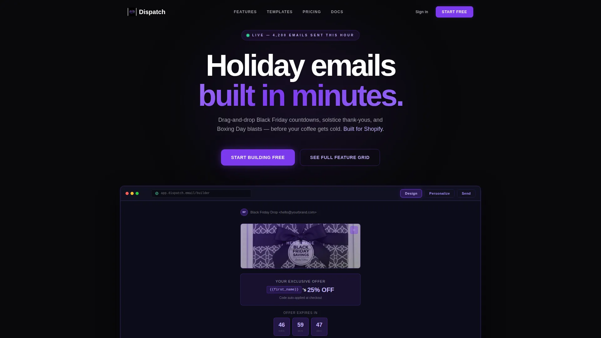
- A browser-chrome Feature Tab Switcher header with three tabs ("Design," "Personalize," "Send") that swap interior content instantly
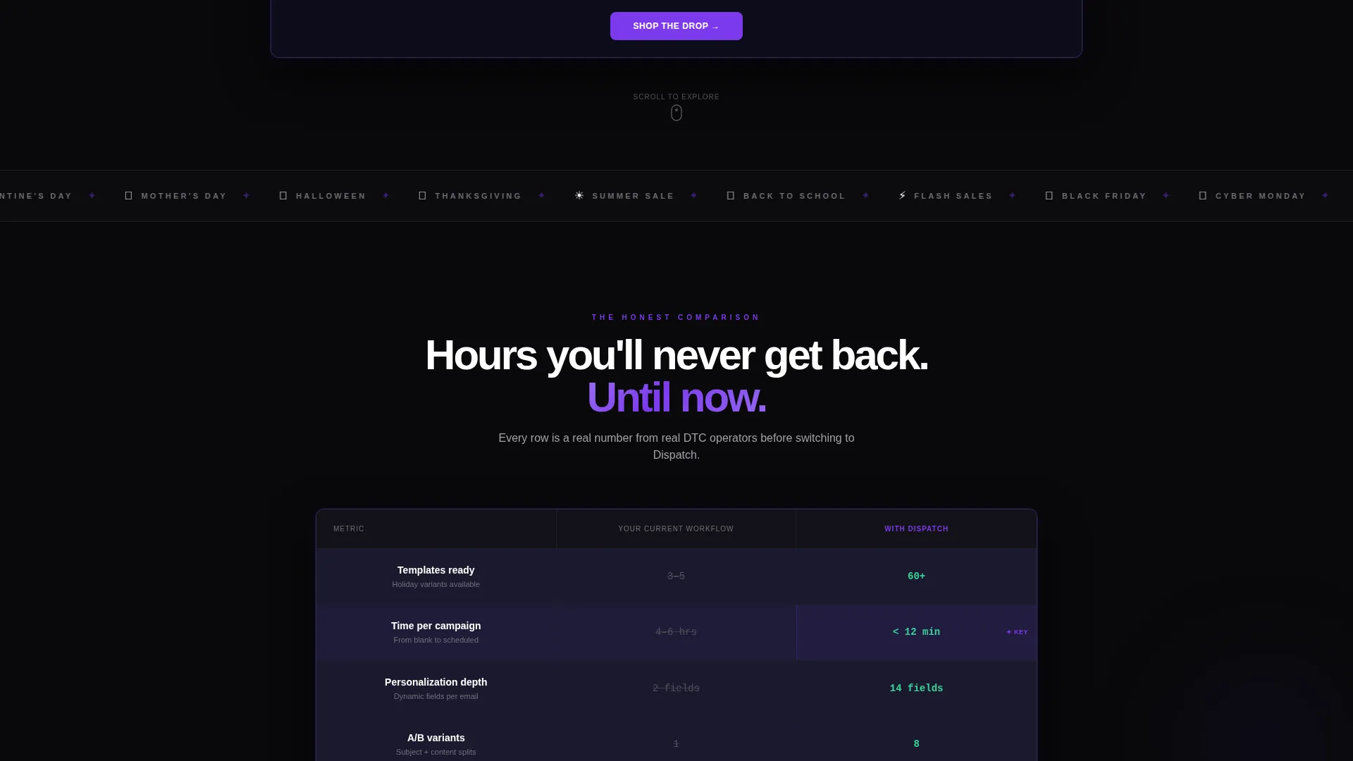
- An animated comparison data grid contrasting "Your Current Workflow" with "With Dispatch" across metrics like template count, send speed, and personalization depth
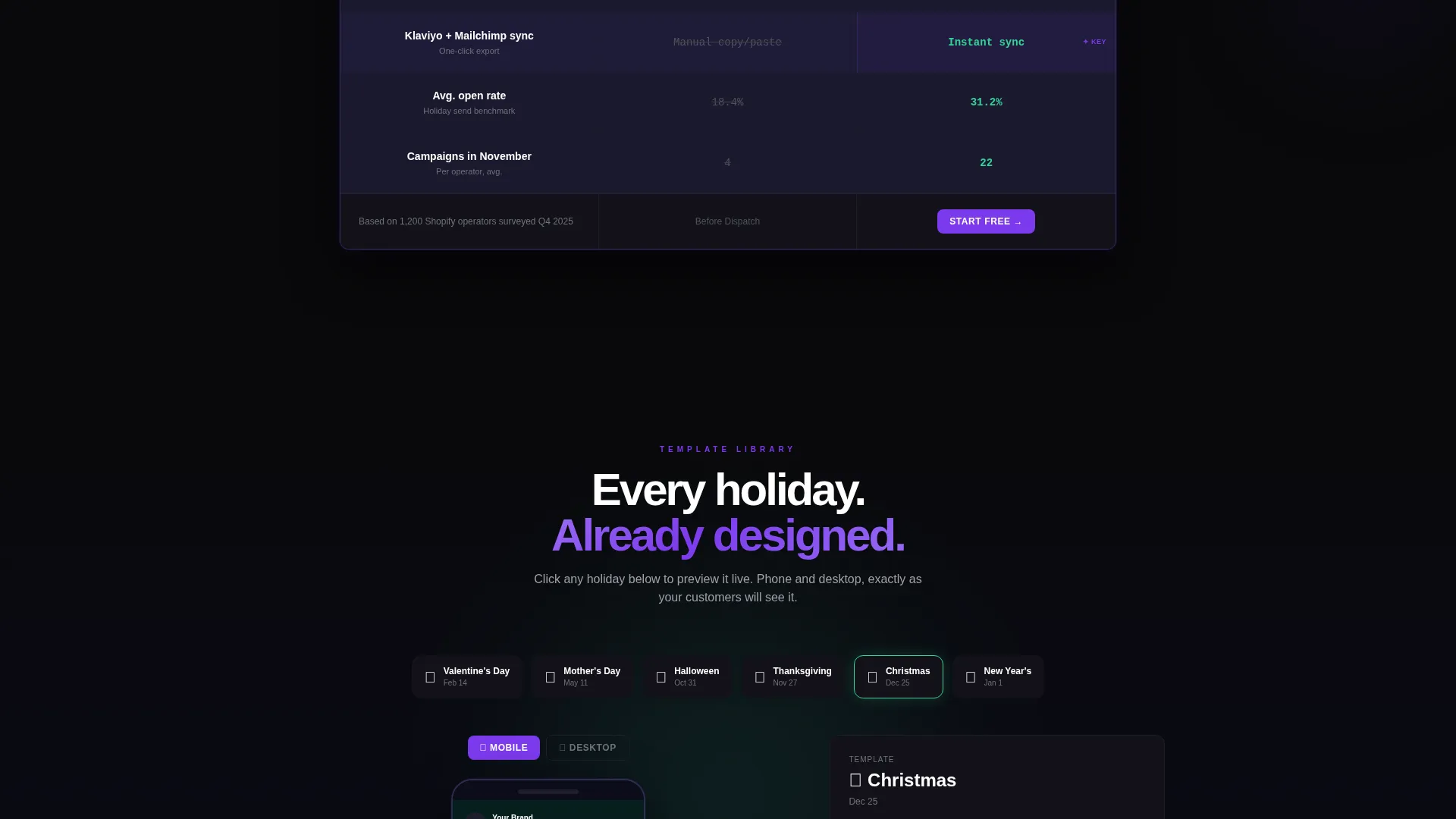
- A six-template interactive email preview explorer rendering each holiday design inside phone and desktop mockups
Feature list
This template is built around components that move, respond, and prove the product's value at every scroll depth.
Feature Tab Switcher Header
A realistic browser-chrome frame holds three clickable tabs labeled "Design," "Personalize," and "Send." Each tab swap reveals a different interior state, a half-built holiday email, segmentation toggles with merge-tag chips, or a delivery calendar heat-mapped in violet. The header feels like the actual product is already running.
Animated Comparison Data Grid
Two columns sit side by side: "Your Current Workflow" versus "With Dispatch." Each row covers a key metric, template count, personalization depth, send speed, and A/B variants. Numbers animate on viewport entry, making the visitor's current pain quantifiable and the product's advantage unmistakable.
Interactive Email Preview Explorer
Visitors click through six holiday email templates covering Valentine's Day, Mother's Day, Halloween, Thanksgiving, Christmas, and New Year. Every selection renders instantly inside both a phone mockup and a desktop mockup, demonstrating campaign breadth without a single static screenshot.
Fixed Conversion Bar
A slim violet bar sits fixed at the bottom of the viewport at all times. It holds the primary call to action "Start Building Free" and keeps one conversion path permanently within thumb reach throughout the entire scroll journey.
Ghost Button Secondary Path
A "See Full Feature Grid" ghost button gives analytical buyers a frictionless route to the deep-comparison table. It respects both decision styles, the ready buyer and the researcher, without cluttering the primary flow.
Void and Violet Color System
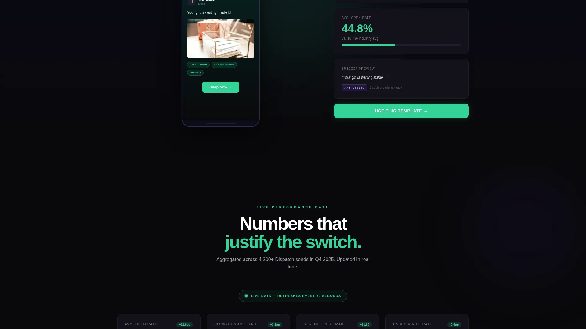
Backgrounds stay void-black (#09090B), card surfaces lift to #121218, and deep ultraviolet (#7C3AED) anchors every interactive border and toggle state. Phosphor lilac (#C4B5FD) washes over secondary text, and status-green (#34D399) accents live data figures like open rates and click metrics.
Page sections overview
| Section | Purpose |
|---|---|
| Tab Switcher Header | Shows the product interface live across three workflow states |
| Comparison Data Grid | Quantifies the visitor's current pain against the product's output |
| Email Preview Explorer | Lets visitors browse six holiday templates in phone and desktop views |
| Deep Comparison Table | Provides a full feature breakdown for detail-oriented buyers |
| Fixed call to action Bar | Keeps the primary signup action visible at all scroll depths |
Design & branding system
The visual identity channels a Startup Velocity theme through a Void and Violet palette. Every color decision is intentional, nothing decorative, nothing wasted.
- Core palette: void-black (#09090B) backgrounds, #121218 card surfaces, deep ultraviolet (#7C3AED) for interactive states, phosphor lilac (#C4B5FD) for secondary text, and status-green (#34D399) for live metric accents
- The overall aesthetic evokes a mission-control screen at a dim co-working desk, electric purples bleeding out of darkness, every glow earning its place
- Interactive borders, toggle states, and tab indicators all use violet as their anchor color, creating a consistent visual language throughout the page
Mobile & speed optimization
The template is structured for fast rendering and thumb-friendly navigation across screen sizes. The fixed call to action bar is specifically designed to remain accessible during mobile scroll.
- The fixed violet conversion bar stays at the viewport bottom on all device sizes, keeping the primary action one thumb-reach away
- The interactive email preview explorer renders phone and desktop mockups side by side, making the template's responsiveness visible to the visitor directly on the page
- Section transitions and viewport-triggered animations are scoped to individual components, keeping the layout clean and avoiding unnecessary rendering overhead
How this template helps you convert
The page is engineered around a Comparison and Versus conversion strategy. Every scroll step adds a new layer of conviction before the visitor reaches the bottom.
- The Feature Tab Switcher header places visitors inside the product immediately, replacing abstract feature claims with a tangible interface they can interact with before signing up.
- The animated comparison data grid makes the visitor's existing workflow feel slow and costly in concrete, metric-level terms, turning a passive browser into someone who feels the problem.
- The fixed "Start Building Free" bar removes every last friction point at the moment of decision, so the free trial feels like relief rather than a commitment.
Other information about this template
This template is purpose-built for the e-commerce holiday email space and reflects the real pressures of seasonal campaign work. A few additional details worth knowing:
- The template is categorized under Technology and the E-Commerce Email Templates subcategory, making it discoverable for operators searching within that niche
- The Interactive Explorer creative direction means the page rewards scroll, each section adds new information rather than repeating the same pitch
- The Dashboard and Data Grid template style makes it particularly well-suited for products that need to demonstrate measurable output, not just visual polish
- The six holiday templates in the preview explorer span the full calendar year, signaling year-round utility beyond the Black Friday and Christmas window
Theme
Startup Velocity
Creative direction
Interactive Explorer
Color system
Void & Violet
Style
Dashboard/Data Grid
Direction
Comparison/Versus
Page Sections
Feature Tab Switcher Header
Animated Comparison Data Grid
Six-template Preview Explorer
Fixed Violet Conversion Bar
Ghost Button Secondary Path
Void and Violet Visual System
Related questions
What kind of product is this template designed to promote?
Can a solo brand owner use this template effectively?
What makes the header different from a standard hero section?
Does the template include all six holiday email preview designs?
What is the fixed call to action bar and how does it work?



