Dispatch - Powerful K-12 Landing Page Template
Dispatch is a modular K-12 email newsletter landing page template built for district communications teams. It features a dark Data Command visual theme, a card-grid feature matrix, and side-by-side comparison strips that prove your current tool is falling short. The primary call to action drives visitors toward a district email audit, making the first step feel effortless.
by Rocket studio
Quick summary
Dispatch is a single-page landing page template designed for K-12 email newsletter platforms. It uses a dark cockpit aesthetic, a modular card grid layout, and a Comparison/Versus scroll structure to show district communications teams exactly why their current email tool is not keeping up.
Who this template is for
This template is built for the people who keep district communications running before most staff arrive at their desks. It speaks directly to the operators who measure success in open rates and on-time delivery.
- K-12 communications coordinators managing high-volume weekly sends to thousands of families
- Superintendents and district leaders who want send performance visible at a glance
- Building-level principals who need to add their own content without breaking district brand standards
What problem this template solves
District communications teams often run weekly newsletters through generic email platforms that were never built for schools. Those tools leak opens, skip accessibility requirements, and cost hours of manual reformatting every single week.
- Staff spend too much time rebuilding templates that should already be locked and ready
- Generic platforms lack compliance and multilingual features that K-12 audiences require
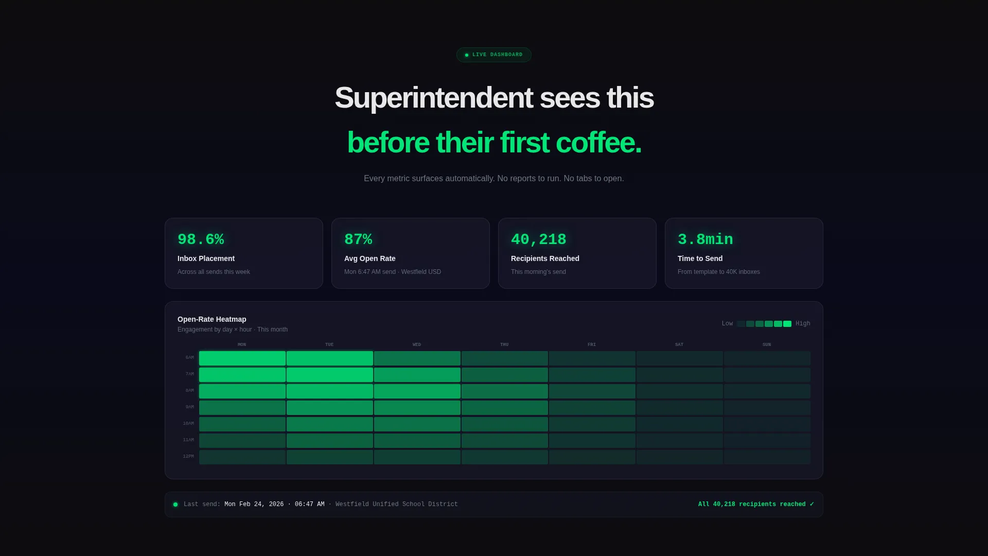
- Administrators have no easy way to see open-rate performance without digging through reports
What you get with this template
You get a fully designed, single-page landing page that communicates the full value of a K-12 email newsletter platform. Every section is built to move a skeptical communications director from curiosity to action.
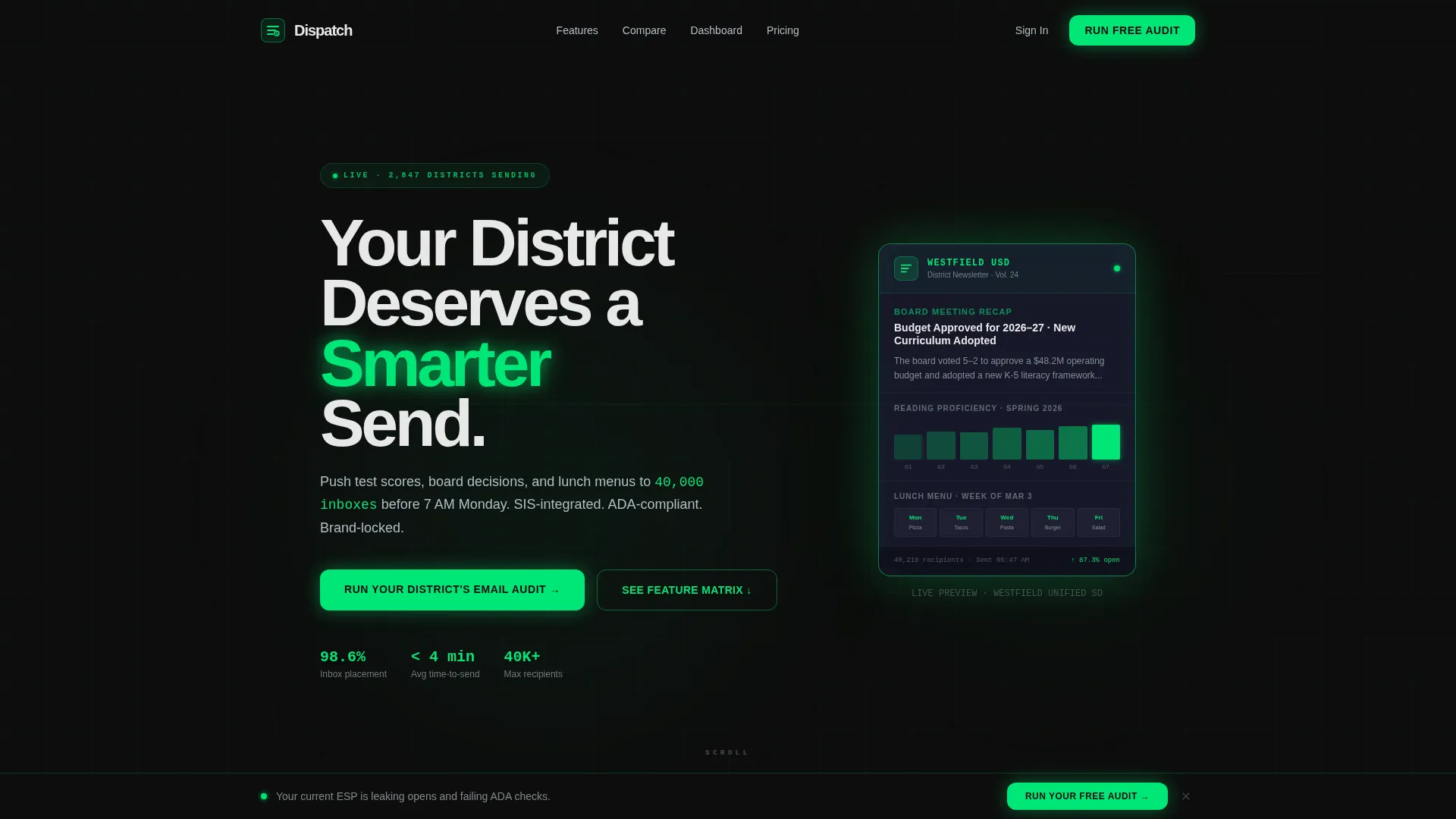
- A dark full-bleed header scene with a realistic K-12 newsletter preview glowing in neon green
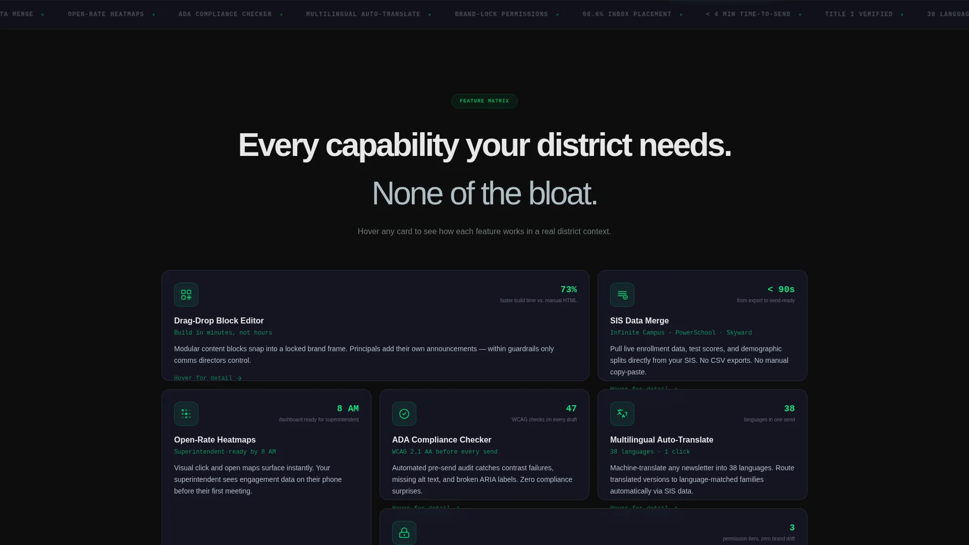
- A scrollable card grid that isolates each platform capability in its own modular block
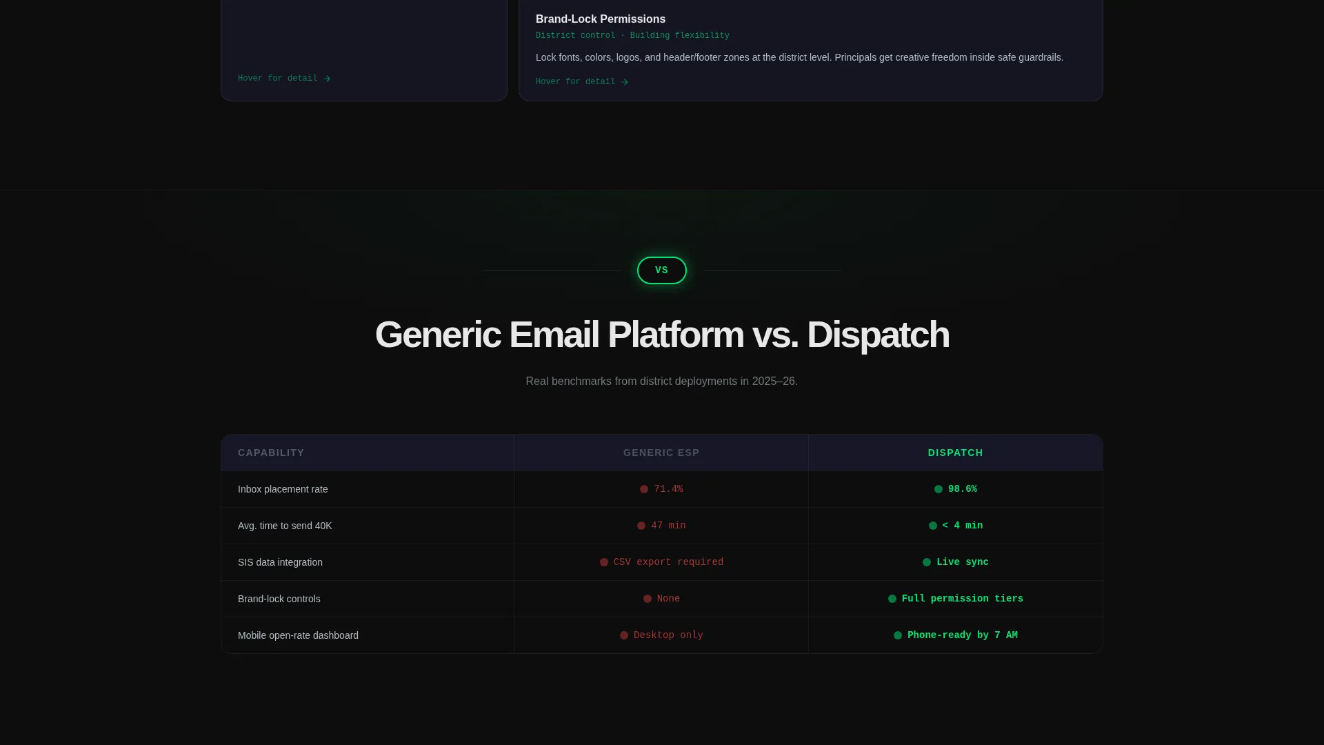
- Full-width Comparison/Versus strips that appear every third row to benchmark the platform against generic tools
- A sticky bottom call-to-action bar that activates once the first comparison strip scrolls into view
- A dual conversion path: a district email audit form and a gated feature matrix download
Feature list
This landing page template is packed with purposeful sections and interactive layout patterns that serve one goal: earning the click from a time-pressed district professional.
Drag-and-Drop Block Editor Card
Each platform capability gets its own card in the modular grid. The drag-and-drop editor card shows how principals can place announcements into a locked brand frame without design experience or IT involvement.
SIS Data Merge Showcase
A dedicated card highlights how student information system exports feed directly into newsletter content. This positions the platform as purpose-built for the way K-12 data actually flows.
Open-Rate Heatmap Display
The open-rate heatmap card surfaces performance metrics in a format that district leaders can read on a phone screen. It makes the case that visibility should not require a desktop dashboard.
Comparison/Versus Full-Width Strips
Every third scroll row breaks the card grid with a side-by-side comparison strip. These strips show screenshots, deliverability percentages, and time-to-send benchmarks against generic email platforms.
Dual-Path Conversion Form
The primary audit form collects district name, current email service provider, and work email. A secondary path offers a downloadable feature matrix PDF gated behind email capture only.
Sticky Call-to-Action Bar
A persistent bottom bar activates after the first comparison strip enters view. It keeps the primary call to action visible without interrupting the scroll experience before the visitor is ready.
Page sections overview
| Section | Purpose |
|---|---|
| Dark Header Scene | Hooks attention with a glowing K-12 newsletter preview and the primary headline |
| Feature Card Grid | Presents each platform capability as a flippable, expandable modular card |
| Comparison Strip One | Benchmarks generic email tools against the platform on deliverability and speed |
| Comparison Strip Two | Escalates stakes from convenience to accessibility compliance |
| Compliance and Equity Card | Closes the grid with the 98.6% inbox placement claim for Title I districts |
| Audit Capture Form | Converts visitors through a short, progressive district email audit form |
| Feature Matrix Download | Offers a secondary gated PDF path for visitors who want full detail |
| Sticky call to action Bar | Keeps the audit call to action visible throughout the lower scroll |
Design & branding system
The visual identity runs on a Carbon Fiber color system that feels like the inside of a mission control room at dawn. Dark surfaces dominate every background, and only the data that matters gets to emit light.
- Deep cockpit black (#0D0D0D) covers all page backgrounds, and woven graphite (#1A1A2E) separates individual cards and content blocks
- Status-green glow (#00E676) activates on calls to action, hover states, and live metric counters to signal urgency without noise
- Cool aluminum (#B0BEC5) handles secondary text and dividers, keeping body copy legible without competing with the primary data
Mobile & speed optimization
The card grid layout is built to reflow cleanly across screen sizes, so a superintendent checking open rates on a phone gets the same clarity as a desktop user. The design keeps visual weight intentional rather than heavy.
- Modular card blocks stack vertically on smaller screens without losing the hierarchy of the comparison strips
- The sticky call-to-action bar remains functional and unobtrusive on mobile viewports throughout the scroll
How this template helps you convert
Every design and layout decision in Dispatch is aimed at building conviction row by row, then removing friction at the moment a visitor is ready to act.
- The escalating Comparison/Versus strips move the reader through three stages: convenience, compliance, and equity, each one raising the cost of inaction before the audit form appears
- The dual conversion path lets high-intent visitors grab the full feature matrix PDF with just an email, while decision-makers ready to commit step into the full audit form
- The sticky bottom call-to-action bar ensures the primary prompt stays reachable at every scroll depth, capturing visitors who are convinced before they reach the bottom
Other information about this template
Dispatch is a landing page template sold as a design and layout asset. It is not a live email platform or a software subscription. Buyers receive the page layout to use as a promotional or sales page for a K-12 email newsletter product or service.
- The template is categorized under Technology and the Education K-12 Digital Presence subcategory, making it suitable for edtech product pages and district software marketing
- The card-flip and expand-on-hover interactions described in the creative direction are part of the intended design behavior for this template
- The 98.6% inbox placement figure referenced in the comparison section is a narrative element from the source brief and should be replaced with verified data before publishing
- This template is built around a single-page, section-led structure and is not a multi-page website theme
Theme
Data Command
Creative direction
Feature Matrix
Color system
Carbon Fiber
Style
Card Grid (Modular)
Direction
Comparison/Versus
Page Sections
Modular Card Grid Layout
Full-width Comparison Strips
Dual-path Conversion Design
Sticky Call-to-action Bar
Dark Full-bleed Header Scene
Carbon Fiber Branding System
Related questions
Who is this landing page template built for?
What are the two conversion paths included in this template?
Does this template include actual email newsletter files?
When does the sticky call-to-action bar appear on the page?
Is the Carbon Fiber color system easy to customize?



