AI for Logistics Professional Website Template
Dispatch is a comparison-focused landing page template built for AI voice dispatcher tools in the logistics industry. It features a sticky 12-metric comparison table, scroll-triggered row reveals, a cinematic dark product screenshot header, feature deep-dive sections, a cost-at-scale breakdown, and a dual call-to-action system targeting fleet operations managers, freight brokers, and 3PL coordinators.
by Rocket studio
Quick summary
Dispatch is a single-page template designed to sell an AI voice dispatcher against manual dispatch and legacy systems. It leads with a full-width dark product screenshot, locks a sticky 12-metric comparison table into view, expands winning rows into feature deep-dives, and closes with a load-volume-aware demo request form. The layout makes the case before the reader reaches the call to action.
Who this template is for
This template is built for B2B SaaS teams selling AI-powered logistics tools. It speaks directly to operational decision-makers who evaluate tools based on hard numbers and side-by-side proof.
- Fleet operations managers running 200 or more trucks across multiple time zones
- Freight brokers handling high volumes of carrier check-calls throughout the day
- Third-party logistics coordinators dealing with appointment-scheduling phone trees and after-hours coverage gaps
What problem this template solves
Manual dispatch and legacy transportation management systems leave operations teams reactive. Check-calls pile up, after-hours loads go unmonitored, and proof-of-delivery capture depends on human memory. This template gives a logistics AI voice assistant a structured page that proves its advantage with data, not just claims.
- Buyers need direct comparisons, not marketing language, to justify replacing dispatch staff or legacy software
- Operations teams at scale need to see cost-per-touch and load volume numbers before they commit to a demo
- Research-mode visitors need a lower-stakes path, like a downloadable comparison document, before they are ready to talk
What you get with this template
You get a complete, single-page layout built around a Feature Matrix creative direction. Every section is sequenced to move a skeptical operations buyer from curiosity to conviction.
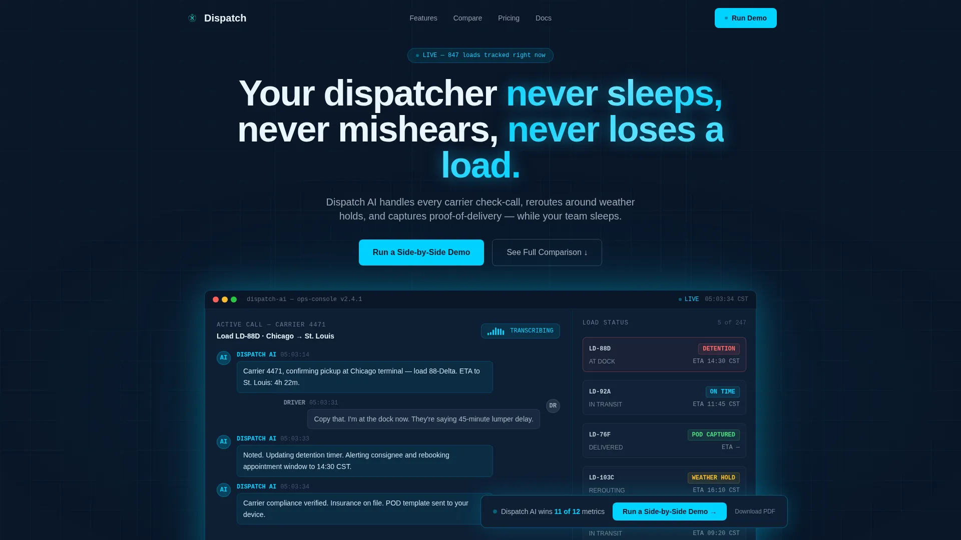
- A cinematic hero section with a full-width product screenshot and teal glow effect on a deep terminal navy background
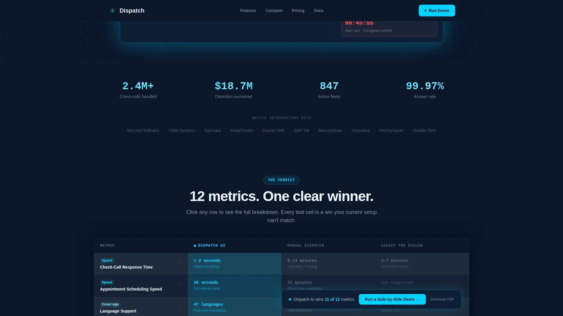
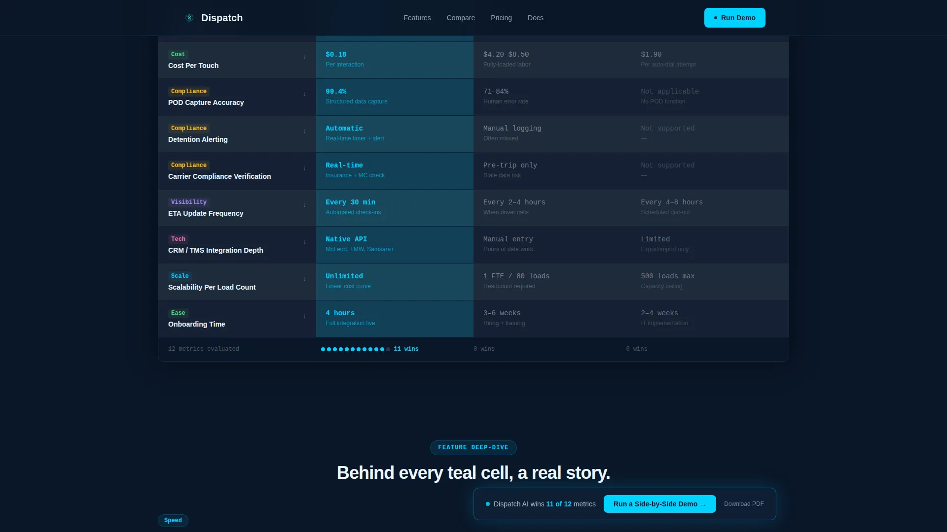
- A sticky 12-metric comparison table scored across the AI assistant, manual dispatch, and legacy auto-dialers, with scroll-triggered teal highlights on the winning column
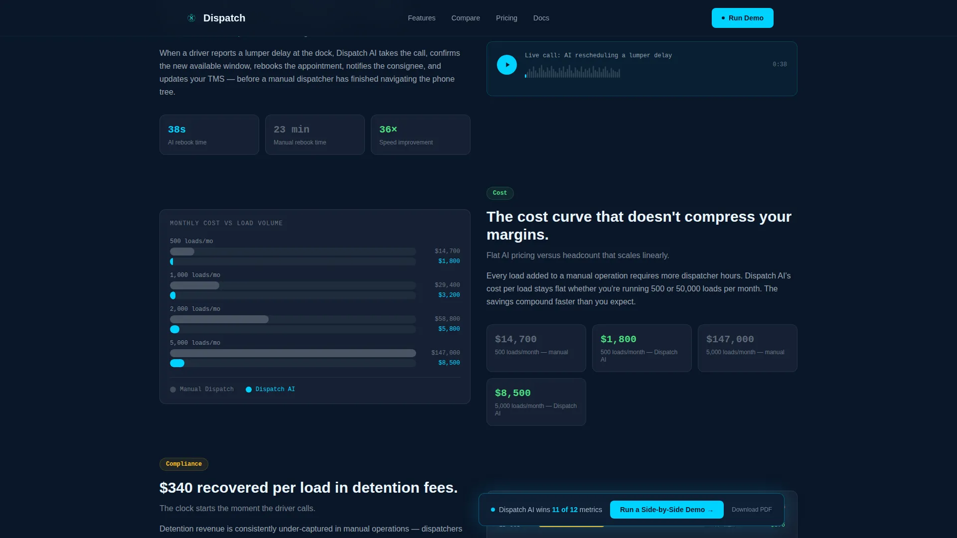
- Feature deep-dive sections that expand three key table rows with an audio clip embed, side-by-side cost breakdowns at 500 and 5,000 loads per month, and a detention-time counter
- A dual call-to-action system: a floating bar that appears after the third table row and a full-width demo request form with conditional fields
- A secondary email-gated path to download the full comparison as a PDF for research-mode visitors
- A linear single-row footer
Feature list
This section covers the core built-in components that make Dispatch work as a conversion tool.
Sticky 12-Metric Comparison Table
The table locks to the viewport as the visitor scrolls. Each of the twelve rows covers a distinct operational metric, including check-call response time, appointment scheduling speed, language support, after-hours coverage, cost per touch, proof-of-delivery capture accuracy, detention alerting, carrier compliance verification, ETA update frequency, CRM integration depth, scalability per load count, and onboarding time. The AI column lights up in teal while competing columns render in muted gray.
Scroll-Triggered Row Reveals
Each table row animates into view on scroll. The reveal sequence builds a rhythm that turns the comparison into a running verdict rather than a static chart. Visitors absorb one metric at a time, which keeps attention focused and reinforces the AI column's visual dominance.
Feature Deep-Dive Sections
Three expanded sections sit below the main table and develop the most impactful winning rows into mini-case formats. Each section includes an audio clip embed, a plain-language explanation, and a cost comparison at two load volumes. The detention-time counter is embedded here as a live social proof element.
Floating Call-to-Action Bar
A persistent bar slides into view after the visitor passes the third table row. It carries the primary call to action, "Run a Side-by-Side Demo," and stays visible through the deep-dive sections without blocking content. It disappears at the full-width form block to avoid duplication.
Load-Volume-Aware Demo Form
The demo request form opens with a monthly load volume dropdown segmented into four ranges. It then asks for the current dispatch method before requesting a work email. Conditional field logic adapts the form based on earlier selections, so the data collected is immediately useful for sales qualification.
PDF Download Gate
A secondary conversion path offers the full comparison as a downloadable PDF behind an email-only capture. This path targets visitors who are still in the research phase and not yet ready to book a demo. It keeps those visitors in the funnel without requiring a phone call or live commitment.
Page sections overview
| Section | Purpose |
|---|---|
| Hero product screenshot | Establishes context and trust with a cinematic AI interface visual |
| Sticky comparison table | Delivers the 12-metric verdict across three dispatch methods |
| Feature deep-dives | Expands three winning rows with audio, cost data, and live counters |
| Cost at scale | Shows side-by-side load economics at 500 versus 5,000 loads per month |
| Demo call to action | Captures qualified leads through a conditional load-volume form |
| PDF download gate | Converts research-mode visitors via email-only gated content |
| Linear footer | Closes the page with a clean single-row layout |
Design & branding system
The design follows a Data Command theme. Every color choice is intentional, referencing the visual language of a live logistics control room rather than a generic SaaS product page.
- Color palette: deep terminal navy (#0A1628) as the primary background, dispatch-screen teal (#00D2FF) for active states and live-data accents, steel-panel gray (#1E2A3A) for card surfaces and table rows, and alert white (#EAF6FF) for body typography
- Typography pairing: DM Sans for headings and marketing copy, JetBrains Mono for data values, metrics, and table content to reinforce the terminal-screen aesthetic
- Animation system: teal glow pulses on the hero screenshot edge, beam animations on section transitions, scroll-linked row highlights in the comparison table, and a floating call-to-action bar entrance
Mobile & speed optimization
The template is desktop-first by design, matching the multi-monitor environment of its primary audience. The layout still adapts for mobile so that freight brokers and coordinators checking loads on the go can read the comparison and reach the form.
- Desktop layout prioritizes the sticky table experience with multi-column visibility across the three comparison categories
- Responsive breakpoints preserve table readability and form usability on smaller screens
- Static sections use server-rendered components while animations and interactive elements are handled client-side to keep the initial load clean
How this template helps you convert
The page is sequenced as a continuous argument. By the time a visitor reaches the call-to-action block, the table has already made the case.
- The sticky comparison table scores all twelve metrics in a single view, so the AI column's advantage is visible before the visitor reads a single marketing line
- The feature deep-dives turn abstract metrics into concrete proof, attaching real numbers, an audio example, and a cost model to the rows that matter most to operations buyers
- The dual call-to-action system captures visitors at two readiness levels: the floating bar catches buyers who decide early, while the PDF gate keeps research-mode visitors in the funnel
Other information about this template
This template is built on a Comparison/Versus landing page direction, which is one of the highest-intent page structures in B2B SaaS. It is suited for teams launching or repositioning a logistics AI voice assistant product where the main sales objection is justifying replacement of existing dispatch staff or software.
- The twelve comparison metrics were chosen to address the specific friction points of US-based logistics operations, including after-hours coverage, language support, and carrier compliance
- Localization defaults are set for English, USD pricing, 12-hour time format, and US logistics terminology
- The footer uses a Pattern 1 linear single-row layout to keep the close clean and uncluttered
- The template supports high animation and interactivity levels, including beam animations, scroll-triggered reveals, teal glow pulses, and a floating bar, all implemented with client-side components
Theme
Data Command
Creative direction
Feature Matrix
Color system
Midnight Blue
Style
Comparison Table
Direction
Comparison/Versus
Page Sections
Sticky 12-metric Comparison Table
Scroll-triggered Row Reveals
Feature Deep-dive Sections
Floating Call-to-action Bar
Load-volume-aware Demo Form
Email-gated PDF Download
Related questions
Who is this template designed for?
What makes the comparison table different from a standard feature grid?
Can I customize the comparison metrics for my product?
What are the two conversion paths in this template?
Is this template suitable for a product still in early access?



