Music Digital Presence Reviews Website Template
Dispatch is a music discovery newsletter landing page template built for weekly email drops targeting indie label scouts, bedroom producers, and obsessive crate-diggers. It opens with a dashboard-style inbox preview, walks visitors through a data-backed comparison table, and closes with a genre-toggle email capture form, turning curious visitors into Thursday subscribers before they scroll away.
by Rocket studio
Quick summary
Dispatch is a single-page newsletter landing page template designed for a weekly music discovery email. It uses a UV-lit dark visual identity, a rendered inbox hero, and a scroll-driven comparison table to make the case for human curation over algorithmic feeds. The primary goal is email capture with genre-preference filtering, one field, one click, one Thursday drop.
Who this template is for
This template is built for music-world operators who need a high-conviction sign-up page fast. It fits anyone running a curated newsletter at the intersection of discovery and taste.
- Indie label scouts and A&R professionals looking for a dedicated subscription page that matches their industry credibility
- Bedroom producers and sync-opportunity hunters who want to share their weekly picks with a growing audience
- Playlist curators and crate-diggers building a reader base around human-filtered music discovery
What problem this template solves
Algorithmic recommendation feeds have trained listeners to be passive. For people who live on the edge of what is about to break, that passivity is a professional problem. A generic newsletter sign-up page does nothing to explain why a human-curated drop is worth trading an email address for.
- No standard template communicates the A&R-grade depth and lead time that separates a real curation product from another Mailchimp-style blast
- Visitors land on most newsletter pages and see a headline and a form, no proof, no context, no reason to subscribe
- This template replaces the blank sign-up box with a full evidence trail: a dashboard preview, a structured comparison, edition breakdowns, and reader testimonials that do the convincing before the form appears
What you get with this template
The template delivers a complete, section-led landing page structured around the reader's discovery journey. Every scroll section escalates the argument from problem to proof to action.
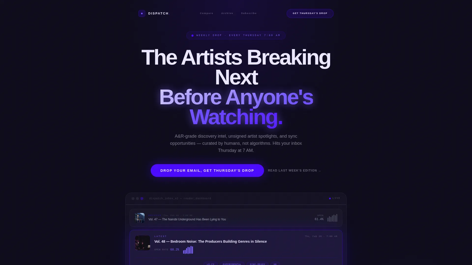
- A rendered dashboard hero showing three recent newsletter editions with subject lines and a middle-card expanded to reveal discovery scores, genre tags, and a streaming trajectory chart
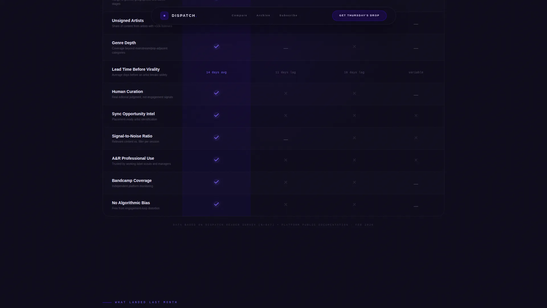
- A four-column comparison table stacking the newsletter against competing discovery sources across dimensions like genre depth, lead time before virality, and signal-to-noise ratio
- A lead generation call-to-action block with a single email field and a genre-preference toggle covering electronic, hip-hop, indie, global, and all, plus a secondary soft-gated archive preview path
Feature list
This section describes the core built-in components and design capabilities included in the Dispatch template.
Dashboard-Style Inbox Hero
The hero section renders a simulated inbox view showing three recent newsletter editions side by side. The middle card is expanded to reveal a discovery score, genre tags, a streaming trajectory chart, and a short editorial write-up. It looks like proprietary software, not a standard email client, the kind of screen an A&R professional would leave open on a second monitor.
Scroll-Driven Algorithm Problem Section
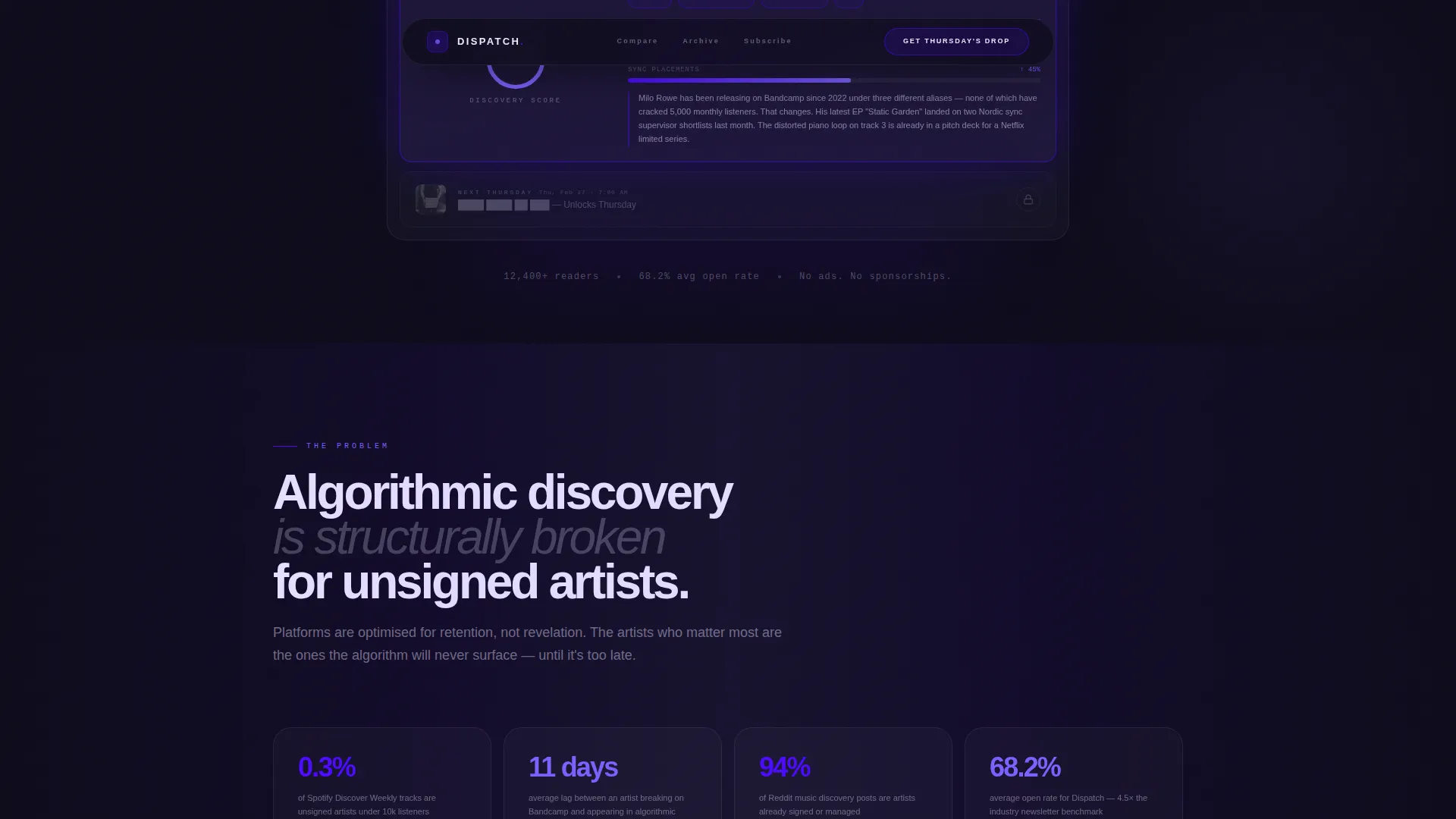
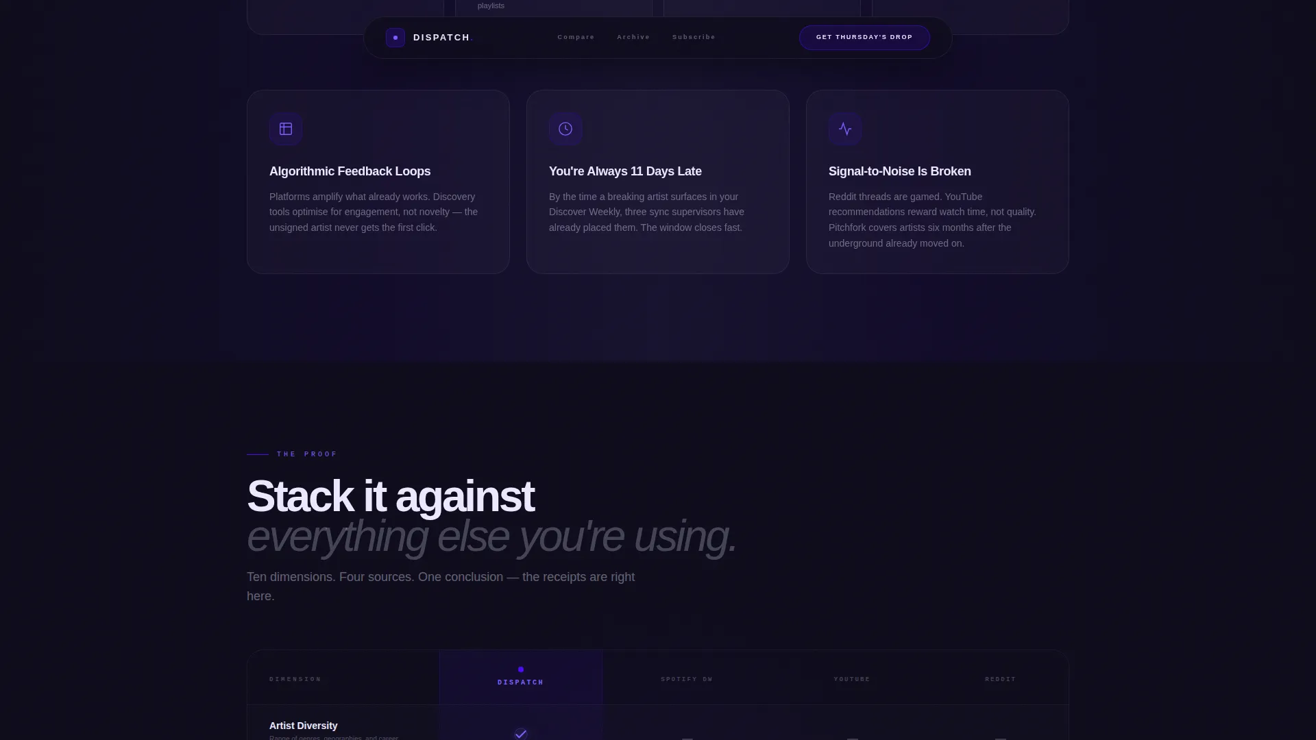
A dedicated scroll section builds a data-backed argument for why algorithmic discovery fails the people who rely on it most. Animated stats reveal as the visitor scrolls, creating a sense of escalating evidence rather than static claims.
Four-Column Comparison Table
The comparison table is the template's main selling engine. It pits the newsletter against three competing discovery sources across multiple dimensions. Check marks and metric badges replace paragraphs, so the case is made visually before a single word of body copy is read.
Recent Editions Breakdown
Three past edition cards display open rates, click maps, and reader testimonials from working A&R professionals. This section bridges social proof and content preview, showing exactly what lands in a subscriber's inbox each Thursday.
Genre-Toggle Email Capture Form
The call-to-action block keeps friction low: one email field paired with a genre-preference toggle. The toggle lets new subscribers signal their taste before they confirm, making the first send feel immediately relevant to their world.
Soft-Gated Archive Preview Path
A secondary conversion path lets curious visitors read last week's edition as a free preview. After the second click, a soft gate prompts an email submission, capturing readers who need more context before committing to the primary call to action.
Page sections overview
| Section | Purpose |
|---|---|
| Hero Dashboard Preview | Shows rendered inbox with three editions and one expanded middle card |
| Algorithm Problem Block | Presents scroll-animated data arguing for human curation over feeds |
| Comparison Table | Stacks newsletter against competing sources using visual metric badges |
| Recent Editions Breakdown | Displays open rates, click maps, and A&R reader testimonials |
| Email Capture Form | Collects sign-ups via single field with genre-preference toggle |
| Footer | Single-row linear footer with minimal navigation links |
Design & branding system
The visual identity follows a Directory and Discovery theme with an Electric Indigo color system. The overall feel is a club hallway lit by a single ultraviolet strip, deep tones with glowing accent elements that make the content feel urgent and exclusive.
- Color palette: deep archive black (#0D0B1A) as the base, electric indigo (#4B0AFF) for primary accents, signal violet (#7B61FF) for hover states and active elements, and phosphor white (#EDEAFF) for body text and card surfaces
- Typography pairing: Plus Jakarta Sans for editorial headings and body copy, with DM Mono reserved for data labels, genre tags, and metric readouts to reinforce the proprietary-software aesthetic
- GSAP ScrollTrigger animations drive stagger reveals, magnetic button behavior, and a grain overlay that adds physical texture to the dark background without breaking readability
Mobile & speed optimization
The template is built desktop-first, designed around the A&R second-monitor experience where the full comparison table and expanded edition cards carry the most weight. Mobile layouts remain fully responsive and legible.
- Interactive elements such as the genre toggle, comparison table hover states, and expandable edition cards use client-side rendering while static sections use server components to keep initial load lean
- The grain overlay, stagger animations, and GSAP scroll effects are scoped to avoid blocking content visibility on smaller screens
How this template helps you convert
The page is structured as a scroll-based argument. By the time a visitor reaches the sign-up form, the comparison table and edition breakdowns have already answered every objection.
- The dashboard hero creates immediate credibility by showing real edition content in a software-grade interface, establishing authority before a single word of persuasion copy appears
- The comparison table removes doubt by placing the newsletter's signal-to-noise ratio, genre depth, and artist lead time next to three familiar but weaker alternatives using visual check marks and metric badges
- The genre-preference toggle on the call-to-action form reduces the friction of subscribing by letting readers personalize their first drop, making the act of signing up feel like a choice rather than a transaction
Other information about this template
This template was designed specifically for the music email newsletter niche at the intersection of music digital presence and technology. It is a strong fit for operators who want their sign-up page to feel as considered as the product itself.
- The template style is Comparison Table, and the landing page direction is Lead Generation, both choices are reflected structurally in every scroll section
- The header concept is Dashboard Preview, which is an uncommon approach for newsletter pages and immediately differentiates the offer from standard subscribe-box designs
- Creative direction follows the Industry Report approach, meaning each section presents an argument with evidence rather than lifestyle imagery or vague aspirational copy
- The footer follows a Linear Single-Row pattern, keeping the exit experience clean and low-distraction after the call-to-action block
- The template is categorized under Technology with a subcategory of Music Digital Presence, making it suitable for music industry professionals who expect a product-grade presentation
Theme
Directory & Discovery
Creative direction
Industry Report
Color system
Electric Indigo
Style
Comparison Table
Direction
Lead Generation
Page Sections
Dashboard-style Inbox Hero
Scroll-driven Algorithm Problem Section
Four-column Comparison Table
Recent Editions Breakdown
Genre-toggle Email Capture Form
Soft-gated Archive Preview Path
Related questions
Can I change the genre options in the toggle?
Does the comparison table support more than four columns?
Is the dashboard hero section editable?
Who is this landing page template best suited for?
Does the archive preview soft gate require a separate page?



