Advanced Optometry Software Professional Website Template
Dispatch is a split-screen landing page template built for optometry field service management platforms. It pairs a live dispatch dashboard screenshot with a Problem-to-Solution scroll arc, guiding fleet managers from daily scheduling chaos to a fully assembled operations view. A three-step lead form and a gated PDF checklist work together to capture prospects at every intent level.
by Rocket studio
Quick summary
Dispatch is a single-page, split-screen lead generation template designed for mobile optometry operations platforms. It opens on a full-viewport dispatch dashboard and walks visitors through a Problem-to-Solution scroll arc. Each section resolves a real operational pain point and ends with two conversion paths: a demo request form and a downloadable revenue-checklist PDF.
Who this template is for
This template is built for companies selling software to organizations that manage traveling optometrists and off-site eye-care programs. The visual language and messaging speak directly to operations leaders, not general consumers.
- Regional eye-care groups coordinating fleets of traveling optometrists across nursing homes, schools, and rural clinics
- Franchise optical chains running both in-store and off-site appointments on a shared calendar
- State vision programs managing hundreds of screenings across county lines before the school year begins
What problem this template solves
Scheduling mobile eye-care teams is operationally complex. Phone-tag rescheduling, lost equipment kits, unsigned consent forms, and unreported Medicaid encounters create daily friction and long-term audit risk. Most generic software landing pages ignore these specifics entirely.
- Visitors cannot quickly see whether a platform understands their field operations workflow
- Lead forms ask for too much too soon, causing high drop-off rates before a demo is ever booked
- A single call-to-action fails to capture prospects at different stages of buying readiness
What you get with this template
You get a fully structured, single-page layout built around a dispatch-platform narrative. Every section is purposefully ordered to move a skeptical operations manager from problem recognition to conversion.
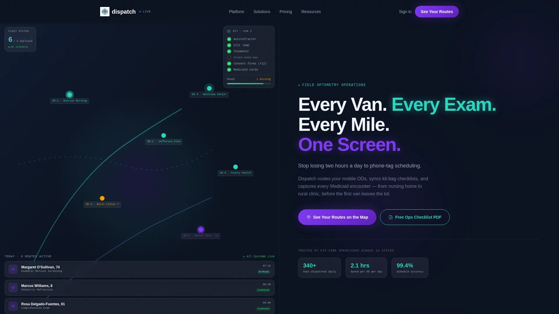
- A full-viewport split-screen header with a dashboard screenshot on the left and a headline plus pain-point subline on the right
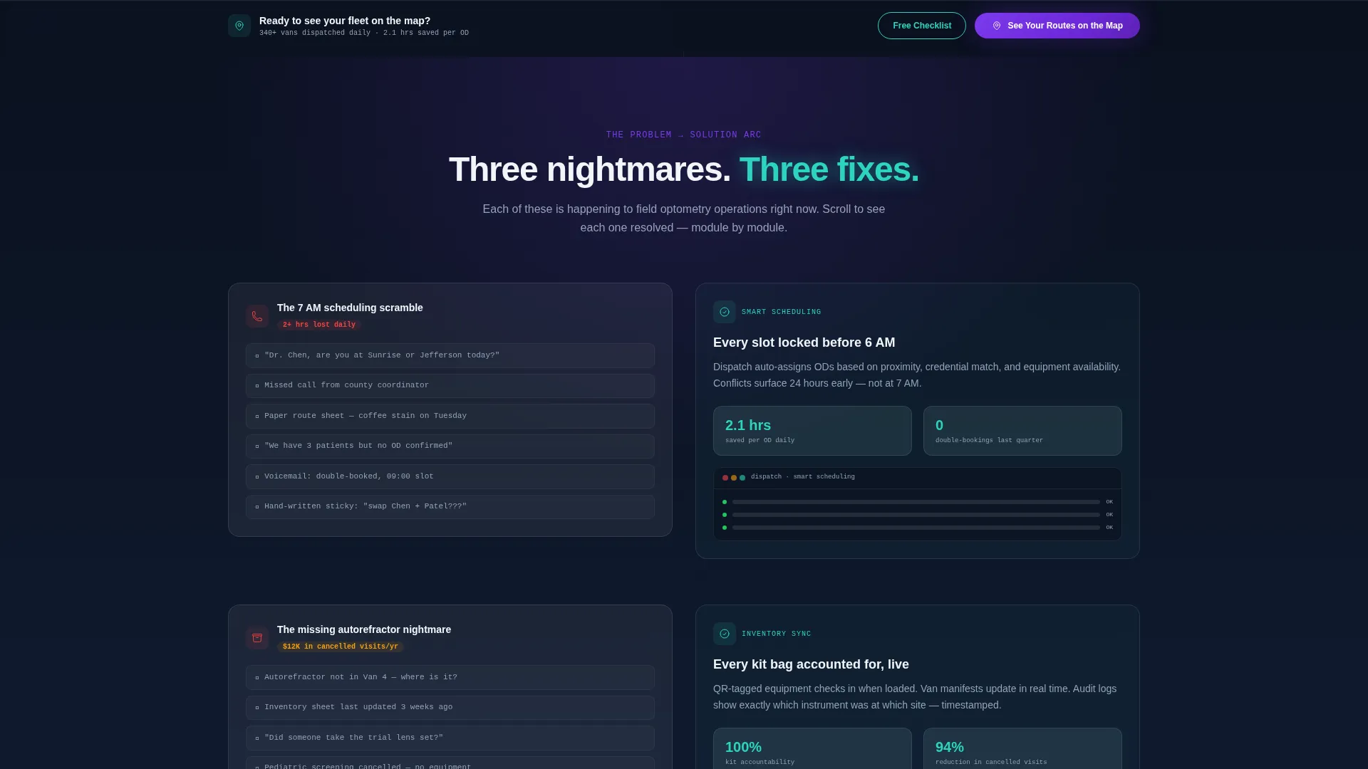
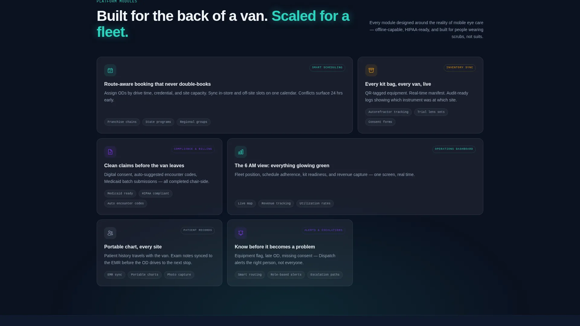
- A Problem-to-Solution scroll arc that animates dashboard modules into view as each operational issue is addressed
- A three-step progressive disclosure lead form and a separate email-gated PDF download for dual-path lead capture
Feature list
This section details the core built-in components and layout capabilities included in the Dispatch template.
Split-Screen Header with Dashboard Screenshot
The header fills the full viewport and divides 50/50. The left panel displays the dispatch dashboard at native resolution, showing a live metro map with six technician pins mid-route, stacked appointment cards with exam types, and a sidebar kit-bag checklist with completion indicators. The right panel holds the primary headline and a sharp pain-point subline.
Problem-to-Solution Scroll Arc
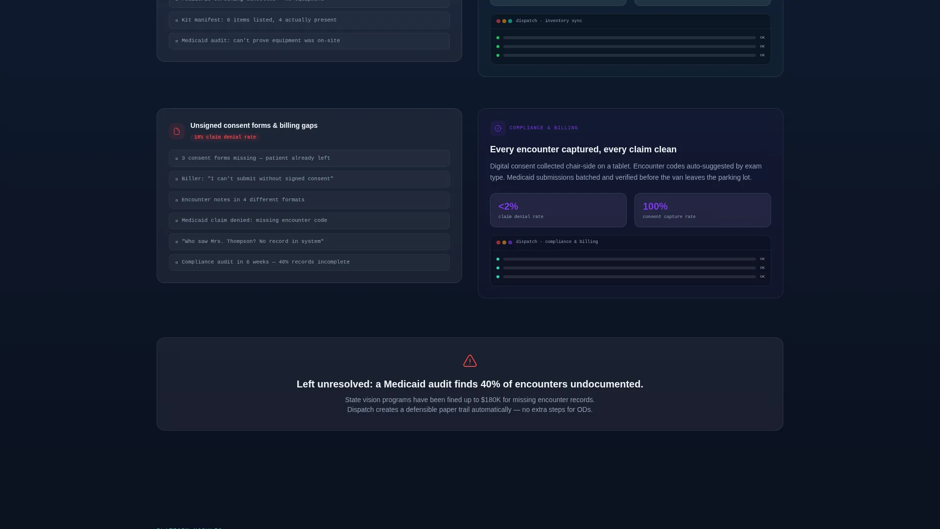
The scroll experience opens on a chaos panel: overlapping text messages, missed-call icons, and a coffee-stained paper route sheet. As the visitor scrolls, each section resolves one specific operational problem by sliding the corresponding dashboard module into the right panel with a frosted-glass entrance animation. Stakes escalate from daily annoyances to audit-level consequences.
Three-Step Progressive Disclosure Form
The lead form captures intent in stages to reduce friction. Step one asks for fleet size (1 to 5 vans, 6 to 20, or 21 or more). Step two presents checkboxes for the workflows that hurt most: scheduling, inventory, billing, or compliance. Step three collects name, email, and phone number.
Gated PDF Secondary Conversion Path
A secondary offer appears deep in the scroll for visitors not yet ready to book a demo. The downloadable PDF, titled "The Field Optometry Ops Checklist: 11 Points Leaking Revenue," is gated behind email only, capturing high-intent visitors at a lower commitment level.
Sticky Bottom Bar Call-to-Action
The primary call-to-action, "See Your Routes on the Map," appears first beneath the header and then reappears as a persistent sticky bar after the third section. This ensures the conversion prompt stays visible throughout the scroll without interrupting the narrative.
Glassmorphic Dashboard Pro Visual System
The template uses a purpose-built color and layer system. Frosted translucent panels float over gradient card surfaces, route lines glow in clinical teal, and alert buttons render in lens-flare violet. The overall visual effect places each interface element on its own optical plane, referencing the precision of a calibrated optical instrument.
Page sections overview
| Section | Purpose |
|---|---|
| Full-viewport header | Introduces dashboard screenshot and primary headline |
| Pain point opener | Shows scheduling chaos with overlapping messages and missed calls |
| Scheduling solution panel | Resolves double-booking by revealing the calendar module |
| Inventory solution panel | Addresses lost equipment kits with the kit-bag checklist view |
| Compliance solution panel | Tackles unsigned consent forms and unreported billing encounters |
| Primary call to action block | Presents the "See Your Routes on the Map" form for the first time |
| Sticky call to action bar | Persists the primary call-to-action after the third section |
| PDF checklist offer | Gated secondary download for mid-funnel visitors |
| Progressive form steps | Three-step lead capture sequence for demo requests |
Design & branding system
The Dispatch template uses a Glassmorphic color system layered over a Dashboard Pro theme. Every visual decision reinforces the feeling of a high-precision operational environment viewed through clean optics.
- Core palette: deep operational navy (#0B1120) as the page background, frosted panels at 12% white opacity over soft-gradient card surfaces, clinical teal (#2DD4BF) for active route lines and status indicators, muted steel (#94A3B8) for secondary labels, and lens-flare violet (#7C3AED) for alerts and primary buttons
- Layer system: each interface element floats on its own optical plane with blurred edges that catch ambient light, creating visual depth without clutter
- Interaction language: frosted-glass entrance animations signal resolution as dashboard modules slide into view during the scroll arc
Mobile & speed optimization
The split-screen layout is designed to reflow cleanly for smaller viewports. The operational narrative remains intact whether a visitor is on a desktop in a dispatch office or a tablet in a van.
- The 50/50 split collapses to a stacked single-column layout on smaller screens, preserving the Problem-to-Solution reading order
- The sticky bottom bar call-to-action adapts to mobile viewports so the conversion prompt stays accessible throughout the scroll
- The three-step form is structured to minimize input friction on touch devices by using selection tiles and checkboxes before text entry
How this template helps you convert
The Dispatch template is built around two parallel conversion paths, both anchored to a clear narrative arc that earns trust before asking for commitment.
- The primary path uses the sticky "See Your Routes on the Map" call-to-action and the three-step progressive form to qualify fleet size and workflow pain before collecting contact details, delivering warmer leads at demo stage.
- The secondary path offers the gated PDF checklist to visitors who scroll deep but are not yet ready for a demo, converting high-intent readers at a lower commitment threshold and building a separate nurture list.
Other information about this template
This template is category-matched to the Technology sector, specifically the Optometry Software subcategory and the Optometry Field Service Management niche. It is purpose-built for platforms serving mobile eye-care operations and is not a general-purpose healthcare template.
- The Intersection Match Score for this template is 13, reflecting a precise alignment between the Dashboard Pro theme, Glassmorphic color system, split-screen layout, and lead generation objective
- The template style is Split Screen (50/50) with a Product Screenshot header concept and a Problem-to-Solution Arc creative direction
- The visual metaphor throughout the template references the precision of optical calibration: elements snap into focus against darkness, each panel clicks into place like a phoropter lens finding the correct prescription
Theme
Dashboard Pro
Creative direction
Problem→Solution Arc
Color system
Glassmorphic
Style
Split Screen (50/50)
Direction
Lead Generation
Page Sections
Split-screen Dashboard Header
Problem-to-solution Scroll Arc
Three-step Progressive Lead Form
Email-gated PDF Checklist Offer
Sticky Bottom Bar Call-to-action
Glassmorphic Layer and Color System
Related questions
Who is the Dispatch template designed for?
What are the two conversion paths included in this template?
What does the Problem-to-Solution scroll arc look like?
Is the lead form designed to reduce drop-off?
Can this template support a different mobile health specialty?



