White-Label Rideshare Platform Landing Page Template
Dispatch is a dashboard-style landing page template built for white-label rideshare platforms. It opens with a live-syntax API code snippet, flows through an animated data grid with real-time ride metrics, and closes with an interactive feature configurator that feeds directly into a three-field sandbox signup form. No credit card required.
by Rocket studio
Quick summary
Dispatch is a single-page, dashboard-driven template designed for operators selling a white-label rideshare platform. It leads with a syntax-highlighted API call, builds trust through simulated live metrics, and earns the conversion through hands-on interaction before any form appears. Visitors play, configure, and commit, all inside one focused scrolling sequence.
Who this template is for
This template is built for the operators and sellers behind white-label rideshare infrastructure. It speaks directly to buyers who run fleets, manage transit budgets, or build mobility products for regional markets.
- Mid-market taxi cooperatives that need a digital platform to compete with large ride-hailing networks
- Airport shuttle companies moving away from paper dispatch manifests toward a branded app experience
- Corporate travel managers building a closed-network ride system their organization actually controls
What problem this template solves
Selling a complex technical platform is hard when your landing page looks like a product brochure. Buyers need to feel the product working before they trust it. This template removes that friction by letting prospects interact with the platform logic directly on the page.
- Operators struggle to convey matching algorithms, surge logic, and payment rails without live demonstrations
- A static page cannot show white-label flexibility across different brand identities
- Developers and decision-makers need separate entry points, and a single generic page fails both
What you get with this template
The template delivers a complete, section-led scrolling experience built around a Data Command visual theme. Every section serves a specific role in the buyer journey, from technical proof to brand flexibility to hands-on configuration.
- A syntax-highlighted API code snippet header showing a real
POST /v1/rides/dispatchcall alongside a consumer-polished rider app preview - A live-simulated dashboard grid displaying rides per minute, driver utilization, and surge zone heat maps in violet gradients
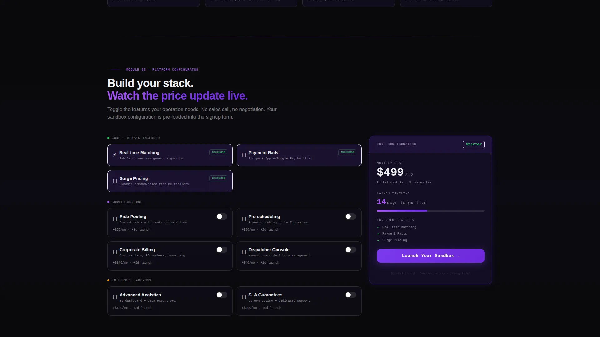
- An interactive feature configurator where visitors toggle pooling, scheduling, and corporate billing options and watch pricing tiers and launch timelines update in real time
Feature list
This template is built around five focused capabilities, each designed to move a specific type of buyer closer to a sandbox signup.
Live API Code Snippet Header
The header renders a syntax-highlighted POST /v1/rides/dispatch call in monospaced type against void black. A blinking cursor and streaming JSON response payload, including driver name, estimated time of arrival, vehicle type, and fare estimate, make the technical case before the visitor reads a single headline. The rider app preview on the right shows the same data in a consumer-polished interface, with the operator's logo in place.
Simulated Live Metrics Dashboard
Section one of the scroll sequence lights up a full data grid showing rides per minute, driver utilization rates, and surge zones rendered as violet-gradient heat maps. The layout is built to feel like mission control, with every metric live and every indicator green, communicating platform readiness without requiring a live backend connection.
White-Label Brand Configurator Panel
Section two shows three operator logos morphing into three distinct branded app interfaces. The visual proof is deliberate: visitors see that the underlying platform is invisible and the operator's brand is fully in control. This section directly addresses the "will it look like ours?" question before it gets asked.
Interactive Feature Toggle and Pricing View
Section three gives visitors an active role. They toggle features such as ride pooling, trip scheduling, and corporate billing, and the template responds with an updated pricing tier and projected launch timeline. This interaction closes the gap between reading about a platform and believing it works.
Three-Field Sandbox Signup Form
The primary conversion form appears after the configurator, pre-filled with the visitor's toggle selections. It asks only for company name, fleet size range from a dropdown, and work email. No credit card is required. A secondary call to action directs developers straight to the API reference documentation.
Page sections overview
| Section | Purpose |
|---|---|
| API Snippet Header | Proves platform capability instantly with a live-syntax code and rider app side-by-side |
| Metrics Dashboard Grid | Shows real-time simulated ride data to demonstrate operational scale |
| White-Label Brand Proof | Morphs operator logos into branded apps to show white-label flexibility |
| Feature Toggle Configurator | Lets visitors build their own feature set and see pricing and timeline update live |
| Sandbox Signup Form | Converts configured interest into a three-field, no-credit-card trial signup |
Design & branding system
The visual identity follows a Data Command theme built on a Void and Violet color system. Every design decision reinforces the feeling of a live operations center running at full capacity.
- Core palette: absolute void black (#09090B) as the base, deep space indigo (#1A1333) for layered depth, electric violet (#7C3AED) across active states and data highlights, and phosphor white (#EEEEF0) for all type and grid lines
- Typography uses a monospaced font family in the header code block, with clean sans-serif type in dashboard and body sections to separate technical signal from readable content
- Violet glows are used sparingly so that every lit element carries meaning, reflecting a spacecraft cockpit aesthetic where ambient darkness makes active indicators more legible
Mobile & speed optimization
The template is structured for clarity on smaller screens without compromising the dashboard aesthetic. Key interactions remain functional across device widths.
- The API snippet header stacks vertically on mobile so the code block and rider app preview remain readable without horizontal scrolling
- The metrics dashboard grid reflows to a single-column layout on narrow viewports, preserving data legibility
- The feature toggle configurator maintains full interaction on touch devices, keeping the hands-on experience intact for mobile visitors
How this template helps you convert
The page is designed around a freemium and trial model. Every scroll milestone builds evidence before asking for anything in return.
- Interactive proof comes before the form. Visitors toggle features, see pricing update, and feel the platform working before they encounter a signup field. That sequence removes doubt at the moment of highest intent.
- The sandbox form captures only three fields and requires no payment. Company name, fleet size range, and work email lower the commitment barrier to near zero, making it easy for both technical and non-technical evaluators to start.
Other information about this template
This template is built for a technology-forward niche at the intersection of consumer app platforms and fleet management infrastructure. A few additional details help clarify what the template is and how it fits a broader go-to-market workflow.
- The template style is classified as Dashboard and Data Grid, making it well-suited for platform products where live data visualization is part of the sales narrative
- The creative direction is described as Launch Energy, a scroll-driven pacing that mirrors a deployment sequence, each section adding a new system to the grid as the visitor moves down the page
- The freemium and trial landing-page direction means the page is optimized for low-friction entry rather than direct purchase, supporting a sales-assisted or self-serve onboarding model
- The header concept is a Code Snippet, a deliberate choice that signals technical credibility to developer evaluators while the rider app preview keeps non-technical decision-makers oriented


Theme
Data Command
Creative direction
Launch Energy
Color system
Void & Violet
Style
Dashboard/Data Grid
Direction
Freemium/Trial
Page Sections
Live API Code Snippet Header
Simulated Live Metrics Dashboard
White-label Brand Flexibility Proof
Interactive Feature Toggle Configurator
Three-field Freemium Signup Form
Related questions
Who is this template designed for?
Does the interactive configurator require custom development to work?
Can I replace the placeholder branding in the white-label proof section?
What does the Launch Your Sandbox call to action mean?
Is this template suitable for a developer audience as well as business buyers?


