Dispatch - Powerful Robotics Landing Page Template
Dispatch is a split-screen landing page template built for robotics fleet scheduling software. It pairs a bold product screenshot header with a scrolling feature matrix that pits legacy tools against modern dispatch logic. Designed with a dark Void and Violet palette and a Startup Velocity theme, it drives conversions through a comparison-first layout and a two-step demo request form.
by Rocket studio
Quick summary
Dispatch is a single-page, split-screen landing page template for robotics fleet scheduling software. It opens with a live dashboard screenshot, then walks visitors through a head-to-head feature matrix. The Void and Violet color system and monospace typography signal serious infrastructure software. Two conversion paths, demo request and PDF benchmark download, capture buyers at every readiness level.
Who this template is for
This template is built for teams selling or marketing autonomous mobile robot (AMR) scheduling and dispatch software. It speaks directly to the people who feel the pain of fleet coordination every day.
- Warehouse operations managers deploying AMR fleets across multi-zone facilities
- Hospital logistics coordinators routing delivery bots across clinical wings
- Fulfillment technology leaders who have scaled their fleet and need uptime back
What problem this template solves
Growing robotics fleets outpace the tools used to manage them. Spreadsheets break down at scale, and generic calendar tools cannot handle multi-bot conflict resolution. This template helps software teams communicate that gap clearly and fast.
- Visitors from manual scheduling backgrounds need to see the contrast immediately
- Prospects evaluating multiple vendors need outcome data, not just feature lists
- Internal champions need a resource they can share to build a business case
What you get with this template
You get a fully structured, single-page layout designed specifically for robotics booking system software. Every section has a clear job, and the layout does not waste a scroll.
- A 50/50 split-screen header with a product dashboard screenshot and a punchy headline
- A scrolling feature matrix comparing legacy scheduling against your dispatch engine
- Two conversion paths: a two-step demo request form and a gated PDF benchmark report
Feature list
This template is built around focused, purposeful components. Each one is grounded in the source brief and serves the comparison-driven buyer journey.
Split-Screen Header with Dashboard Screenshot
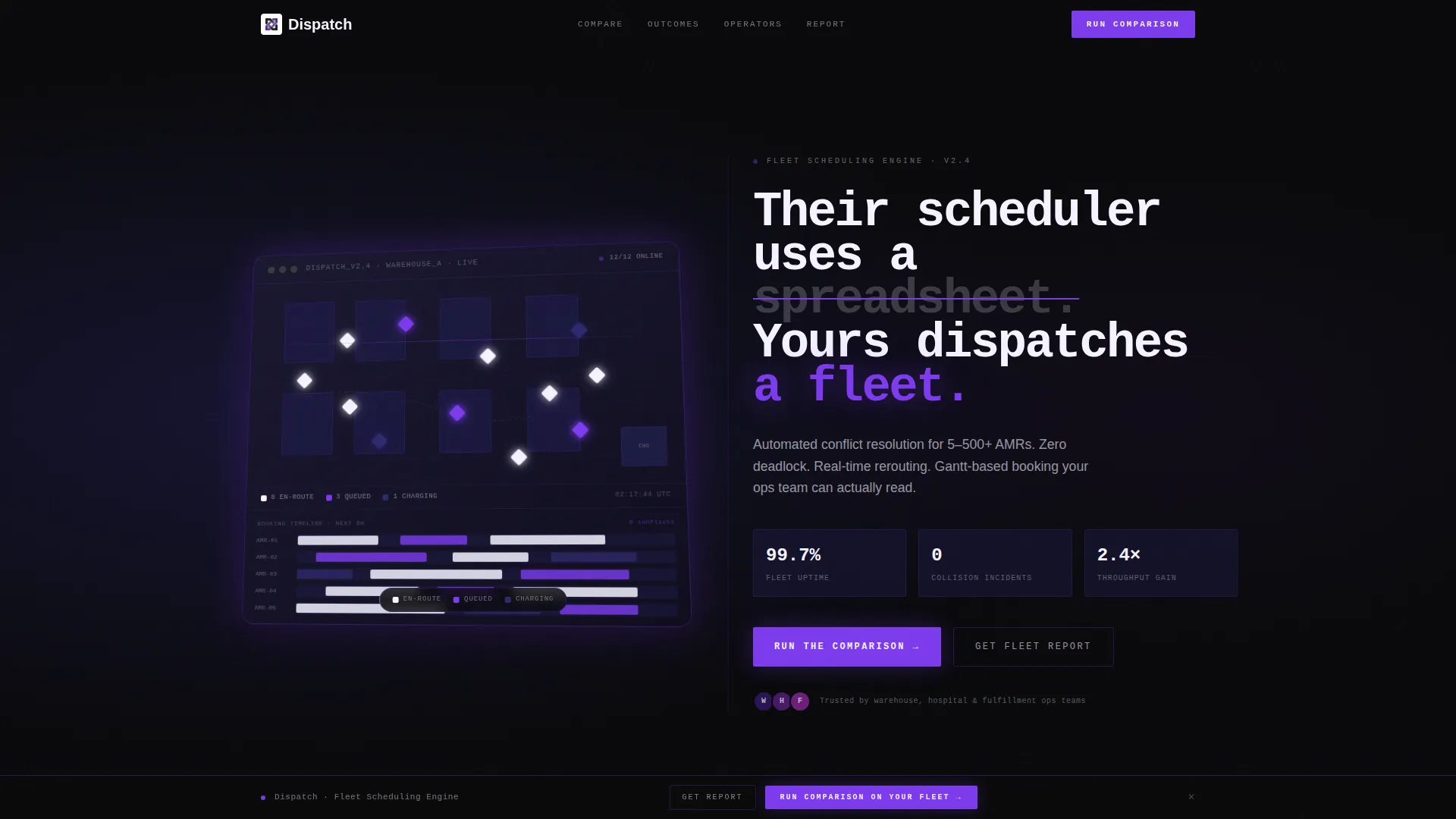
The header divides into two equal halves. The left side holds a full-resolution dispatch dashboard screenshot at a slight isometric tilt with a soft violet ambient glow beneath it. The right side carries a bold headline set in monospace type on a void black background, framing the product as the clear alternative to manual scheduling.
Scrolling Feature Matrix
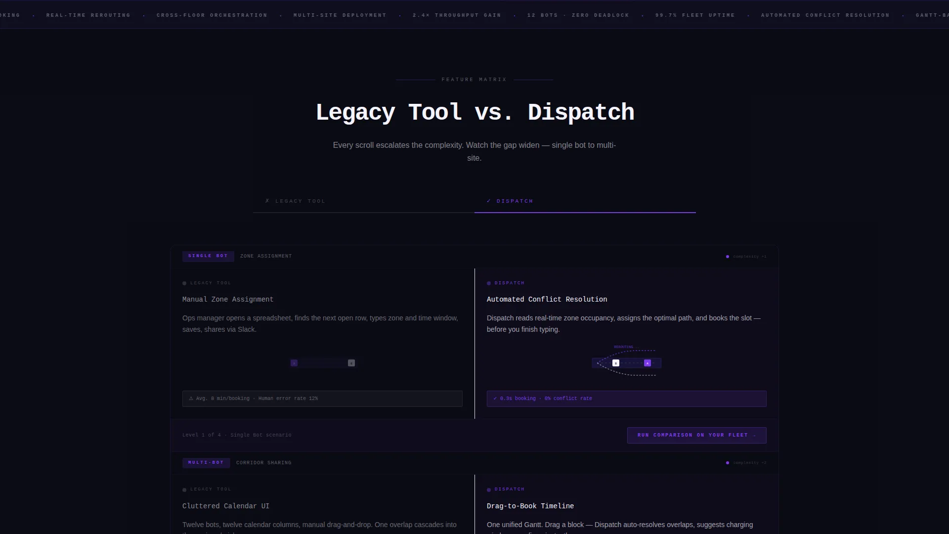
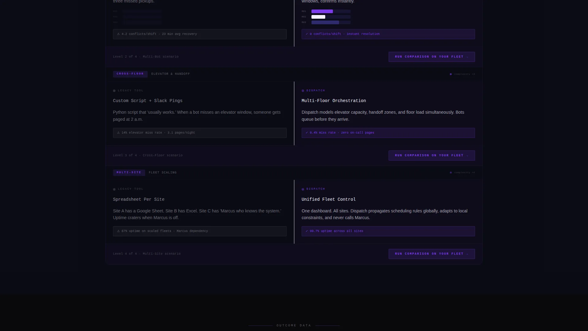
Each scroll section presents a direct left-versus-right confrontation between a legacy approach and the Dispatch engine. Rows escalate in complexity from single-bot routing to multi-site coordination, so the visitor feels the capability gap widen with every step down the page.
Versus Bar Charts with Entry Animation
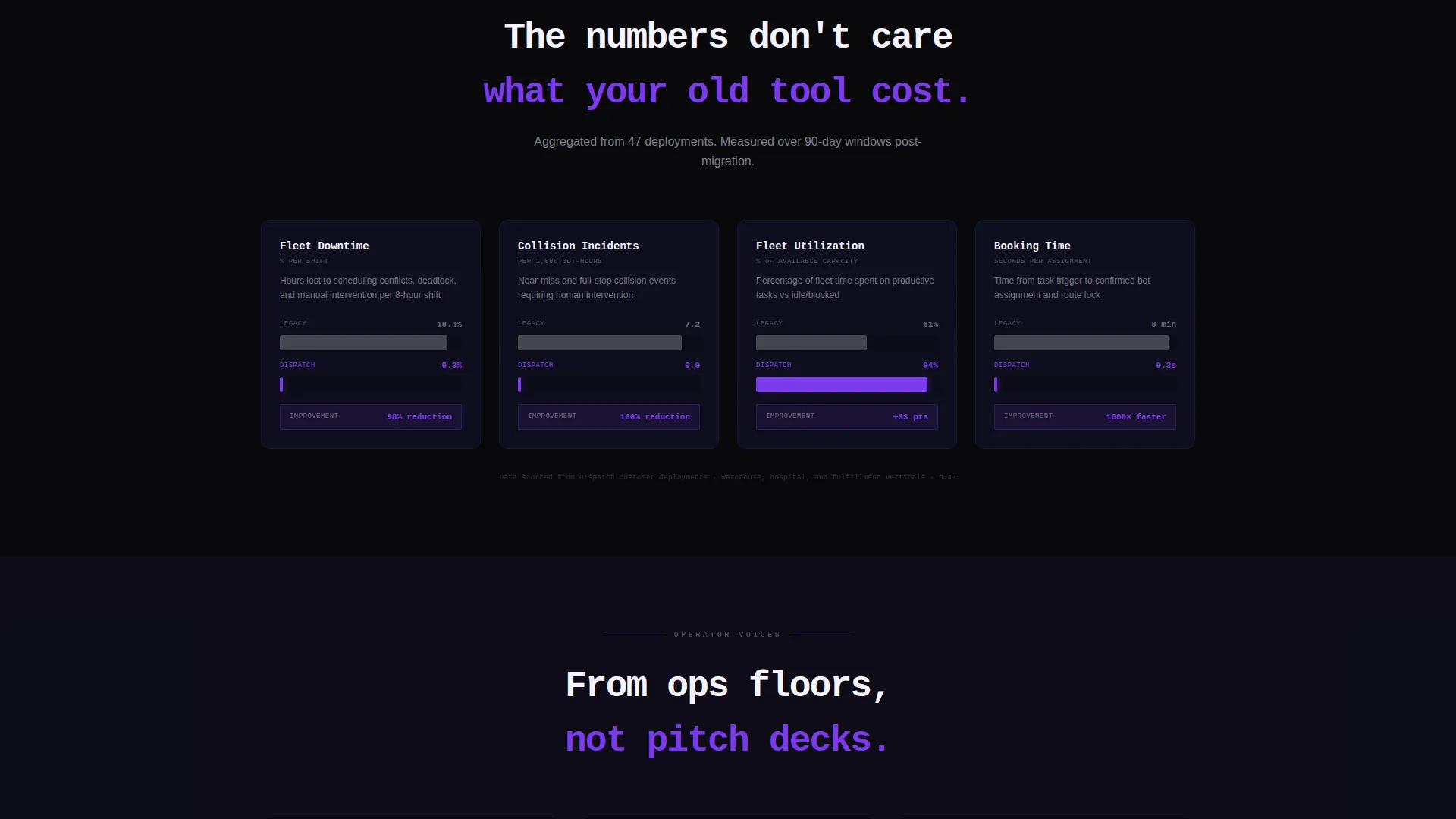
Midway through the matrix, the template shifts from feature comparisons to outcome metrics. Downtime percentages, collision incidents, and fleet utilization rates each appear as an animated bar chart that triggers on entry, making the performance story visual and immediate.
Two-Step Demo Request Form
The primary call to action opens a two-step form. Step one collects fleet size via a slider, current scheduling method via a dropdown, and facility type. Step two asks for a work email and a preferred demo window, keeping the qualification process clean and low-friction.
Gated PDF Benchmark Report
A secondary conversion path offers a downloadable fleet efficiency report gated behind an email field only. This captures prospects who are not yet ready to demo but need data to build an internal business case.
Persistent Bottom Bar with Pinned Call to Action
After the third scroll, a slim bottom bar appears and stays visible. It keeps the primary call to action, "Run the Comparison on Your Fleet", within reach at all times without interrupting the reading flow.
Page sections overview
| Section | Purpose |
|---|---|
| Split-Screen Header | Introduce the product with a live dashboard visual and a sharp positioning headline |
| Feature Matrix Rows | Compare legacy scheduling tools against Dispatch row by row, escalating in complexity |
| Micro-Animation Splits | Show two bots rerouting and a drag-to-book timeline to make feature claims tangible |
| Versus Bar Charts | Present outcome metrics as animated comparisons triggered on scroll entry |
| Demo Request Form | Qualify and convert high-intent visitors through a two-step interactive form |
| PDF Report Download | Capture research-stage visitors with a gated fleet efficiency benchmark report |
| Persistent call to action Bar | Keep the primary conversion action visible after the third scroll |
Design & branding system
The visual identity follows a Startup Velocity theme built entirely on the Void and Violet color system. Every color choice is intentional and tied to system state, not decoration.
- Absolute void black (#09090B) as the full-bleed background so product screenshots appear to float
- Deep space indigo (#1E1B4B) grounding section backgrounds with a sense of depth and structure
- Electric violet (#7C3AED) reserved for hover states, active bot indicators, and primary call-to-action elements
- Status-glow white (#F5F3FF) used for body text, active states, and the headline typography set in a monospace stack
Mobile & speed optimization
The template is structured with a mobile-first layout in mind. The split-screen sections reflow naturally for smaller viewports without losing the visual hierarchy that makes the comparison readable.
- The 50/50 split stacks vertically on mobile so both sides remain fully readable
- Micro-animations and entry-triggered bar charts are scoped to avoid layout disruption on smaller screens
- The persistent bottom bar is sized for thumb reach, keeping the call to action accessible on any device
How this template helps you convert
This template is built around a single conversion philosophy: show the gap, then close it. Every section moves the visitor closer to a decision.
- The feature matrix creates progressive contrast, so by the time a visitor reaches the outcome charts, they have already built a mental case for switching
- The pinned bottom bar ensures the primary call to action is never more than a glance away after the first few sections
- The dual-path conversion model captures both demo-ready buyers and research-stage visitors, so no qualified traffic leaves without giving an email
Other information about this template
This template is part of a broader set of Startup Velocity themed layouts designed for vertical software products with a technical buyer audience. A few additional details worth knowing before you build:
- The Gantt-style timeline in the header footer edge shows booking slots stacked per robot, giving technical visitors an immediate read on product depth
- Bot icons in the dashboard screenshot are color-coded by task state: queued in violet, en-route in white, and charging in dim indigo, reinforcing the color system throughout
- The headline copy direction, "Their scheduler uses a spreadsheet. Yours dispatches a fleet.", is included as a starting point and is fully editable
- This layout is designed to support robotics vertical SaaS positioning, where the buyer is sophisticated and needs outcomes, not marketing language
- The template is a single landing page format with a section-led scroll flow, not a multi-page website
Theme
Startup Velocity
Creative direction
Feature Matrix
Color system
Void & Violet
Style
Split Screen (50/50)
Direction
Comparison/Versus
Page Sections
Split-screen Header with Product Screenshot
Scrolling Feature Matrix Layout
Animated Versus Bar Charts
Two-step Demo Request Form
Gated PDF Benchmark Download
Persistent Pinned Call to Action Bar
Related questions
Who is this template designed for?
What are the two conversion paths included in this template?
Can I edit the headline and feature matrix copy?
Is this a single landing page or a full website?
How does the feature matrix handle different fleet sizes?



