Dispatch - Powerful Seniorcare Landing Page Template
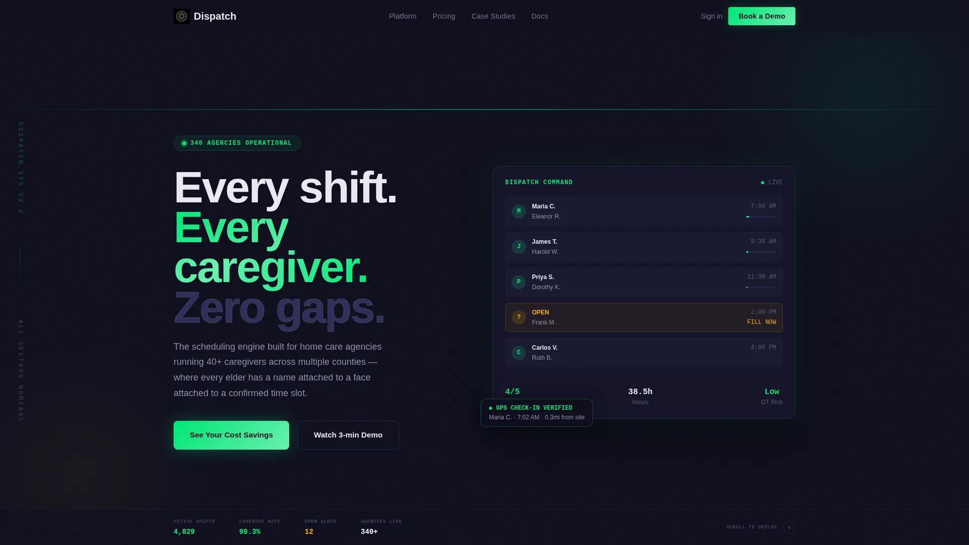
Dispatch is a bento grid landing page template built for senior care scheduling software. It uses a dark Data Command visual theme with color-coded shift indicators, versus-style comparison tiles, and a built-in cost savings calculator. The layout is designed to turn operational pain points into a compelling, row-by-row case for switching.
by Rocket studio
Quick summary
Dispatch is a single-page bento grid template for senior care scheduling software. It opens with industry logo credibility, walks visitors through side-by-side operational comparisons, and closes with an interactive savings calculator. The design runs on a Carbon Fiber color system that reads like a command cockpit, sharp, trustworthy, and built for decision-makers.
Who this template is for
This template is built for software companies and SaaS operators selling scheduling tools into the senior care industry. It speaks directly to buyers who manage complexity at scale and need more than a brochure.
- Home care agency owners managing large caregiver rosters across multiple counties
- Assisted living operations directors handling rotating and on-call staff under compliance pressure
- Franchise operators who need a single dashboard view across many locations
What problem this template solves
Senior care operations run on tight margins and tighter schedules. A generic landing page cannot carry the weight of that context. Dispatch fills that gap by making the operational case visually and sequentially.
- Scheduling chaos, missed shifts, and spreadsheet dependency are hard to communicate in static layouts
- Buyers in this industry need proof before they engage, and a logo bar plus versus tiles deliver that proof early
- The floating calculator gives hesitant buyers a reason to stay on the page and a number to bring to their leadership team
What you get with this template
You get a fully structured bento grid landing page that builds its argument section by section. Every component listed below comes from the template design as described in the source brief.
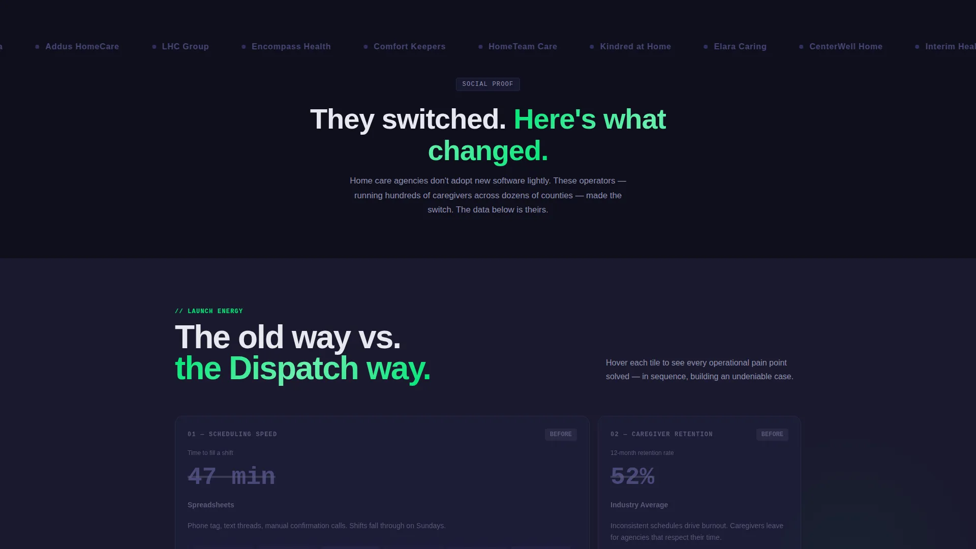
- A scrolling logo bar header with social proof from recognizable home care and assisted living brands
- A multi-row bento grid of versus tiles comparing old workflows against the software's approach
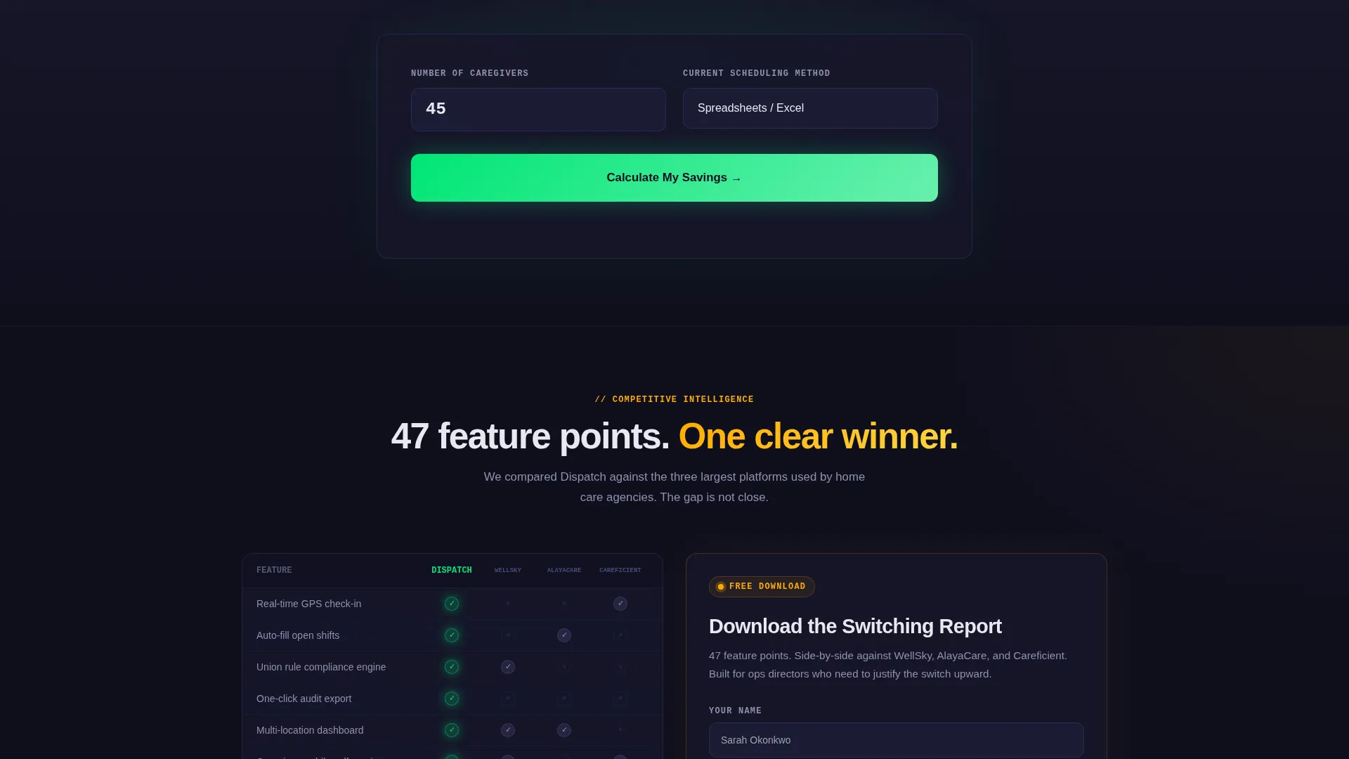
- A floating primary call-to-action button, a two-field savings calculator, and a gated secondary conversion path
Feature list
This template packages several high-impact components into one cohesive layout. Each piece is purpose-built for a software audience that needs to earn trust before asking for a click.
Scrolling Logo Bar Header
A horizontal ribbon of home care and assisted living brand logos opens the page before any product copy appears. Social proof lands first, and the credibility of industry-recognized names sets the tone for everything that follows.
Versus Bento Grid Tiles
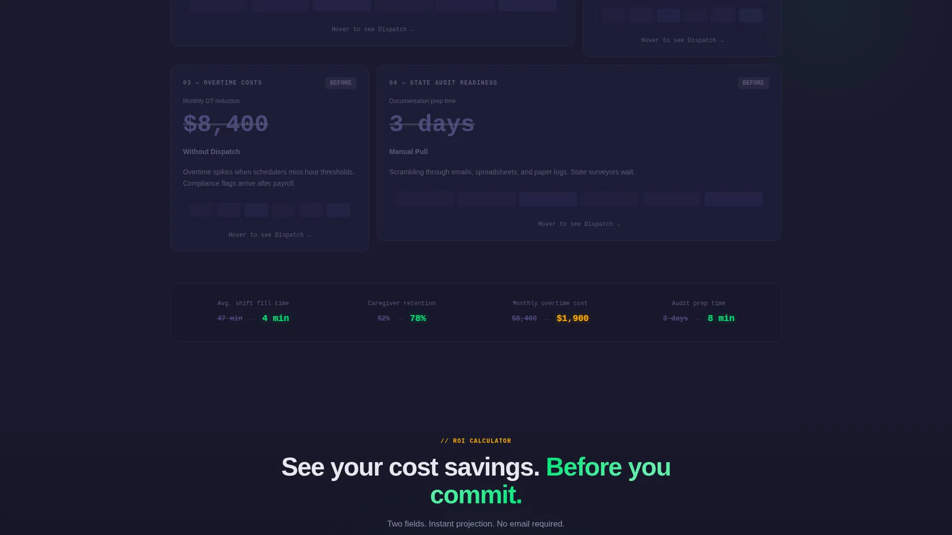
Each bento tile is a side-by-side comparison card. One side shows the old workflow with static, grayed-out visuals. The other side animates the modern approach with color-coded shifts, real-time check-in indicators, and compliance badges turning green. The grid escalates from scheduling speed through caregiver retention, overtime cost, and audit readiness.
Floating Cost Savings Calculator
A two-field calculator stays pinned to the screen as visitors scroll. Entering caregiver headcount and current scheduling method instantly returns projected weekly hours saved and annual overtime reduction. The result gives buyers a concrete number before they ever fill out a form.
Gated Switching Report Download
A secondary conversion path offers a downloadable comparison report. It is framed as a detailed feature-point breakdown against the three largest competitors in the market. This path captures buyers who are not yet ready to request a demo but want to do more research.
Data Command Color Signaling
Status-green is used exclusively for active shifts and confirmed actions. Alert amber appears only where attention or action is needed. This intentional color grammar means visitors can scan the page and understand system health at a glance, just like a real operational dashboard.
Sequential Persuasion Layout
The page is structured so each bento row hits harder than the last. Scheduling speed comes first, then retention metrics, then cost reduction, then compliance readiness. The order is deliberate and builds an undeniable case through momentum rather than hype.
Page sections overview
| Section | Purpose |
|---|---|
| Logo Bar Header | Opens with industry brand credibility before any product pitch |
| Headline Block | Delivers a single trust-first statement against a carbon black background |
| Versus Row One | Compares scheduling speed: spreadsheet chaos versus. auto-filled rosters |
| Versus Row Two | Compares caregiver retention metrics side by side |
| Versus Row Three | Shows overtime cost reduction with animated contrast tiles |
| Primary call to action Block | Places "See Your Cost Savings" after the third bento row |
| Savings Calculator | Two-field interactive tool returning hours saved and overtime reduction |
| Versus Row Four | Covers state audit readiness and compliance badge activation |
| Secondary call to action Block | Offers the gated switching report download as a research path |
| Floating call to action Button | Stays pinned on scroll for persistent access to the calculator |
Design & branding system
The visual identity follows a Data Command theme built on a Carbon Fiber color system. Every design decision reinforces the feeling of a lit, operational cockpit under low ambient light.
- Deep carbon black (#1A1A2E) dominates backgrounds; titanium panel gray (#30305A) defines card edges and grid dividers
- Status-green (#00E676) signals active shifts and confirmed states; alert amber (#FFAB00) draws the eye only to open slots and compliance flags
- Typography renders in titanium white against dark backgrounds for maximum readability at a glance
Mobile & speed optimization
The bento grid layout is structured to adapt across screen sizes without losing its visual hierarchy. Comparison tiles remain legible and distinct at smaller widths.
- Color-coded shift indicators and status signals retain their meaning on mobile screens
- The floating call-to-action button is positioned to stay accessible without blocking key content on any device
- The two-field calculator is designed for quick input, keeping the interaction lightweight on any connection
How this template helps you convert
Every structural decision in Dispatch is made to reduce friction and increase buyer confidence before any form is shown.
- The logo bar and versus tiles build credibility and demonstrate value before the first call to action appears, so visitors arrive at the calculator already convinced.
- The floating "See Your Cost Savings" button keeps the primary conversion path visible at every scroll depth, reducing the chance a motivated buyer loses the entry point.
- The gated report download captures research-phase buyers with a low-commitment ask, giving the sales funnel a second entry point beyond the calculator.
Other information about this template
Dispatch is a purpose-built template for the senior care software market. It is especially relevant for teams positioning a scheduling product against established competitors in the home care and assisted living space.
- The template style is Bento Grid, and the creative direction is Launch Energy, meaning the layout is designed to build momentum as visitors scroll
- The header concept is Logo Bar, a pattern that prioritizes industry recognition over product screenshots at the top of the page
- The landing page direction is Comparison/Versus, making it well suited for campaigns targeting buyers who are actively evaluating options
Theme
Data Command
Creative direction
Launch Energy
Color system
Carbon Fiber
Style
Bento Grid
Direction
Comparison/Versus
Page Sections
Scrolling Logo Bar Header
Versus Bento Grid Tiles
Floating Cost Savings Calculator
Gated Switching Report Download
Data Command Color Signaling
Sequential Persuasion Layout
Related questions
Who is this template designed for?
How does the savings calculator work in this template?
What conversion paths does this template include?
Can the versus tiles be customized for a different product?
Does the template work for scheduling software outside senior care?



