Software & SaaS Booking Website Template
Dispatch is a dark-mode, hub-and-spoke landing page template built for social media management tools. It opens with an animated API code snippet, then walks visitors through six capability spec cards, Scheduler, Inbox, Analytics, AI Writer, Approvals, and Integrations, using a fixed anchor nav, frosted-glass panels, and a violet-on-black visual identity that reads like a premium developer product.
by Rocket studio
Quick summary
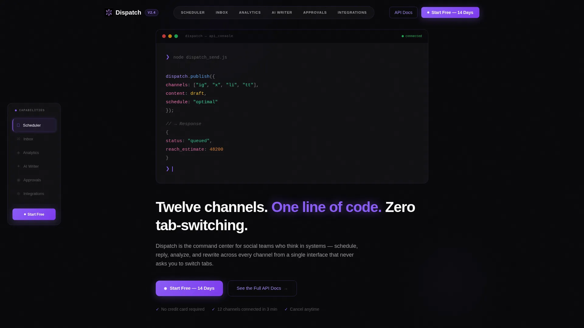
Dispatch is a single-page, anchor-nav landing page template for social media management software. It uses a Tech Glass visual identity, void black, frosted panels, and electric violet accents, to present six technical spec-card sections. The header opens with a live-typing API code snippet, and every spoke section is built to earn buyer trust before the click.
Who this template is for
This template is built for SaaS founders and marketing teams who need to sell a complex, multi-channel tool to a technically confident audience. It works especially well when the product targets power users who evaluate tools by how they work, not just what they promise.
- Solo founders who need a polished product page between funding rounds
- Agency coordinators managing multiple client social accounts under tight deadlines
- In-house social media leads who report directly to senior marketing stakeholders
What problem this template solves
Most SaaS landing pages either oversimplify the product or bury its depth in generic marketing language. For a social media management tool with real technical capability, that mismatch kills conversions. Visitors who think in systems need a page that thinks in systems too.
- Visitors leave when a page cannot match the sophistication of the product it describes
- Generic layouts fail to communicate multi-channel, multi-feature depth at a glance
- No fixed navigation means users must scroll blindly instead of investigating on their own terms
What you get with this template
You get a fully structured, single-page layout with a fixed anchor navigation bar, six capability spoke sections, and a clear conversion path. Everything is ready to adapt to your product copy, screenshots, and brand colors.
- A hero section with an animated, syntax-highlighted API code snippet and a primary call-to-action button
- Six spec-card spoke sections covering Scheduler, Inbox, Analytics, AI Writer, Approvals, and Integrations
- A fixed left anchor nav with active-state highlighting and a persistent call-to-action button
Feature list
This template is built around six components that work together to move a skeptical technical buyer from curiosity to confidence.
Animated Code Snippet Hero
The header opens with a monospaced, syntax-highlighted block that types itself onto the screen in real time. It simulates a live API call, with a response object animating back below it. The effect establishes immediate product credibility before a single paragraph is read.
Fixed Anchor Navigation
A left-side navigation bar stays fixed as the visitor scrolls. Each spoke link glows violet when its section is active, giving the visitor a clear sense of position and full control over how they explore the page.
Spec-Card Spoke Sections
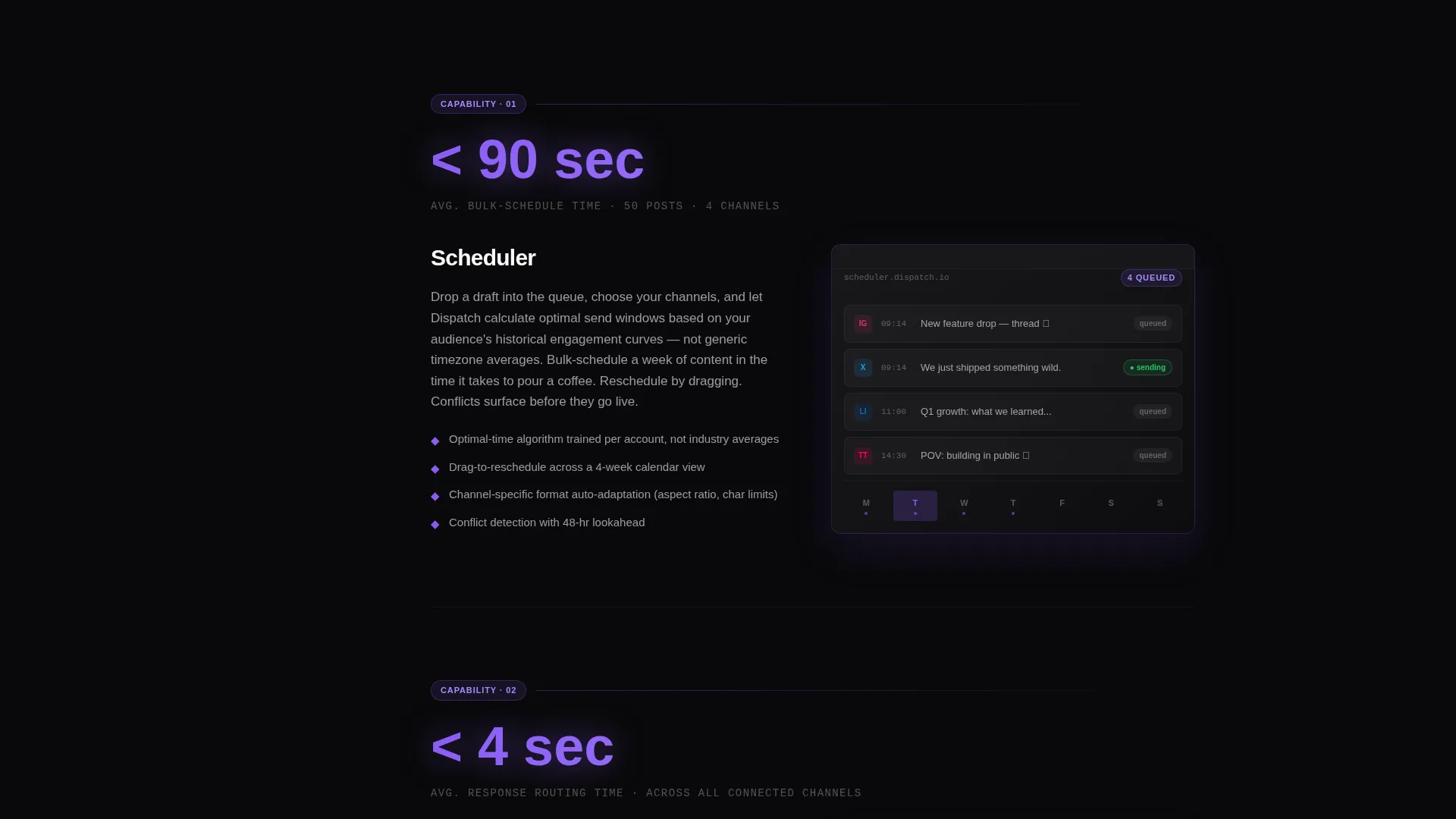
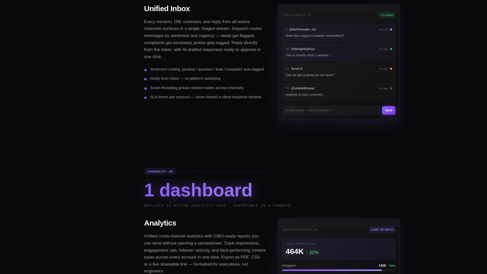
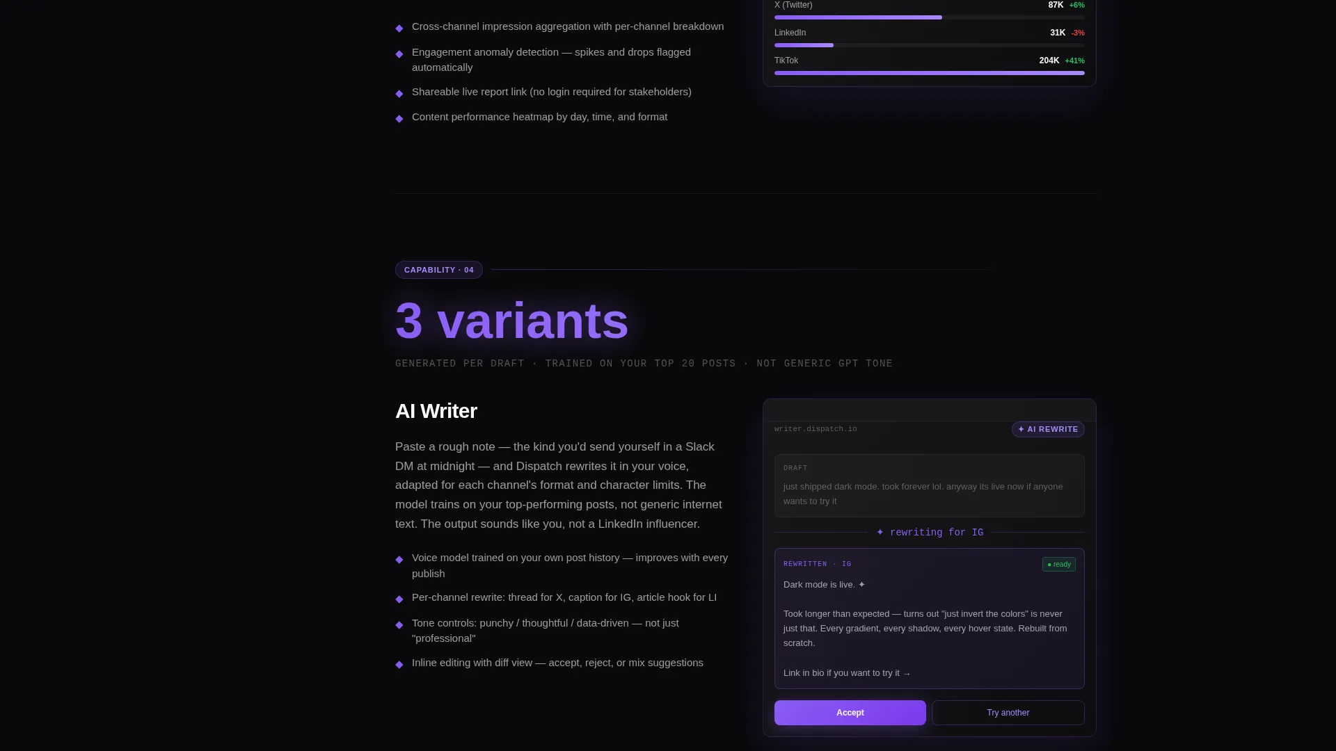
Each of the six capability sections opens with an oversized metric in violet type, followed by a concise description paragraph and a frosted-glass product screenshot. The format reads like a technical teardown and builds confidence with every section.
Frosted Glass Panel System
All content cards use a frosted-glass treatment, a dark panel at 60 percent opacity over the void-black background. This keeps the layout layered and premium without sacrificing readability.
Persistent Call-to-Action Placement
The primary "Start Free for 14 Days" button appears in three locations: the header, the anchor nav, and the final section. A secondary "See the Full API Docs" link catches the technical buyer who wants to verify before committing.
Void and Violet Color System
Every interactive element, live-state indicator, and active nav link uses electric violet as its accent color. Secondary violet handles hover states and gradient trails, keeping the interface consistent and purposeful throughout.
Page sections overview
| Section | Purpose |
|---|---|
| Hero Code Snippet | Opens with a typing API call and the primary call-to-action |
| Anchor Nav Bar | Fixed left nav for jumping between spoke sections |
| Scheduler Spec Card | Highlights scheduling capability with a metric and screenshot |
| Inbox Spec Card | Shows reply routing and response management features |
| Analytics Spec Card | Presents performance data and reporting capability |
| AI Writer Spec Card | Covers AI-assisted content creation and rewriting |
| Approvals Spec Card | Explains the workflow approval process for teams |
| Integrations Spec Card | Lists connection capability across channels and tools |
| Final call to action Section | Anchors the page with the primary sign-up button |
Design & branding system
The visual identity follows a Tech Glass theme built on the Void and Violet color system. The palette is designed to feel like a premium developer environment, dark, precise, and alive with purposeful color signals.
- Core colors: absolute void black (#09090B) for backgrounds, frosted glass panels (#18181B at 60 percent opacity), electric violet (#8B5CF6) for interactive accents, and phosphor white (#FAFAFA) for primary text
- Secondary violet (#A78BFA) handles hover states and gradient trail effects throughout the layout
- Typography uses monospaced typefaces in the hero and code elements, with clean sans-serif body type for spec-card paragraphs
Mobile & speed optimization
The layout is designed to translate its fixed-nav, dark-mode experience to smaller screens without losing the spec-card structure. The anchor nav collapses cleanly, and the frosted panels stack in a readable single-column flow.
- Frosted glass panels restack vertically on smaller viewports to preserve readability
- The fixed anchor nav adapts to a compact navigation pattern on mobile screens
- Call-to-action buttons remain visible and accessible at every scroll depth on all screen sizes
How this template helps you convert
The conversion strategy behind Dispatch is built on earned trust, not pressure. By the time a visitor has read three spec cards, they have seen enough technical depth to believe the product matches its promise.
- The animated code snippet hero filters for the right audience immediately and signals engineering-grade quality before any marketing copy appears
- The spec-card format lets each capability section do the selling on its own terms, with a metric, a description, and a screenshot working together
- Three placements of the primary call-to-action button mean the visitor is never more than one scroll away from committing, with no form friction on this page
Other information about this template
Dispatch is a hub-and-spoke landing page template, meaning the anchor nav acts as the central hub and each capability section is a spoke the visitor can reach directly. This structure suits products with several distinct features that each deserve space to breathe.
- The template style is Hub and Spoke with Anchor Navigation, well suited to software products with multiple parallel feature sets
- The header concept is a Code Snippet, making this template a strong fit for developer-facing or technically positioned SaaS products
- The creative direction is Spec Sheet, borrowing the format of a product teardown to communicate depth and precision
- The landing page direction is Click-Through, meaning the page is optimized to move visitors to a separate sign-up flow rather than capturing a form submission on-page
- This template sits within the Technology category, specifically the Software and SaaS subcategory, targeting the social media management tool niche
Theme
Tech Glass
Creative direction
Spec Sheet
Color system
Void & Violet
Style
Hub & Spoke (Anchor Nav)
Direction
Click-Through
Page Sections
Animated Code Snippet Hero
Fixed Anchor Navigation Bar
Six Spec-card Spoke Sections
Frosted Glass Panel Design
Triple Call-to-action Placement
Void and Violet Color System
Related questions
Can I change the spoke sections to match my own product features?
Does the template include the typing animation for the code snippet?
Is this template suitable for a social media management tool with a free trial offer?
Can the anchor navigation work on mobile devices?
Do I need a form on this page to collect leads?



