No-Code Enterprise Software Careers Website Template
Dispatch is a no-code transportation management system landing page template built for freight brokers and third-party logistics operators. It showcases drag-and-drop module building, a rate management panel, carrier scorecards, and document generation in a dark cockpit-style dashboard. The design guides visitors straight into a live sandbox with zero friction.
by Rocket studio
Quick summary
Dispatch is a single-page, click-through landing page template for a no-code transportation management platform. It targets mid-size freight and logistics operations that need a full system without writing code. The layout follows a Problem-to-Solution scroll arc, building from chaos to a fully assembled, all-green dashboard by the final section.
Who this template is for
This template is built for logistics businesses that have outgrown patched-together tools and need to present a serious software platform confidently. It speaks directly to operators who live inside load boards, rate sheets, and carrier compliance tasks every day.
- Third-party logistics operators running 200 to 2,000 loads per month
- Freight brokers building or promoting a no-code transportation management system
- Operations managers who need to replace multi-tab, multi-login workflows with one command center
What problem this template solves
Managing freight operations across disconnected tools creates real daily pain. Dispatchers alt-tab between rate platforms, tracking apps, shared spreadsheets, and email inboxes just to cover one load. This template gives you a page that names that pain clearly and shows a structured path out of it.
- Communicates the cost of fragmented logistics tools in a visually immediate way
- Guides qualified prospects from problem recognition to hands-on product trial without a form or demo call
- Presents complex platform capabilities, rate management, carrier vetting, load tracking, and document generation, as simple and approachable
What you get with this template
You get a fully structured, scroll-driven landing page built around a dark dashboard visual system. Every section is purpose-built to move a logistics operator from skepticism to action. The layout is ready to customize with your own module data, branding colors, and call-to-action links.
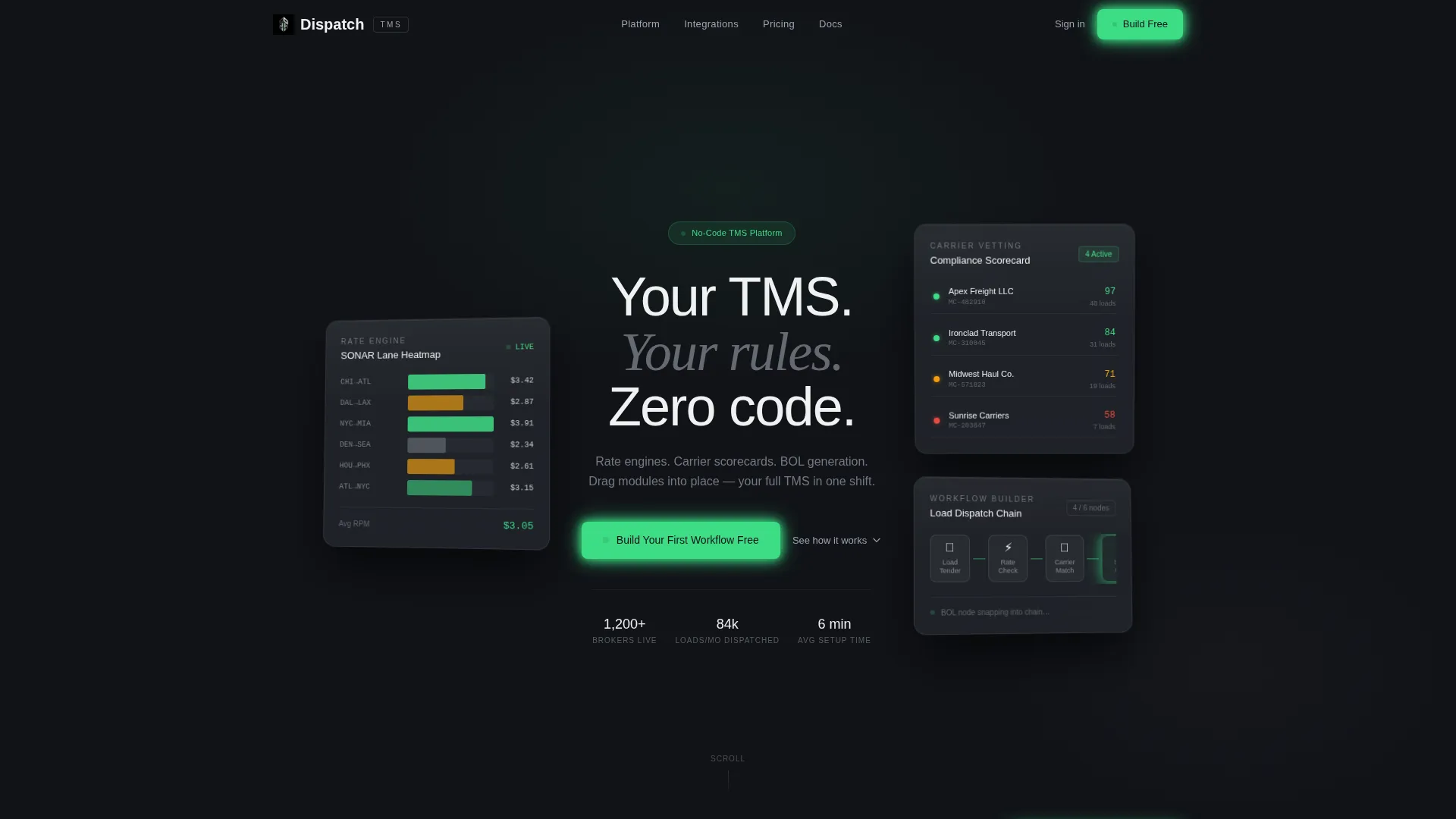
- A header with three floating frosted-glass user interface cards showing live product modules
- A Problem-to-Solution scroll arc with a split-screen chaos section that resolves into an assembled dashboard
- A sticky bottom call-to-action bar, a primary header button, and an anchored final-section conversion block
Feature list
This section walks through the core design and structural features built into the Dispatch template.
Dark Glass Panel Header
Three frosted-glass user interface cards float on a pure black field, each angled slightly to suggest depth. One shows a rate-per-mile heat map, one displays a carrier compliance scorecard with status indicators, and one presents a drag-and-drop workflow builder mid-construction. A thin white headline fades up between the panels.
Problem-to-Solution Scroll Arc
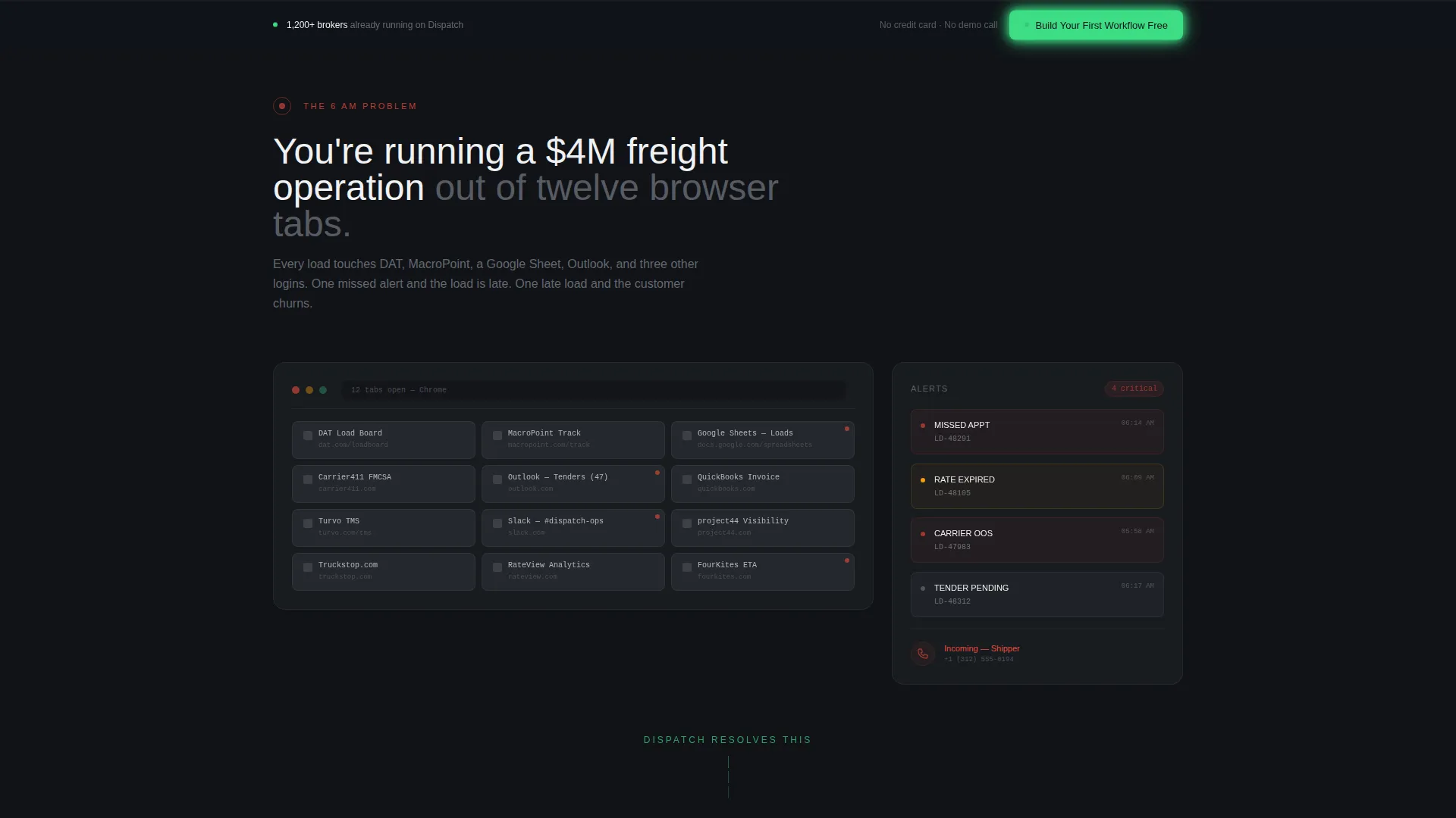
The scroll journey opens with a simulated chaos section rendered in desaturated steel tones. Red pulse indicators mark pain points like missed appointments and stacked load tender emails. Each subsequent section resolves one problem with a corresponding product module panel, and the panels assemble into a complete dashboard by the final section.
Interactive Data Grid Panels
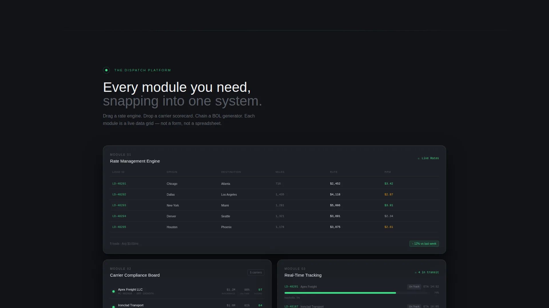
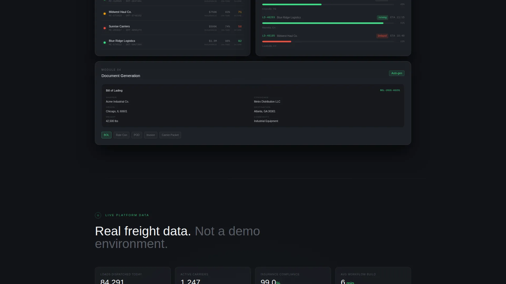
Each product module, rate management, carrier vetting, real-time tracking, and document generation, is presented as an interactive data grid. The panels snap together visually as the visitor scrolls, reinforcing the platform's core drag-and-drop metaphor without requiring any explanation.
Multi-Point Call-to-Action System
The primary call-to-action button appears in operational green in the header. It repeats as a sticky bottom bar after the second scroll section. The final assembled-dashboard section anchors a conversion block with a supporting line that removes friction: no credit card, no demo call, just direct sandbox access.
Monochrome Steel Color System
The entire palette is built from five tones: deep cockpit black, brushed gunmetal, panel-edge silver, status-glow white, and a single operational green used only for live indicators and primary calls to action. The system creates maximum contrast so key information is always visible at a glance.
BOL Generation Module Visual
A bill of lading node is shown snapping into a drag-and-drop workflow chain inside one of the header glass panels. This detail signals document generation capability to logistics buyers immediately, without requiring any explanatory copy around it.
Page sections overview
| Section | Purpose |
|---|---|
| Dark Glass Header | Introduces the platform with three live-module user interface cards and the primary call-to-action |
| Chaos Split Screen | Visualizes fragmented tool pain using desaturated tones and red pulse indicators |
| Rate Management Panel | Resolves rate chaos with an interactive rate-per-mile data grid module |
| Carrier Vetting Panel | Shows carrier compliance scorecards with green, amber, and red status dots |
| Real-Time Tracking Panel | Presents live load tracking as a resolved data module in the scroll arc |
| Document Generation Panel | Displays bill of lading generation as a drag-and-drop workflow node |
| Assembled Dashboard | Shows the complete system running clean with every indicator green |
| Sticky call to action Bar | Persistent bottom bar repeating the primary call-to-action after scroll section two |
| Final Conversion Block | Anchors the page with the primary button and a zero-friction supporting line |
Design & branding system
The visual identity is built entirely around the Monochrome Steel palette and the Dashboard Pro theme. There is no lifestyle photography, no warm tones, and no decorative elements. Every visual choice serves information clarity, making the page feel like the inside of an operational control room.
- Five-tone color system: deep cockpit black (#111318), brushed gunmetal (#2A2D35), panel-edge silver (#9EA3AE), status-glow white (#F0F1F3), and operational green (#3DDC84) reserved for live indicators and calls to action
- Frosted-glass panel surfaces with subtle reflections and slight angular depth to create a layered, high-tech look
- Thin white typography for headlines, maximum contrast body text, and red (#E74C3C) pulse accents used only in the problem section
Mobile & speed optimization
The template is designed as a single-page layout with a lean section structure. The scroll arc and panel assembly behavior are built to translate cleanly across screen sizes, keeping the dashboard metaphor intact on smaller viewports.
- Single-page structure with clearly segmented scroll sections keeps load weight minimal
- Data grid panels and glass card components are designed to reflow without losing visual hierarchy on mobile screens
- Sticky call-to-action bar is optimized for thumb reach on mobile, keeping conversion access constant throughout the scroll
How this template helps you convert
Dispatch is built as a click-through landing page. The goal is not to collect a form submission but to move a qualified visitor directly into a live sandbox environment. Every structural decision reduces the distance between first impression and hands-on product use.
- The three-panel header immediately shows the product in action, giving visitors a functional preview before they read a single word of body copy.
- The Problem-to-Solution scroll arc qualifies visitors by naming their exact daily pain, then resolves each point with a module panel, building confidence incrementally before the final call to action.
- The multi-point call-to-action system, header button, sticky bar, and final anchor block, ensures the conversion opportunity is always one tap away without feeling aggressive or repetitive.
Other information about this template
Dispatch sits at the intersection of no-code enterprise software and logistics technology. It is designed to serve a specific operational buyer, not a general SaaS audience. The template's visual language and section flow are both calibrated to that context.
- Template style: Dashboard and Data Grid, aligned with the Dashboard Pro theme
- Creative direction: Problem-to-Solution Arc, a scroll narrative that mirrors a dispatcher's actual morning workflow
- Landing page direction: Click-Through, routing directly to a pre-loaded sandbox with sample loads and carriers already populated
- The no-code transportation management system niche sits within the broader no-code enterprise software subcategory, targeting operators who need real system power without developer dependency
- The template is suitable for presenting any modular logistics platform where drag-and-drop configuration, rate engines, load boards, and carrier management are core selling points
Theme
Dashboard Pro
Creative direction
Problem→Solution Arc
Color system
Monochrome Steel
Style
Dashboard/Data Grid
Direction
Click-Through
Page Sections
Dark Glass Panel Header
Problem-to-solution Scroll Arc
Interactive Data Grid Panels
Multi-point Call-to-action System
Monochrome Steel Color System
BOL Generation Workflow Visual
Related questions
What kind of business is this template built for?
Does this template include a contact form or lead capture?
Can I customize the color system and module panels?
What is the bill of lading node shown in the header?
How does the scroll arc structure work in this template?



