Public Transit Vertical SaaS Booking Website Template
Dispatch is a dashboard-style landing page template built for public transit booking platforms. It presents a feature-tab interface, a spec-sheet capability layout, and an app-download conversion flow. The Electric Indigo color system gives it the feel of a live transit control room, precise, data-dense, and immediately credible to commuters, coordinators, and transit operators alike.
by Rocket studio
Quick summary
Dispatch is a single-page landing page template designed for public transit booking systems. It combines a Feature Tab Switcher header, a numbered Spec Sheet content layout, and a persistent app-download call to action. The result is a page that feels operational from the first scroll, every section pulling its weight like a vehicle on a live route map.
Who this template is for
This template speaks directly to transit technology teams and mobility service operators who need a landing page that earns rider trust quickly. It works equally well for city transit authorities launching a booking app as it does for paratransit service providers scheduling accessibility-focused rides.
- Daily commuters who want to reserve seats and compare departure windows before leaving home
- Mobility-access coordinators arranging wheelchair-accessible pickups for elderly or disabled clients
- Suburban families routing multi-transfer journeys for teenagers who commute to weekend jobs
What problem this template solves
Riders and operators both suffer from the same problem: transit booking feels unreliable and opaque. Guessing arrival times, hunting for fare information, and calling a dispatcher for accessible van service are all friction points that push riders away. This template addresses that trust gap with a dense, functional interface that looks like the actual product running.
- Riders cannot easily compare fares, seat availability, and departure times in one view
- Accessibility coordinators lack a clear scheduling interface that shows vehicle capacity and pickup windows
- Transit operators lose potential app downloads because their landing page does not reflect the sophistication of their platform
What you get with this template
You get a complete, ready-to-customize landing page structured around the real workflows of transit riders and coordinators. Every section is designed to communicate capability, not just promise it. The page layout mirrors what riders expect from modern booking software.
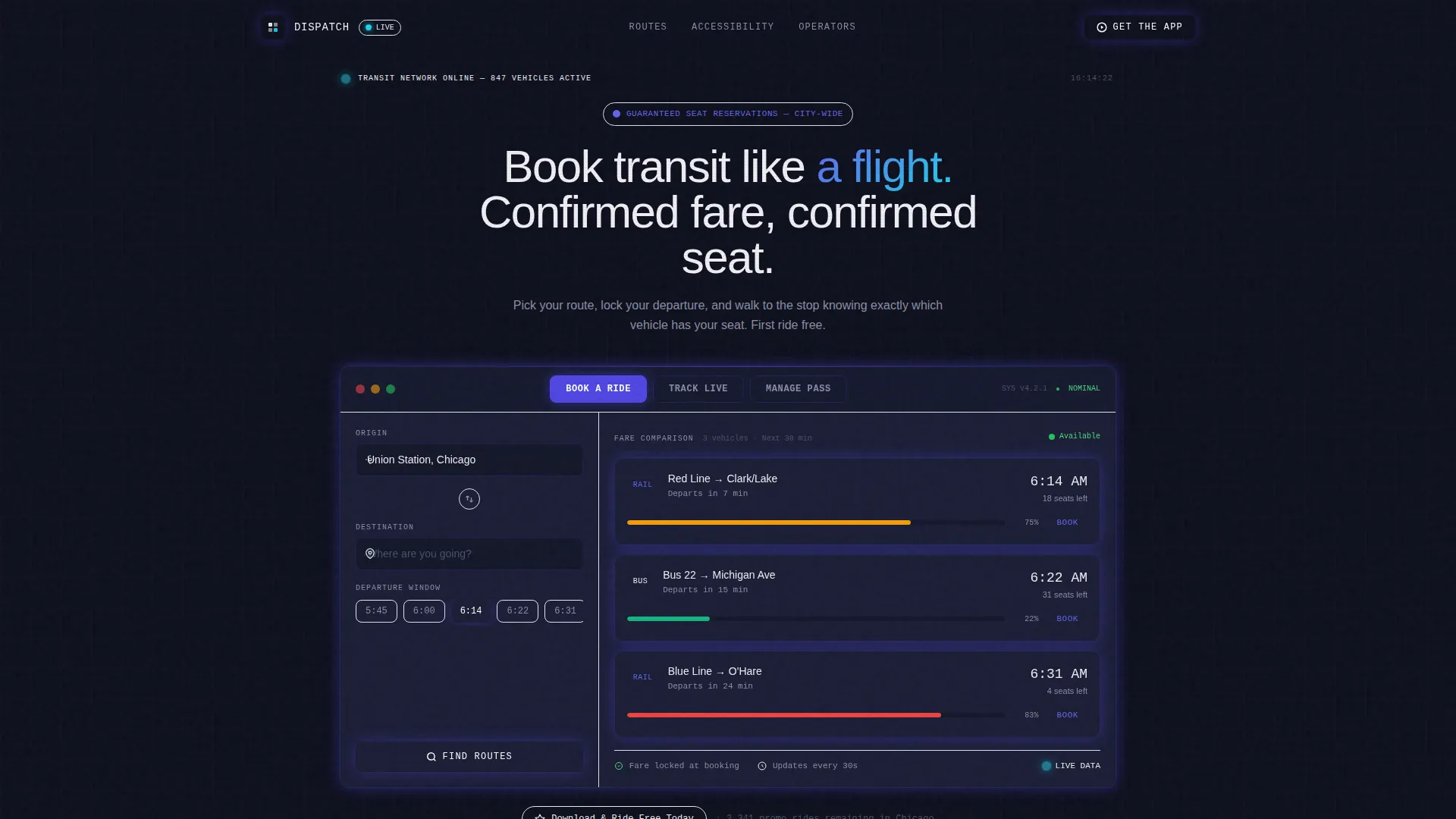
- A Feature Tab Switcher header with three views: Book a Ride, Track Live, and Manage Pass
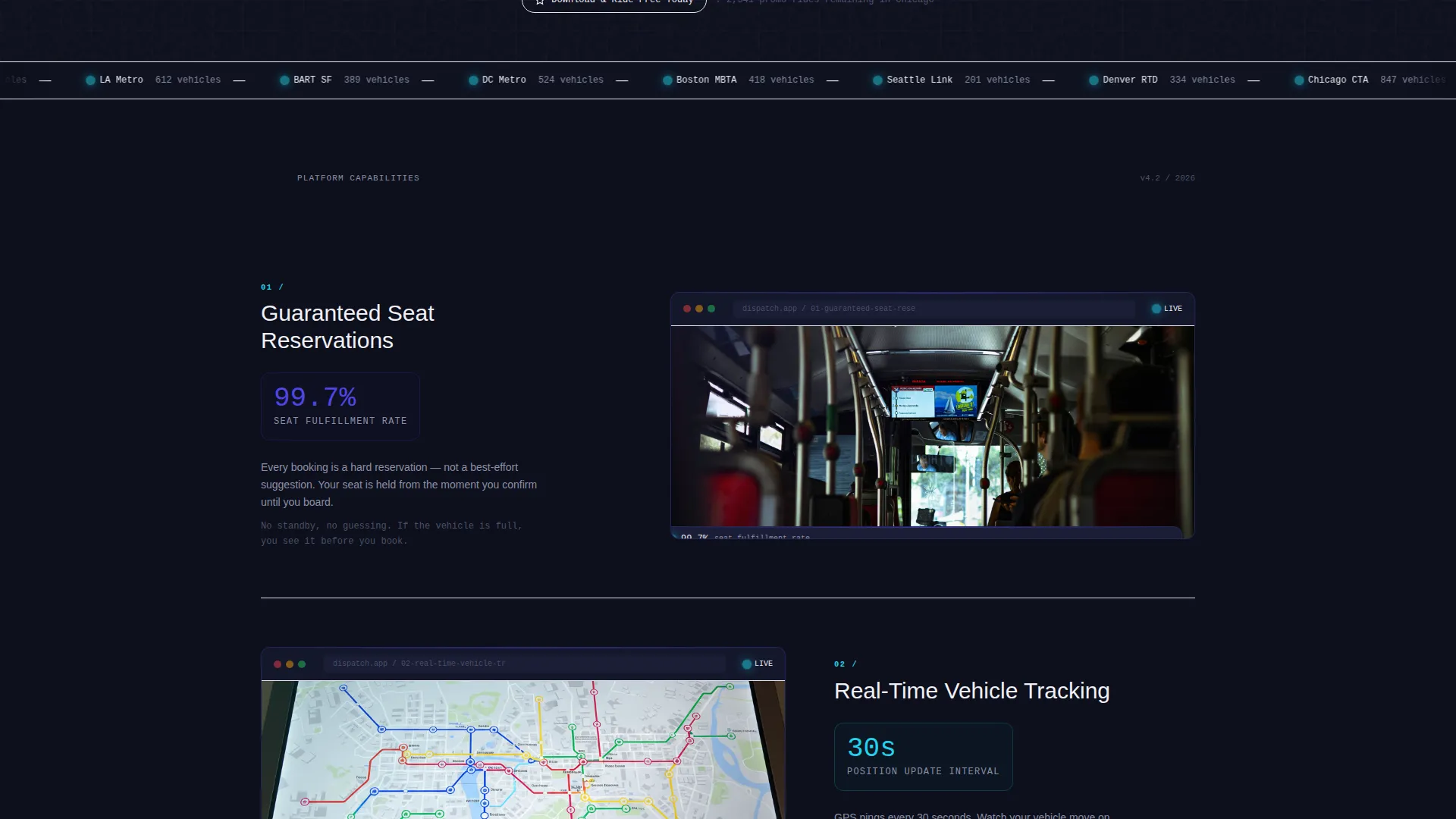
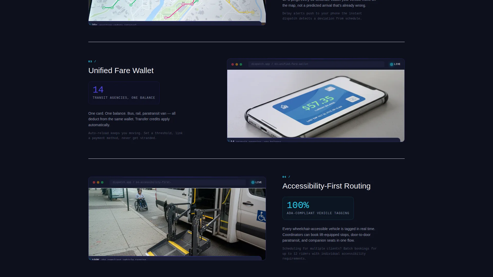
- A numbered Spec Sheet section with capability blocks covering seat reservations, live tracking, fare wallet, and accessibility routing
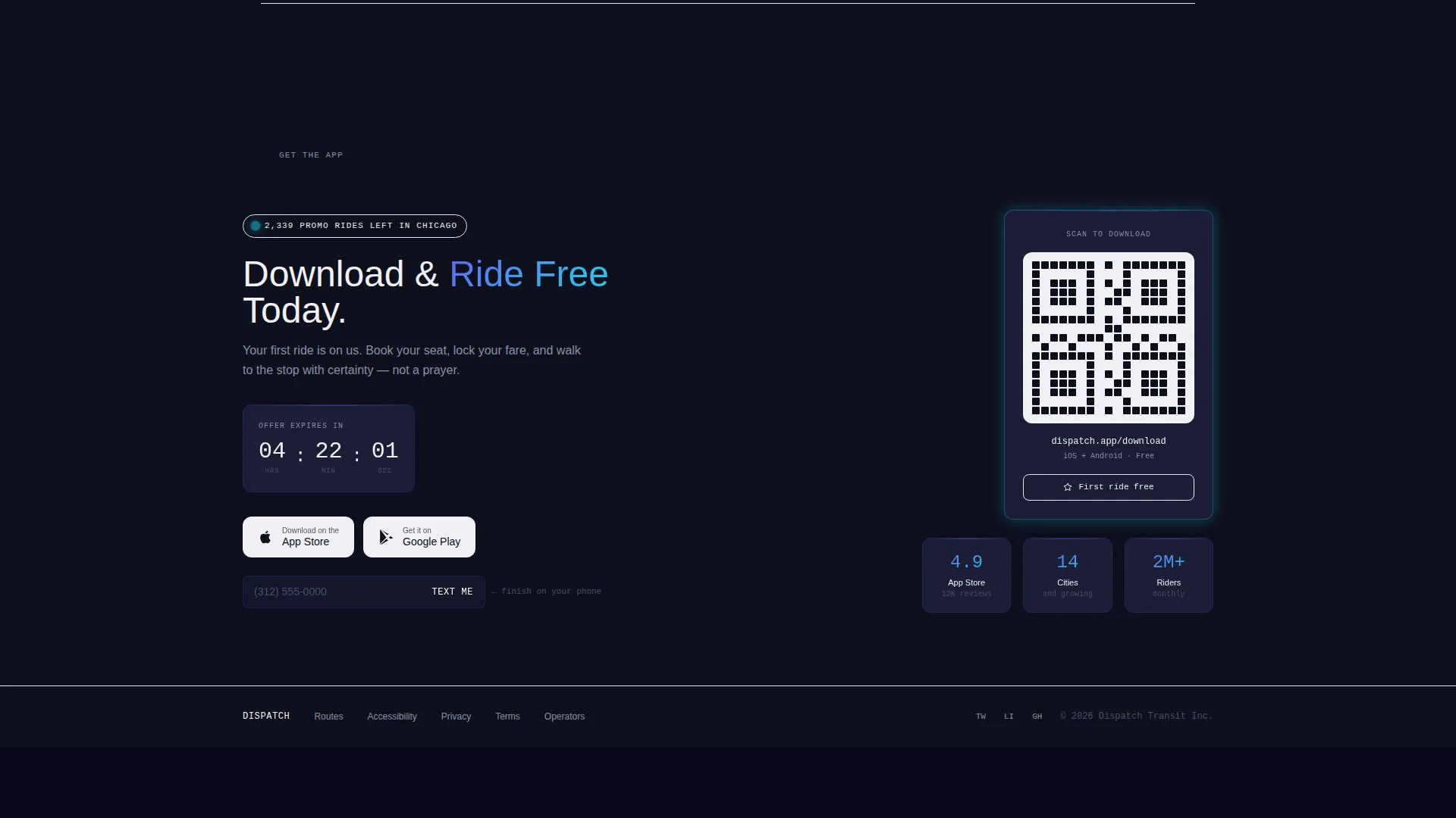
- A persistent app-download call to action with platform-detect buttons, a QR code fallback, and a "Text Me the Link" secondary path
Feature list
This template is built around four core content capabilities drawn directly from the platform brief. Each one is presented with the visual weight it deserves.
Feature Tab Switcher Header
Three clickable tabs sit across the top of a simulated dashboard interface. The default view shows a route-selection panel with origin and destination fields, a departure-time carousel, and a fare comparison grid. Switching tabs swaps the dashboard content instantly, showing either a live tracking map with vehicle dots or a digital transit card with balance, ride history, and auto-reload toggle.
Numbered Spec Sheet Layout
Each capability block is numbered and structured as a stat callout, a tight user interface screenshot, and two lines of plain-language explanation. The rhythm is deliberate and metronomic. Capability after capability stacks until the platform feels comprehensive and inevitable.
Persistent App Download Call to Action
A sticky bottom bar on mobile and a persistent sidebar card on desktop anchor the primary call to action throughout the scroll. Tapping reveals platform-detect buttons for iOS and the App Store alongside a QR code fallback for desktop visitors.
Scarcity-Driven Incentive Display
The free-ride offer appears in the header tab view and is reinforced at the bottom of the page with a countdown showing remaining promotional rides in the user's city. The incentive is stated once and earned through scarcity, not repetition.
Accessibility-First Routing Block
Capability block 04 in the Spec Sheet is dedicated to accessibility-first routing. It highlights paratransit van scheduling and wheelchair-accessible pickup windows as first-class platform features, not afterthoughts.
Secondary Conversion Path
A "Text Me the Link" field with a single phone-number input gives users a frictionless way to hand off the download to their mobile device. This removes the barrier for desktop visitors who prefer to complete the action on a phone.
Page sections overview
| Section | Purpose |
|---|---|
| Feature Tab Switcher | Show route booking, live tracking, and pass management in one interactive header |
| Fare Comparison Grid | Display three upcoming vehicles with seat availability as visual fill bars |
| Spec Sheet Block 01 | Present guaranteed seat reservation capability with stat and screenshot |
| Spec Sheet Block 02 | Present real-time vehicle tracking capability with stat and screenshot |
| Spec Sheet Block 03 | Present unified fare wallet capability with stat and screenshot |
| Spec Sheet Block 04 | Present accessibility-first routing capability with stat and screenshot |
| App Download Bar | Anchor the primary call to action with platform buttons and QR code fallback |
| Promotional Countdown | Reinforce the free-ride incentive with remaining-rides scarcity counter |
| Text Link Field | Offer a secondary path to download via SMS phone-number input |
Design & branding system
The visual identity follows a Data Command theme built on the Electric Indigo color system. The palette is designed to feel like a subway map backlit on an OLED panel at midnight, luminous, functional, and precise.
- Deep terminal black (#0D0F1C) as the base background, giving every element maximum contrast
- Charged indigo (#4F46E5) for interactive elements and primary highlights, with live-signal cyan (#22D3EE) for active route indicators and data callouts
- Platform-tile white (#F0F0F5) for card surfaces and data cells, keeping text legible against the dark base
Mobile & speed optimization
The template is built with mobile-first conversion in mind. The sticky bottom bar on mobile keeps the app-download call to action visible at all times without interrupting the reading flow.
- Platform-detect buttons adapt the call to action for iOS and Android visitors automatically
- A QR code fallback ensures desktop visitors can still complete the download on their preferred device
- The "Text Me the Link" field gives any user a one-field path to move the action to their phone
How this template helps you convert
Every structural decision in this template is oriented toward getting riders to download the app and complete their first booking. The incentive, the interface, and the layout all serve the same goal.
- The free-ride offer is introduced in the header and reinforced at the bottom with a live countdown of remaining promotional rides, creating a specific and time-sensitive reason to act now.
- The simulated dashboard interface makes the product feel real and trustworthy before a single tap, reducing the hesitation that generic marketing pages create.
- Multiple conversion paths, platform buttons, QR code, and SMS link, ensure that no visitor, regardless of device or context, hits a dead end on the way to downloading the app.
Other information about this template
Dispatch is categorized under Technology and sits within the Public Transit Vertical SaaS subcategory, making it purpose-built for this niche rather than adapted from a generic SaaS template. The template style is Dashboard and Data Grid, which means the layout language draws from operational software interfaces rather than marketing brochure conventions.
- The template theme is Data Command, a visual and structural approach that prioritizes data legibility and interface density over decorative elements
- The creative direction is Spec Sheet, meaning content is organized as numbered capability blocks rather than narrative storytelling
- This template is a strong fit for transit technology teams preparing an app launch or a rebrand of an existing public transit booking service
Theme
Data Command
Creative direction
Spec Sheet
Color system
Electric Indigo
Style
Dashboard/Data Grid
Direction
App Download
Page Sections
Feature Tab Switcher Header
Numbered Spec Sheet Sections
Persistent App Download Call to Action
Scarcity Countdown Incentive
Accessibility-first Routing Block
Related questions
Can I customize the tab labels in the Feature Tab Switcher?
Does the fare comparison grid require live data to display correctly?
Is this template suitable for paratransit or accessibility-focused transit services?
How does the app download call to action behave on a desktop computer?
Can I replace the Electric Indigo color system with my own brand colors?



