Dispatch - Powerful Travel ERP Landing Page Template
Dispatch is a dark-themed, dashboard-style travel ERP landing page built for operations-heavy travel companies. It pairs a glassmorphic visual system with a Problem-to-Solution scroll arc, guiding visitors from operational chaos to a single consolidated platform. Four live-data header panels, shatter-and-rebuild scroll transitions, and a device-aware app download call to action make the case fast.
by Rocket studio
Quick summary
Dispatch is a full-viewport, single-page travel ERP landing page template. It opens with four frosted-glass data panels showing live bookings, itineraries, forex rates, and supplier ledgers. A Problem-to-Solution scroll arc then walks visitors through every fragmented tool they currently use and shows how Dispatch replaces it, closing with a device-aware app download call to action.
Who this template is for
This template is built for travel technology teams that need to sell a complex operations product without losing visitors in technical detail. It works best when the product genuinely replaces fragmented, multi-tool workflows.
- Operations managers at mid-size outbound travel companies managing concurrent group movements
- Ground handlers and destination management companies coordinating supplier contracts and itineraries
- Finance controllers reconciling multi-currency supplier invoices at month-end
What problem this template solves
Most travel ERP products are genuinely powerful, but their landing pages look like software documentation. Visitors arrive from browser-tab chaos and need to feel the relief of consolidation before they read a single feature bullet. This template solves the gap between a product's capability and a buyer's first impression.
- Fragmented tools like disconnected spreadsheets, email threads, and messaging groups make the problem feel invisible on a static page
- A flat feature list never shows the emotional payoff of replacing twelve open tabs with one screen
- Generic SaaS templates do not carry the operational weight that travel ERP buyers expect to see
What you get with this template
You get a fully designed, single-page layout built around the Data Command visual theme. Every section is structured to carry a visitor from pain recognition to confident download, using layered glassmorphic panels and scroll-triggered transitions as the narrative engine.
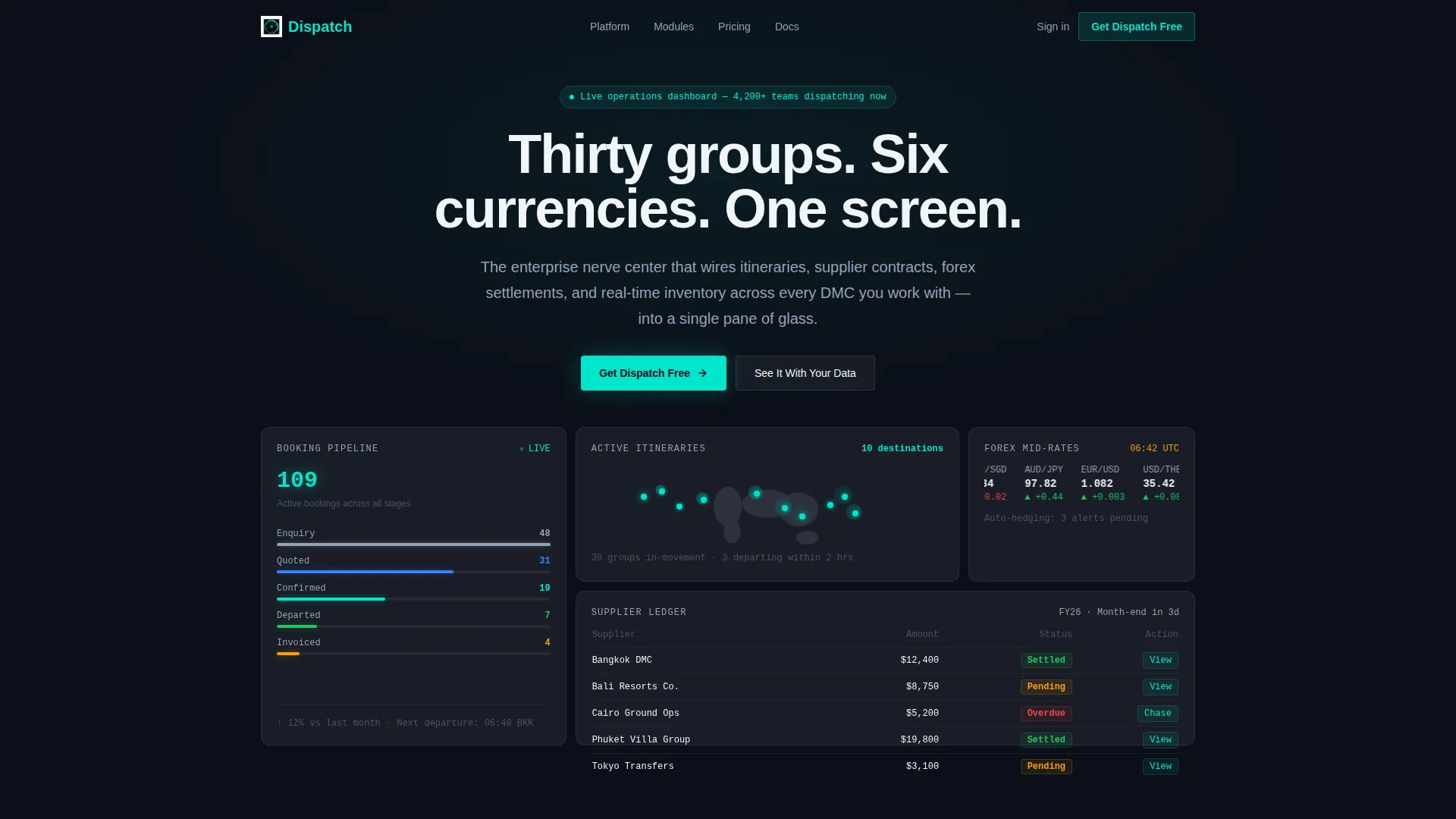
- A full-viewport header with four asymmetric frosted-glass data cards covering bookings, active itineraries, forex tickers, and supplier settlement status
- A Problem-to-Solution scroll arc with shatter-and-rebuild panel transitions across booking, operations, finance, and reporting stages
- A device-aware app download section with platform toggle buttons for iOS, Android, and Desktop, plus a guided demo booking form
Feature list
This template ships with a focused set of design and layout capabilities drawn directly from the brief. Each feature is purpose-built for a travel ERP audience that expects precision.
Four-Panel Live-Data Header
The header fills the entire viewport with four frosted-glass cards arranged in an asymmetric grid. Each card displays a different operational vignette: booking pipeline stage counts, a world map with active itinerary markers, a forex ticker for currency pairs, and a color-coded supplier ledger. Panels have a subtle parallax drift on mouse movement to reinforce layered depth.
Self-Typing Hero Headline
A single headline types itself into view on load, reading "Thirty groups. Six currencies. One screen." This micro-interaction sets the product's value proposition before a visitor scrolls, creating immediate context for everything that follows.
Shatter-and-Rebuild Scroll Transitions
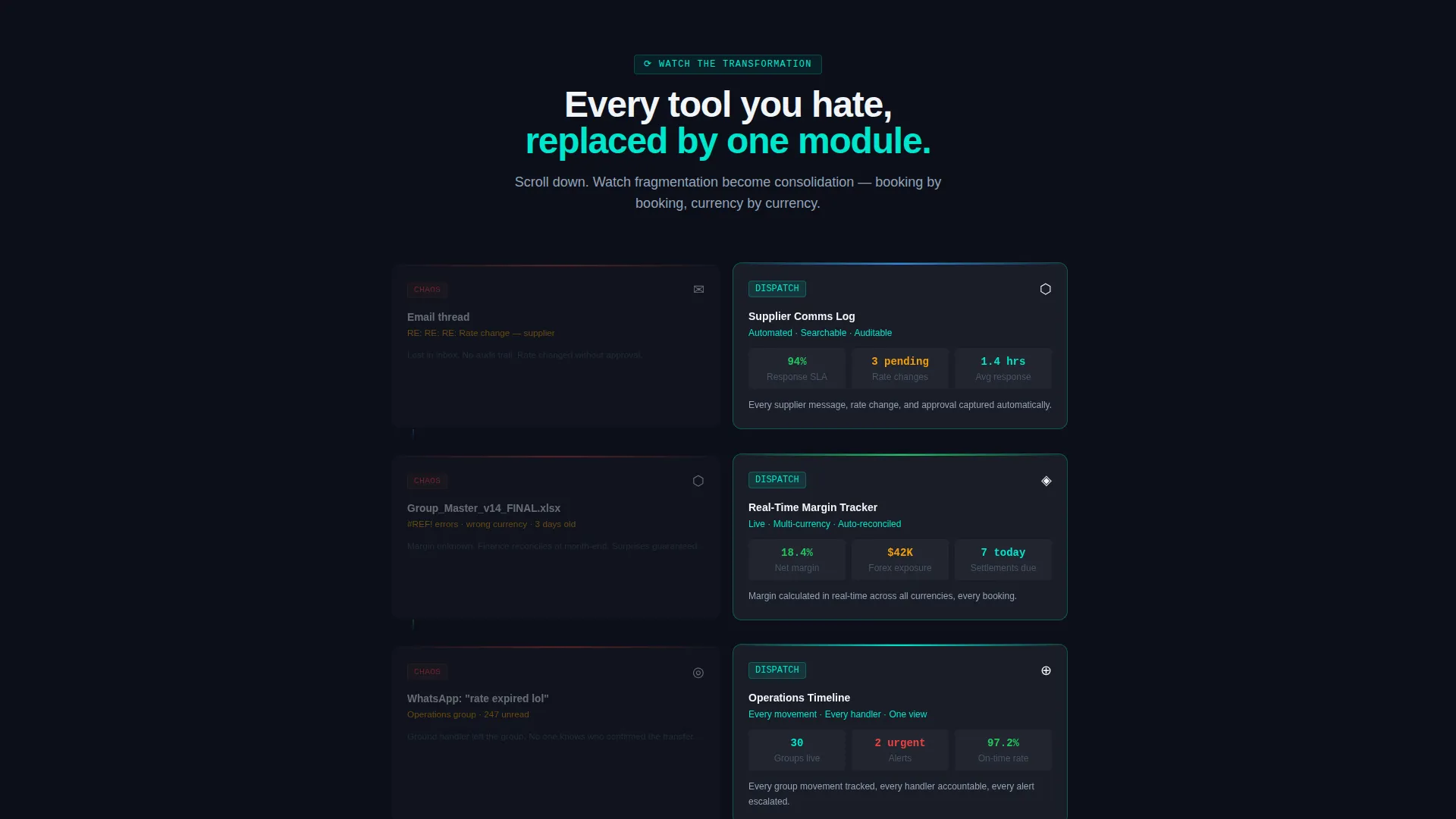
As the visitor scrolls through the problem section, frosted cards representing disconnected tools shatter and reorganize into the corresponding Dispatch module. The messy email becomes a supplier communication log. The broken spreadsheet becomes a margin tracker. The WhatsApp thread becomes an operations timeline.
Device-Aware App Download call to action
The primary call-to-action section auto-detects the visitor's device and highlights the matching platform toggle button among iOS, Android, and Desktop options. A social proof counter showing active travel operations teams sits directly above the download button.
Guided Demo Booking Form
A secondary conversion path offers a "See It With Your Data" demo form. It collects company name, average monthly bookings, and current tools used, giving the sales team qualified context before the first conversation.
Glassmorphic Dark Design System
Every surface uses deep cockpit black as the base, with frosted translucent panels layered on top using low-opacity white and a blur effect. Electric teal highlights active data. Muted cloud gray handles secondary text and grid lines. The result reads like an air-traffic control interface.
Page sections overview
| Section | Purpose |
|---|---|
| Full-Viewport Header | Establish operational credibility with four live-data glass panels |
| Self-Typing Headline | Deliver the core value proposition on load |
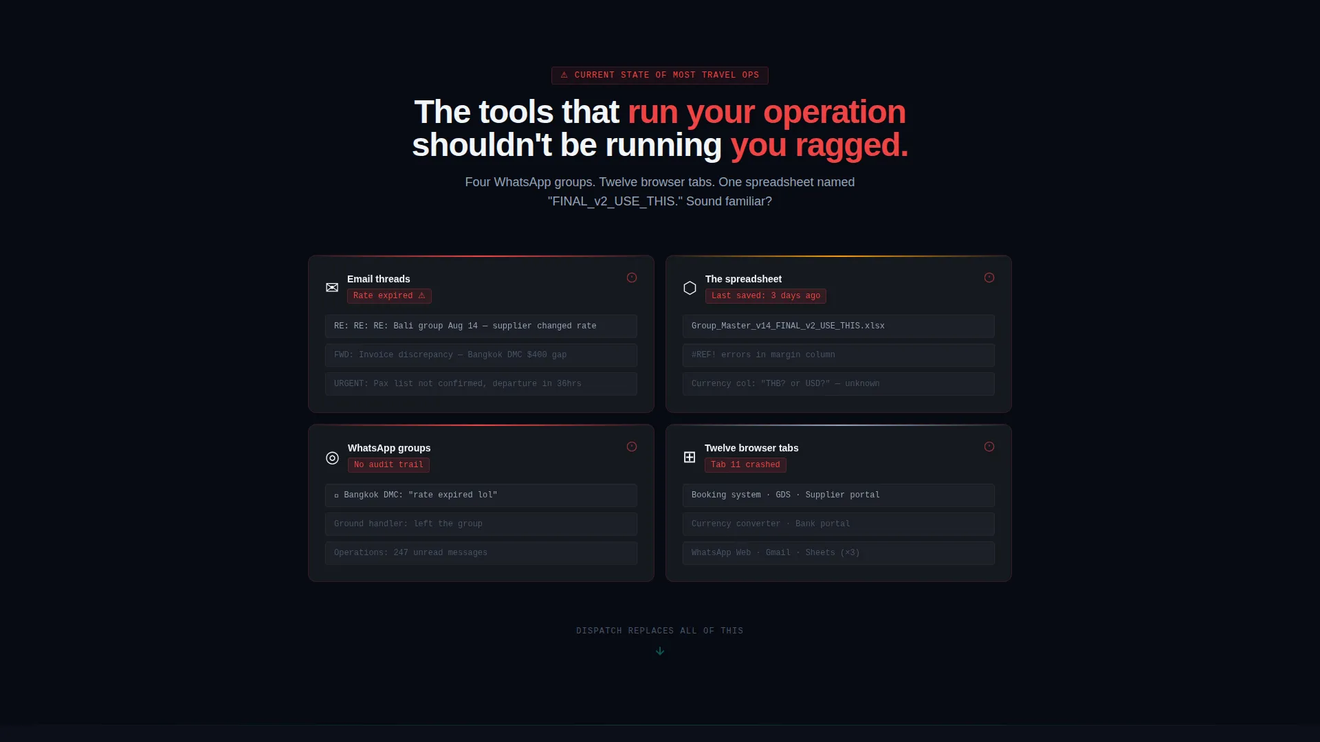
| Problem Chaos Section | Show the fragmented-tool reality that buyers already live in |
| Booking Transition | Shatter disconnected email into a supplier communication log |
| Operations Transition | Rebuild broken spreadsheet into a real-time margin tracker |
| Finance Transition | Transform messaging thread into an operations timeline |
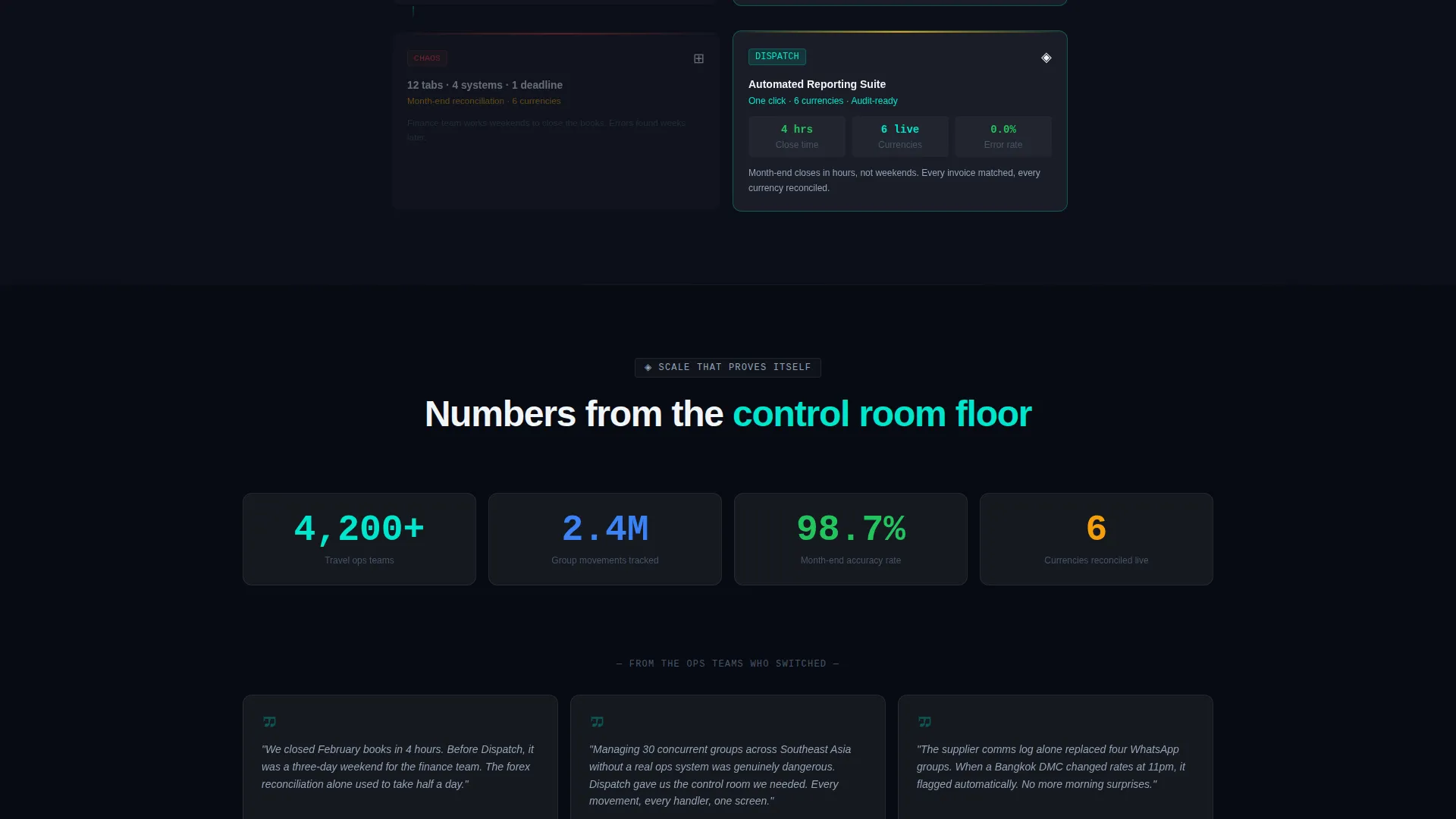
| Reporting Transition | Complete the arc from chaos to consolidated reporting view |
| Social Proof Counter | Provide the final trust nudge before the download call to action |
| App Download call to action | Drive platform-specific downloads with device auto-detection |
| Demo Booking Form | Capture qualified leads via a guided secondary conversion path |
Design & branding system
The visual identity follows a Data Command theme executed through a glassmorphic color system. The palette is inspired by an air-traffic control tower at night, where depth comes from layers of smoked glass rather than drop shadows.
- Base background in deep cockpit black (#0B0F19), frosted panels at 6% white opacity with a 12-pixel blur, electric teal (#00E5CC) for live-data highlights and hover states
- Muted cloud gray (#94A3B8) for secondary text, grid lines, and non-critical interface elements
- Asymmetric panel layouts, parallax mouse-drift on the header, and scroll-triggered shatter animations create a layered, dimensional feel throughout
Mobile & speed optimization
The template is designed to translate the dense data-panel layout into a clean, readable experience on smaller screens. The dark base color and low-opacity glass panels are lightweight by nature, keeping the visual system practical across devices.
- Asymmetric four-panel header reflows into a stacked single-column layout on mobile viewports
- Platform toggle buttons for iOS, Android, and Desktop adapt to device detection, keeping the primary call to action relevant on every screen size
- Parallax and shatter animations are scoped to scroll events so they do not interfere with touch navigation on mobile
How this template helps you convert
The conversion strategy is built into the scroll experience itself. By the time a visitor reaches the download button, the template has already made the case through demonstration rather than assertion.
- The Problem-to-Solution Arc earns trust by naming the exact pain points travel operations teams recognize, then resolving each one visually before asking for a click.
- The social proof counter showing active travel operations teams directly above the download button delivers a final confirmation that the product is already in use at scale.
- The dual-path call to action structure serves both ready-to-download visitors and those who need a guided demo, reducing drop-off at the decision moment.
Other information about this template
This template is categorized under Travel Software and SaaS within the broader Technology category, making it relevant for travel ERP product teams, travel technology startups, and destination management companies building a direct-to-buyer acquisition page. The Data Command theme and Dashboard-and-Data-Grid template style make it a strong fit for any operations-heavy product that needs to demonstrate consolidation value at a glance.
- The template style is classified as Dashboard and Data Grid, suited for products where live data visualization is central to the value story
- The landing page direction targets app downloads as the primary conversion event, with a guided demo form as a secondary lead-capture path
- The glassmorphic color system and dark-mode-first design make the template visually distinctive in a category where most competitors use light, generic SaaS layouts
Theme
Data Command
Creative direction
Problem→Solution Arc
Color system
Glassmorphic
Style
Dashboard/Data Grid
Direction
App Download
Page Sections
Four-panel Live-data Header
Self-typing Hero Headline
Shatter-and-rebuild Scroll Transitions
Device-aware App Download Call to Action
Guided Demo Booking Form
Glassmorphic Dark Design System
Related questions
What type of product is this template designed for?
Can I use this template if my product does not have a mobile app?
How does the Problem-to-Solution scroll arc work visually?
Is the guided demo form included in the template?
Who does the social proof counter reference above the download button?



