Trucking Vertical SaaS Professional Website Template
Dispatch is a trucking analytics landing page template built for carriers who know their revenue but not their true cost-per-load. It combines a terminal code animation hero, scroll-triggered industry-finding sections, live-looking dashboard modules, and a three-step progressive lead generation form to turn fleet data uncertainty into confident, actionable decisions.
by Rocket studio
Quick summary
Dispatch is a dark-mode, dashboard-style landing page template for a trucking analytics platform. It opens with an animated terminal sequence, assembles a full data dashboard on scroll, and guides fleet managers through escalating industry findings before delivering a three-step lead capture form. Built for carriers running five to fifty trucks.
Who this template is for
This template is built for B2B SaaS products in the trucking and logistics space. It fits teams who need a high-converting landing page that speaks directly to the numbers carriers care about most.
- Owner-operators running five to fifteen trucks who track revenue but cannot calculate true cost-per-mile
- Fleet managers at mid-size carriers losing margin on deadhead miles and disconnected systems
- Dispatch coordinators managing transportation management system outputs that never sync with each other
What problem this template solves
Most carriers work from spreadsheets and gut feel. They see gross revenue, but true cost-per-load, lane margin, and deadhead loss stay invisible. That gap is expensive, and the Dispatch template frames exactly that cost at every scroll step.
- No clear way to unify electronic logging device data, fuel receipts, and broker rate sheets into one view
- Deadhead miles running at industry averages near 34% with no dashboard to surface the loss
- Generic SaaS templates that cannot communicate the urgency and specificity of fleet profitability problems
What you get with this template
You get a full single-page layout structured as an industry report, where each scroll section delivers a data finding and then shows exactly how the platform answers it. Every section builds on the last, creating a cumulative picture of the product before the form appears.
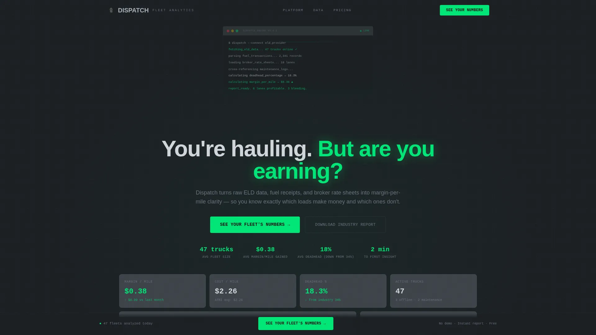
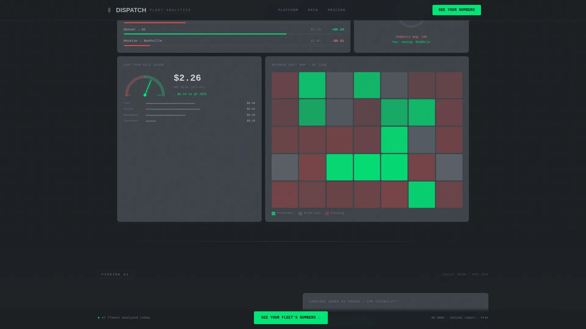
- A terminal code animation hero that transitions into an assembled dashboard interface with revenue heat maps, a cost-per-mile gauge, and a deadhead percentage ring chart
- Four scroll sections covering hero, three escalating data findings, and a progressive three-step lead generation form
- A secondary lead path offering a gated industry report PDF for visitors not yet ready to fill out the main form
Feature list
A paragraph introducing this section: every component in this template is purpose-built for a trucking analytics platform. Nothing is decorative. Each piece serves a conversion or clarity function grounded in the brief.
Terminal Code Animation Hero
The header opens with a monospaced terminal block that animates line by line, pulling live-looking fleet data on screen. After four seconds the terminal window shrinks and docks into the corner as a full dashboard interface assembles itself around it, including revenue heat maps by lane, a cost-per-mile gauge, and a deadhead percentage ring chart.
Scroll-Triggered Industry Findings
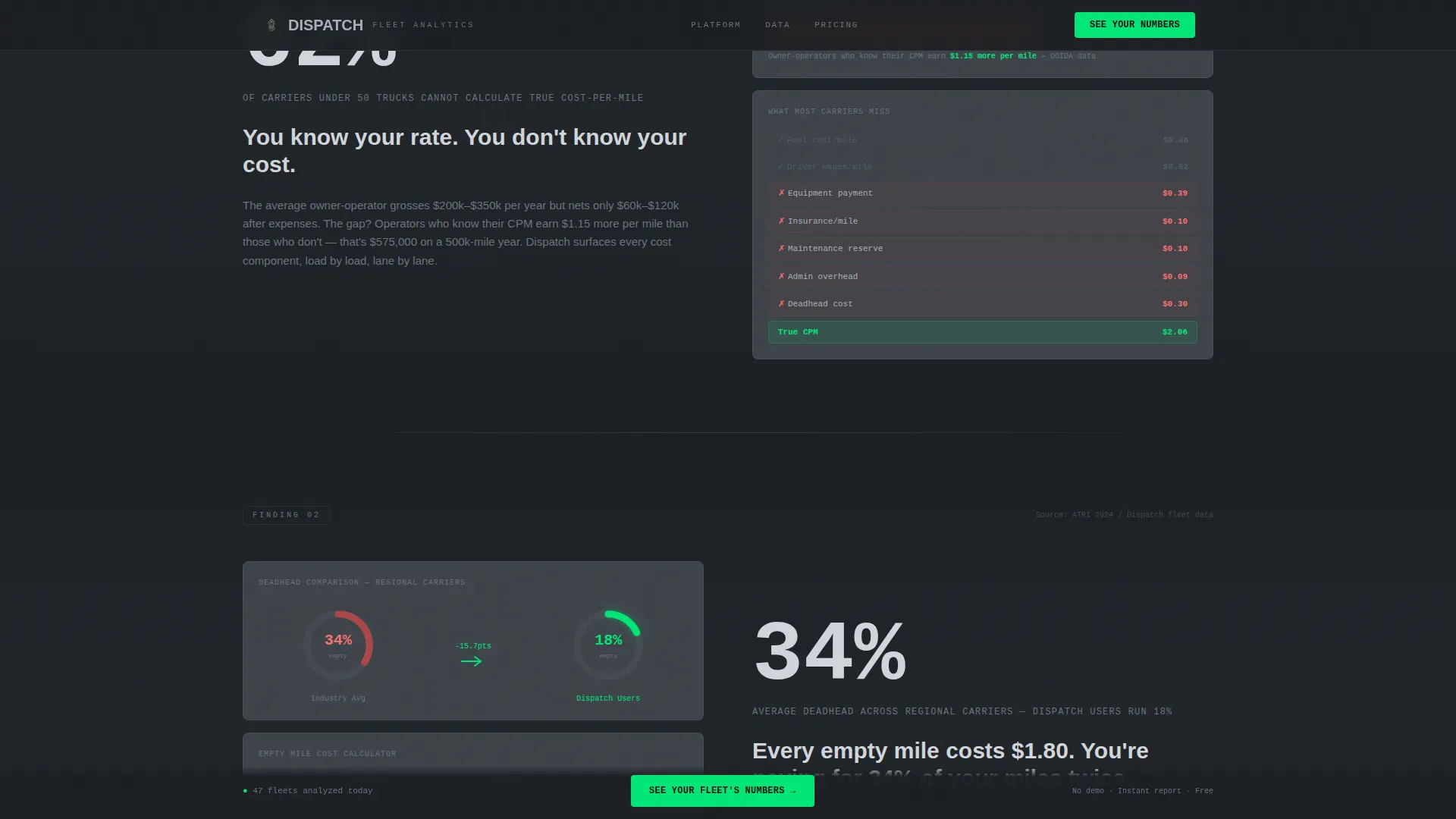
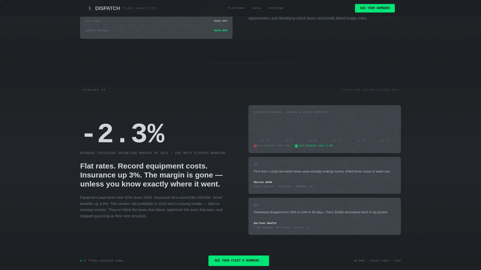
Each scroll section presents a formatted data finding styled like a proprietary research insight. The stat lands large on screen, then a dashboard module animates in to show how the platform closes that specific gap. The sequence escalates across three findings, building urgency with each section.
Progressive Three-Step Lead Form
The primary lead generation form uses a fleet size slider from one to one hundred trucks, a lane type selector covering regional, over-the-road, dedicated, and mixed, and a work email field. Submission triggers an instant sample report preview rather than a scheduling step, removing friction from the conversion path.
Gated Industry Report PDF Path
A secondary conversion path offers a downloadable industry report for visitors not ready to commit to the main form. It captures email address and fleet size only, giving hesitant buyers a low-commitment entry point into the funnel.
Pinned Primary Call to Action Rail
After the third data finding, a primary call-to-action button locks to the bottom rail of the page and stays visible through all remaining scroll. The button uses the high-voltage accent green reserved for positive metrics and clickable actions, keeping it immediately recognizable against the dark background.
Instrument Cluster Dark Interface
Card surfaces, data modules, and chart elements are styled to feel like the instrument cluster of a heavy-duty truck cab at night. Every visual element earns its place. No decorative elements compete with the data.
Page sections overview
| Section | Purpose |
|---|---|
| Terminal Hero Animation | Opens with live-looking ELD data fetch, transitions into full dashboard assembly |
| Finding One: Cost Blindness | Presents the 62% cost-per-mile stat and animates the cost-per-mile dashboard module |
| Finding Two: Deadhead Loss | Delivers the 34% versus 18% deadhead comparison and draws the ring chart visual |
| Finding Three: Margin Crisis | Escalates operating margin urgency and introduces the first primary call-to-action appearance |
| Lead Generation Form | Three-step progressive form: fleet slider, lane type selector, work email field |
| Footer | GitHub developer minimal pattern with secondary links and gated PDF download path |
Design & branding system
The visual identity follows a Startup Velocity theme built on a Monochrome Steel color system. Every color has a specific role, and none are used interchangeably. The palette reads like a Peterbilt instrument cluster at night: dark, purposeful, and precise.
- Background runs full deep asphalt at hex code #1B1F23, card surfaces lift in diesel smoke gray at #3D4349, and body text renders in brushed aluminum at #A8B0B8
- The single accent color, high-voltage green at #00E676, appears only on positive metrics, live indicators, and primary call-to-action elements
- Typography pairs JetBrains Mono for all terminal and data display elements with DM Sans for body copy and headlines
Mobile & speed optimization
The template is built desktop-first, reflecting the real usage context of fleet managers opening laptops at truck stops and dispatch offices. The layout prioritizes the wide-viewport dashboard experience where data grids and chart modules have room to perform.
- Server components handle all static sections, reducing client-side load for non-interactive content
- Client components are scoped to animation-heavy and interactive elements, including the terminal typewriter, scroll-triggered stat reveals, ring chart draw, fleet size slider, and progressive form steps
How this template helps you convert
The page is structured as a closing argument. Each section adds pressure, and by the time a visitor reaches the form, they have seen three data findings, watched the dashboard build out, and connected every stat to their own fleet situation.
- The industry report cadence makes every finding feel personal: 62% of carriers under fifty trucks cannot calculate true cost-per-mile, and each stat is presented as the visitor's own gap, not a generic benchmark
- The pinned call-to-action rail and instant sample report preview remove the two most common conversion blockers: losing the button on scroll and dreading a sales call after submitting
Other information about this template
This template is designed for desktop-first deployment, localized for United States carriers using United States dollars, imperial miles, and twelve-hour time format. The social proof structure supports specific metric testimonials and industry data citations, including references to American Transportation Research Institute data. The footer follows a GitHub developer minimal pattern suited to a technical SaaS audience.
- Template style: Dashboard and Data Grid, under the Startup Velocity theme
- Category alignment: Technology, Trucking Vertical SaaS, Trucking Analytics Dashboard niche
- Animation complexity is high, covering terminal typewriter sequences, dashboard assembly, scroll-triggered stat reveals, and ring chart draw animations
- Interactivity includes a fleet size slider, lane type selector, frequently asked questions accordion, and multi-step progressive form
Theme
Startup Velocity
Creative direction
Industry Report
Color system
Monochrome Steel
Style
Dashboard/Data Grid
Direction
Lead Generation
Page Sections
Terminal Code Animation Hero
Scroll-triggered Industry Findings
Progressive Three-step Lead Form
Gated Industry Report Download
Pinned Call-to-action Rail
Instrument Cluster Dark Interface
Related questions
Who is this template designed for?
What lead generation approach does this template use?
Does the template include a secondary conversion option?
What animations and interactive elements are included?
Can I customize the industry findings and data stats?



