Higher Education Digital Presence Portfolio Website Template
Dispatch is a dashboard-style landing page template built for university communications teams. It pairs a Bold Brutalist visual identity with a Stats-First creative direction to showcase higher education email newsletter performance. Dark data-grid layouts, animated open-rate counters, and a coral-accented download call to action work together to turn raw engagement numbers into an irresistible case for the platform.
by Rocket studio
Quick summary
Dispatch is a single-page, data-forward landing page template designed for higher education email newsletter platforms. It leads with performance numbers, uses a dark command-center aesthetic, and pushes visitors toward an app download through layered proof points. Every scroll section adds weight to the case before the call to action appears.
Who this template is for
This template is built for communications and marketing professionals inside universities and colleges. If your job involves getting campus emails actually read, this layout was designed with your workflow in mind.
- Enrollment marketing directors running admit weekend countdowns and recruitment campaigns
- Alumni relations coordinators packaging giving campaign results and donor updates
- Provost office staffers who need faculty research highlights to reach a real audience
What problem this template solves
University inboxes are crowded. A generic email template blends into the noise, and communications teams have no easy way to prove their work is performing. Dispatch solves the credibility gap by making the numbers the centerpiece.
- Open rates and engagement stats are buried or ignored in standard campaign tools
- Communications staff struggle to justify investment in email without visible benchmarks
- Prospective users need proof before they commit to a new platform or editor
What you get with this template
You get a fully structured landing page that leads with data, builds trust through visual evidence, and closes with a clear app download path. Every section is purpose-built for a higher education email newsletter platform audience.
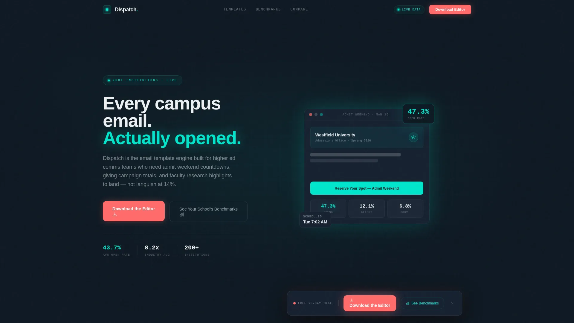
- A dark full-bleed header with a floating email template and an oversized animated open-rate stat
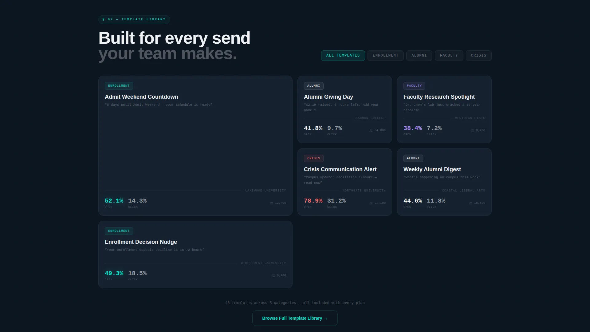
- A live-style filterable grid of template cards showing real engagement numbers per template type
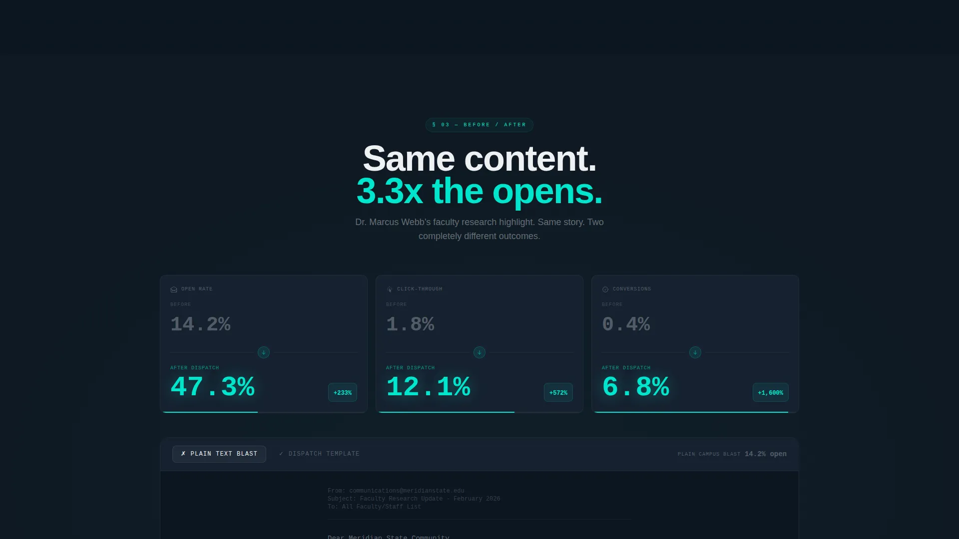
- A before-and-after split section comparing plain-text campus email with a Dispatch-formatted version
- A floating bottom bar with a coral download call to action and a secondary lead-capture path for benchmark reports
Feature list
This template delivers six core design and interaction features, all grounded in the Stats-First creative direction and the Bold Brutalist visual language described in the brief.
Animated Open-Rate Counter
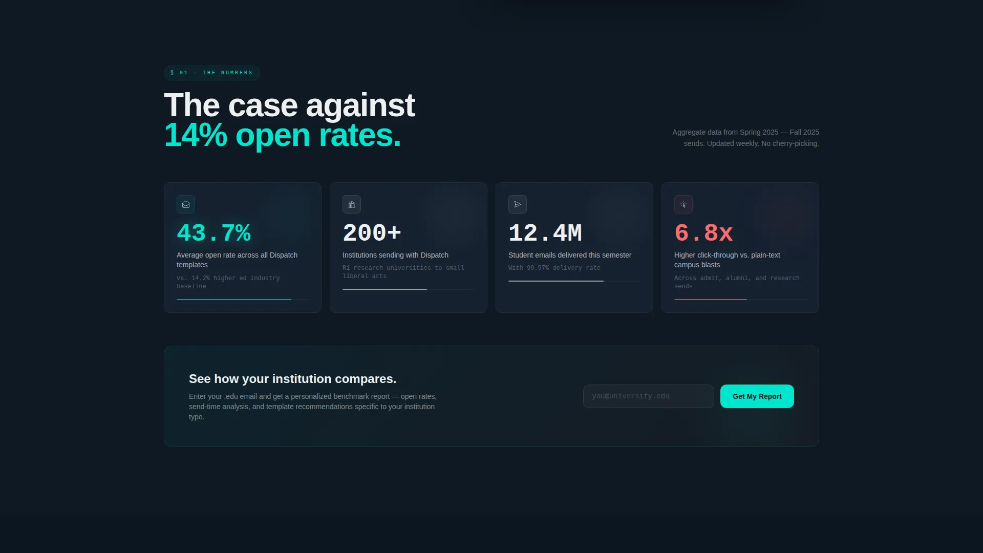
The first scroll section opens with an aggregate open-rate figure drawn from 200-plus institutions, rendered as a large animated counter. The number builds in real time as the visitor arrives, making the first impression entirely data-led.
Dark Full-Bleed Header with Glow
The header fills the full viewport in deep blackboard slate (#0F1923). A single email template floats center-frame with its open-rate stat, 47.3%, in electric teal (#00E5CC) with a soft radial glow. Faint data grid lines, ghosted send-time heatmaps, and click-map overlays animate around it.
Filterable Template Card Grid
Section two presents a live-style grid of template cards covering admit letters, alumni digests, faculty spotlights, and crisis alerts. Each card displays its own engagement stat. The grid is filterable by institution type, letting visitors find the most relevant proof point fast.
Before-and-After Comparison Section
Section three places a plain-text campus email beside the same content reformatted in a Dispatch template. Click-through rate differences appear in brutalist oversized type, giving the visual argument a concrete, measurable anchor.
Floating Download Bar with Platform Selector
After the second scroll section, a coral (#FF6B6B) "Download the Editor" bar pins to the bottom of the viewport. Tapping it opens a platform selector covering iOS, Android, and Desktop. A single institutional email field with automatic dot-edu detection unlocks the download link.
Benchmark Lead-Capture Path
A secondary call to action, "See Your School's Benchmarks", sits alongside the primary download prompt. It gates a personalized open-rate report behind the same dot-edu email field, capturing leads who are curious but not yet ready to install.
Page sections overview
| Section | Purpose |
|---|---|
| Dark Header Hero | Anchor the page with a glowing open-rate stat and animated email preview |
| Animated Stats Counter | Hit visitors immediately with aggregate performance data from 200-plus institutions |
| Template Card Grid | Show filterable engagement numbers across real email template types |
| Before-and-After Split | Prove click-through improvement with oversized comparative data |
| Floating Download Bar | Deliver the primary app download call to action after sufficient proof has been shown |
| Benchmark Capture Path | Collect dot-edu leads through a personalized open-rate report offer |
Design & branding system
The Teal Catalyst color system gives Dispatch its identity: institutional weight cut by urgency. Every color choice carries a specific role, and the palette never mixes those roles.
- Deep blackboard slate (#0F1923) fills all backgrounds, setting a focused, command-center atmosphere
- Electric teal (#00E5CC) pulses across data points, hover states, and the central open-rate stat
- Chalk white (#EDF0F2) handles body text and card surfaces for clean contrast against the dark base
- Hot coral (#FF6B6B) is reserved exclusively for alert badges and primary call-to-action buttons
Mobile & speed optimization
The template is designed with a mobile-first hierarchy so the Stats-First impact survives on smaller screens. Data-heavy sections reflow cleanly without losing their visual weight.
- The floating bottom bar adapts to touch targets on iOS and Android viewports
- Oversized type in the comparison section scales proportionally across screen sizes
- The filterable card grid stacks vertically on narrow screens while keeping engagement stats visible
How this template helps you convert
Dispatch earns the download by proving performance before asking for anything. The layout is structured as a progressive case, not a pitch.
- Each scroll section adds a heavier proof point, moving from aggregate data to template-level stats to a direct before-and-after comparison, so trust compounds as the visitor scrolls.
- The floating download bar appears only after the visitor has seen enough evidence, reducing friction at the moment of highest intent.
- The benchmark lead-capture path gives undecided visitors a lower-commitment next step, keeping them in the funnel even if they are not ready to install.
Other information about this template
Dispatch is categorized under Technology with a subcategory focus on higher education digital presence. It is purpose-built for the higher education email newsletter niche and carries an intersection match score of 13, indicating strong alignment between the template style and the target use case.
- The template style is Dashboard and Data Grid, making it suited to platforms where performance metrics are the primary selling point
- The Bold Brutalist theme is deliberately institutional, reflecting the physical weight of campus architecture translated into a digital interface
- The Stats-First creative direction means no stock campus photography appears anywhere in the layout; the product data is the visual
- The primary call-to-action direction is App Download, with dot-edu email detection built into the platform selector flow
Theme
Bold Brutalist
Creative direction
Stats-First Impact
Color system
Teal Catalyst
Style
Dashboard/Data Grid
Direction
App Download
Page Sections
Animated Open-rate Counter
Dark Full-bleed Header with Glow Effect
Filterable Template Card Grid
Before-and-after Comparison Section
Floating App Download Bar
Benchmark Report Lead Capture
Related questions
Who is the Dispatch landing page template designed for?
What makes the header section different from a standard hero layout?
How does the filterable template card grid work?
Can the template support both a download call to action and a lead-capture path simultaneously?
What color roles does the Teal Catalyst system define?



