Advanced Veterinary Software Cost Estimator Website Template
Dispatch is a split-screen landing page template built for veterinary field service management platforms. It pairs a live route-optimization calculator with a Problem-to-Solution visual arc, guiding mixed-practice owners, equine dispatchers, and mobile vaccination crews from chaotic scheduling to a clean, conversion-ready freemium trial signup. The Tech Glass aesthetic makes every section feel urgent and precise.
by Rocket studio
Quick summary
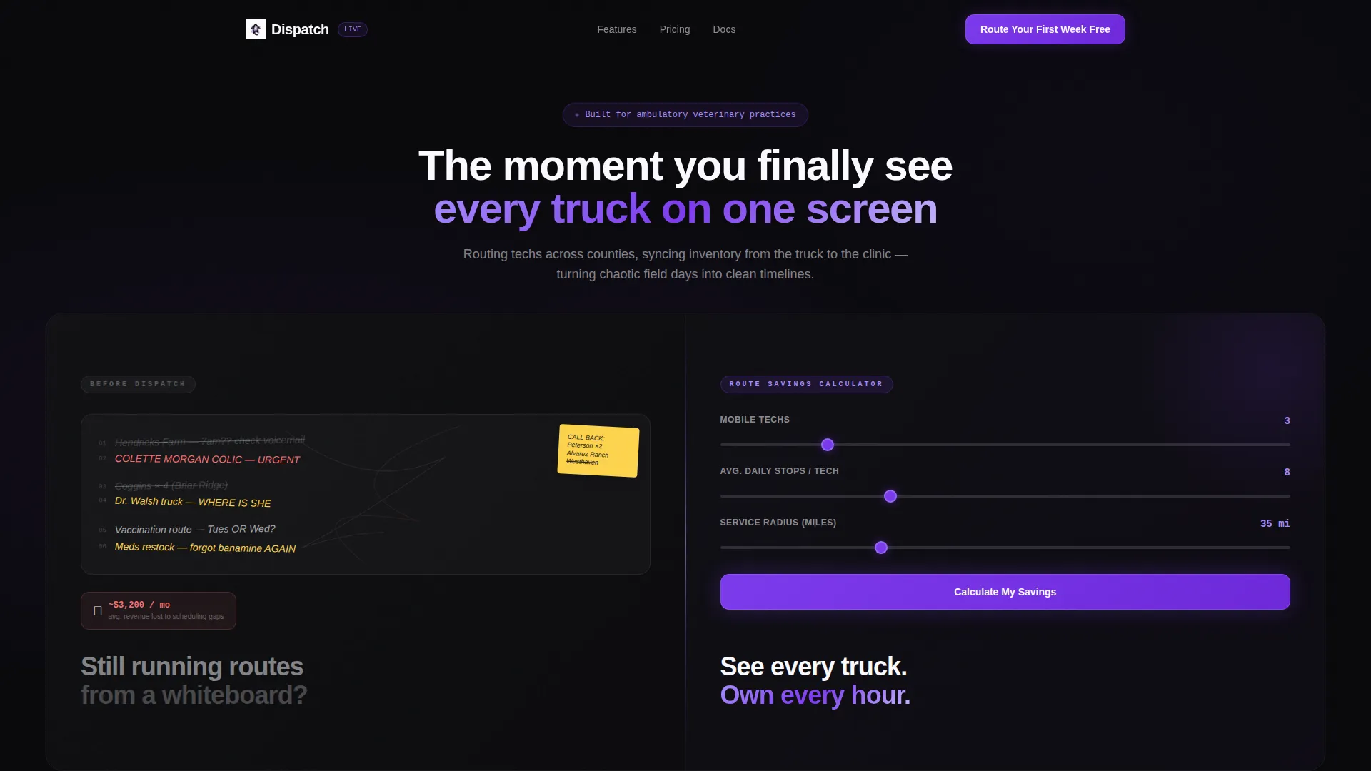
Dispatch is a single-page landing page template designed for veterinary field service management software. It uses a 50/50 split-screen layout, a Tech Glass visual theme, and a Problem-to-Solution arc that moves visitors from a relatable scheduling nightmare straight to a free trial signup. The interactive calculator in the header makes the value feel personal before the visitor ever reads a headline.
Who this template is for
This template speaks directly to the people managing mobile veterinary operations at scale. It is built for teams where every hour on the road counts and scheduling errors have real financial consequences.
- Mixed-practice owners managing large-animal ambulatory routes across multiple counties
- Equine hospital dispatchers coordinating emergency cases alongside routine appointments
- Mobile vaccination crews covering wide service areas with a small number of field technicians
What problem this template solves
Running a mobile veterinary practice on whiteboards and phone callbacks creates compounding chaos. Each missed appointment, double-booked technician, or misrecorded inventory charge quietly erodes revenue and trust. This template gives that pain a visual form and pairs every problem with a credible solution on the same screen.
- Missed appointments and double-booked routes that bleed revenue without a clear audit trail
- Inventory discrepancies from truck stock that never sync back to the clinic billing system
- No single view of where every technician is, what their ETA is, or which stop comes next
What you get with this template
The template delivers a fully structured, conversion-focused landing page with every visual section and interactive component already in place. You receive a ready-to-customize layout that handles both the emotional arc and the practical signup flow.
- A live calculator panel in the header that accepts technician count, daily stops, and service radius to return personalized savings estimates
- A scrolling Problem-to-Solution arc with six paired panels, each escalating from operational frustration to software-backed resolution
- A two-step freemium trial form that carries calculator results forward so the visitor sees their own data at signup
Feature list
This section covers the core interactive and visual capabilities built into the Dispatch landing page template.
Interactive Route Savings Calculator
The header splits into two halves. The left side shows a chaotic whiteboard mockup of crossed-out farm names and sticky-note callbacks. The right side renders a glowing calculator where visitors enter their number of field technicians, average daily stops, and service area radius. The output animates upward in violet, showing estimated miles saved per week and hours reclaimed per month.
Problem-to-Solution Scroll Arc
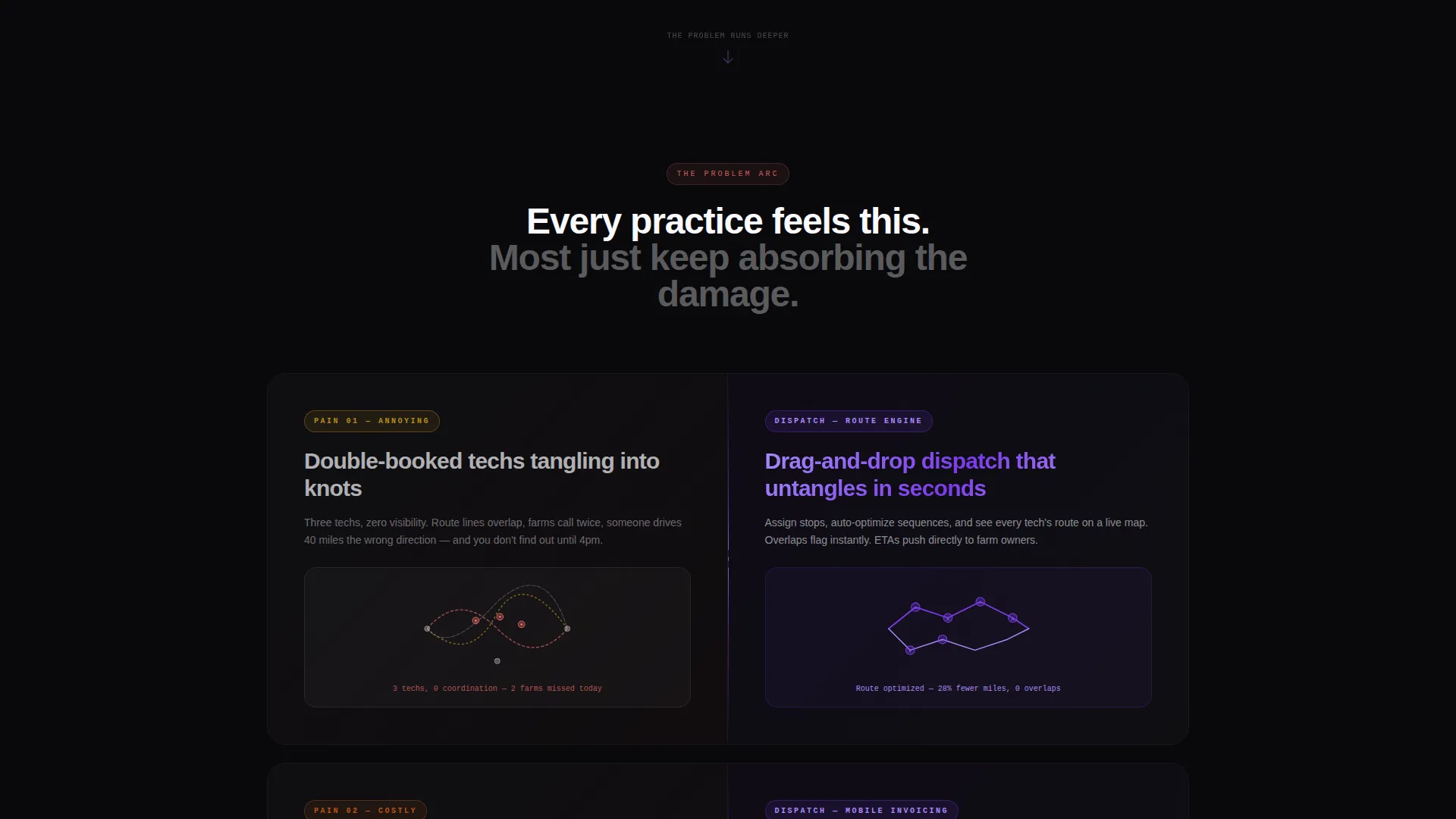
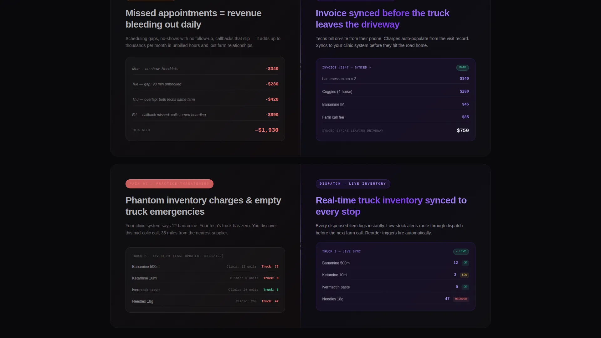
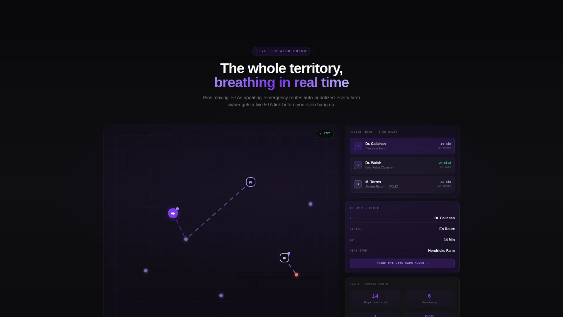
Each scroll section pairs a problem panel on the left with a solution panel on the right. Problems are rendered in grainy, stressed typography against void black, covering missed appointments, tangled route lines from double bookings, and phantom inventory charges. The corresponding right panels illuminate with drag-and-drop dispatch boards, real-time GPS with farm-owner ETA sharing, and mobile invoicing that syncs before the technician leaves the driveway.
Persistent Glass-Bar Footer Call to Action
After the third scroll section, a frosted glass footer bar locks to the bottom of the viewport. It repeats the primary call to action so conversion opportunities stay visible throughout the full scroll journey without interrupting the content flow.
Two-Step Freemium Trial Form
Clicking the primary call to action opens a two-step modal. Step one collects practice name, number of mobile technicians, and primary species mix. Step two collects email address and preferred start date. No credit card is required, and the calculator results carry forward so the visitor sees their personalized savings already reflected in the form context.
Tech Glass Visual System
Every panel floats on frosted glass layers with soft blur edges. The Void and Violet color system creates a spacecraft instrument panel atmosphere where data feels weightless and precise. Violet accent elements pulse against the void black background, making live-data states feel active and trustworthy.
Page sections overview
| Section | Purpose |
|---|---|
| Split-screen header | Contrast old-way chaos with calculator-driven savings |
| Route savings calculator | Deliver personalized miles and hours estimates |
| Missed appointments panel | Visualize revenue loss from scheduling gaps |
| Double-booking route panel | Show tangled routes as a practice-level risk |
| Inventory discrepancy panel | Illustrate phantom charges from unsynchronized stock |
| Dispatch board solution | Introduce drag-and-drop scheduling as the resolution |
| GPS and ETA panel | Present real-time truck visibility and farm-owner sharing |
| Mobile invoicing panel | Show synced billing that closes before the tech drives away |
| Persistent footer bar | Reinforce the primary call to action after scroll depth |
| Two-step signup form | Capture practice details and start the free trial flow |
Design & branding system
The Dispatch template uses a Void and Violet palette that feels like a spacecraft instrument panel glowing in a dark cockpit. Every design decision reinforces the idea of precision under pressure, with information floating on translucent surfaces rather than sitting flat on a page.
- Color palette: absolute void black (#09090B), deep orbital violet (#7C3AED), frosted glass panel (#E2E0F0 at 60% opacity), and clinical white (#FAFAFE) for text and data surfaces
- Typography treatment: grainy, stressed type on problem panels contrasts with clean, glowing numerals on solution panels to make the transformation feel visceral
- Layering and blur: glass panel components use soft blur edges and translucent overlays so every data surface feels weightless and precise rather than heavy or cluttered
Mobile & speed optimization
The split-screen layout is structured to reflow gracefully on smaller viewports. The calculator, problem panels, and solution panels are each self-contained components that stack vertically without losing their visual contrast or conversion logic.
- The calculator inputs and animated results are built for touch interaction, keeping the estimator usable on a phone or tablet in the field
- Problem and solution panels restack as full-width sections on narrow screens, preserving the left-to-right arc as a top-to-bottom reading flow
- The persistent glass-bar footer stays fixed at the bottom of the screen on mobile, keeping the trial call to action reachable without the visitor scrolling back up
How this template helps you convert
The Dispatch template earns the click before asking for it. Every structural decision is sequenced to build personal relevance, then urgency, then a low-friction path to starting a trial.
- The calculator makes the value specific. Visitors input their own practice details and receive a personalized savings estimate before reading a single feature description. Their data is already in the page before they scroll.
- The Problem-to-Solution arc escalates from annoying to practice-threatening. Each problem panel is designed to feel personally recognizable, so the solution panel that follows lands as relief rather than a sales pitch.
- The two-step form removes the largest conversion barrier. No credit card, no long questionnaire, and the visitor's calculator results carry forward so the signup context feels continuous and already personalized.
Other information about this template
The Dispatch template is positioned for veterinary field service management software products that use a freemium or free trial acquisition model. It is built as a single landing page, not a multi-page website, so all conversion logic lives within one continuous scroll experience.
- The template style is a 50/50 split screen, making it well suited for side-by-side before-and-after narratives common in field service and route management software marketing
- The Tech Glass theme and Void and Violet color system are self-contained within the template and do not require external design libraries to function
- The creative direction follows a Problem-to-Solution arc, a structure that works particularly well for niche professional audiences who immediately recognize the pain being described
- The header calculator concept is designed to create a personalized data hook early, which supports freemium and free trial conversion flows where trust must be built before the ask
Theme
Tech Glass
Creative direction
Problem→Solution Arc
Color system
Void & Violet
Style
Split Screen (50/50)
Direction
Freemium/Trial
Page Sections
Interactive Route Savings Calculator
Problem-to-solution Scroll Arc
Persistent Glass-bar Footer Call to Action
Two-step Freemium Trial Form
Tech Glass Visual System
Related questions
Who is this landing page template designed for?
Does the calculator in the header actually run live calculations?
Can I change the species options in the two-step signup form?
Is a credit card required to use the trial form flow?
Can this template work for a non-veterinary field service product?



