Precision IT Scheduling Landing Page Template
Dispatch is a split-screen IT scheduling landing page template built for MSPs, solo IT consultants, and enterprise help desks. It leads with an interactive ROI calculator, then walks visitors through a chaos-to-order narrative using animated split-screen sections. The dark glass aesthetic, iridescent color system, and freemium conversion flow make this template purpose-built for high-stakes IT service businesses.
by Rocket studio
Quick summary
Dispatch is a dark-glass, split-screen landing page template for IT scheduling and dispatch software. It opens with a live ROI calculator that shows visitors exactly how many hours and dollars they recover per month. From there, animated sections move the story from scheduling pain to precision dispatch operations, building trust and driving freemium signups from the first scroll.
Who this template is for
This template is designed for B2B software teams and IT service businesses that need a landing page that earns attention before asking for a signup. The visitor profile is technical, cost-aware, and skeptical of vague marketing claims. The page speaks directly to that mindset by leading with data and showing the product in context.
- MSP operations managers handling 200 or more open tickets across multiple service regions who need to schedule jobs without overlap or SLA risk
- Solo IT consultants losing billable hours to phone tag, manual scheduling, and no-show appointments who want efficient scheduling that runs without babysitting
- Enterprise help desk teams where a missed service window triggers five-figure SLA penalties and where every dispatch process step must be documented and traceable
What problem this template solves
IT service businesses face a specific set of scheduling problems that generic booking tools do not address. Tickets pile up, technicians get double-booked, drivers cover inefficient routes, and customers receive no real-time updates. Back office teams manually manage what should be automated, and every mistake costs money. This template is designed to communicate exactly why that pain is expensive and how precision dispatch solves it.
- Manual task allocation creates scheduling gaps, missed appointments, and technician idle time that erodes team productivity and raises operational costs
- No real-time tracking visibility means customers call in to check status, back office staff repeat the same updates, and dispatch efficiency drops with every interruption
- Disorganized routes and poor travel time management push drivers into inefficient paths, inflating vehicle costs and reducing the number of jobs completed per day
What you get with this template
You get a fully structured, single-page layout built to convert IT service software prospects into freemium trial signups. Every section is purposeful. Every interaction reinforces the value of switching from manual dispatch to an automated system. The template document includes all page sections, interactive component designs, a sticky savings bar, and a dark glass visual system ready to customize.
- An interactive hero calculator with three sliders that outputs a personalized hours-recovered and revenue-saved estimate in real time, giving visitors a reason to keep reading
- A scroll-animated split-screen narrative that dissolves chaotic scheduling user interface mockups into clean dispatch boards, progressing from individual technician scheduling to multi-team dispatch to white-label client portals
- A complete conversion flow including a primary "Start Dispatching Free" call to action, a secondary "Watch a 90-Second Dispatch" video path, and a sticky savings bar that follows the visitor with their personalized number
Feature list
This template includes a focused set of high-impact features drawn directly from the source brief. Each one is designed to address a real stage of the visitor's decision journey, from first impression to signup.
Interactive ROI Calculator Hero
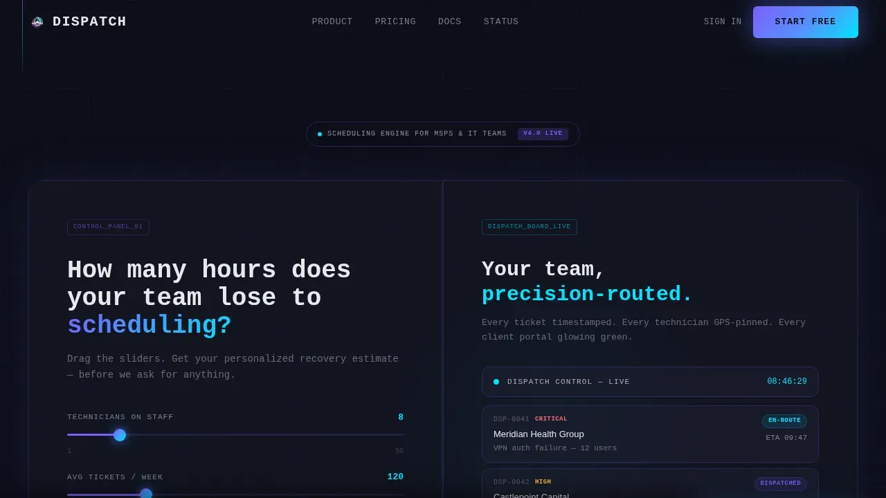
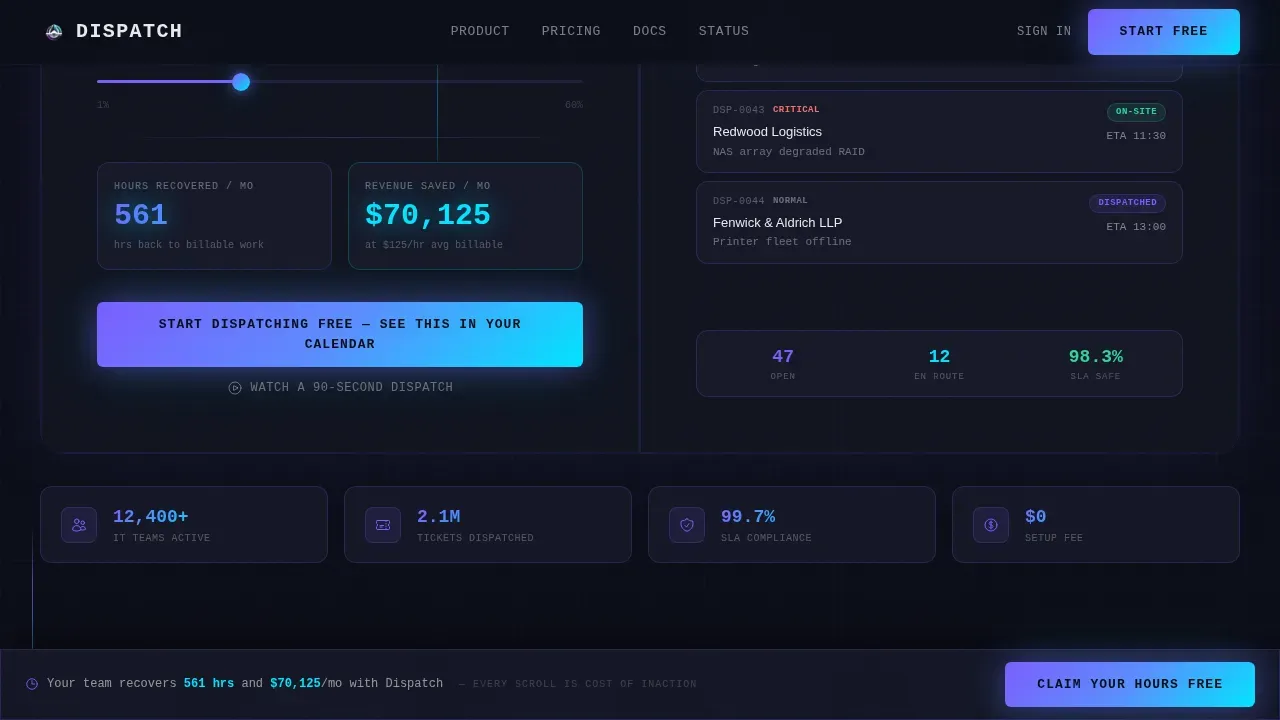
The hero section replaces a static image with a live tool. Three sliders let visitors input their technicians on staff, average tickets per week, and current no-show rate. As each slider moves, the output below updates in real time, showing hours recovered and revenue saved per month. This Calculator/Tool First creative direction means the template earns attention by delivering immediate, personalized value before requesting anything. The numbers tick upward in cyan accent, making the output feel alive and credible.
Animated Split-Screen Pain versus. Product Sections
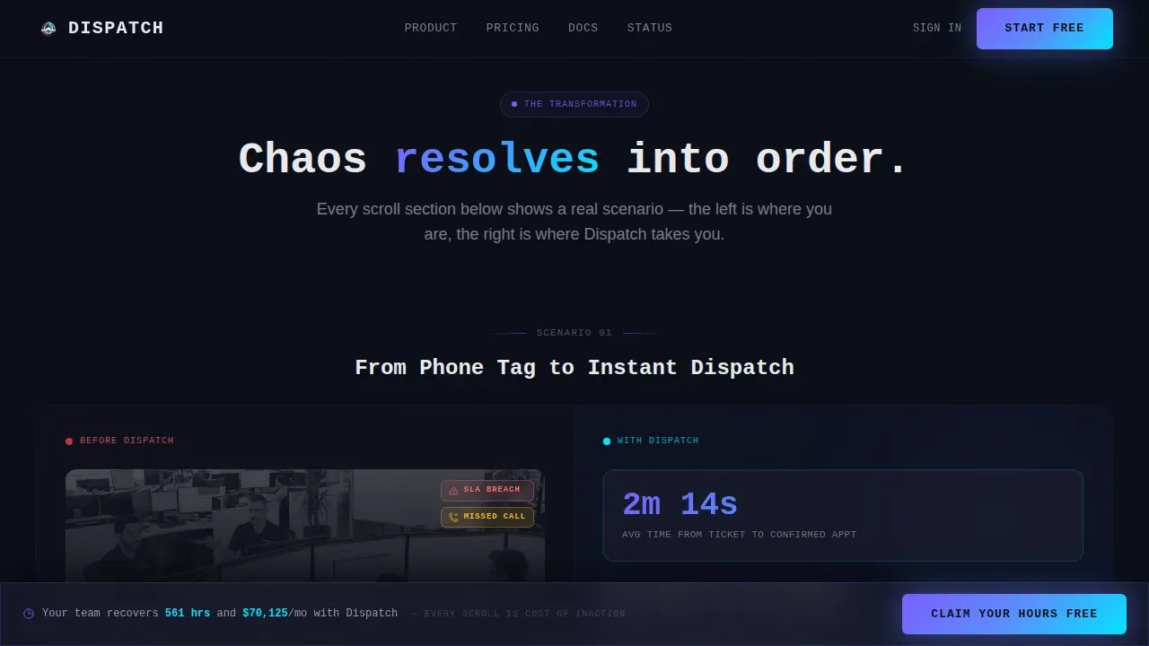
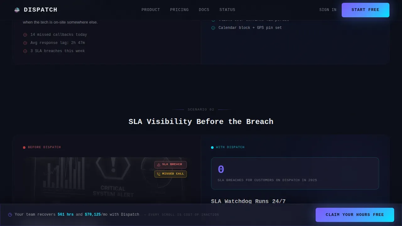
The template uses a 50/50 split-screen layout to tell a before-and-after story across multiple scroll sections. The left panel shows the pain: cluttered calendars, missed calls, and service-level agreement breach alerts rendered as dark-themed user interface mockups. The right panel shows the solution: clean dispatch boards, automated confirmations, and client self-service portals. Each section animates the left panel dissolving into the right, so the visitor literally watches chaos resolve into order as they scroll. The narrative escalates from individual technician scheduling to full white-label dispatch operations.
Dispatch Board with Real-Time Tracking
The template showcases a dispatch board interface that gives dispatchers a centralized view of order statuses, driver locations, and overall operational progress. Real-time tracking indicators show where each technician is at any given moment. The board supports different types of filters, allowing dispatchers to focus on specific regions, job types, or service windows. Status-driven visuals with color-coded status badges reflect the live nature of IT dispatching and give visitors an immediate sense of the system's clarity.
Sticky Personalized Savings Bar
Once a visitor interacts with the calculator, their personalized savings number is carried into a sticky bottom bar that stays visible throughout the page. This reinforces the cost of inaction with every scroll. The bar acts as a persistent, non-intrusive reminder that their specific team could recover hours and reduce costs, connecting the abstract value proposition to a concrete, visitor-specific number.
Streamlined Freemium Signup Flow
The primary call to action, "Start Dispatching Free," appears first below the calculator results. Clicking opens a three-field signup: work email, team size auto-filled from the calculator slider, and primary calendar integration choice. This reduces friction and connects the signup form directly to the visitor's already-stated context. A secondary path, "Watch a 90-Second Dispatch," serves visitors who are not yet ready to commit, ending with the same call to action after the screen recording.
Spotlight Testimonial Cards
The social proof section uses spotlight-style testimonial cards with beam-drop animation. Each card features a role-specific quote, such as from an MSP operations manager, a solo consultant, or an enterprise help desk lead, along with specific metrics to establish credibility. Testimonials, case studies, and client logos serve as trust signals that reinforce the template's conversion goal. The cards are designed to feel like real evidence, not filler.
Page sections overview
| Section | Purpose |
|---|---|
| Hero Calculator Panel | Deliver personalized ROI before any ask |
| Pain versus. Product | Animate chaos dissolving into dispatch order |
| System Metrics Bento | Show live-style operational stats at a glance |
| Social Proof Cards | Build trust with role-specific testimonials |
| call to action and Pricing | Drive freemium signup with sticky savings bar |
| Footer Pattern | Provide navigation and minimal developer-style links |
Design & branding system
The visual identity is built around a Tech Glass theme with an AI Iridescent color system. The aesthetic is precise and immersive, like a server room control surface at 2 a.m., cool and still until you interact with it, then suddenly alive with refracted light.
- The color palette uses obsidian (#0B0D17) as the base, frosted glass panels (#1A1D2E at 60% opacity) for floating cards, iridescent violet (#7B5EFF) shifting to cyan (#00E5FF) on hover states, and signal-white (#E8EAED) for primary text, every clickable element pulses with the violet-to-cyan gradient like fiber optic light traveling through cable
- Typography is set in JetBrains Mono for all headlines and interface elements, giving the page a terminal-precision feel, while DM Sans is used for body copy to keep long-form content readable and approachable
- Animation is set to high intensity throughout: beam drops on testimonial cards, slider-ticking numbers in the calculator, scroll-dissolve transitions between pain and product panels, and spotlight effects on interactive elements
Mobile & speed optimization
The template is built desktop-first to honor the server room control surface aesthetic, but it is fully responsive for field technicians and operations managers who review schedules on mobile devices. Over half of web traffic is mobile, so the layout adapts without losing its core interactivity or visual clarity.
- Interactive sections such as the calculator sliders and dispatch board previews are built as client components, while static sections such as the footer and testimonial cards are handled server-side, keeping the page architecture clean and load behavior predictable
- Buttons and tap targets are sized for easy interaction on smaller screens, and the sticky savings bar remains accessible at the bottom of the viewport on both desktop and mobile, keeping the personalized conversion prompt visible at all times
How this template helps you convert
This template is designed around a single conversion insight: technical buyers need to see value before they trust a signup form. Every structural decision supports that principle, from the calculator-first hero to the animated product narrative to the sticky savings bar.
- The calculator delivers a personalized outcome immediately, making the visitor's potential savings concrete and specific before they read a single feature bullet, so the page earns trust through delivery rather than through claims
- The split-screen scroll narrative builds on that trust by showing the actual product interface in context, progressing from individual scheduling pain to full multi-team dispatch operations, which addresses the customer experience at every scale of IT service business
- The sticky savings bar and dual call-to-action paths ensure that no visitor leaves without a clear, low-friction next step, whether they are ready to sign up or just want to see a 90-second dispatch in action first
Other information about this template
This section covers additional practical details about the Dispatch template for buyers evaluating it for their IT scheduling software business.
- The template is structured as a single-page, section-led landing page flow, making it a strong fit for freemium and trial-driven software marketing campaigns where a focused conversion path outperforms a multi-page site
- Customization options are broad: the color system, typography, calculator ranges, testimonial details, and call-to-action copy can all be adjusted to match your specific requirements and brand identity without restructuring the layout
- The dispatch precision it scheduling landing page template is purpose-built for IT service providers, MSP platforms, and field service operations software companies that need a high-conversion front door for their scheduling product
- Pricing information is presented in the call-to-action and pricing section, where the freemium tier is positioned prominently and upgrade paths can be added to address different types of service plans and team sizes
- The template includes a search bar placeholder in the dispatch board mockup section, giving buyers the option to demonstrate quick access to tickets and reference numbers within their product preview
- Route optimization is a core narrative element: the template addresses how dispatch scheduling software enhances operational efficiency by automating task assignments and optimizing routes, with facts grounded in real dispatch logistics, including the documented potential to reduce fuel costs by 15 to 20 percent when drivers follow more efficient paths and to increase the number of deliveries completed each day without additional vehicle costs
- The dispatch board section documents how allowing dispatchers to view driver locations, manage time window constraints, and perform bulk updates from a single interface improves both back office workflow and customer satisfaction
- Predictive analytics positioning can be layered into the system metrics bento grid to help prospects understand how historical data informs future scheduling decisions and helps teams anticipate demand spikes
- A seamless integrations block showcasing logos of compatible tools, including IT Service Management platforms and calendar providers, can be added to the site to address buyer questions about connecting Dispatch to their existing stack
- The template supports comparative analysis use cases: the pain-versus-product split screen is designed to act as a visual comparison that highlights dispatch efficiency gains over manual scheduling practices
- Customer feedback and social proof components are built in, with spotlight testimonial cards that document specific metric improvements, addressing the learning curve concern that technical buyers often have before committing to a new dispatch system
- The template's communication tools section can be expanded to show how automated confirmations, client portals, and real-time status updates streamline operations and reduce the volume of inbound support requests
Theme
Tech Glass
Creative direction
Calculator/Tool First
Color system
AI Iridescent
Style
Split Screen (50/50)
Direction
Freemium/Trial
Page Sections
Interactive ROI Calculator Hero
Animated Split-screen Pain Versus. Product
Live Dispatch Board Preview
Sticky Personalized Savings Bar
Freemium Signup with Calendar Integration
Spotlight Testimonial Cards
Related questions
What makes this template different from a generic booking page template?
Can I adjust the calculator ranges and output labels to match my product?
Does the template support a secondary conversion path for visitors not ready to sign up?
How does the sticky savings bar work throughout the page?
Is this template suitable for a solo IT consultant or only for large MSPs?



