Cloud-Native Enterprise Software Complete Professional Website Template
Dispatch is a dark, data-command landing page template built for cloud-native warehouse management systems. It uses a modular card-grid layout, a carbon fiber color system, and an industry-report creative direction to turn fulfillment metrics into a compelling click-through experience. The primary call to action routes visitors straight to a live demo, no form required.
by Rocket studio
Quick summary
Dispatch is a single-page, modular card-grid template designed for cloud-native warehouse management software. It pairs a full-bleed dark header with glowing signal-green data visuals, benchmark-style content cards, and a pinned call-to-action toolbar. The result feels like a live operations control room, authoritative, precise, and built to earn the demo click.
Who this template is for
This template is built for enterprise software teams that sell to operations-focused buyers. If your product lives in the fulfillment or logistics space and your prospects respond to hard data over marketing language, Dispatch was designed for you.
- Third-party logistics (3PL) providers targeting VP-level operations leaders managing complex SKU-velocity tiers
- Direct-to-consumer (DTC) brands that need to demonstrate mispick cost reduction to margin-conscious decision-makers
- Supply chain software vendors replacing legacy radio-frequency (RF) scanning systems with a cloud-native warehouse management system (WMS)
What problem this template solves
Generic software landing pages lose enterprise buyers fast. Operations leaders want proof, not promises. They arrive on a page, scan for hard numbers, and leave if the value is not immediately obvious.
- No clear data story: most templates cannot present benchmarked metrics in a way that makes inaction feel expensive
- Weak conversion architecture: single static call-to-action placements lose visitors who scroll but are not yet ready to commit
- Visual mismatch: a bright, lifestyle-style design undercuts credibility with technical buyers who expect precision and control
What you get with this template
You get a fully structured, single-page layout with every section pre-built and logically sequenced. The design system is ready to apply, colors, typography roles, and card behaviors are all defined in the template.
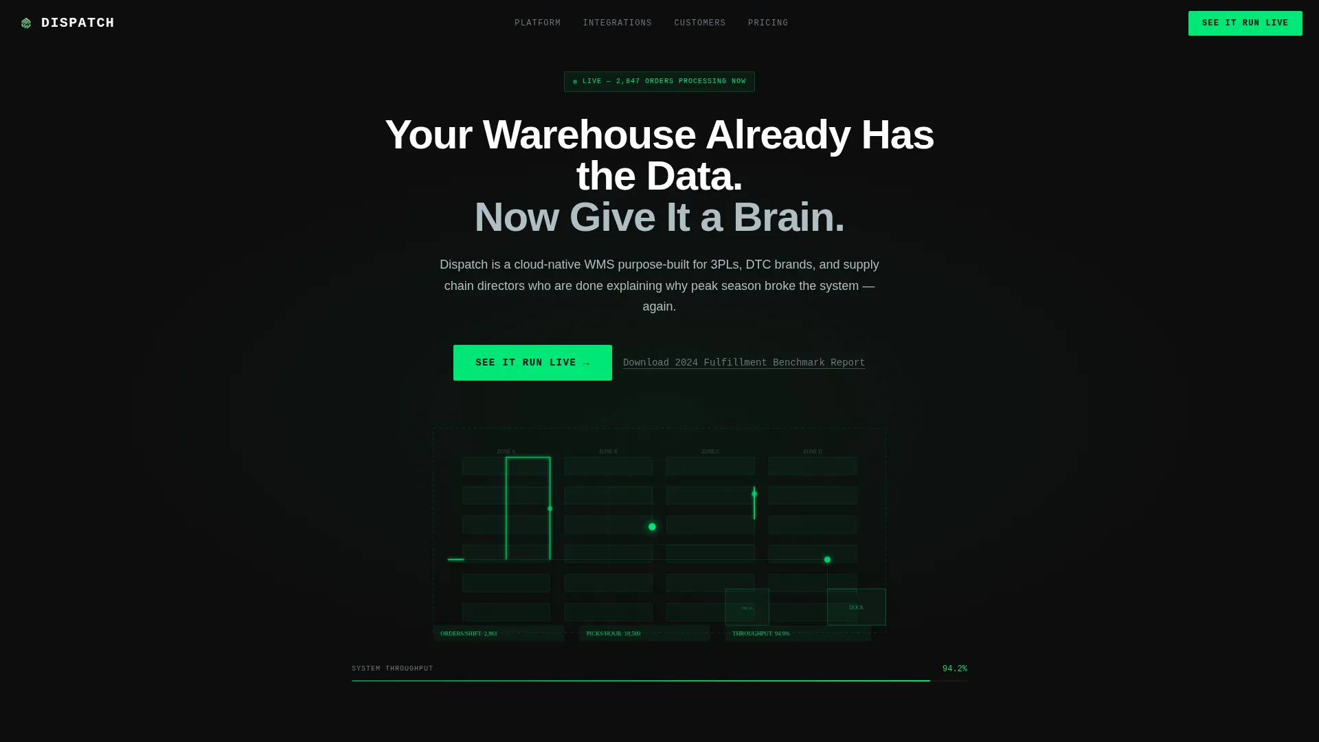
- A dark full-bleed header with a signal-green animated warehouse floor-plan visualization and a bold headline
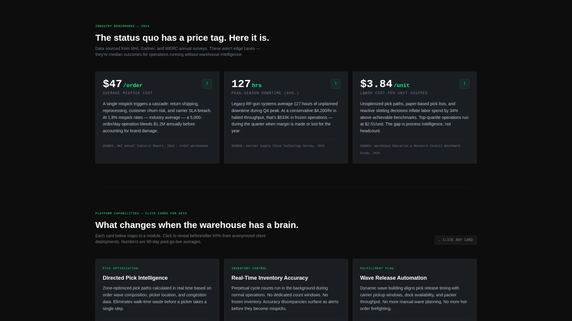
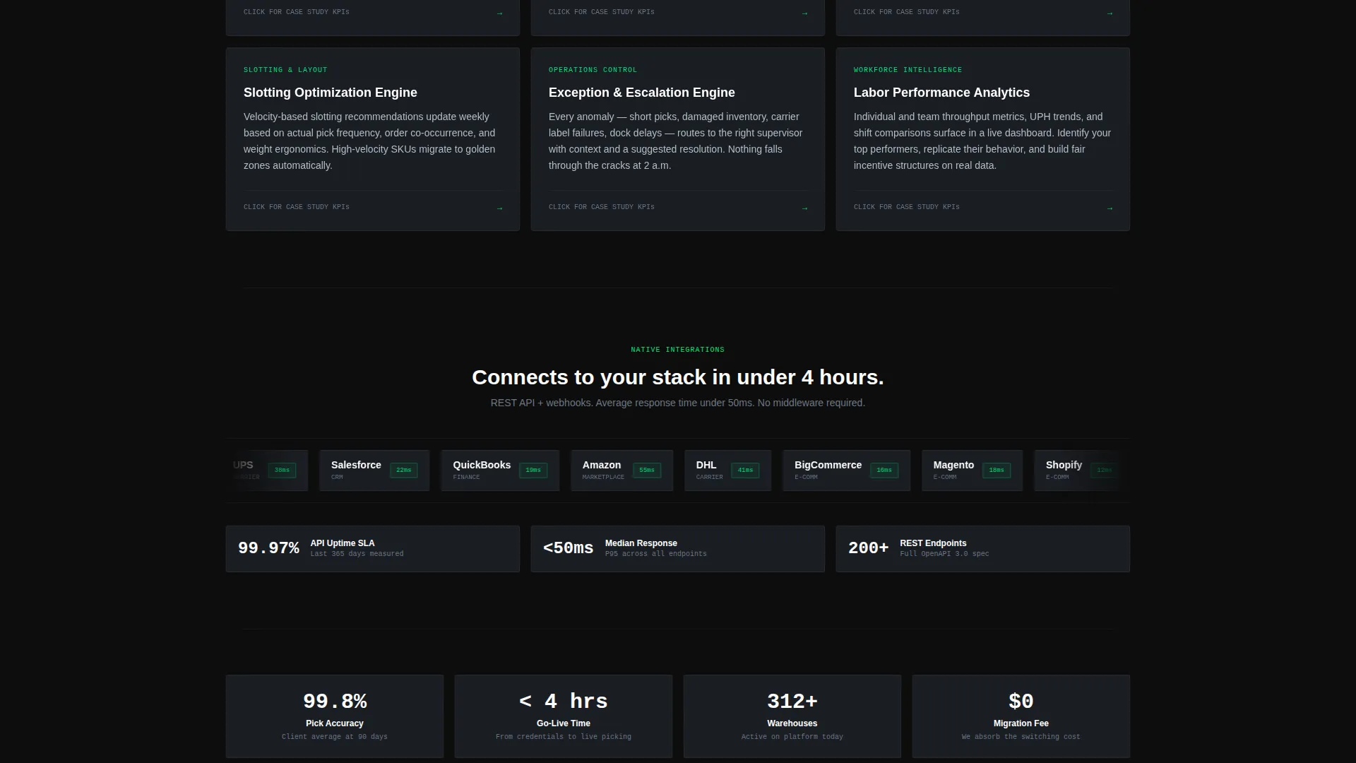
- Three modular card rows presenting industry pain-point stats, flip-on-click capability cards with before-and-after metrics, and integration logo badges with API response-time indicators
- A pinned slim toolbar with a persistent primary call-to-action and a secondary email-capture modal for the benchmark report offer
Feature list
This section describes what the template delivers as a designed, buildable artifact based on the source brief.
Dark Full-Bleed Header with Glow Visualization
The header spans the full viewport in deep carbon black (#0D0D0D) with a faint carbon-fiber texture. A stylized warehouse floor plan glows in signal green at center screen, with animated pick paths and a live-state throughput gauge. No stock photography is used, the data visualization is the hero image.
Modular Three-Row Card Grid
The layout is organized in three distinct card rows. The first row presents industry pain-point statistics with hard numbers. The second row features capability cards that flip on click to reveal anonymized before-and-after key performance indicators (KPIs). The third row displays integration logos alongside API response-time badges.
Pinned Click-Through Toolbar
After the first scroll, a slim dark toolbar locks to the top of the viewport. It holds the primary call-to-action button, "See It Run Live," keeping the demo entry point visible at all times without interrupting the content-reading experience.
Secondary Email-Capture Modal
A text link labeled "Download the 2024 Fulfillment Benchmark Report" triggers a single-field modal overlay. This captures email addresses from visitors who are not yet ready to request a demo, creating a second conversion path without adding a form to the main page.
Full-Width Bottom Call-to-Action Card
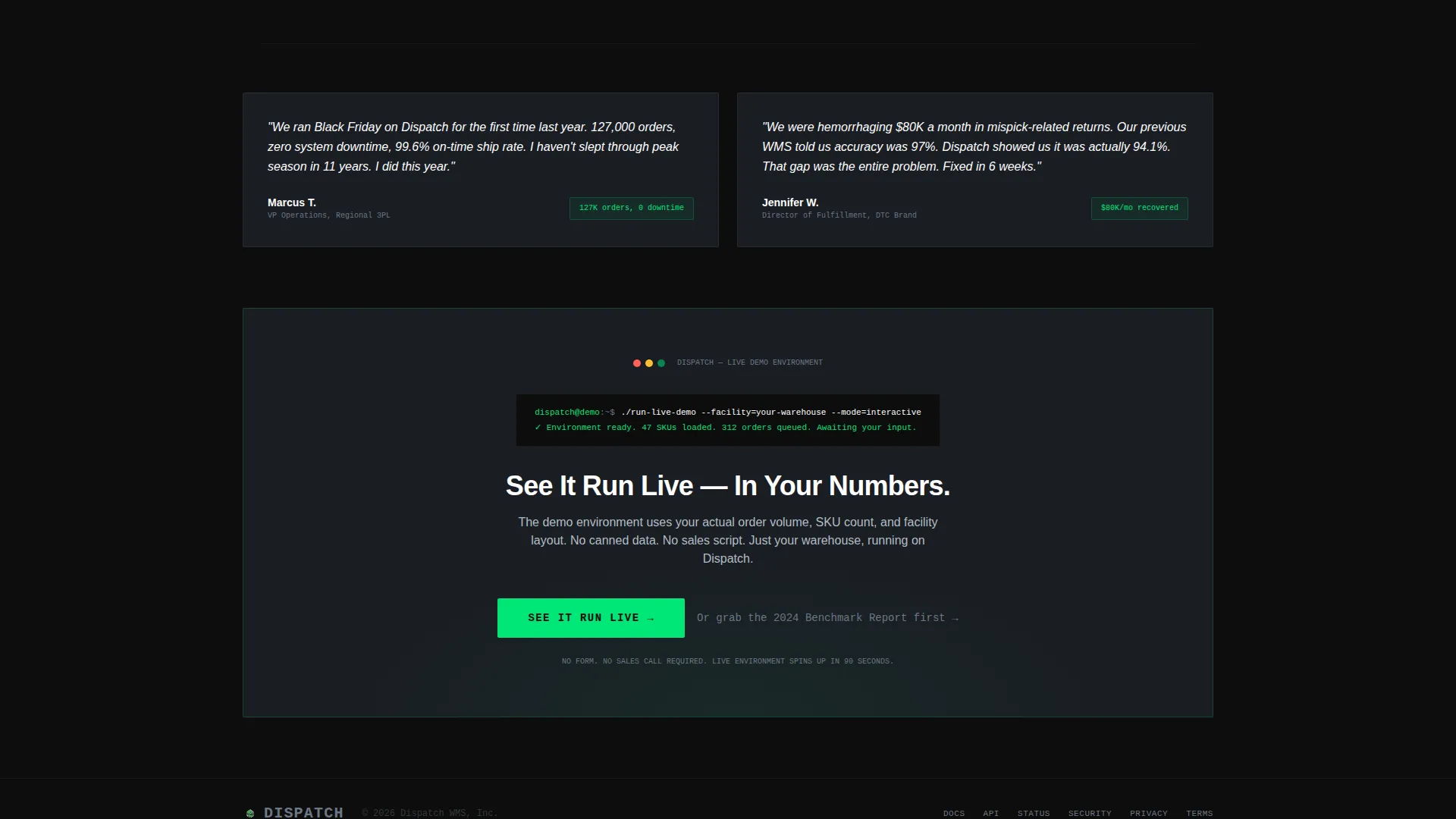
The page closes with a full-width card repeating the primary call-to-action. This placement catches visitors who read through the entire page and are ready to act after consuming the full data narrative.
Signal-Green Hover Pulse Borders
Every card in the grid carries a 1-pixel signal-green border that pulses on hover. This micro-interaction reinforces the live-data aesthetic and gives the interface a responsive, engineered feel consistent with the Data Command theme.
Page sections overview
| Section | Purpose |
|---|---|
| Dark Full-Bleed Header | Establishes visual tone and introduces the core headline with the animated floor-plan glow |
| Pain-Point Card Row | Presents three industry statistics, mispick cost, peak-season downtime, and labor cost per unit |
| Capability Flip Cards | Reveals before-and-after KPIs from anonymized case studies on click interaction |
| Integration Logo Row | Displays third-party integration logos and API response-time badges |
| Pinned call to action Toolbar | Keeps the primary demo call-to-action visible after the first scroll |
| Benchmark Report Link | Offers a secondary conversion path via single-field email-capture modal |
| Full-Width call to action Card | Closes the page with a final, full-width prompt to enter the live demo environment |
Design & branding system
The visual identity follows a Data Command theme built on a carbon fiber color system. Every design decision reinforces the feeling of a precision operations environment, dark, deliberate, and alive with data.
- Color palette: deep carbon black (#0D0D0D) for backgrounds, woven graphite (#1A1D23) for card surfaces, signal green (#00E676) for live-state accents and data highlights, and cool aluminum (#B0BEC5) for secondary text and dividers
- Typography: oversized aluminum-toned type for the hero headline, with a clear hierarchy that prioritizes data readability over decorative elements
- Card styling: cards float on the graphite background with 1-pixel signal-green borders that pulse on hover, giving the grid a live, interactive quality
Mobile & speed optimization
The modular card-grid structure is inherently responsive. Each row of cards is designed to reflow cleanly across screen sizes, so the data narrative reads correctly on any device a buyer might use.
- Card rows reflow from three-column desktop layouts to single-column stacks on smaller screens without breaking the visual hierarchy
- The pinned toolbar adapts to mobile viewports, keeping the primary call-to-action reachable without covering the content below
- The header visualization scales within the viewport so the signal-green floor-plan glow remains centered and legible on both desktop and mobile displays
How this template helps you convert
The page is structured around a click-through conversion strategy. Every section is sequenced to build stakes before the call-to-action appears, so the demo request feels like a logical conclusion rather than an interruption.
- The industry-report card cadence presents hard statistics first, making the cost of inaction concrete and quantifiable before any product capability is introduced.
- The pinned toolbar and full-width closing card create two high-visibility call-to-action placements, while the benchmark report modal provides a lower-commitment path for buyers still in the research phase.
Other information about this template
Dispatch fits naturally within a broader cloud-native enterprise software go-to-market toolkit. The template's design and content structure reflect common patterns used in high-stakes B2B software buying environments.
- The template style is Card Grid (Modular), which makes it straightforward to add, remove, or reorder cards as your product messaging evolves
- The creative direction follows an Industry Report cadence, meaning the content is structured to build credibility through data before it asks for anything from the visitor
- The theme and color system are purpose-built for the WMS and fulfillment technology category, where buyers are operations-minded and respond to precision over polish
Theme
Data Command
Creative direction
Industry Report
Color system
Carbon Fiber
Style
Card Grid (Modular)
Direction
Click-Through
Page Sections
Dark Full-bleed Header with Glow Visualization
Modular Three-row Card Grid
Pinned Click-through Toolbar
Secondary Email-capture Modal
Full-width Closing Call-to-action Card
Signal-green Hover Pulse Borders
Related questions
Who is the ideal buyer for this template?
Does this template include a contact form?
Can I customize the card content and statistics?
What makes this different from a standard software landing page template?
Is the benchmark report modal included in the template?



