Warehouse & Distribution Professional Website Template
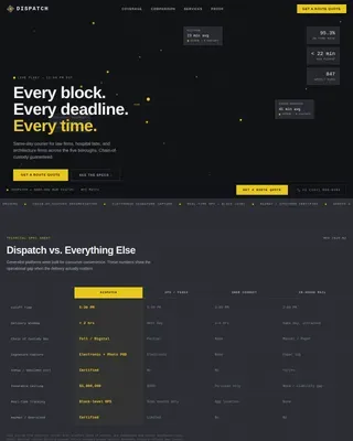
Dispatch is a dark-mode landing page template built for rapid urban delivery services. It combines an animated isometric dark store illustration, a terminal-style competitor comparison grid, and a pinned address-check input. The result is a focused, data-driven single-page experience that shows the delivery system is already running before a visitor ever taps the call to action.
by Rocket studio
Quick summary
Dispatch is a Dashboard/Data Grid landing page template for dark store rapid delivery services. It pairs an animated isometric fulfillment hub illustration with a scrolling terminal comparison grid and a sticky address-confirmation input. Every section is built to replace persuasion copy with hard numbers, letting the data do the convincing.
Who this template is for
This template is built for founders and product teams launching or pitching an urban rapid delivery service. It works equally well for a live consumer-facing rollout or an investor-facing proof of concept.
- Urban rapid delivery startups that need a high-credibility launch page fast
- Dark store operators wanting to convert skeptical apartment dwellers with metrics, not marketing copy
- Product teams prototyping a consumer-facing address-check flow for a new delivery radius
What problem this template solves
Most delivery service pages lead with lifestyle photography and vague promises. Skeptical urban consumers, especially late-night and mobile-first shoppers, need proof before they hand over their address. This template replaces trust-me copy with a data grid that argues the case on its own.
- Visitors do not trust delivery speed claims they cannot verify, so the template shows live hub metrics as HUD callouts instead of headlines
- Competitor tables built from bullet-point copy feel biased, so this template uses monospaced data rows that read like a neutral teardown
- A standard above-the-fold call to action gets ignored, so a sticky pinned input keeps the address check one tap away at every scroll depth
What you get with this template
You get a complete, single-page layout structured around four primary sections plus a footer. Each section is self-contained and purpose-built for a specific conversion task.
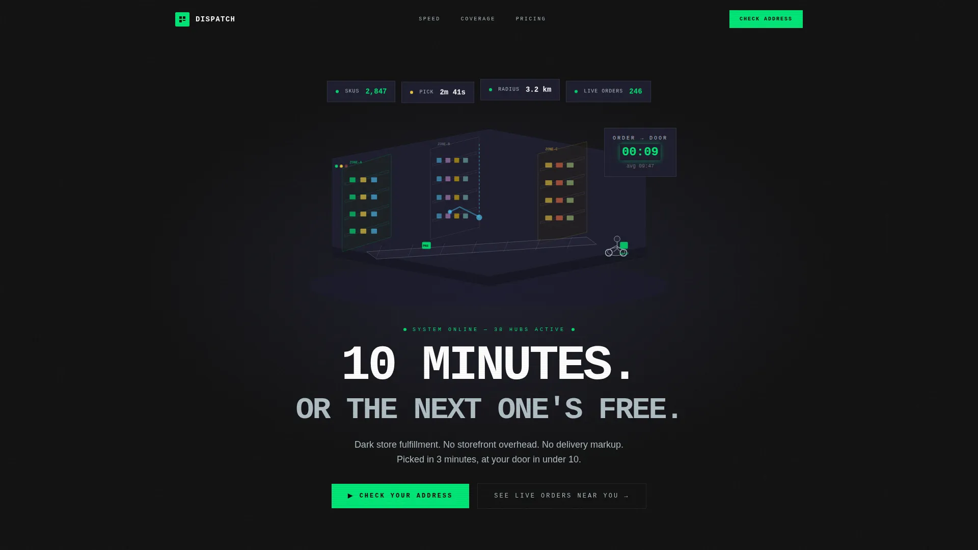
- Animated hero with isometric dark store illustration, floating HUD data callouts, and a looping conveyor animation
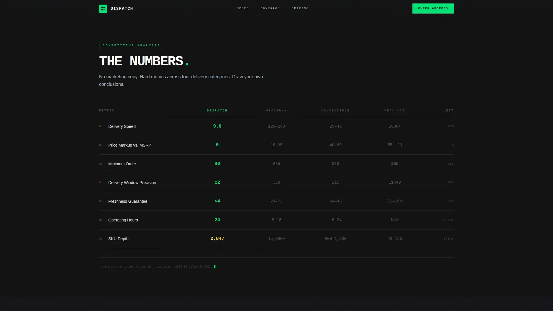
- Terminal-style spec sheet comparing speed, markup, minimum order, delivery precision, and freshness across four service types
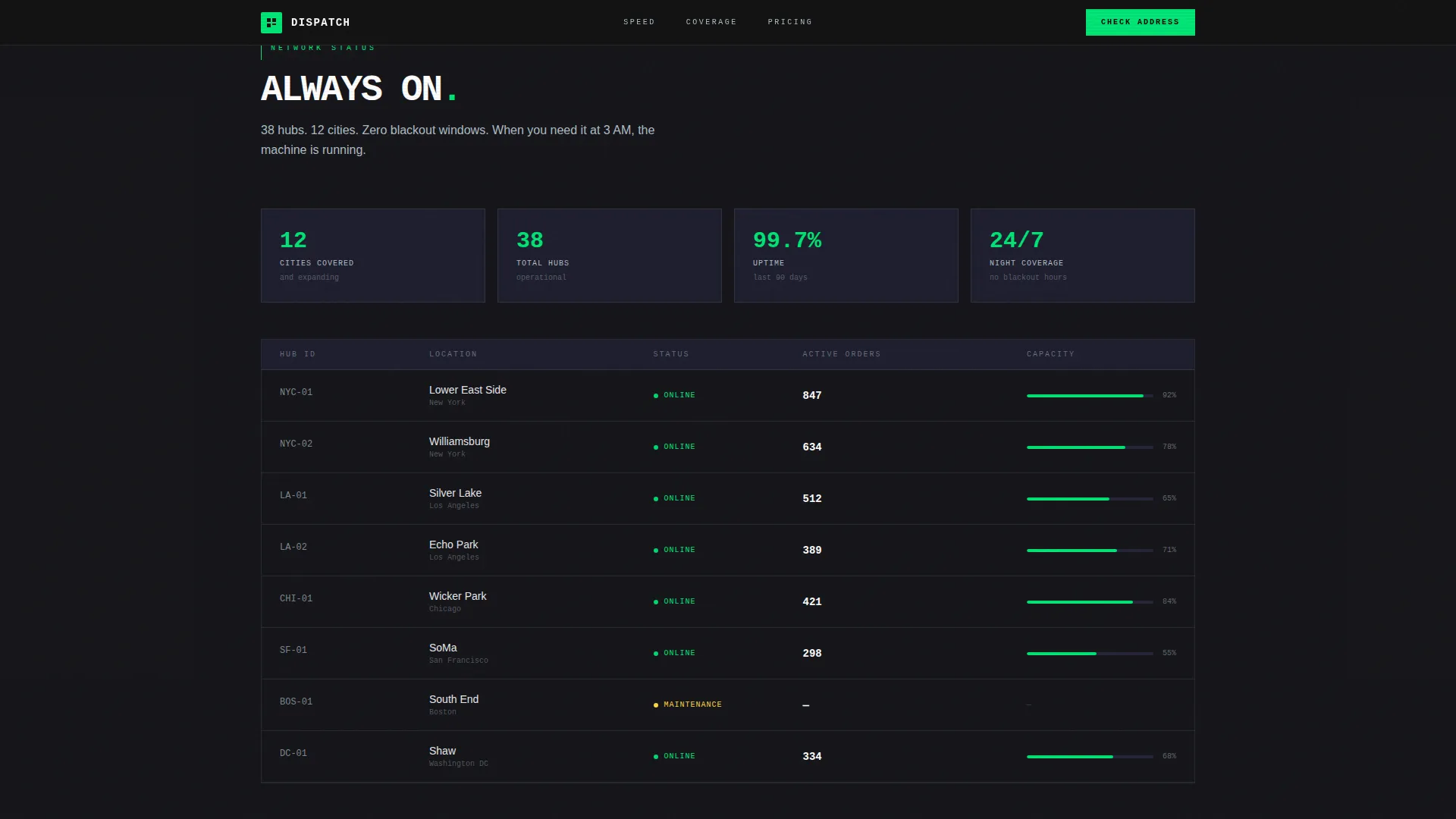
- Coverage grid showing 24/7 hub network reliability stats and hub count
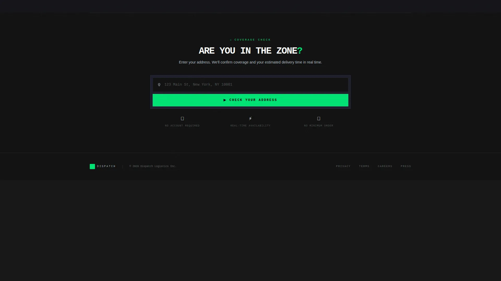
- Sticky address call-to-action input with dynamic coverage confirmation display in status-green, plus a live orders map modal trigger
Feature list
This section describes the core built-in components and interactive elements included in the template.
Animated Isometric Hero
The header features a detailed isometric cross-section of a dark fulfillment hub. Shelves are organized by pick-zone color, a robotic conveyor threads through the aisles, and a rider waits at the loading dock. Items travel from shelf to bag to bike in a seamless canvas loop. A countdown clock ticks from 00:00 to 09:47, the stated average order-to-door time. Floating HUD callouts display hard metrics: 2,847 SKUs, average pick time of 2 minutes 41 seconds, and a 3.2 km delivery radius.
Terminal Competitor Data Grid
The spec sheet section renders as a dark panel data grid. Each row compares Dispatch against traditional grocery delivery, convenience store markup, and meal-kit subscriptions across five hard metrics. The metrics covered are delivery speed, price-per-item markup percentage, minimum order threshold, delivery window precision, and product freshness guarantee. Rows reveal with a clean scroll-triggered fade, imitating a terminal printing results line by line.
Sticky Address Input with Coverage Confirmation
A single autofill address input is pinned to the bottom of the viewport at all times. When a visitor enters their address, the page dynamically confirms coverage and displays their estimated delivery time in status-green type. This keeps the primary call to action visible without interrupting the scroll experience.
Live Orders Map Modal
A secondary call to action labeled "See Live Orders Near You" opens a real-time map modal. The modal displays active riders, giving first-time visitors immediate visual proof that the service is already operating in their area.
Scroll-Triggered Section Animations
Sections escalate from speed to cost to reliability to coverage hours. Each data grid row enters with a GSAP ScrollTrigger fade, reinforcing the terminal-output feeling as visitors scroll deeper into the comparison.
Page sections overview
| Section | Purpose |
|---|---|
| Hero HUD | Animated isometric dark store with live metric callouts and looping conveyor |
| Spec Sheet Grid | Terminal-style competitor comparison across five delivery metrics |
| Coverage Stats | 24/7 hub network reliability data and hub count display |
| Address Input | Sticky pinned input for coverage check and estimated delivery time |
| Footer | Linear single-row footer pattern |
Design & branding system
The visual identity follows a Service Utility theme. Every design decision prioritizes function over decoration, creating the feeling of a server rack interface at 2 AM where each indicator light earns its place.
- Color palette: deep matte black (#121212) for background, panel gunmetal (#1E1E2E) for content panels, status-green (#00E676) for live metrics and confirmation states, and cool aluminum (#B0BEC5) for secondary text and divider lines
- Typography pairing: JetBrains Mono handles all data labels, metrics, and grid values; DM Sans handles body copy and navigation for readable contrast
- Illustration style: isometric industrial HUD with pick-zone color coding, robotic conveyor detail, and floating data callout overlays
Mobile & speed optimization
The template is built mobile-first. The core use case is a time-pressed shopper reaching for their phone at 11 PM, so every layout decision starts at small screen sizes and scales up.
- Sticky address input is designed for one-thumb tap on mobile, remaining pinned and accessible at every scroll depth
- High-animation sections use GSAP ScrollTrigger and CSS keyframes; static server components handle non-interactive content to keep the initial render lean
- The isometric hero canvas loop and live orders modal are built as client-side components, isolating heavy rendering away from the critical page path
How this template helps you convert
The conversion strategy is built around proof before persuasion. Visitors do not need to take your word for anything because the template surfaces hard data at every scroll depth.
- The animated hero establishes immediate credibility with specific, verifiable numbers displayed as HUD callouts rather than headline claims, so the visitor sees a running system before reading a single word of copy.
- The terminal comparison grid uses monospaced numbers on dark panels to let metrics argue the case against competitors without a single persuasion sentence, reducing skepticism in a category full of overpromising.
- The sticky address input removes friction at the moment of intent. The visitor never has to scroll back to the top or hunt for a sign-up button because the call to action is always one tap away.
Other information about this template
This template is categorized under Logistics and Supply Chain, specifically the Warehouse and Distribution subcategory, with a niche focus on dark store rapid delivery services.
- The template style is Dashboard/Data Grid, making it suitable for data-rich service presentations where metrics carry more weight than lifestyle imagery
- The creative direction follows a Spec Sheet approach, which means the layout is structured around objective comparison rather than narrative storytelling
- The header concept is Isometric, a format well suited to showing the interior logic of a fulfillment operation in a single glance
- The landing page direction is Comparison/Versus, meaning the primary job of every section is to stack Dispatch's performance against alternatives
- Localization is set for the United States market, with pricing in USD and copy in English
- The footer uses a linear single-row pattern, keeping the page exit clean and uncluttered
Theme
Service Utility
Creative direction
Spec Sheet
Color system
Carbon Fiber
Style
Dashboard/Data Grid
Direction
Comparison/Versus
Page Sections
Animated Isometric Dark Store Hero
Terminal-style Competitor Spec Sheet
Sticky Address Coverage Input
Live Orders Map Modal
GSAP Scrolltrigger Section Reveals
Related questions
What type of business is this template designed for?
Can I update the metrics and comparison data shown in the grid?
Does the address input require a backend service to function?
Is this template built for mobile users?
How many sections does this landing page include?