AI Helpdesk SaaS Landing Page Template
Dispatch is a hub-and-spoke landing page template built for AI-powered helpdesk SaaS products. It follows a Problem-to-Solution arc that opens on real support team pain, then walks visitors through five spoke sections, Resolution Engine, Smart Routing, Learning Loop, Integration Layer, and Analytics Core, before routing them to a live demo with zero form friction.
by Rocket studio
Quick summary
Dispatch is a single-page, anchor-nav landing page template designed for B2B AI chatbot products targeting mid-market SaaS support teams. It opens hard on the pain of ticket overload, builds evidence across five spoke sections, and funnels every visitor toward one friction-free call to action: a live product demo.
Who this template is for
This template was built for founders and marketers selling AI-driven helpdesk automation to technical buyers. The tone, layout, and evidence structure speak directly to VP-level support leaders who have seen too many vendor decks and need proof before a conversation.
- Product teams at SaaS companies launching or repositioning an AI support agent
- Marketing leads who need a high-trust, demo-first landing page for a complex B2B product
- Agencies building conversion-focused pages for AI tooling clients in the support automation space
What problem this template solves
Most SaaS landing pages for AI tools lead with features. Buyers with budget authority do not respond to feature lists. They respond to cost math, recognizable pain, and live proof. This template solves the credibility gap between a cold first impression and a booked demo.
- Generic hero sections fail to hook VP-level buyers who are skeptical of AI claims
- Long form-gated demo requests create friction exactly when intent is highest
- No existing template combines a real-time cost calculator, social proof, and a proof-first demo path in one structured flow
What you get with this template
You get a complete, ready-to-customize landing page built around a single conversion goal: getting a qualified support leader into a live demo environment. Every section is purposefully sequenced to lower skepticism before asking for a click.
- A full hub-and-spoke page layout with anchor navigation linking to five spoke sections
- A code-snippet hero with a blinking cursor, a live ticket-counter pain block, and a cost-per-resolution calculator
- Five spoke sections, each structured as problem-mechanism-metric, plus dual call-to-action placement throughout
Feature list
This section describes the core structural and functional features built into the Dispatch template.
Code Snippet Hero Block
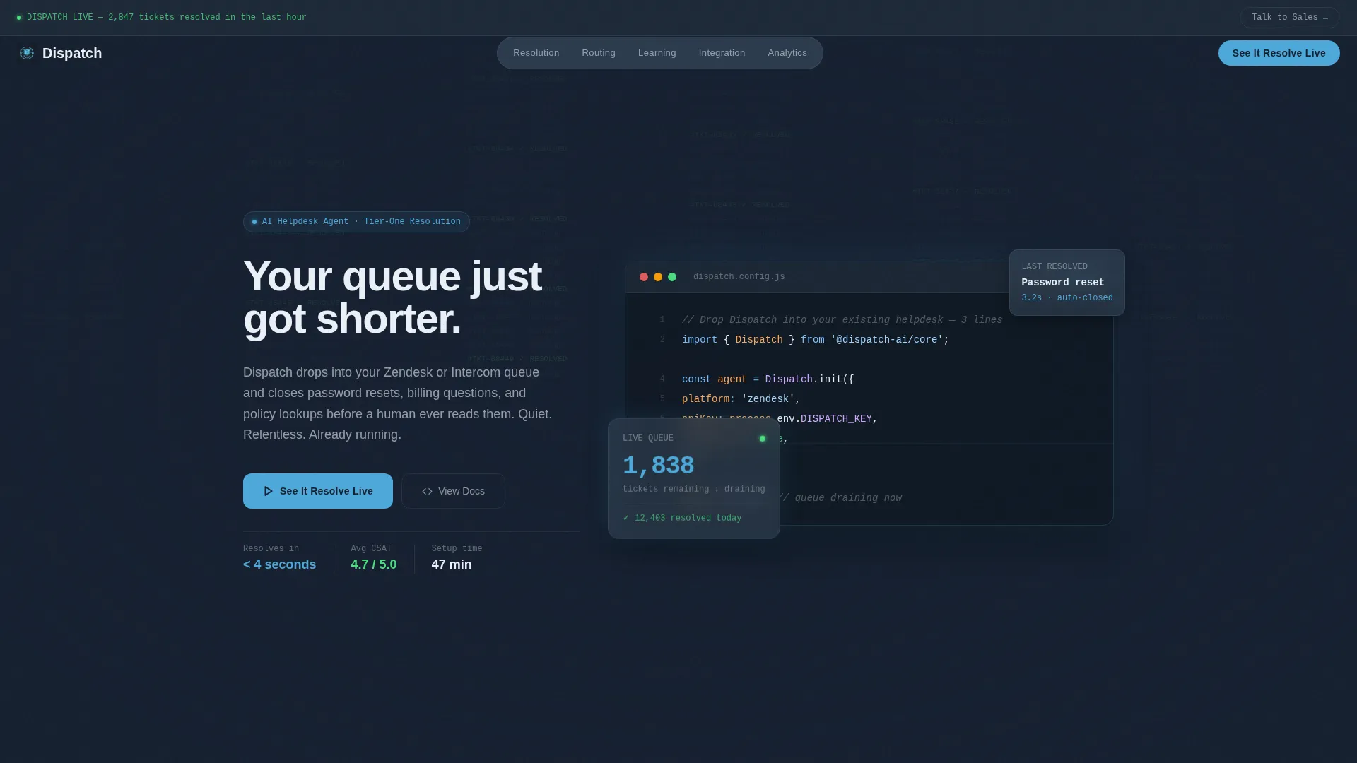
The header replaces stock imagery with a six-line JavaScript integration call rendered in syntax-highlighted code. A blinking cursor sits at the end of the final line. Behind it, a faint terminal grid scrolls resolved ticket IDs in sky blue. The headline types itself letter by letter: "Your queue just got shorter."
Real-Time Pain Block
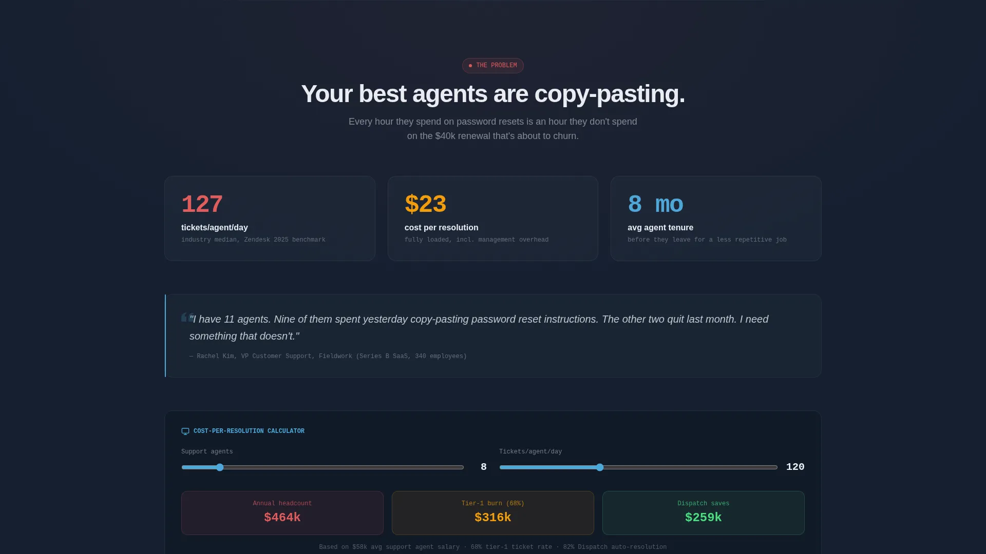
Immediately below the hero, a live counter displays average tickets per agent per day. A cost-per-resolution calculator auto-populates with industry benchmarks, giving visitors an instant, personalized number to react to. A pull quote styled like a resignation letter from a support lead anchors the emotional case before any feature is introduced.
Hub and Spoke Anchor Navigation
A sticky anchor navigation bar links to five spoke sections: Resolution Engine, Smart Routing, Learning Loop, Integration Layer, and Analytics Core. Each spoke opens with a specific, data-backed problem statement before revealing the mechanism and a moving metric. Visitors can jump to any section or scroll through the full arc.
Proof-First Demo Call to Action
Every spoke section ends with the same call-to-action button: "See It Resolve Live." The button routes to a guided demo environment where visitors watch the AI handle five real ticket types in real time. There is no form on the landing page itself. The click is earned by accumulated evidence.
Sticky Enterprise Sales Bar
A secondary sticky bar persists across the page for enterprise buyers who need procurement-track pricing. It surfaces a "Talk to Sales" option without competing with the primary demo path. The bar keeps enterprise intent captured without disrupting the main conversion flow.
Problem-to-Solution Section Arc
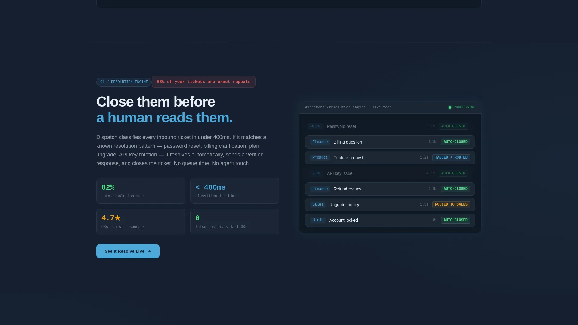
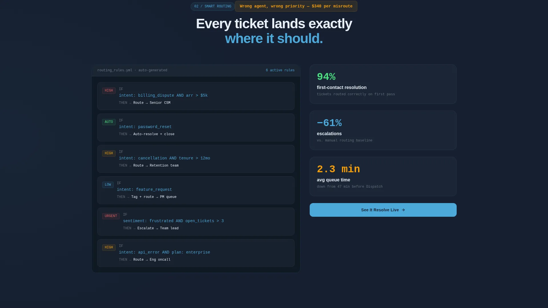
Each spoke section follows the same tight narrative structure: lead with the specific problem it kills, reveal the mechanism, show the metric moving. By the final spoke, visitors are calculating their own savings rather than evaluating whether the product works.
Page sections overview
| Section | Purpose |
|---|---|
| Code Snippet Hero | Opens with a live integration call and typed headline to signal technical credibility immediately |
| Real-Time Pain Block | Quantifies ticket volume and cost-per-resolution to make the buyer's problem feel urgent and specific |
| Anchor Navigation Bar | Gives VP-level visitors direct access to the spoke they care about most without forcing a linear scroll |
| Resolution Engine | Explains how the AI closes tier-one tickets before a human reads them, with a live metric |
| Smart Routing | Shows how tickets are tagged and routed automatically, eliminating manual triage |
| Learning Loop | Demonstrates how the AI improves over time by learning from resolved tickets |
| Integration Layer | Covers how the agent drops into an existing helpdesk queue via API without a migration |
| Analytics Core | Surfaces the metrics support leaders actually track: resolution rate, handle time, cost per ticket |
| Demo Call to Action | Every spoke ends here, routing visitors to a live demo with no form required |
| Sticky Sales Bar | Persists across the page to capture enterprise buyers who need a procurement conversation |
Design & branding system
The Dispatch template uses a Data Command visual theme built around a Slate and Sky color palette. The result feels like a mission control dashboard at dawn: dark enough to hold attention for a full scroll, lit by the precise blue glow of systems running clean.
- Background surfaces use deep gunmetal (#1E2A38) for primary areas and mid-slate (#3B4D61) for card surfaces and nav rails
- Sky blue (#4DA8DA) fires on every interactive element, live data point, and syntax-highlighted code token to draw the eye exactly where action is possible
- Cloud white (#EAF0F7) handles all body typography and whitespace, keeping the dark backgrounds readable without eye strain
Mobile & speed optimization
The Dispatch template is structured so the most persuasive elements appear early in the scroll on any screen size. The anchor navigation collapses cleanly on smaller viewports, and each spoke section is self-contained enough to read as a standalone unit if a visitor deep-links in.
- The hero code block and pain counter are sized to remain legible and impactful on mobile screens without horizontal scrolling
- Each spoke section is designed as a contained module, making reordering or removal straightforward during customization
- The sticky sales bar and demo call-to-action button are always within thumb reach on mobile, keeping the conversion path accessible throughout the scroll
How this template helps you convert
The Dispatch template is engineered around a single premise: the demo closes deals, not the landing page. The page's only job is to build enough evidence and urgency that clicking "See It Resolve Live" feels like the obvious next step.
- The hero and pain block hit the buyer's real problem within the first viewport, with specific numbers rather than vague claims, so skeptical VP-level visitors stay and read.
- Each spoke section follows a problem-mechanism-metric arc that tightens the case with every scroll, moving the visitor from recognition to calculation before they reach the call to action.
- The no-form demo path removes the single biggest friction point in B2B SaaS conversion: the moment a buyer has to surrender contact details before seeing proof.
Other information about this template
The Dispatch template was designed with a specific buyer psychology in mind. VP-level support leaders at mid-market SaaS companies are not early adopters. They are budget owners who have already burned headcount on a problem that should be solved by now.
- The template's tone is described as "pulling up a terminal at 2 a.m. and watching the backlog drain itself", quiet, relentless, and data-forward rather than hype-forward
- The page is formatted as a hub-and-spoke layout with anchor navigation, making it well-suited for products with multiple distinct capability areas that each deserve their own proof moment
- The demo-first conversion path is designed to work alongside existing sales motions: the sticky "Talk to Sales" bar ensures enterprise buyers on procurement tracks are never left without a path
- The template is built to support helpdesk automation products that integrate with existing queue systems via API, as reflected in the JavaScript integration snippet in the hero
- This template is compatible with the visual and functional conventions commonly expected by buyers already working in tools like Zendesk or Intercom, based on the prompt's stated audience context
Theme
Data Command
Creative direction
Problem→Solution Arc
Color system
Slate & Sky
Style
Hub & Spoke (Anchor Nav)
Direction
Click-Through
Page Sections
Code Snippet Hero with Typed Headline
Real-time Pain Block and Cost Calculator
Hub and Spoke Anchor Navigation
Proof-first Demo Conversion Path
Sticky Enterprise Sales Bar
Problem-mechanism-metric Section Structure
Related questions
Does this template include a lead capture form?
Can I customize the spoke sections to match my product's features?
What type of buyer is this template designed to reach?
How does the anchor navigation work?
Is the code snippet in the hero functional or decorative?



