Micro-SaaS & Developer Tools Specialist Professional Website Template
Dispatch is a bento grid landing page template built for a background job processor product. It combines a live-metrics header, glassmorphic dark user interface, and a scroll-driven activation flow to communicate reliability at a glance. The template is designed to convert backend engineers and platform teams into free-trial signups without asking for a credit card.
by Rocket studio
Quick summary
Dispatch is a single-page, bento grid landing page template for a background job processing product. It opens with a stats-first header packed with real throughput numbers, then walks visitors through scheduling, retry logic, observability, and integrations, each section activating as it enters the viewport. The end goal is a no-friction freemium signup.
Who this template is for
This template is built for developer-tool founders and product teams who need to earn technical trust fast. It speaks directly to an audience that reads code before marketing copy.
- Backend engineers who manage job queues and need proof of reliability before committing to a new tool
- Platform teams that currently wire together cron jobs and serverless functions with fragile scripts
- CTOs who require audit-grade evidence that critical jobs, payments, webhooks, emails, actually fired
What problem this template solves
Most developer-tool landing pages bury their strongest proof points behind hero images and taglines. Technical visitors leave before they see the numbers that would have converted them.
- Visitors cannot quickly assess throughput, latency, or retry reliability from a typical marketing page
- The path from "I'm curious" to "I'm signing up" is too long, requiring too many clicks or form fields
- Pages built on generic templates feel mismatched for infrastructure products and fail to build technical credibility
What you get with this template
You get a fully structured bento grid landing page with a clear visual hierarchy, a defined conversion flow, and a design system that communicates data and reliability from the first pixel.
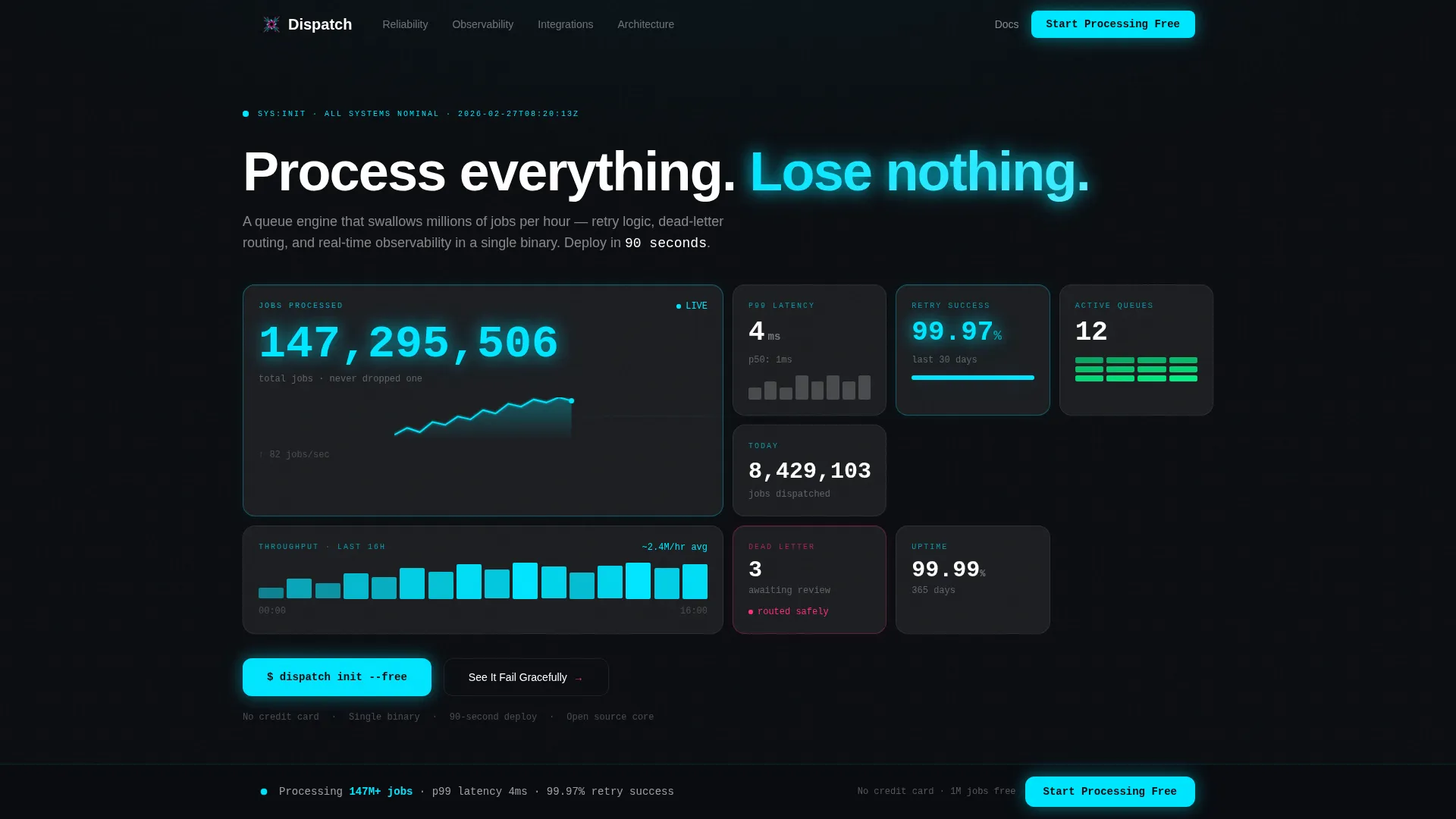
- A live-metrics header bento grid displaying jobs processed, p99 latency, retry success rate, active queues, and a throughput sparkline
- A scroll-driven section activation sequence that reveals scheduling, retry policies, observability, and integrations module by module
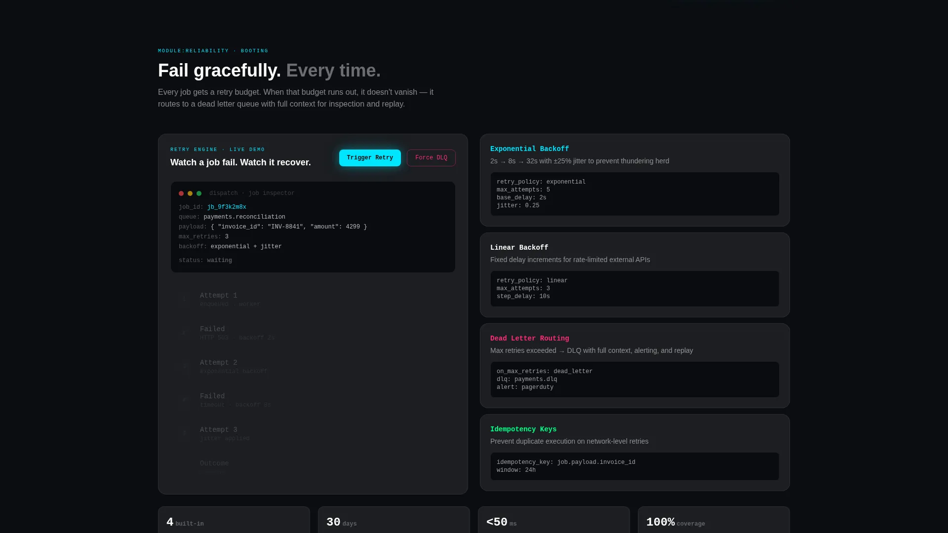
- A dual conversion path: a primary freemium signup with an inline framework selector and a secondary live demo that shows error recovery in action
Feature list
This template packages every layout and interaction detail needed to present a job processing product with confidence.
Stats-First Metrics Header
The header is a bento grid of frosted glass cards showing live-style numbers: 147,293,841 jobs processed, 4ms p99 latency, 99.97% retry success rate, and 12 active queues. A throughput sparkline pulses with cyan light. The headline "Process everything. Lose nothing." sits above the grid, short, factual, and impossible to misread.
Scroll-Activated Module Sections
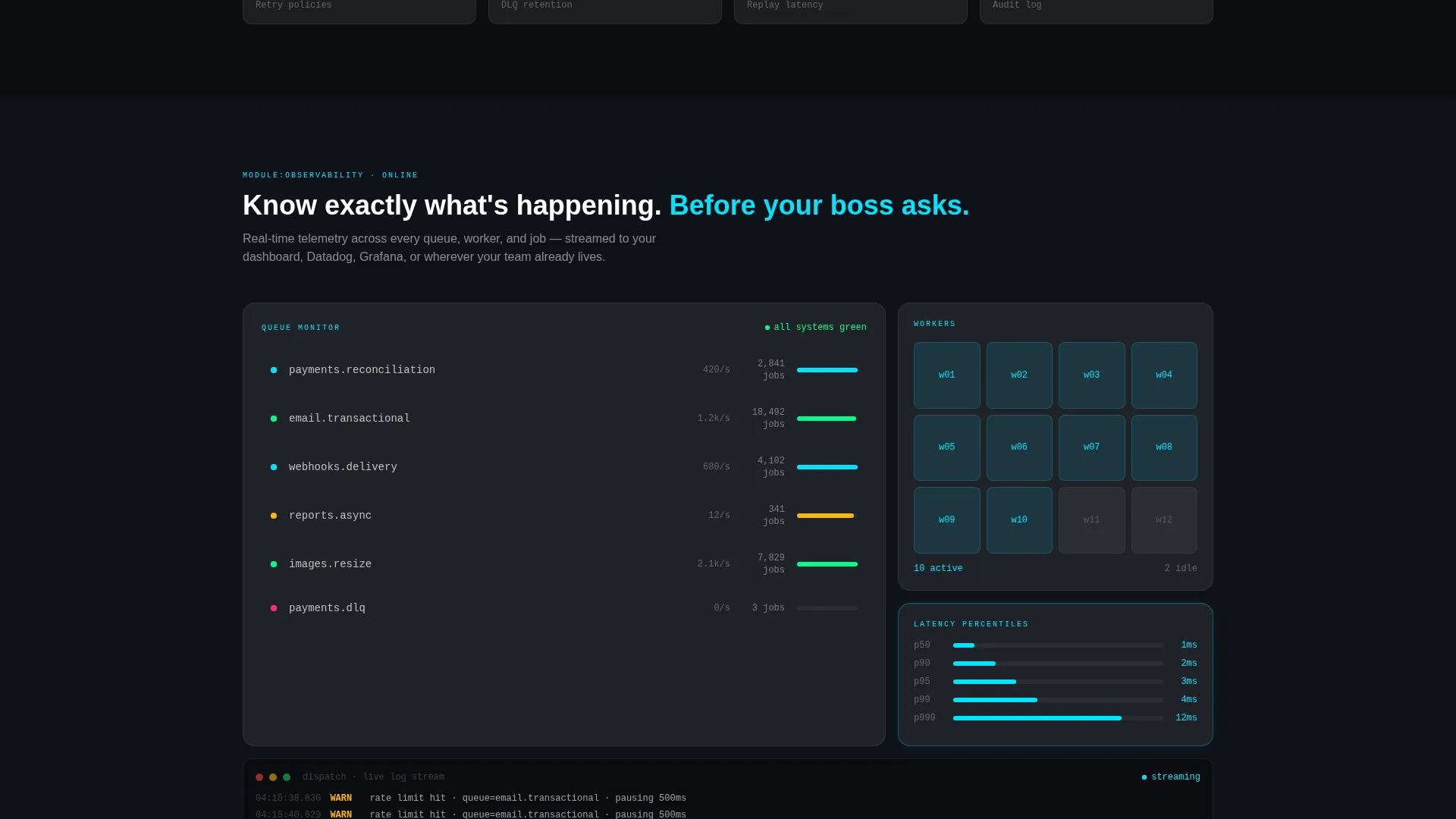
Each bento card below the header enters the viewport and activates in sequence, mimicking a system boot. Scheduling loads first, then retry policies, then observability dashboards, then integrations. The effect gives visitors a guided architectural tour without requiring them to read long paragraphs.
Dual Conversion Path Design
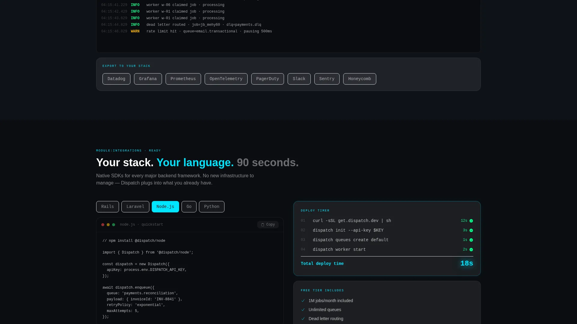
The primary call to action, "Start Processing Free", appears in the header and again in a sticky bottom bar that surfaces after the third scroll. Clicking it opens an inline signup: email entry, a one-click framework selector covering Rails, Laravel, Node, Go, and Python, and a terminal snippet ready to copy. No credit card is required. The secondary path, "See It Fail Gracefully", opens a live demo that triggers retries and dead-letter routing on purpose.
Glassmorphic Bento Card System
Every card uses a frosted panel at 12% white opacity with a 1px luminous border. Cards float over a void black background. Electric cyan highlights live data and active states. Signal magenta marks errors and alerts. The layered depth makes the interface feel like mission control reflected in smoked glass.
Monospace and Geometric Typography Pairing
Metrics and terminal output use tabular monospace to reinforce technical precision. Headlines and section labels use geometric sans-serif for clarity and weight. The pairing makes large numbers instantly readable and keeps the page feeling authoritative without being cold.
Inline Signup with Framework Selector
The freemium signup flow is embedded directly in the page. After entering an email, the visitor selects their framework in one click. A ready-to-copy terminal snippet appears immediately. The flow removes every friction point between intent and action.
Page sections overview
| Section | Purpose |
|---|---|
| Live Metrics Header | Opens with throughput, latency, and retry stats in a bento grid |
| Scheduling Engine Card | Introduces the core job scheduling capability |
| Retry Policy Section | Explains retry logic and dead-letter routing behavior |
| Observability Dashboard | Shows real-time job monitoring and alerting visuals |
| Integrations Grid | Displays framework and platform connection options |
| Primary call to action Block | Hosts the inline freemium signup and framework selector |
| Sticky Bottom Bar | Reinforces the signup call to action after the third scroll |
| Secondary Demo Path | Lets visitors trigger a live error-recovery demonstration |
Design & branding system
The template follows a Data Command visual theme rendered through a glassmorphic color system. Every surface is intentional: darkness is the default, and data provides the light.
- Color palette: void black (#0B0D11) backgrounds, frosted panel white at 12% opacity (#FFFFFF1F) for cards, electric cyan (#00E5FF) for live data and active states, signal magenta (#FF2D7B) for errors and alerts
- Typography: tabular monospace for all metrics and terminal content, geometric sans-serif for headlines and labels
- Bento cards use subtle 1px luminous borders and a frosted glass surface that creates visible depth layers against the dark background
Mobile & speed optimization
The bento grid layout is structured to reflow cleanly across screen sizes. The template is designed to keep the critical metrics and conversion elements visible and functional at every viewport width.
- Bento card grids collapse to single-column stacks on smaller screens, preserving readability of large metric numbers
- The sticky bottom bar call to action remains visible and accessible across mobile and desktop viewport sizes
- The inline signup flow is compact enough to complete on a phone screen without horizontal scrolling
How this template helps you convert
The template is designed around a single principle: show proof first, then ask for the signup. Every layout decision supports that sequence.
- The metrics header puts the strongest evidence, job counts, latency, and retry rates, at the very top, before any visitor has to scroll or decide whether to trust the product.
- The scroll-activated module sequence builds confidence incrementally, letting visitors absorb each capability before the next one appears, so the sticky call to action arrives after trust is already established.
- The no-credit-card freemium path, inline framework selector, and copy-ready terminal snippet reduce the signup to under three steps, removing every common reason to abandon the page.
Other information about this template
Dispatch is built specifically for the background job processing niche within developer tools and micro-SaaS products. The template's structure and tone are designed to resonate with engineers who are skeptical of marketing pages.
- The "Launch Energy" creative direction means the scroll experience feels like a system initializing, which matches the mental model engineers already have for infrastructure tools
- The template supports the freemium and free-trial go-to-market model, making it a practical fit for products that want to reduce time-to-first-value for new signups
- The bento grid layout is a strong choice for data-dense developer tools because it lets metrics, code snippets, and status indicators coexist on screen without visual clutter
- The dual call to action structure (primary signup plus secondary demo) is particularly useful for products where engineers need to see failure recovery before they trust the happy path
Theme
Data Command
Creative direction
Launch Energy
Color system
Glassmorphic
Style
Bento Grid
Direction
Freemium/Trial
Page Sections
Stats-first Bento Metrics Header
Scroll-activated Module Sequence
Dual Conversion Path Layout
Inline Signup with Framework Selector
Glassmorphic Dark Card System
Monospace and Geometric Type Pairing
Related questions
Who is this landing page template designed for?
Can I replace the placeholder metrics with my own product numbers?
What frameworks does the inline selector support?
Does the signup flow require a credit card?
What is the secondary demo conversion path?



