Fleet & Transportation Management Comparison Website Template
Dispatch is a modular, card grid landing page template built for transportation management system providers. It leads with live metric counters, a head-to-head comparison table, and a persistent cost-comparison call to action. The design uses a charcoal and amber palette to give freight and logistics brands an industrial, data-driven presence that turns visitor skepticism into quantified urgency.
by Rocket studio
Quick summary
Dispatch is a single-page, card grid landing page template designed for transportation management system providers targeting mid-market freight operators. It opens with an animated stats wall, builds a data-led argument through modular comparison cards, and closes with a two-step cost-comparison form. The charcoal and amber visual system keeps every metric readable and every call to action impossible to miss.
Who this template is for
This template is built for logistics technology companies and freight service providers who need to convert informed, skeptical buyers. It speaks directly to the frustrations of people running transportation operations on spreadsheets or aging legacy platforms.
- Third-party logistics (3PL) providers drowning in manual, spreadsheet-based dispatching workflows
- Regional shippers whose transportation spend bleeds significant monthly costs to operational inefficiency
- Logistics directors inheriting a patchwork of EDI connections and manual rate confirmation processes
What problem this template solves
Mid-market freight operators rarely struggle with awareness of a problem. They struggle with the gap between knowing inefficiency exists and seeing a credible, quantified case to act. A generic feature list does not close that gap.
- Visitors land without a clear sense of what their current process is costing them in real dollars
- Competitor and legacy TMS comparisons are buried in PDFs instead of being front and center
- Lead capture forms ask too much too soon, pushing self-educating buyers away before they engage
What you get with this template
The template delivers a full single-page layout structured as a conversion-focused comparison engine. Every section is designed to add another data point to a buyer's decision before they reach the call to action.
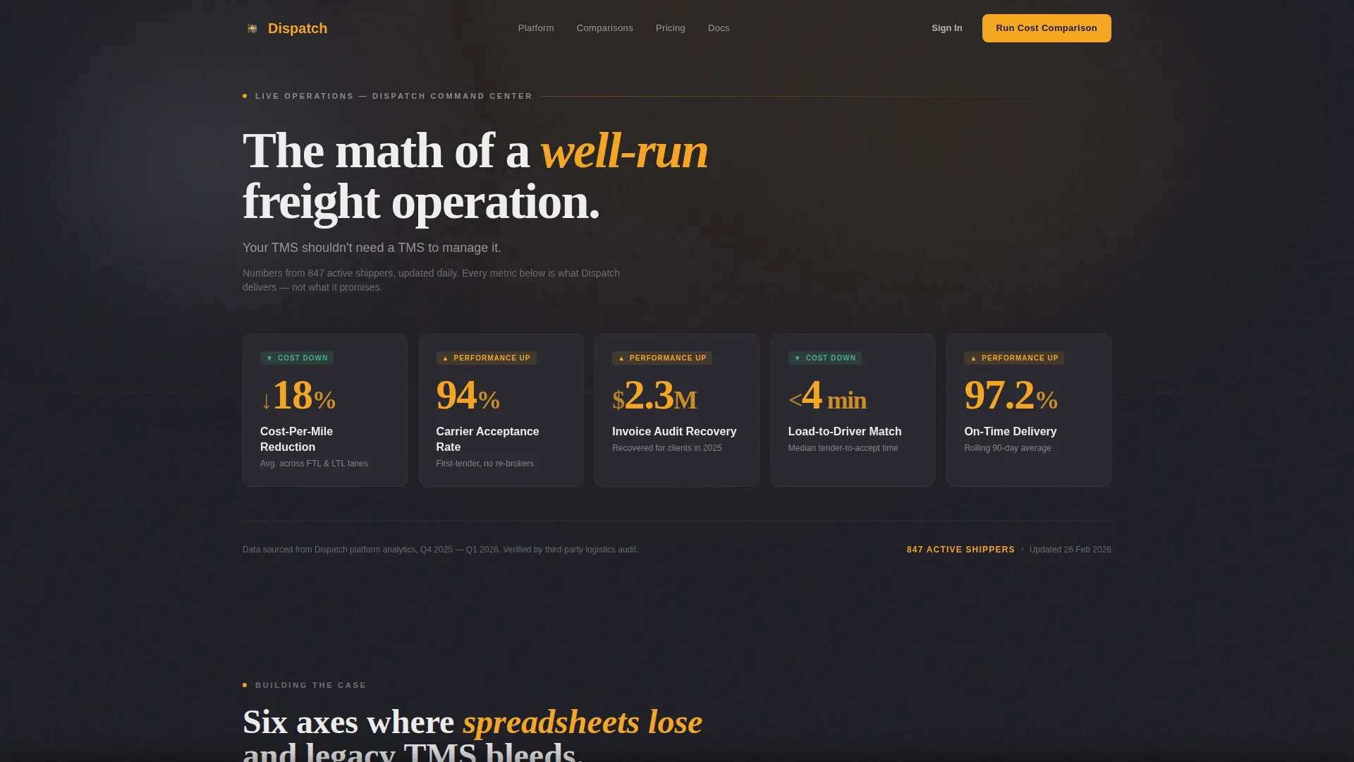
- An animated header metrics wall with five live odometer-style counters in amber on charcoal
- A modular card grid where each card leads with a metric differential before naming the feature
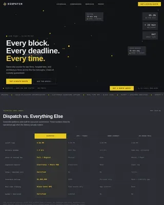
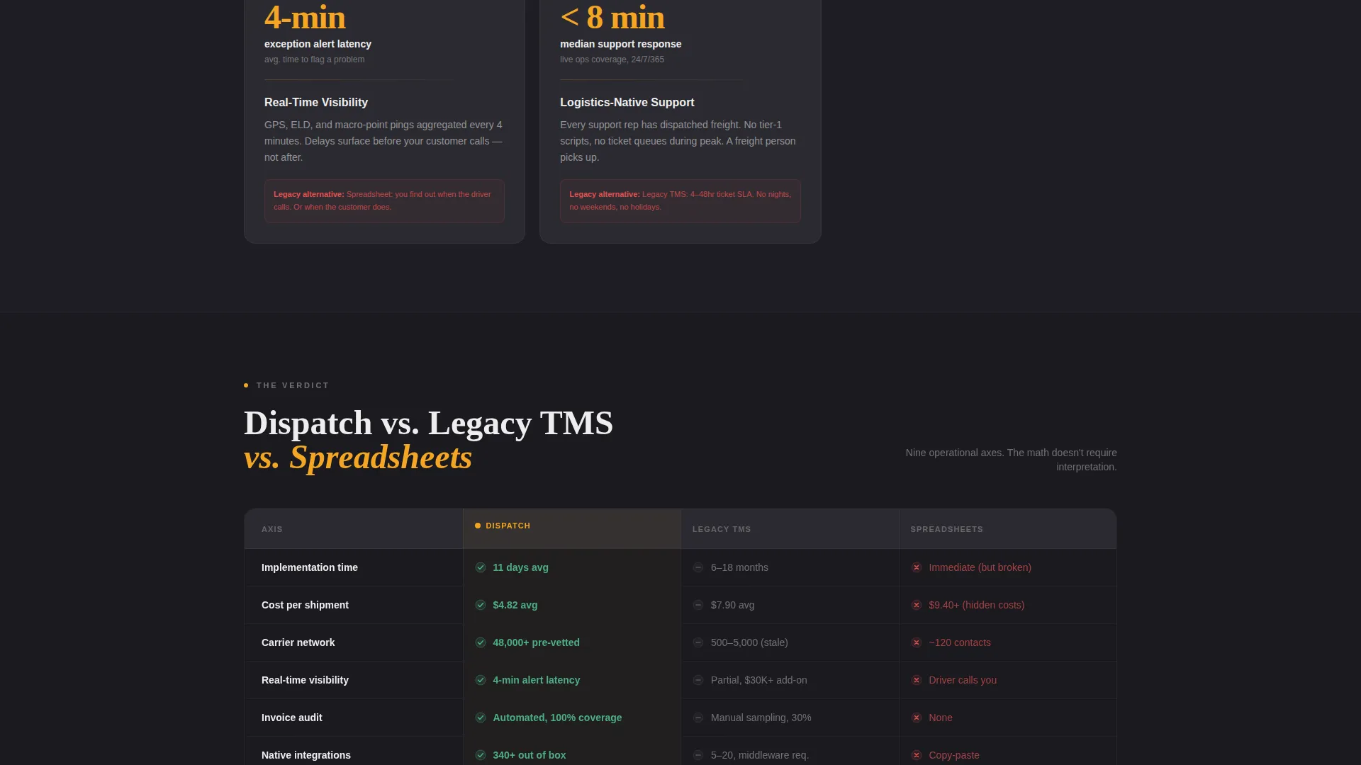
- A full-width comparison break card presenting a side-by-side table across three columns: your TMS, legacy TMS, and spreadsheets
- A persistent bottom bar carrying the primary call to action after the third card row
- A two-step cost-comparison form capturing shipment volume, mode, current TMS, and average cost per shipment
- A secondary lead path gating a downloadable comparison PDF behind a single email field
Feature list
This template includes the following built-in design and structural capabilities based on the source brief.
Animated Stats Header
The header opens with five oversized counters animating upward simultaneously. Metrics include cost-per-mile reduction, carrier acceptance rate, invoice audit recovery, load-to-driver match time, and on-time delivery percentage. Numbers tick like an odometer rolling over, rendered in signal amber against deep charcoal.
Modular Comparison Card Grid
Each card module represents a distinct competitor comparison axis. Cards lead with the metric differential before naming the feature, covering cost per shipment, implementation timeline, carrier network depth, API integrations, real-time visibility, and support response. Scrolling builds a cumulative, data-led argument.
Full-Width Versus Break Card
A horizontal break card spans the full grid midway down the page. It presents a three-column side-by-side table using amber checkmarks, gray dashes, and red X marks to make the competitive verdict immediately visual without requiring the reader to interpret prose.
Persistent Bottom Bar call to action
After the third card row, a fixed bottom bar appears carrying the primary call to action. It remains visible as the visitor continues scrolling, ensuring the prompt to act stays present throughout the rest of the page without interrupting the content flow.
Two-Step Cost Comparison Form
The primary call to action opens a two-step inline form. Step one captures monthly shipment volume and primary freight mode, covering full truckload (FTL), less-than-truckload (LTL), intermodal, and parcel. Step two captures current TMS name or "no TMS" and average cost per shipment if known.
Gated PDF Secondary Path
A secondary conversion path offers a downloadable comparison matrix PDF. It is gated behind a single email field, creating a low-friction lead capture option for visitors who are researching but not yet ready to speak with sales.
Page sections overview
| Section | Purpose |
|---|---|
| Animated Stats Header | Opens with five live odometer counters showing key performance metrics |
| Tagline Bar | Delivers the single anchor statement beneath the metrics wall |
| Comparison Card Grid | Builds a metric-first case across six competitive axes |
| Versus Break Card | Shows a full-width three-column competitive table at mid-scroll |
| Persistent call to action Bar | Anchors the primary call to action from the third card row onward |
| Two-Step Form | Collects shipment volume, freight mode, and current TMS details |
| PDF Gated Path | Captures emails in exchange for a downloadable comparison matrix |
Design & branding system
The template uses a Service Utility visual theme rooted in the atmosphere of a well-run loading dock at 5 AM. Every color choice has a functional reason. Nothing decorates without signaling something.
- Deep asphalt charcoal (#1E1E24) as the primary background, freight-dock concrete (#3A3A42) for card surfaces, signal amber (#F5A623) on every metric, badge, and interactive element, and manifest white (#EDEDED) for body text
- No hero image and no lifestyle photography; the header communicates entirely through animated data
- Amber is used exclusively on actionable and data-bearing elements, so every flash of color carries meaning
Mobile & speed optimization
The card grid layout is built modularly, which means it reflows naturally across screen sizes. Visitors on mobile devices experience the same data-first argument without layout breakdowns.
- Modular card structure allows clean single-column stacking on smaller screens
- The persistent bottom bar is designed to remain visible and functional on mobile viewports
- The two-step form keeps each step short enough to complete comfortably on a phone
How this template helps you convert
The entire page is structured as a prosecution case. Each section adds one more data point until the cost of inaction feels specific and personal to the visitor.
- The animated metrics header quantifies outcomes immediately, so visitors arrive at the comparison cards already primed with performance benchmarks rather than marketing language.
- The modular card grid and versus break card together eliminate the need for visitors to research competitors independently, making the page itself the most complete comparison resource they will find.
- The dual conversion paths, a two-step cost-comparison form and a gated PDF download, match two distinct buyer readiness levels, capturing leads at both stages without forcing a single commitment on all visitors.
Other information about this template
Dispatch is designed specifically for the logistics technology and freight management space. It fits naturally within the Fleet and Transportation Management category and targets the Transportation Management System niche.
- The template style is a Card Grid (Modular) layout, making it straightforward to add, remove, or reorder comparison cards without breaking the page structure
- The landing page direction is Comparison and Versus, meaning the entire content architecture is built around showing differentiation rather than listing features in isolation
- The header concept is a Stats and Metrics wall, which makes the page unusual and memorable in a category where most competitors lead with hero imagery
- This template is built for single-page deployment and does not require a multi-page site structure to deliver its full conversion argument


Theme
Service Utility
Creative direction
Stats-First Impact
Color system
Charcoal & Amber
Style
Card Grid (Modular)
Direction
Comparison/Versus
Page Sections
Animated Odometer Stats Wall
Metric-first Comparison Card Grid
Full-width Versus Break Card
Persistent Bottom Bar Call to Action
Two-step Cost Comparison Form
Gated Comparison PDF Path
Related questions
Who is the Dispatch template built for?
Can I update the metrics shown in the animated header?
What freight modes does the two-step form support?
How does the gated PDF lead path work?
Do I need coding skills to reorder or remove comparison cards?