Security Guard Vertical SaaS Cost Calculator Website Template
Dispatch is a bold brutalist landing page template built for security guard management software. It opens with a live cost-savings calculator, drives scroll through a relentless feature comparison table, and funnels visitors toward a free trial with zero friction. Designed for regional security firm owners and operations managers who need proof before they commit.
by Rocket studio
Quick summary
Dispatch is a single-page, click-through landing page template for security guard management software. It pairs a real-time savings calculator with a prosecutorial feature matrix to show prospects exactly what they are losing by sticking with spreadsheets. The design is Bold Brutalist with an AI Iridescent color palette: high-contrast, authoritative, and built to convert.
Who this template is for
This template was built for operators and decision-makers in the security industry who need to demonstrate clear software value fast. It speaks to buyers who are already in pain and need numbers, not promises.
- Regional security firm owners managing between 50 and 500 guards across multiple sites
- Operations managers dealing with no-show calls, scheduling gaps, and manual reporting
- Compliance officers who need documented guard activity and reliable audit trails
What problem this template solves
Security operations teams lose hours every week to manual scheduling, missed-shift phone trees, and paper incident logs that don't hold up under review. A generic software landing page doesn't close that gap. Dispatch closes it by making the cost of inaction visible and the switch feel overdue.
- No way to show prospects the real dollar cost of their current patchwork processes
- Feature lists that don't differentiate from legacy competitors prospects already distrust
- Long sales pages that bury the call to action and let prospects drift away
What you get with this template
Dispatch delivers a fully structured, single-page layout that moves a skeptical buyer from curiosity to click-through in one scroll. Every section is designed to build pressure and reduce hesitation.
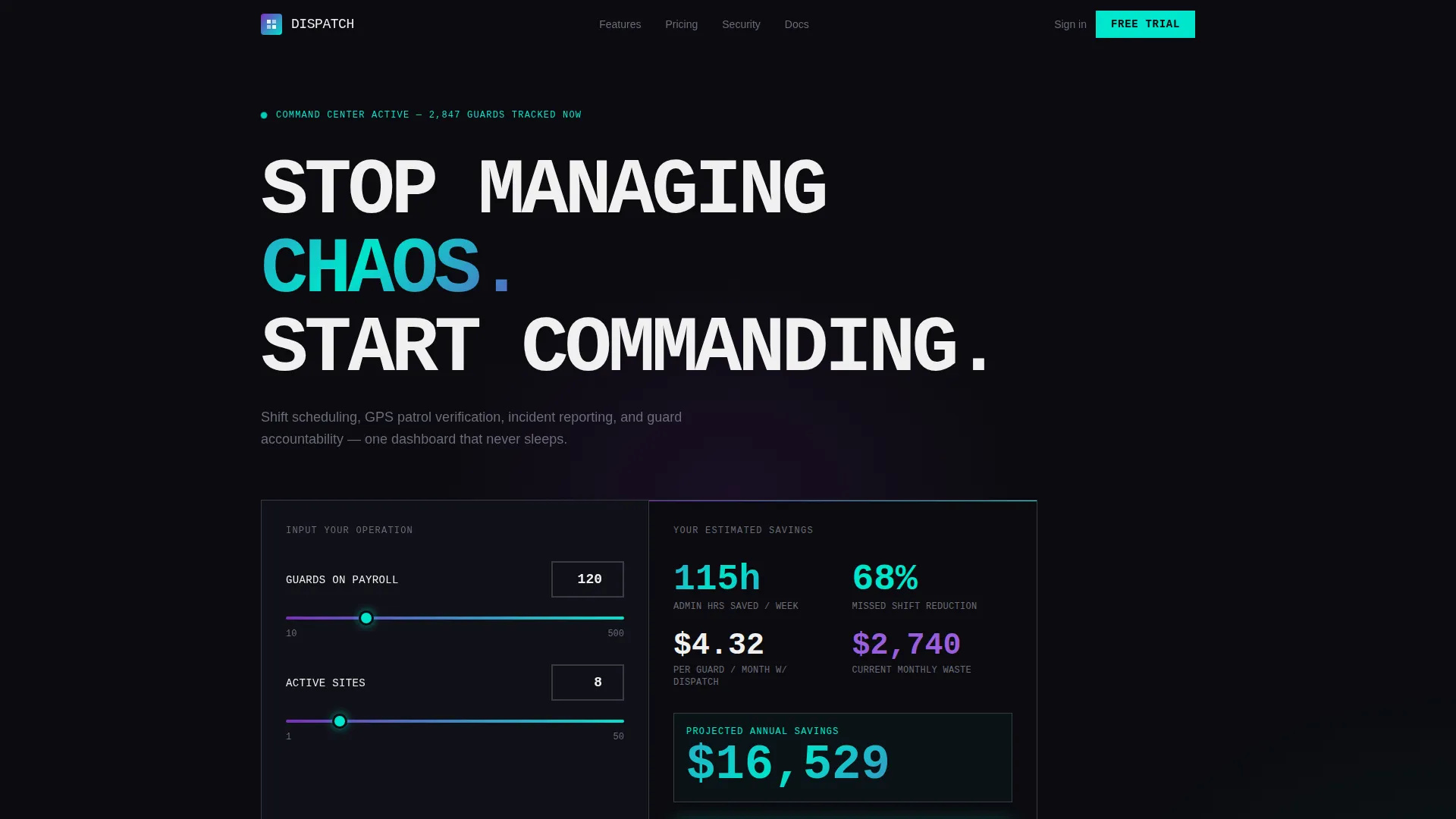
- A live calculator header that rebuilds cost and time estimates in real time based on guard count and site count inputs
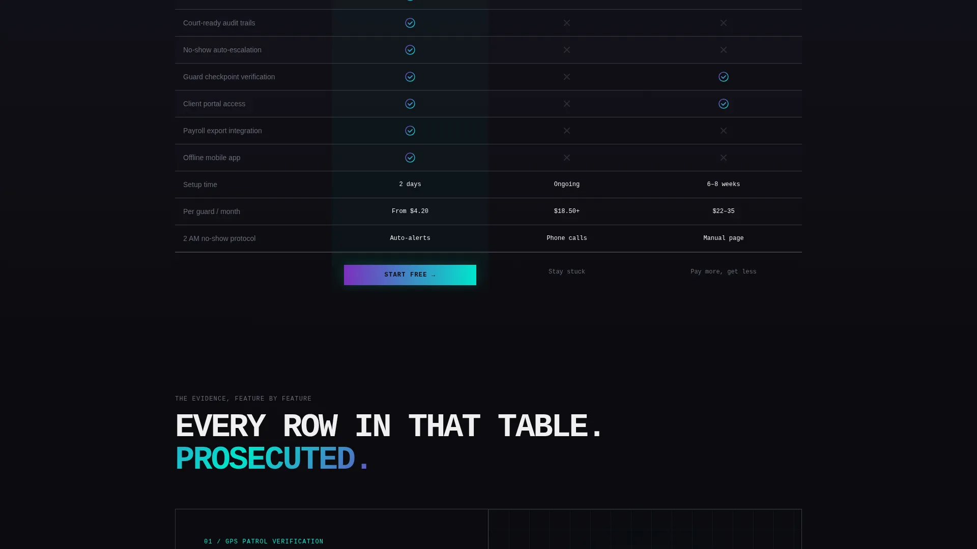
- A three-column brutalist comparison table pitting the software against spreadsheets and a legacy competitor
- Three contextual call-to-action placements that carry calculator inputs forward so visitors never re-enter data
Feature list
Dispatch is built around a small set of high-impact components, each doing specific conversion work. Every element earns its place on the page.
Live Cost-Savings Calculator
The header is an interactive estimator built on a brutalist black slab. Visitors input guard count and site count using oversized input fields and a thick cyan slider. Estimates for hours saved per week, missed-shift reductions, and cost per guard per month rebuild in real time with iridescent number animations.
Brutalist Feature Comparison Table
A three-column table compares the software directly against spreadsheet workflows and a legacy competitor. Check marks appear in reactive violet; gaps appear in dim gray. The contrast is immediate and deliberate, making the alternative look visibly painful.
Exploding Row Sections
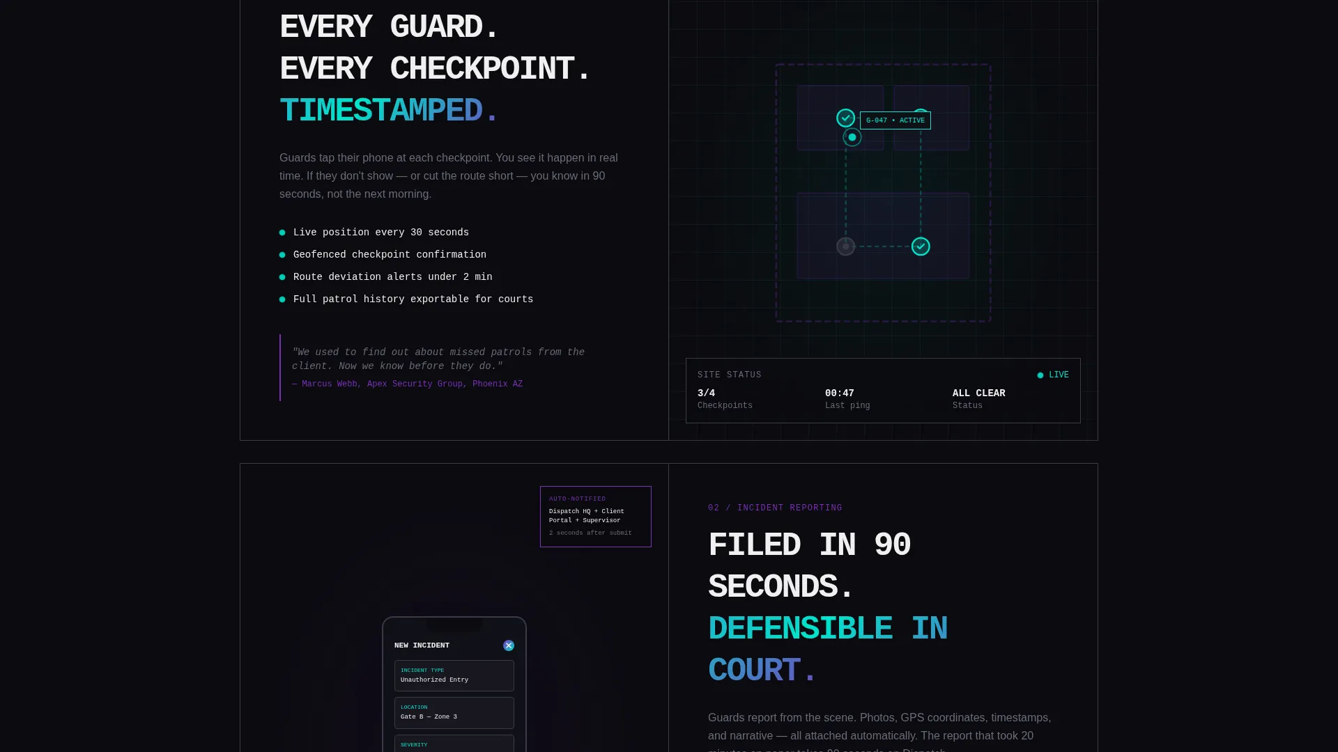
Each row in the comparison table expands into its own full-width section. GPS patrol verification shows a live map with location dots. Incident reporting shows a phone screen mid-submission. Scheduling shows drag-and-drop shift blocks snapping into a grid. Visuals and copy stack the evidence row by row.
Persistent call to action Bar
After the comparison table, a fixed brutalist bar locks to the viewport and keeps the primary call to action visible throughout the rest of the scroll. It does not disappear. It does not compete with content. It simply stays present.
Contextual Trial Entry Points
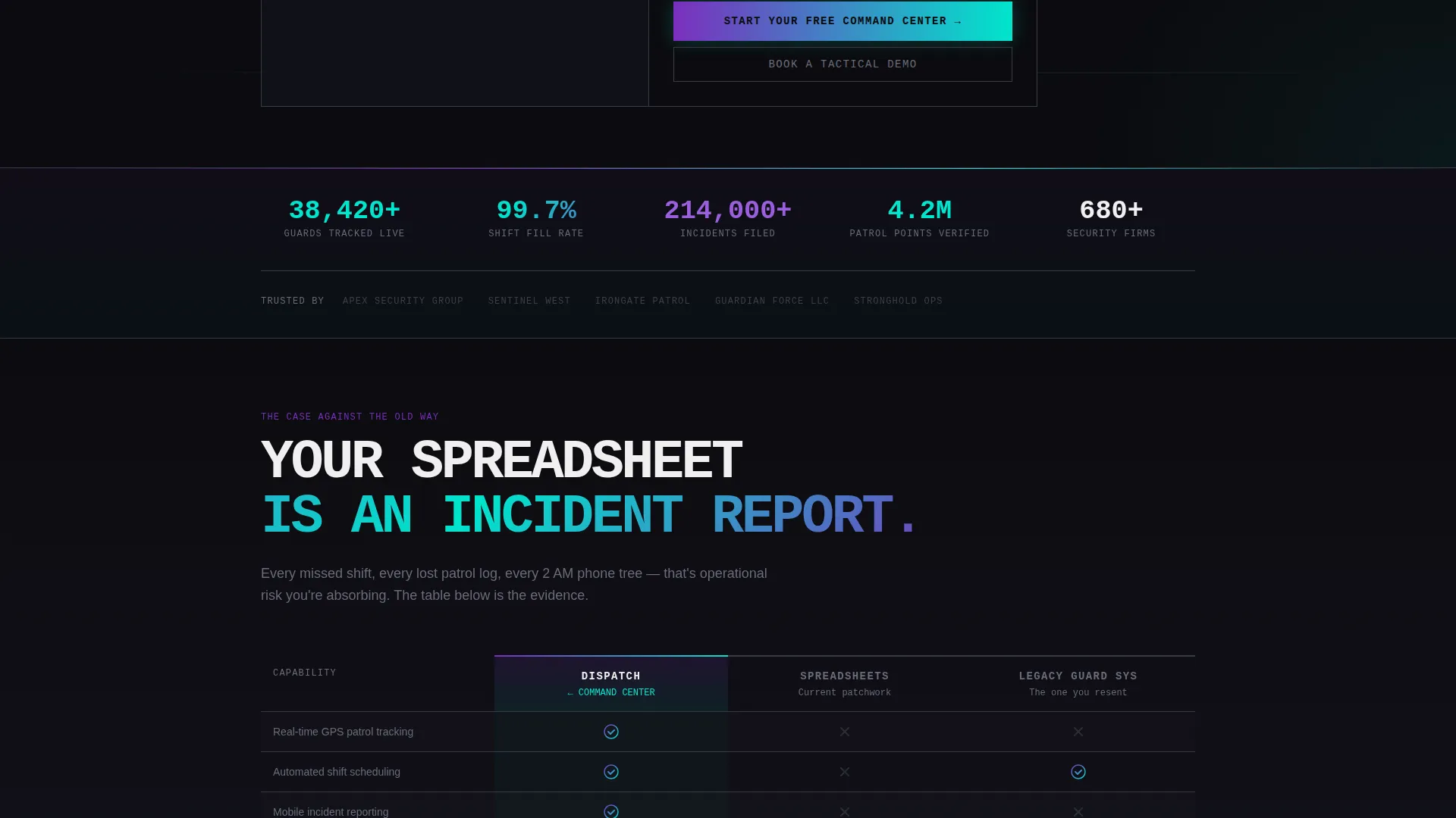
The primary call to action, "Start Your Free Command Center," appears first inside the calculator results, then in the fixed bar, and again at page bottom. Each instance carries the visitor's calculator inputs into the trial signup flow so data entry is never repeated.
Secondary Demo Booking Path
Enterprise prospects who need a human conversation before committing are directed to a "Book a Tactical Demo" secondary call to action. This path runs alongside the free trial without competing with it, giving the page two conversion lanes.
Page sections overview
| Section | Purpose |
|---|---|
| Calculator Header | Quantify savings in real time |
| Primary call to action Block | Convert on first savings reveal |
| Feature Matrix Table | Compare against known alternatives |
| GPS Verification Section | Visualize live patrol tracking |
| Incident Reporting Section | Show mobile submission in action |
| Shift Scheduling Section | Demonstrate drag-and-drop scheduling |
| Fixed call to action Bar | Keep trial entry always visible |
| Bottom call to action Section | Final push to free trial |
Design & branding system
The visual identity is Bold Brutalist with an AI Iridescent color system. The palette was designed to feel like a holographic badge catching fluorescent light in a dark operations room: synthetic, authoritative, and slightly alien.
- Void black (#0B0B0F) dominates every background; reactive violet (#7B2FBE) and signal cyan (#00E5CC) appear as gradients on borders, table headers, and hover states
- Hard white (#F0F0F0) carries all primary typography; monospaced fonts are used for data readouts and calculator outputs
- Text is oversized and slammed to grid edges with brutalist indifference; no stock photography, no decorative imagery, only functional visuals tied to specific feature sections
Mobile & speed optimization
The template is built for a lean, single-page structure that keeps the layout controlled and the scroll intentional on any screen size. The brutalist grid adapts without losing its edge.
- Oversized input fields and the cyan slider in the calculator header remain usable and tap-friendly on smaller screens
- The fixed call to action bar is designed to sit cleanly at the bottom of mobile viewports without obscuring key content
- Section-by-section scroll flow ensures the feature matrix and exploding row visuals load contextually as the visitor moves down the page
How this template helps you convert
Every structural decision in Dispatch is tied to a specific conversion moment. The page does not rely on persuasion copy alone. It uses math, contrast, and momentum.
- The calculator creates a personalized savings moment early in the session, anchoring the free trial call to action to a number the visitor generated themselves
- The feature matrix builds cumulative contrast, making each row feel like another piece of evidence until switching feels like the obvious move
- Three non-redundant call-to-action placements keep the trial entry point available at the exact moment a visitor decides to act, without requiring them to scroll back up
Other information about this template
Dispatch is a purpose-built template for the security guard vertical SaaS category. It is designed for software products in the security guard management space that need a high-conviction landing page rather than a generic feature overview.
- The template style is Comparison Table, which suits products competing against entrenched legacy tools or manual workflows
- The header concept is Calculator/Estimator, making it especially effective for software with quantifiable operational impact
- The click-through landing page direction means there is no form on the page itself; conversion happens at the trial signup destination
- The Bold Brutalist theme and AI Iridescent color system make this template visually distinct in a category that typically defaults to corporate blue and stock photography
- This template is well-suited for security guard management software products looking to position against spreadsheet-based operations and legacy dispatch systems
Theme
Bold Brutalist
Creative direction
Feature Matrix
Color system
AI Iridescent
Style
Comparison Table
Direction
Click-Through
Page Sections
Real-time Savings Calculator
Three-column Comparison Table
Exploding Row Feature Sections
Persistent Fixed Call to Action Bar
Dual Conversion Paths
Calculator Input Carry-through
Related questions
Does this template include a form on the page?
What is the calculator in the header designed to do?
How does the comparison table work beyond listing features?
Who is the target buyer for this template?
Can the template support two different types of prospects?



