Specialist Pharmacy Software Cost Estimator Website Template
Dispense is a bold brutalist pharmacy case management landing page built for specialty pharmacy teams. It combines a Feature Tab Switcher header, a twelve-row comparison table, and stats-first impact sections to show exactly how the platform tracks prior authorizations, closes adherence gaps, and converts payer denials into approvals. A gated calculator drives qualified lead generation.
by Rocket studio
Quick summary
Dispense is a single-page pharmacy case management template built for high-stakes clinical operations teams. It opens with a live-dashboard tab switcher, slams visitors with impact statistics, then walks them through a brutalist comparison table before funneling them into a lead-capture calculator. Every section earns the click before it asks for anything.
Who this template is for
This template is built for pharmacy professionals who manage large, complex patient panels under constant payer pressure. If your day involves chasing authorizations, managing denials, or watching patients fall through workflow cracks, this layout speaks directly to your reality.
- Specialty pharmacy directors managing payer rejections at scale
- Clinical coordinators handling hundreds of open cases simultaneously
- Health-system pharmacists losing revenue to prior authorization (PA) failures
What problem this template solves
Pharmacy case management is drowning in paper, fax trails, and disconnected tools. Teams lose revenue not because the clinical work is wrong, but because the workflow is invisible. This template makes the cost of chaos impossible to ignore.
- Payer denial rates and case aging go untracked until revenue is already lost
- Manual workflows cannot surface the patients most at risk of lapsed fills
- No clear visual proof exists to convince decision-makers that a better system pays for itself
What you get with this template
You get a complete, conversion-focused landing page structured to move specialty pharmacy buyers from skepticism to action. Every section is designed to build trust through data before asking for contact information.
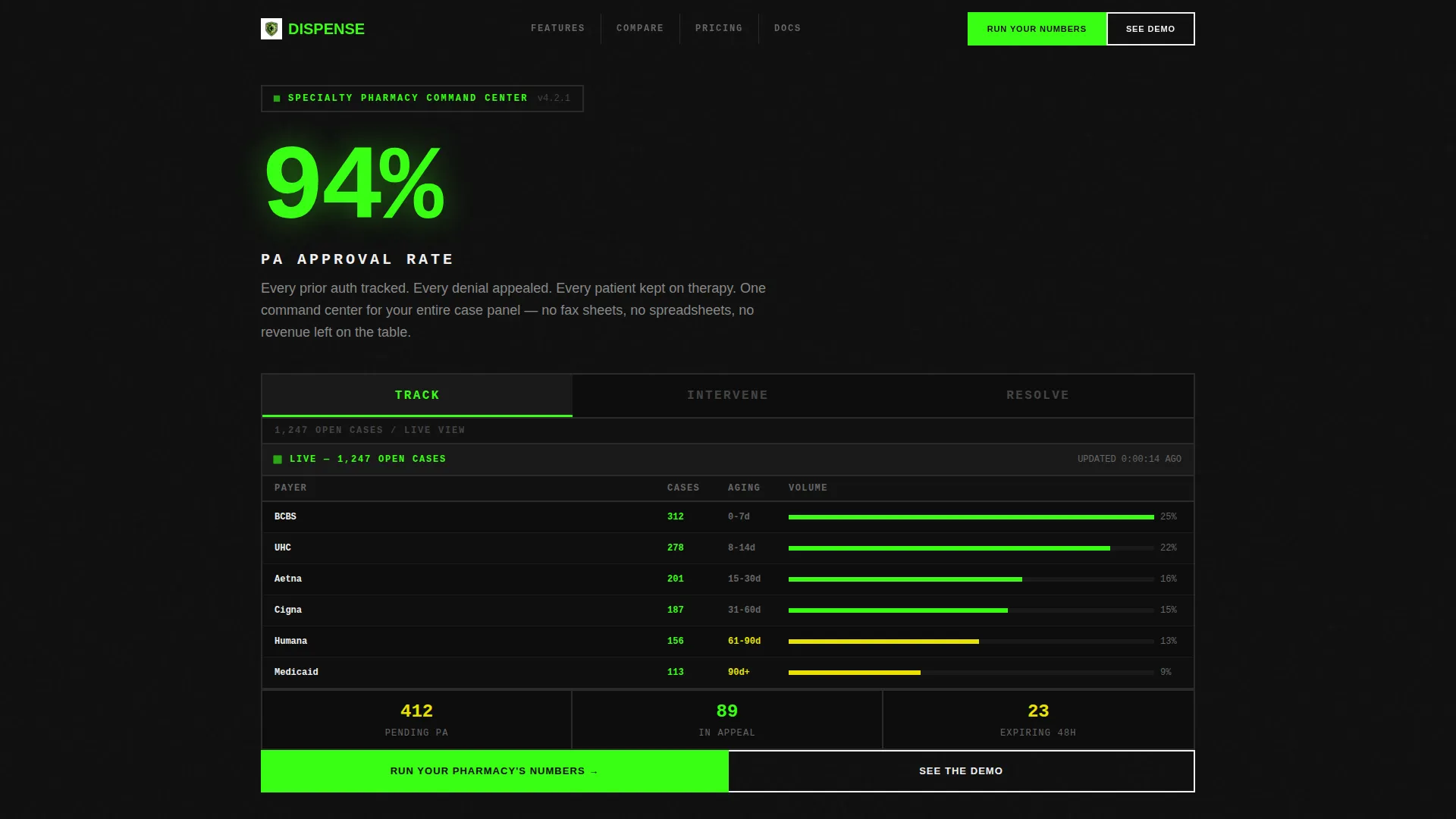
- A Feature Tab Switcher header with three live-dashboard mockup states: TRACK, INTERVENE, and RESOLVE
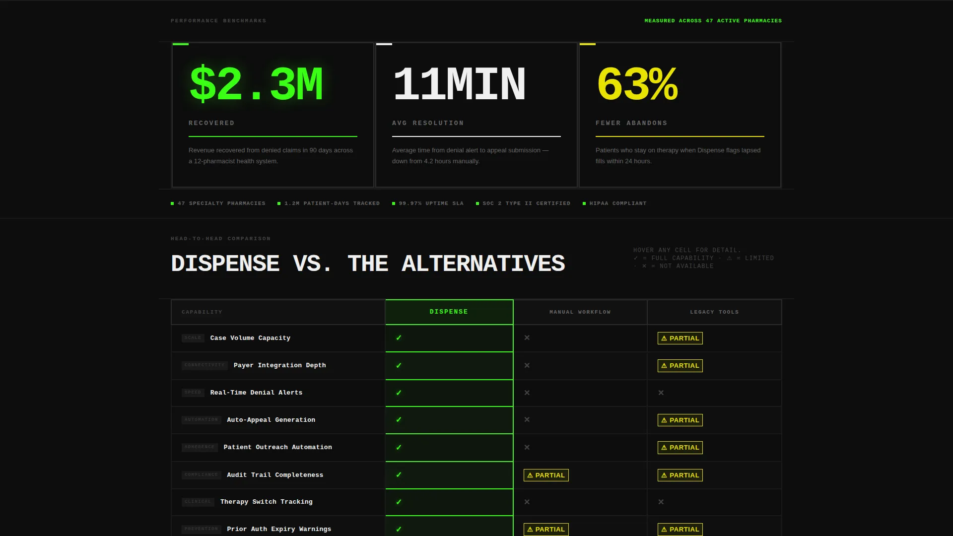
- A mid-page twelve-row comparison table pitting the platform against manual workflows and competing tools
- A gated lead-generation calculator and a secondary "See the Demo" booking button
Feature list
This template includes six purpose-built sections and components drawn directly from the brief. Each one serves the single goal of turning a skeptical pharmacy professional into a booked demo or a submitted lead.
Feature Tab Switcher Header
Three oversized tabs labeled TRACK, INTERVENE, and RESOLVE sit on a void black slab. Each tab click snaps instantly to a different dashboard mockup. TRACK displays 1,247 open cases with payer mix and aging buckets. INTERVENE flags 38 patients with lapsed fills in acid green. RESOLVE shows a closed-case velocity chart climbing week over week. A single 94% PA approval rate stat anchors the header in 120-pixel type.
Stats-First Impact Sections
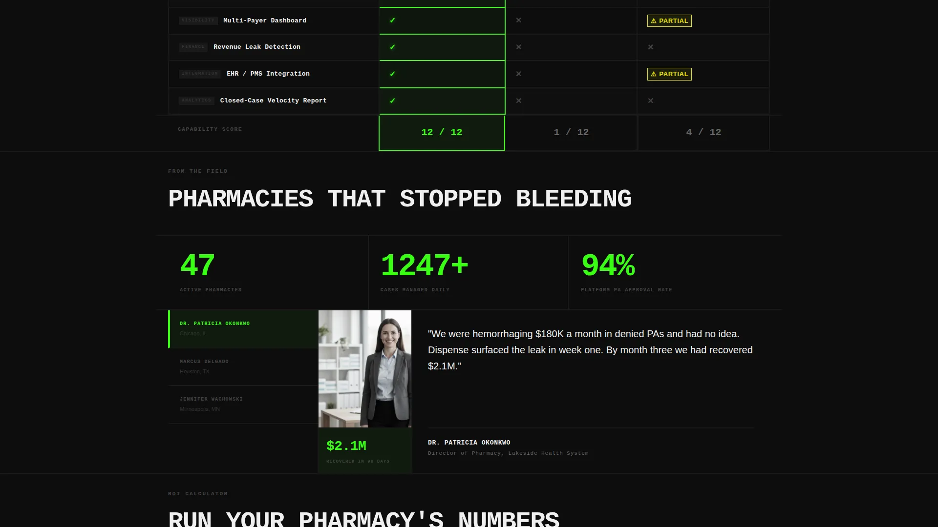
Every major section opens with a massive number before any explanation appears. Figures like "$2.3M recovered," "11-minute average resolution," and "63% fewer abandons" hit the reader before context arrives. This structure forces the visitor to confront the gap between their current workflow and what the platform delivers.
Twelve-Row Comparison Table
The comparison table drops mid-page and benchmarks the platform across twelve dimensions. Rows cover case volume capacity, payer integration depth, real-time denial alerts, auto-appeal generation, patient outreach automation, and audit trail completeness. Phosphor green checkmarks and hazard yellow caution icons make the gaps between columns impossible to miss.
Gated Lead Calculator
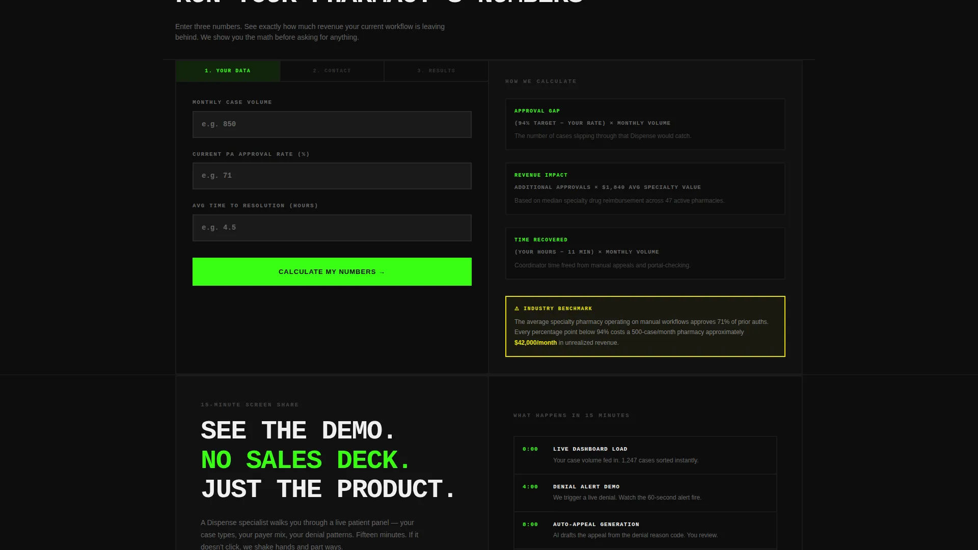
The "Run Your Pharmacy's Numbers" calculator lets visitors enter their monthly case volume, current approval rate, and average time-to-resolution. It returns a projected improvement estimate. The result is gated behind a short form requesting name, pharmacy name, email, and phone. The math does the persuading before the form asks for anything.
Secondary Demo Booking Path
A bottom-of-page "See the Demo" button opens a fifteen-minute screen-share booking flow. This gives visitors who are not ready to submit their information a lower-friction next step, keeping them engaged rather than bouncing.
Bold Brutalist Visual System
Every design choice reinforces urgency and clarity. No rounded corners. No gradients. Two-pixel solid borders throughout. Font weight is 800 across all display text. The layout feels like a command-line interface built for clinical operations, not a polished marketing brochure.
Page sections overview
| Section | Purpose |
|---|---|
| Tab Switcher Header | Introduce dashboard views and anchor the 94% PA stat |
| Headline Stat Block | Open scroll with "$2.3M recovered" impact number |
| Resolution Speed Stat | Surface "11-minute average resolution" before explanation |
| Abandonment Stat Block | Display "63% fewer abandons" as a standalone visual punch |
| Comparison Table | Benchmark platform versus manual workflows and competing tools |
| Calculator Form Gate | Capture leads through a personalized improvement estimate |
| Demo Booking Footer | Offer a secondary, low-friction path to a screen share |
Design & branding system
The visual identity is a Bold Brutalist interpretation of an Acid Digital color system. It is deliberately stripped of every decorative impulse and built to feel like a mainframe running in a hospital basement at 2 AM.
- Void black (#0D0D0D) crushes backgrounds flat; terminal phosphor green (#39FF14) pulses on active data points and calls to action; hazard yellow (#E8E200) marks warnings, denials, and expiring authorizations; clinical white (#F0F0F0) breathes inside dense comparison table rows
- No rounded corners, no gradients, no softness anywhere in the layout; every border is 2-pixel solid and every display font weight is 800
- Tab transitions are instant cuts with no easing, reinforcing the mechanical, brutalist feel throughout
Mobile & speed optimization
The template is structured for clarity on smaller screens without sacrificing the density that makes the comparison table useful on desktop. The brutalist grid adapts to narrower viewports while keeping data readable.
- Oversized stat typography scales down cleanly so impact numbers remain legible on mobile screens
- The comparison table is built to scroll horizontally on smaller devices, preserving all twelve rows without truncation
- The calculator form collapses to a single-column input stack on mobile, keeping the lead gate frictionless
How this template helps you convert
This landing page converts by proving its case before it makes a request. Every structural decision builds toward a visitor who already believes the math by the time they reach a form field.
- The tab switcher and stat blocks establish credibility instantly, giving pharmacy decision-makers real numbers to anchor against their own workflow costs before they read a single feature description.
- The comparison table makes the cost of staying on manual or competing tools visible in a single scroll, removing the need for visitors to imagine the gap themselves.
- The gated calculator delivers a personalized projection that makes submitting contact information feel like a transaction the visitor wins, not a form they are forced through.
Other information about this template
This template is built in the Pharmacy Software category under the broader Technology niche. It targets the Pharmacy Case Management intersection and is designed specifically for the Lead Generation direction. A few additional details worth noting before you build.
- The template style is a Comparison Table layout, one of the highest-trust formats for software purchasing decisions in clinical and enterprise contexts
- The creative direction follows a Stats-First Impact model, meaning quantitative proof arrives before feature descriptions throughout the entire page
- The header concept is a Feature Tab Switcher, a component that simulates a live product experience without requiring a full product demo to be embedded
- The Acid Digital color system is a distinct visual language; teams should carry it consistently into any downstream assets such as follow-up emails or demo decks to maintain brand coherence
Theme
Bold Brutalist
Creative direction
Stats-First Impact
Color system
Acid Digital
Style
Comparison Table
Direction
Lead Generation
Page Sections
Feature Tab Switcher with Live Dashboard States
Stats-first Impact Architecture
Twelve-row Brutalist Comparison Table
Gated Lead Calculator
Secondary Demo Booking Path
Bold Brutalist Visual System
Related questions
Who is this template designed for?
What does the comparison table include?
How does the lead capture work?
What stats are pre-loaded into the template?
Can the color system be adapted to a different brand palette?



