Pharmacy Delivery Landing Page Template
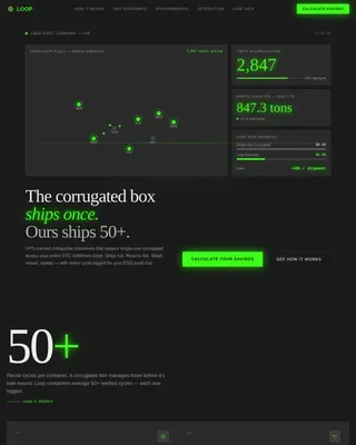
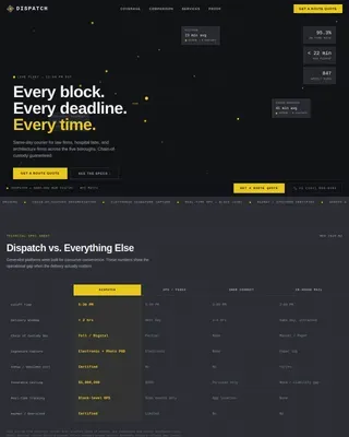
Dispense is a single-page pharmacy delivery landing page template built around a Stats-First Impact layout. It pairs a live-counter metrics header with zigzag alternating sections that each lead with an oversized performance figure. The template is designed for pharmacy delivery services targeting homebound patients, caregivers, and chronic-illness managers who need medication on time, every time.
by Rocket studio
Quick summary
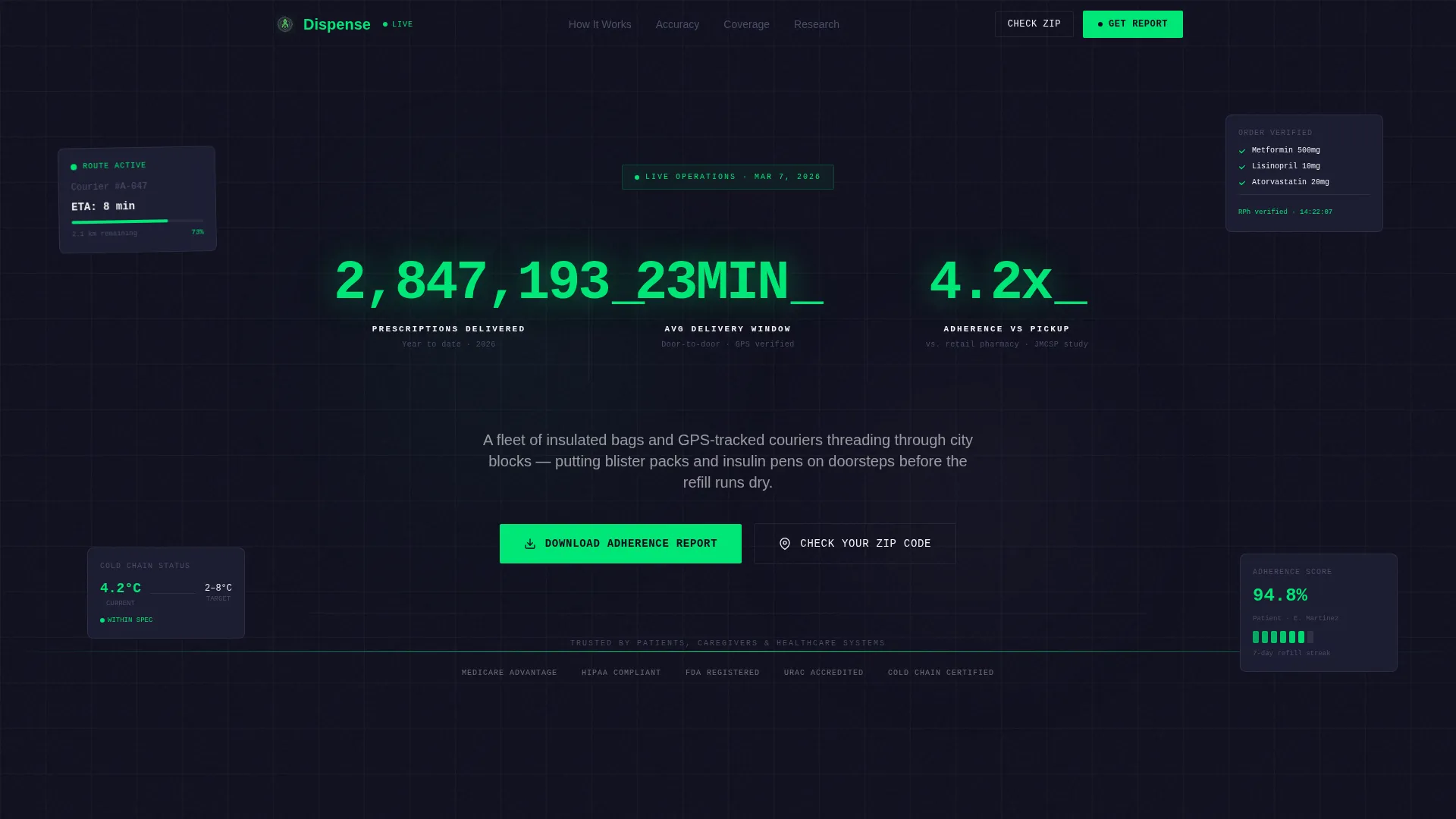
Dispense is a precision-engineered pharmacy delivery landing page template. It opens with three real-time counters tracking prescriptions delivered, average delivery time, and adherence improvement. Zigzag sections then build an evidence case section by section, pairing hard metrics with operational context. Two conversion paths capture leads: a gated adherence report download and a zip code coverage checker.
Who this template is for
This template is built for pharmacy delivery services that want to lead with data, not marketing language. It suits operations where on-time delivery and medication accuracy are measurable competitive advantages.
- Pharmacy delivery startups and regional services targeting homebound or chronically ill patients
- Healthcare marketers promoting delivery-based adherence programs to patients, caregivers, and providers
- Operators who need a credibility-first page to convert skeptical or research-minded visitors
What problem this template solves
Many pharmacy delivery services struggle to communicate reliability without sounding like generic healthcare marketing. Visitors, especially seniors, caregivers, and chronic-illness patients, need proof before they commit to switching from a familiar pickup routine.
- Generic landing pages fail to convey operational precision, leaving skeptical visitors unconvinced
- Pharmacy services lose conversions when there is no clear, low-friction path for visitors who are not ready to sign up immediately
- High-intent healthcare visitors often abandon pages that lead with imagery rather than evidence
What you get with this template
You get a fully structured, single-page layout that places performance metrics at the center of the visitor experience. The design guides scroll from speed data to accuracy data to health-outcome data, compounding the evidence before asking for anything in return.
- A live-counter stats header with three upward-ticking metrics rendered in monospaced type
- Zigzag alternating content sections, each anchored by an oversized stat and matched with an operational explanation
- Two distinct conversion paths: a gated PDF download form and a single-field zip code coverage checker
Feature list
This section highlights the standout structural and design capabilities built into the Dispense template.
Live Metrics Header Wall
Three full-width counters tick upward in real time against a matte-black field. Each number is set in a monospaced engineering typeface using diagnostic green on black, referencing prescriptions delivered, average delivery minutes, and adherence improvement percentage.
Zigzag Alternating Section Layout
Each content section alternates left-right placement of a large stat and its operational story. This pattern builds a scrollable evidence case that escalates from speed metrics through accuracy figures to health-outcome data.
Dual Conversion Path Design
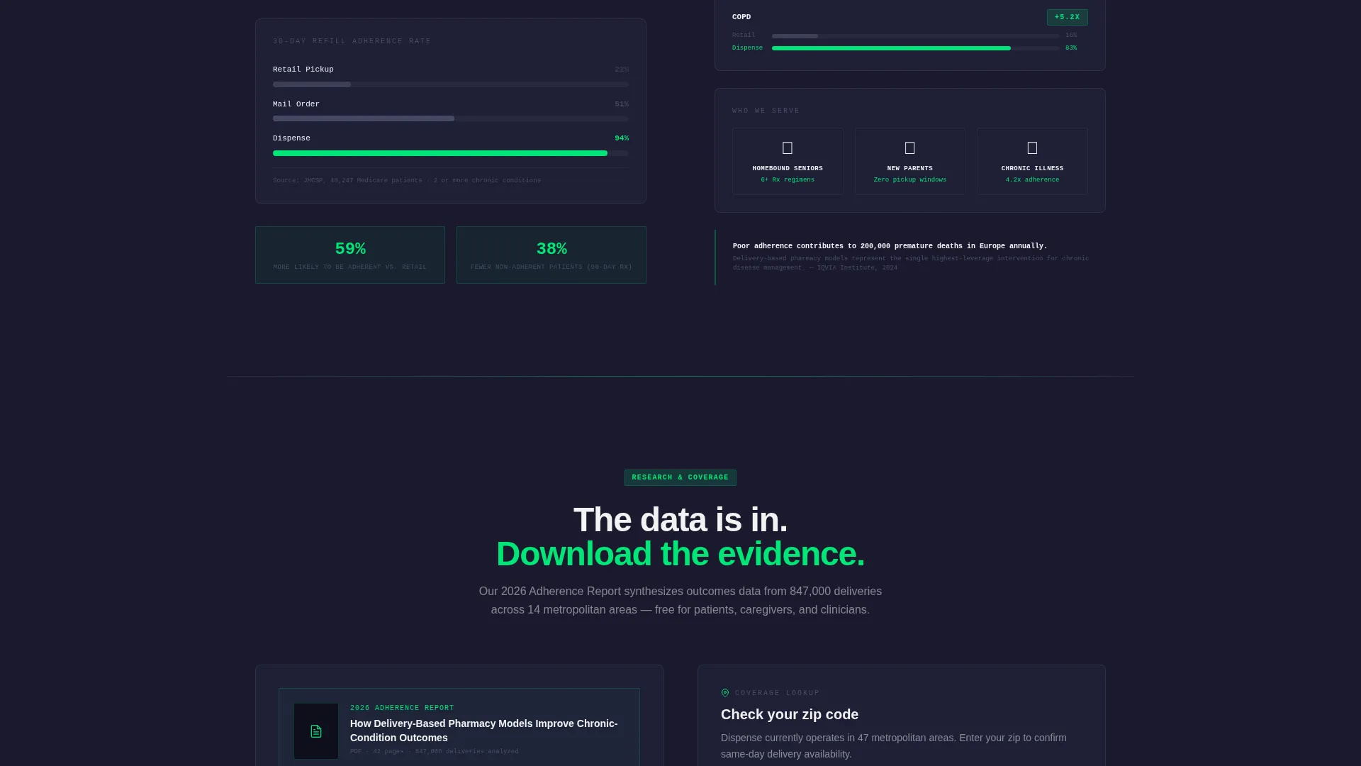
The primary call to action prompts visitors to download a gated adherence report via a three-field form. A secondary single-field zip code lookup confirms coverage and captures location intent without asking for a full commitment.
Stats-First Visual Hierarchy
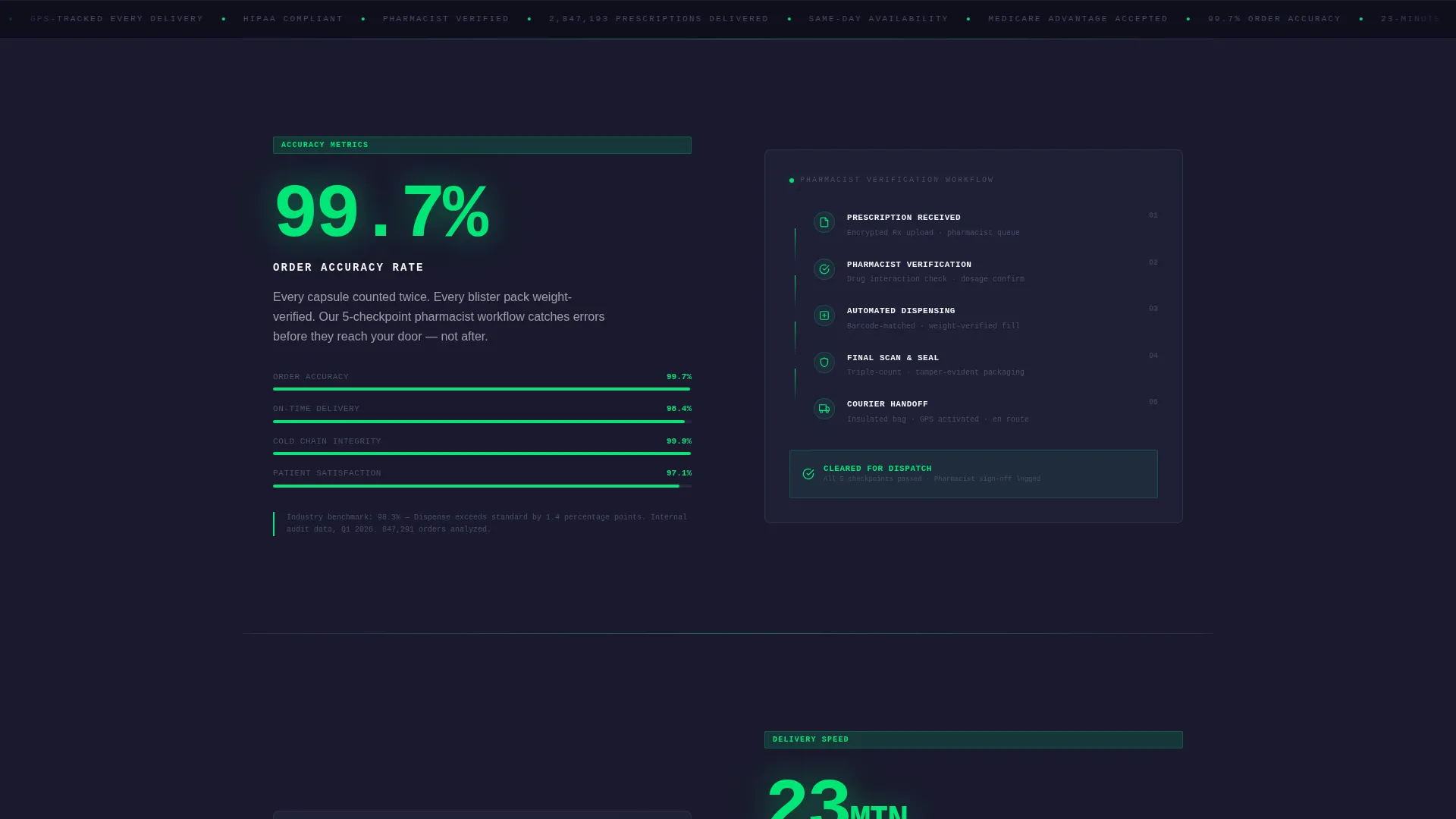
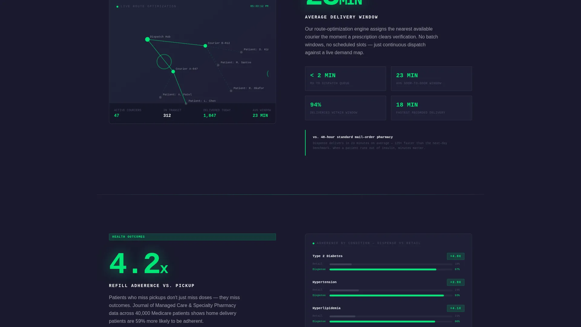
Oversized metrics such as "99.7% Order Accuracy" and "23-Minute Average Window" serve as the visual anchors for each section. Paired operational diagrams, workflow breakdowns, and route maps provide the supporting narrative on the opposite side.
Engineering Blueprint Color System
The palette uses structural black, titanium mid-gray, clinical white, and diagnostic green. Color is reserved for status and action, so green appears only on live counters, progress bars, and call-to-action pulse elements.
Gated Report Lead Capture Form
The adherence report form collects email, visitor role (patient, caregiver, or healthcare provider), and condition interest area in three sequential fields. This progressive structure keeps the form approachable while gathering meaningful segmentation data.
Page sections overview
| Section | Purpose |
|---|---|
| Stats Header Wall | Anchors page with three live upward-ticking performance counters |
| Speed Metrics Section | Leads with delivery time stat paired with route-optimization map |
| Accuracy Metrics Section | Leads with order accuracy stat paired with pharmacist verification workflow |
| Health Outcomes Section | Leads with adherence improvement stat paired with chronic-condition context |
| Adherence Report call to action | Presents gated PDF download with three-field progressive lead capture form |
| Zip Code Checker | Single-field coverage lookup capturing location data as secondary conversion |
Design & branding system
The template follows an Engineering Blueprint visual theme. Every design decision is functional: color communicates status, type communicates precision, and layout communicates system confidence.
- Carbon Fiber color system: structural black (#1A1A2E) as the base, titanium mid-gray (#4A4E69) for supporting text, clinical white (#F2F2F2) for content surfaces, and diagnostic green (#00E676) strictly for live counters, progress indicators, and call-to-action pulses
- Monospaced engineering typeface used for all counter numerals, reinforcing the mechanical odometer aesthetic across the metrics header and each zigzag stat anchor
- Zero-waste pixel philosophy: no hero images or decorative illustrations; every visual element, from cold-chain diagrams to route maps, earns its place by communicating operational information
Mobile & speed optimization
The dark technical aesthetic and data-dense layout are structured to remain clear and fast at every screen size. The single-page format avoids unnecessary page loads.
- Zigzag column pairs reflow to stacked vertical blocks on smaller screens, keeping stat-to-story pairing intact without horizontal scrolling
- Monospaced counter elements and the dark base palette are lightweight by design, relying on typography and color rather than heavy image assets
- The two conversion forms, the adherence report download and the zip code checker, collapse cleanly into single-column layouts on mobile viewports
How this template helps you convert
The Dispense template is built around a trust-first conversion philosophy. Visitors arrive with skepticism and leave with evidence, which makes handing over an email feel like a fair exchange.
- The live metrics header stops the scroll immediately with real numbers, establishing operational credibility before a visitor reads a single line of body copy.
- The escalating zigzag structure compounds the evidence across three data categories: speed, accuracy, and health outcomes, so by the time a visitor reaches the call to action, the case is already made.
- The dual conversion paths serve different intent levels: high-intent visitors download the adherence report, while exploratory visitors check zip code coverage, and both actions capture usable lead data.
Other information about this template
Dispense sits at the intersection of last-mile delivery operations and pharmacy care, a niche where trust and precision carry more weight than visual flair. The template is purpose-built for this context.
- Template style is Zigzag/Alternating, suited to pages that need to present multiple independent proof points without losing visual rhythm
- The creative direction is Stats-First Impact, a structure particularly effective for logistics and supply chain services where quantified performance beats narrative marketing
- The header concept is a Stats/Metrics wall, a format that works well for pharmacy delivery services because it replaces claims with evidence at first glance
- The landing page direction is Content/Resource conversion, meaning the primary goal is lead capture through a high-value downloadable asset rather than a direct service sign-up
- This template is listed under the Logistics and Supply Chain category, with Last-Mile and Delivery as its subcategory, and Pharmacy Delivery as its specific niche
Theme
Engineering Blueprint
Creative direction
Stats-First Impact
Color system
Carbon Fiber
Style
Zigzag/Alternating
Direction
Content/Resource
Page Sections
Live Metrics Header Wall
Zigzag Alternating Layout
Dual Conversion Path Design
Stats-first Visual Hierarchy
Engineering Blueprint Color System
Gated Report Lead Capture Form
Related questions
Who is the primary audience for this landing page template?
Can I update the metrics in the header to reflect my own service data?
What is the purpose of the two conversion paths?
Does the template include the adherence report PDF?
Is this template suitable for a multi-location pharmacy delivery network?