Pharmacy Software Professional Website Template
Dispense is a hub-and-spoke pharmacy landing page template built for B2B quoting platforms in the procurement space. It uses a Stats-First design direction, a Tech Glass visual identity, and a Monochrome Steel color system to present live metrics and conversion-focused sections. The template pushes every visitor toward a sandbox quoting environment with zero form friction on the landing page itself.
by Rocket studio
Quick summary
Dispense is a precision pharmacy quoting landing page template designed for B2B software platforms serving independent pharmacy owners, hospital pharmacy directors, and chain pharmacy managers. The landing page design leads with live animated counters, escalates proof through metric-first spoke sections, and closes every section with a direct call to action that routes visitors into a live demo environment.
Who this template is for
This landing page template is built for pharmacy procurement and quoting software platforms that serve professional buyers in the healthcare sector. It is specifically engineered for teams that need to communicate speed, savings, and compliance to a data-driven target audience.
- Independent pharmacy owners who need fast, accurate wholesale proposals
- Hospital pharmacy directors managing formulary bids and budget cycles
- Chain pharmacy regional managers standardizing pricing across multiple locations
What problem this template solves
Pharmacy procurement teams lose hours searching through wholesaler spreadsheets and piecing together manual bids. A standard website design cannot communicate the urgency, precision, or compliance stakes that healthcare procurement buyers demand. This landing page template solves that gap directly.
- It replaces vague marketing copy with hard numbers that do the persuading
- It removes unnecessary navigation so visitors focus on a single conversion action
- It bridges the gap between complex specialty drug pricing and the buyer's need for clarity and trust
What you get with this template
This template delivers a fully structured, anchor-nav landing page with five spoke sections and a footer. Every design and layout decision is optimized to push pharmacy procurement visitors toward a live quoting sandbox with minimal friction.
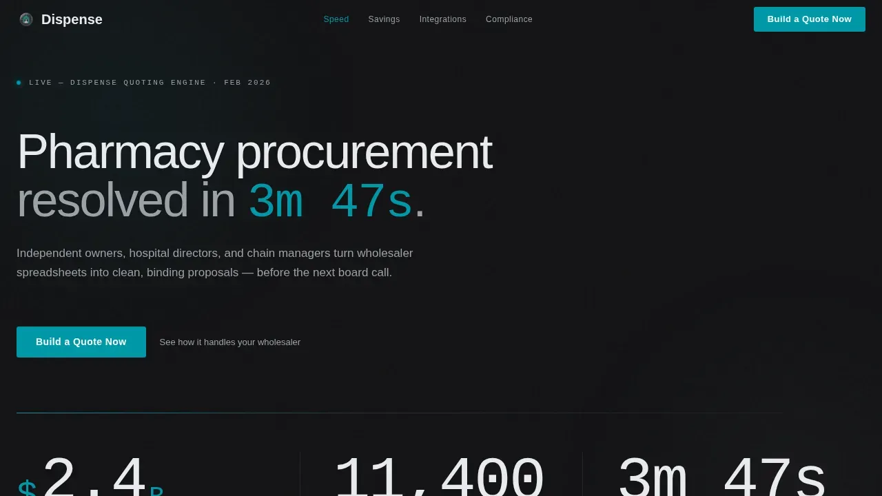
- A Stats Wall header with three animated monospaced counters displaying live proof metrics
- Five conversion-focused spoke sections, each opening with an oversized metric before any explanation
- A pharmaceutical teal call-to-action button labeled "Build a Quote Now" that appears in the anchor nav and at the close of every section
Feature list
This landing page template packages several purposeful design and content features drawn directly from the source brief. Each feature serves the core goal: help pharmacy procurement buyers understand the value and take action immediately.
Stats Wall Hero Header
The header displays three large animated counters set in a monospaced typeface against a deep charcoal background. The counters show proposals generated, active pharmacy users, and average close time. No hero image or stock photography is used. The data itself is the visual.
Anchor Nav Hub and Spoke Structure
A persistent anchor navigation bar links directly to each spoke section below. The primary "Build a Quote Now" call-to-action button sits inside this nav bar in pharmaceutical teal, making the conversion action visible at every scroll position across the landing page.
Metric-First Spoke Sections
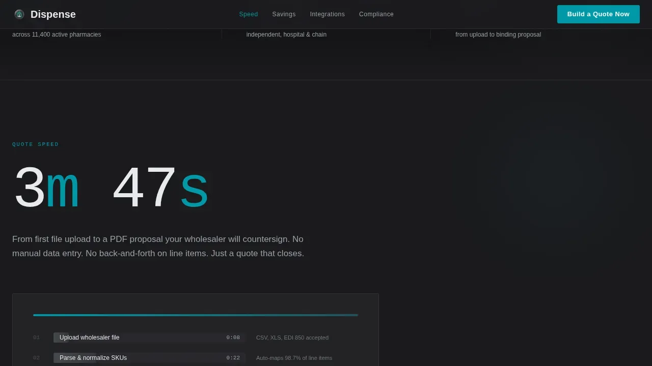
Each of the five spoke sections opens with a single oversized metric before any body copy appears. This Stats-First design direction builds an evidence-based argument as the visitor scrolls, escalating from quote speed to portfolio savings to compliance audit readiness to distributor integration depth.
Compliance and ICP Audience Section
The compliance spoke section displays audit-trail coverage as its lead metric and presents three audience-specific cards for independent owners, hospital directors, and chain managers. Compliance indicators are set to display prominently, reassuring healthcare buyers about data protection and process integrity.
Click-Through Optimized call to action System
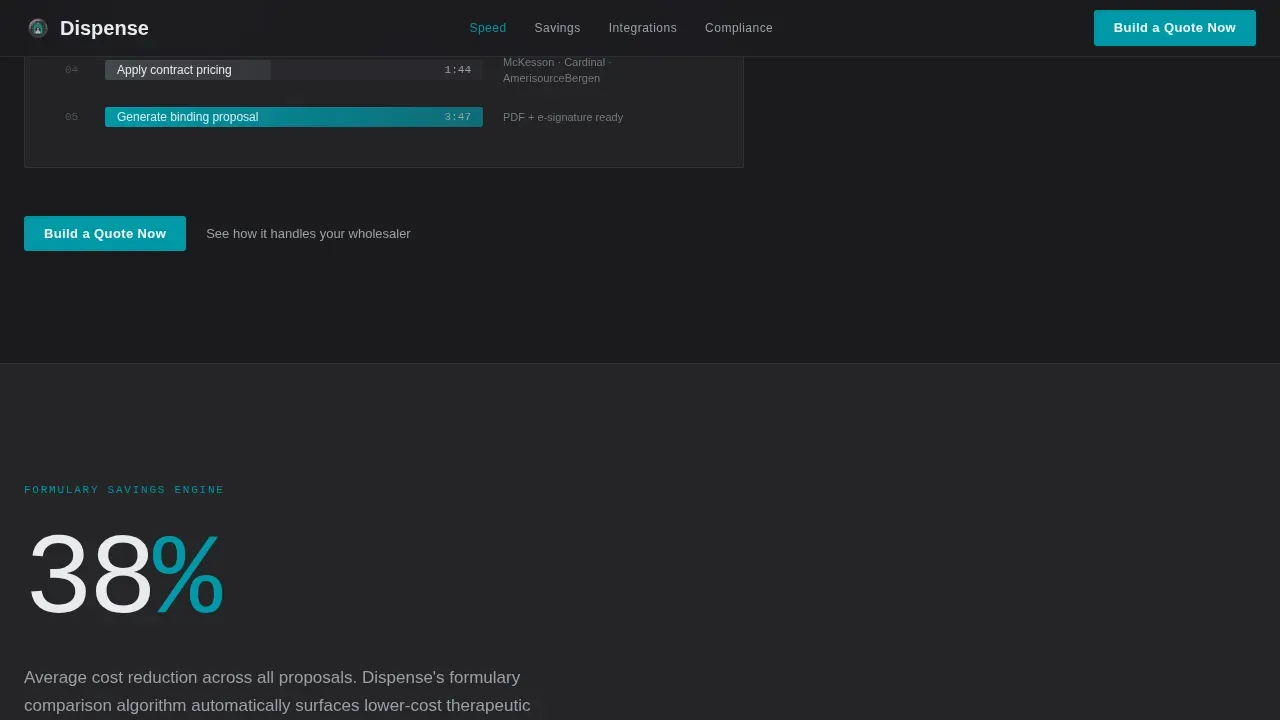
Every spoke section closes with the primary "Build a Quote Now" button and a secondary text link reading "See how it handles your wholesaler." No form fields appear on the landing page itself. The click routes visitors directly into a sandbox quoting interface pre-loaded with sample formulary data.
Tech Glass Visual Design System
The template uses glassmorphism panels, SVG grid line animations, and digit-shimmer effects throughout. The Monochrome Steel color palette combines deep charcoal, surgical steel, frosted panel white, and pharmaceutical teal to create a cleanroom aesthetic that keeps the landing page design focused on numbers and actions.
Page sections overview
| Section | Purpose |
|---|---|
| Stats Wall Header | Opens with three live animated counters as the primary proof mechanism |
| Quote Speed Spoke | Leads with "3m 47s" metric and a step visualization of the quote build process |
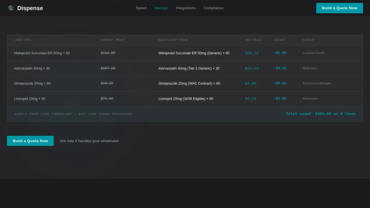
| Savings Engine Spoke | Leads with "38% average cost reduction" and formulary comparison context |
| Integrations Spoke | Leads with "3 distributors, zero manual entry" and distributor data flow visual |
| Compliance and ICP Spoke | Leads with "100% audit-trail coverage" and three buyer-type audience cards |
| Footer Section | Uses a horizontal flow pattern to close the landing page with supporting links |
Design & branding system
The landing page design follows a Tech Glass theme with a Monochrome Steel color system. The palette is surgical and restrained, chosen to let metrics carry the visual weight. Typography is split between JetBrains Mono for all data and numbers and Manrope for body copy.
- Deep charcoal (#1B1B1E) backgrounds, frosted panel white (#E8EAED) surfaces, and surgical steel (#71797E) secondary text
- Pharmaceutical teal (#0097A7) reserved exclusively for interactive elements and live data points
- Glassmorphism panels, SVG traversing grid lines, and digit-shimmer animations throughout the design
Mobile & speed optimization
This template is desktop-first, reflecting the real-world preferences of hospital pharmacy directors and regional managers who work primarily on desktop systems. The landing page is also built to be mobile responsive to serve pharmacy online searches on phones and tablets, since search engines rank mobile-optimized websites higher than non-optimized ones.
- Static sections use server components to reduce client-side rendering load
- Counter animations are isolated in a dedicated client component for targeted performance
- Responsive layout ensures the landing page design works correctly across screen sizes
How this template helps you convert
This pharmacy landing page is structured to move procurement buyers from curiosity to action in the fewest possible steps. Minimal navigation keeps visitors focused on the quoting goal. Real proof metrics build trust before any explanation is needed. Every design choice supports a single conversion outcome.
- The Stats Wall lands immediate credibility with $2.4B in proposals and 11,400 active pharmacy users before a single marketing claim appears
- Each spoke section escalates proof, so visitors accumulate evidence as they scroll and arrive at the call to action already convinced
- The click-through call to action system sends visitors directly into a sandbox environment, removing form friction entirely and shortening time to first value
Other information about this template
This template is well suited for pharmacy software businesses looking to stand out in a competitive market. Listing all pharmacy services your platform supports on the landing page helps potential buyers understand the full scope and helps search engines index the page accurately. Custom content is favored by search engines and can improve how well the page performs for relevant keywords. Using google adwords campaigns to drive traffic to this landing page can maximize return on ad spend, since the landing page design is already optimized to convert paid visitors. Explore how effective communication across each section keeps both patients and prescribers engaged. Real patient testimonials and authentic social proof, such as star ratings or compliance badges, help build trust and establish authority in the healthcare space.
- This template can support email marketing campaigns by serving as a dedicated landing destination from pharmacy-specific outreach
- It is specifically suited for teams creating content that must reach both direct buyers and referring prescribers
- The design helps pharmacies achieve a trustworthy first impression, since a patient or buyer often decides to stay or leave a website in under one second
- Displaying HIPAA compliance and URAC accreditation badges near trust-sensitive content is consistent with how this template is designed to work
- This template works as the foundation for a pharmacy web design that avoids the cookie-cutter approach common across most pharmacy websites
Theme
Tech Glass
Creative direction
Stats-First Impact
Color system
Monochrome Steel
Style
Hub & Spoke (Anchor Nav)
Direction
Click-Through
Page Sections
Stats Wall Hero Header
Anchor Nav Hub and Spoke Layout
Metric-first Spoke Sections
Click-through Call to Action System
Compliance and ICP Audience Cards
Tech Glass Visual Design System
Related questions
Does this template include any form fields on the landing page?
Can this template be customized to match my pharmacy platform's branding?
Is this landing page design suitable for hospital pharmacy buyers as well as independent owners?
How does the Stats-First design direction support trust-building on the landing page?
Can this template serve as a destination for paid search campaigns?



