District Portal - Powerful Education Landing Page Template
Districtportal is a dark-themed, card-grid education landing page built for district administrators, IT coordinators, and curriculum directors. It opens with glowing metric cards and an interactive savings calculator, then walks visitors through roster sync, usage heatmaps, and renewal forecasting, all styled like a real dashboard. One login. Every building. Every number in place.
by Rocket studio
Quick summary
Districtportal is a single-page education customer portal template built on a Dashboard Pro theme with a Void and Violet color system. It leads with live-style metric cards, an interactive savings calculator, and modular feature cards that feel like working dashboard widgets. The design is built for district operations teams who need clarity at a glance.
Who this template is for
This template is designed for education technology teams and school district operations staff who manage software at scale. It speaks directly to the people responsible for licenses, rosters, and budgets across dozens of buildings.
- District IT coordinators tracking licenses and renewal dates across multiple schools
- Instructional coaches and curriculum directors who need proof of teacher engagement and platform usage
- Chief financial officers and operations leads reviewing cost-per-active-seat before budget season
What problem this template solves
Managing a district-wide software platform through scattered spreadsheets and disconnected portals creates real operational drag. Renewal dates get missed, usage data stays buried, and budget conversations happen without the right numbers in the room.
- Administrators lose hours chasing renewal dates across dozens of buildings with no central view
- Instructional leaders cannot easily show whether teachers are actively using the platform
- Finance teams lack a single dashboard that ties software cost to actual seat usage
What you get with this template
You get a fully structured, dark-themed landing page built around the needs of a district education portal. Every section is designed to demonstrate the product before asking for a commitment.
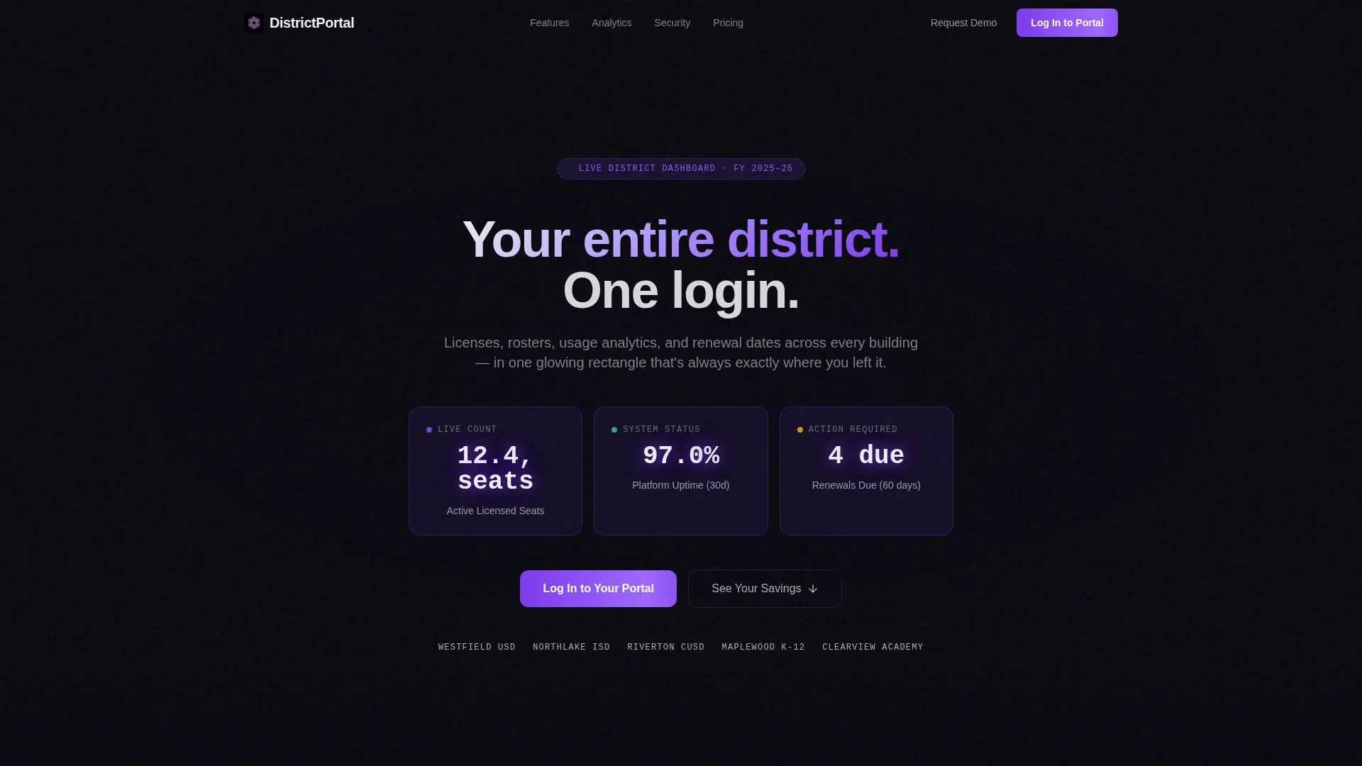
- A dark full-bleed header with three glowing metric cards and a single bold headline
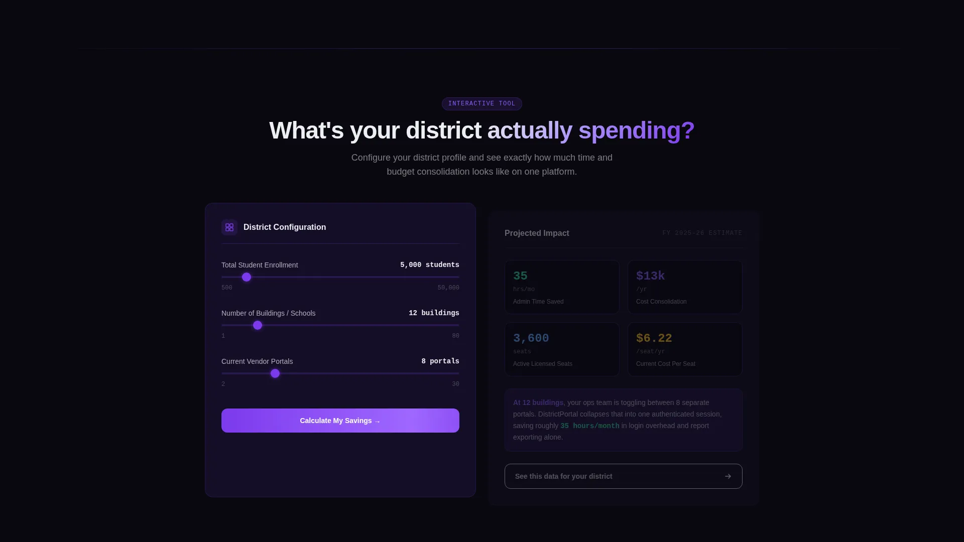
- An embedded interactive savings calculator placed as the second section, before any marketing copy
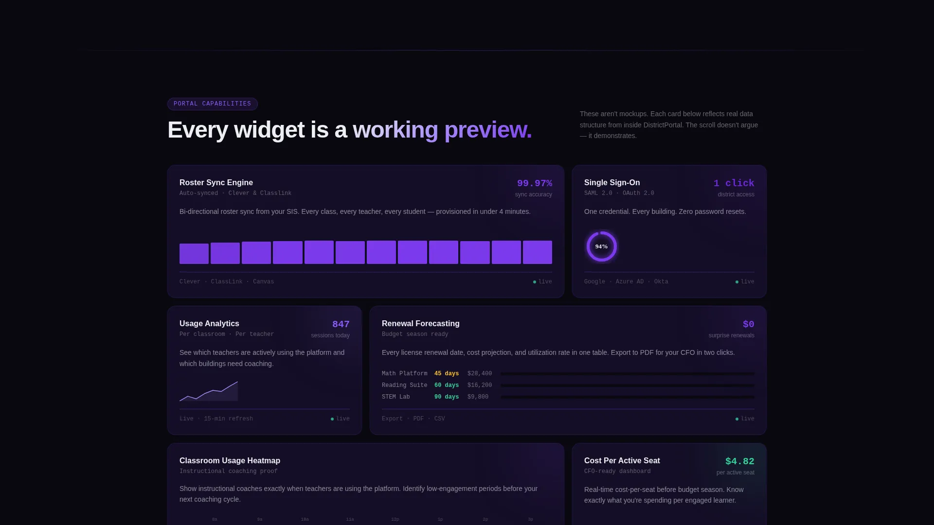
- Modular card-grid sections previewing portal capabilities including roster sync, usage heatmaps, renewal forecasting, and single sign-on
Feature list
This template includes purpose-built sections and interactive components drawn directly from the brief. Each one is designed to move an operations-minded visitor from curiosity to action.
Glowing Metric Header Cards
Three floating data cards display figures such as active seat counts, uptime percentage, and upcoming renewals. They render with real typography and faint animated count-ups against a void-black background with a soft radial violet glow. The data is the hero, no stock photography, no illustrations.
Interactive Savings Calculator
Visitors select their district size, number of buildings, and current number of vendor portals. The tool instantly renders a card showing estimated hours saved per month and projected cost consolidation. A tertiary call-to-action button inside the output card reads "See This Data for Your District."
Modular Dashboard Widget Cards
Each card-grid section presents a portal capability as a mock dashboard widget, complete with mini-charts and sample data. Sections cover roster sync, usage heatmaps, renewal forecasting, and single sign-on. The scroll demonstrates rather than argues.
Sticky Header with Primary Call to Action
The sticky navigation header holds the primary call-to-action button "Log In to Your Portal" at all times. Existing customers can reach the authentication screen without scrolling back up. The button remains visible throughout the entire page experience.
Dual Call-to-Action Architecture
A secondary call-to-action, "Request a Demo Login," appears after the calculator and again beneath the feature cards. It captures only a work email and district name. This keeps the conversion path simple for prospective customers who are not yet active users.
Void and Violet Design System
The full color palette is built around absolute void black, deep interstellar purple, and electric violet for active states and data highlights. Accent glows use violet at 40% opacity as box-shadows and gradient bleeds behind key metrics. The result feels like a mission control room after hours.
Page sections overview
| Section | Purpose |
|---|---|
| Dark Metric Header | Presents three glowing data cards and the primary headline to anchor visitor attention immediately |
| Savings Calculator Tool | Lets visitors input district variables and receive an instant estimate of hours saved and cost consolidation |
| Calculator Output Card | Displays personalized results with a tertiary call-to-action prompting deeper discovery |
| Roster Sync Card | Previews the roster management capability as a live-style dashboard widget with sample data |
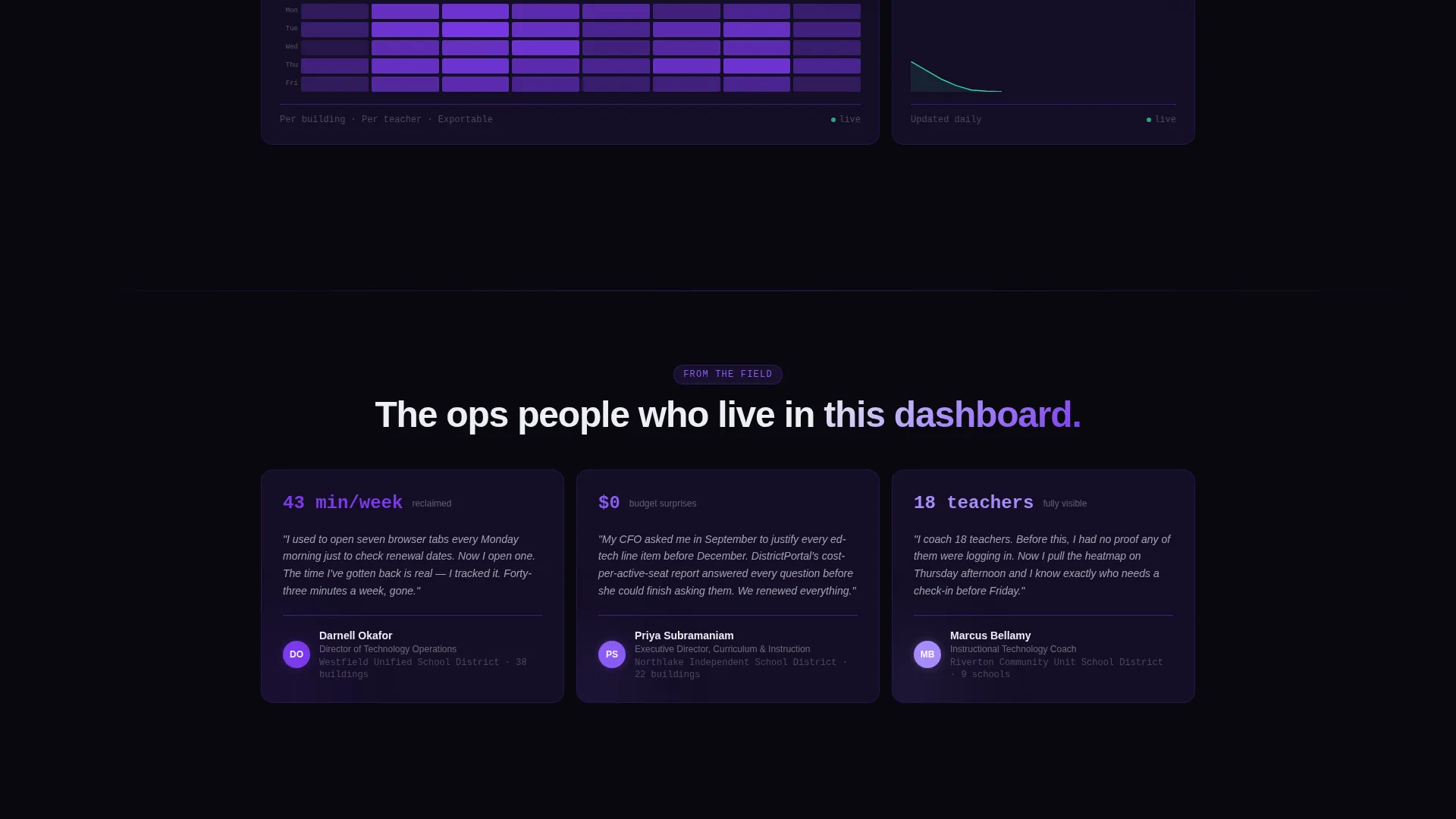
| Usage Heatmap Card | Shows teacher and classroom engagement data in a visual, scannable widget format |
| Renewal Forecasting Card | Displays upcoming renewal timelines across buildings in a compact, data-forward card |
| Single Sign-On Card | Illustrates the unified login capability with a minimal, icon-supported widget layout |
| Demo Login call to action | Captures work email and district name for prospects requesting a demo access login |
| Bottom Portal call to action | Repeats the primary login call-to-action to close the page with a direct path to authentication |
Design & branding system
The visual identity follows a Dashboard Pro theme designed to feel like a mission control environment at night. Every element floats in darkness and is illuminated only by its own data.
- Color palette: absolute void black (#09090F) as the base, deep interstellar purple (#1A1131) for card backgrounds, electric violet (#7C3AED) for active states and data highlights, and cool phosphor white (#EDEEF2) for text and card surfaces
- Accent treatment: violet at 40% opacity used as box-shadows and gradient bleeds behind key metric areas to create depth without distraction
- Typography and layout: real data typography with precise spacing, no stock imagery, no illustrations, the numbers and cards carry the visual weight
Mobile & speed optimization
The card-grid layout is built to adapt across screen sizes without losing the dashboard feel. Modular cards reflow cleanly so the data remains readable on smaller displays.
- Modular card structure allows individual sections to stack vertically on mobile without breaking the visual hierarchy
- The sticky header with the primary call-to-action remains accessible regardless of scroll position or screen size
- Interactive calculator inputs and output cards are designed to remain functional and legible across device widths
How this template helps you convert
This template earns the click by letting visitors experience the product before committing. The conversion architecture is layered intentionally across the page.
- The interactive savings calculator appears before any marketing copy, giving prospects a personalized reason to engage early and stay longer on the page
- Three distinct calls to action serve three different visitor states: an existing customer ready to log in, a prospect wanting a guided demo, and a curious visitor exploring their district-specific data
- Each modular capability card shows sample data and mini-charts, building confidence that the platform delivers on its promise before any form is filled
Other information about this template
This template is categorized under Technology, specifically within the Education Software and SaaS subcategory, targeting the education customer portal niche. It is built as a single-page card-grid layout following the Calculator and Tool First creative direction.
- The header concept uses a dark full-bleed background with a centered radial violet glow, described as a screen warming up in a quiet office before the workday begins
- The landing page direction is optimized for click-through, prioritizing the authenticated login path for returning users while capturing new prospects through a lightweight demo request form
- This template suits teams building or relaunching a district-facing portal product page where the audience is operations-minded and responds to data over imagery
Theme
Dashboard Pro
Creative direction
Calculator/Tool First
Color system
Void & Violet
Style
Card Grid (Modular)
Direction
Click-Through
Page Sections
Glowing Metric Header Cards
Interactive Savings Calculator
Modular Dashboard Widget Cards
Sticky Header with Login Button
Dual Call-to-action Architecture
Void and Violet Design System
Related questions
Who is this landing page template built for?
What makes the header section different from a typical landing page?
Can I customize the savings calculator inputs and output card?
How many calls to action does this template include?
What color system does this template use?



