Shipyard Vertical SaaS Booking Website Template
Berth is a single-page comparison table landing page template built for shipyard booking software. It leads with animated performance metrics, moves into a twelve-row feature comparison, and closes with a two-step freemium sign-up flow. The design uses a carbon-dark color system with a high-voltage teal accent to give operations-focused buyers an immediate sense of precision and control.
by Rocket studio
Quick summary
Berth is a focused landing page template for a shipyard scheduling platform. It opens with a live-style dashboard preview, drives urgency through three bold performance stats, and converts through a detailed comparison table. The page is designed to help yard operators and port coordinators understand the value of the platform before they ever click a button.
Who this template is for
This template is built for the people who run working shipyards, not software generalists. It speaks directly to the decision-makers who feel the daily cost of scheduling chaos.
- Operations managers at mid-size repair yards handling multiple vessels at once
- Port authority coordinators managing berth allocation across tidal windows
- Yard owners who currently track bookings on whiteboards and lose revenue to unbilled idle days
What problem this template solves
Shipyard scheduling is unusually complex. Dry docks, wet berths, crane slots, and labor gangs all have to align, and when they do not, idle berth-days quietly drain revenue. Most yards still rely on spreadsheets, phone calls, or legacy port software that was never designed for this level of coordination.
- Visitors arrive with no quick way to see how the platform compares to what they already use
- The cost of the status quo is invisible until someone shows the math
- Generic software landing pages do not speak the language of a repair yard
What you get with this template
This template gives you a complete, conversion-ready landing page structured around a central comparison argument. Every section is ordered to build the case before asking for a commitment.
- A pixel-perfect dashboard header with six vessels, color-coded job statuses, a live clock, a tidal bar, and a crane utilization gauge
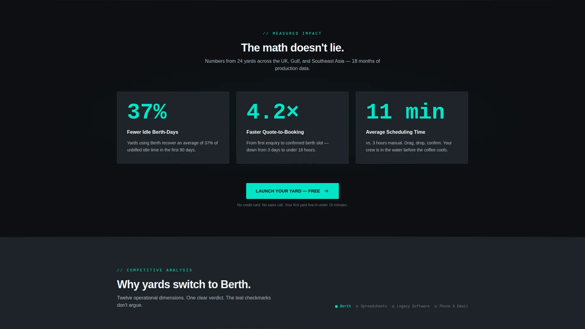
- Three animated stats cards showing idle-day reduction, quote-to-booking speed, and scheduling time saved
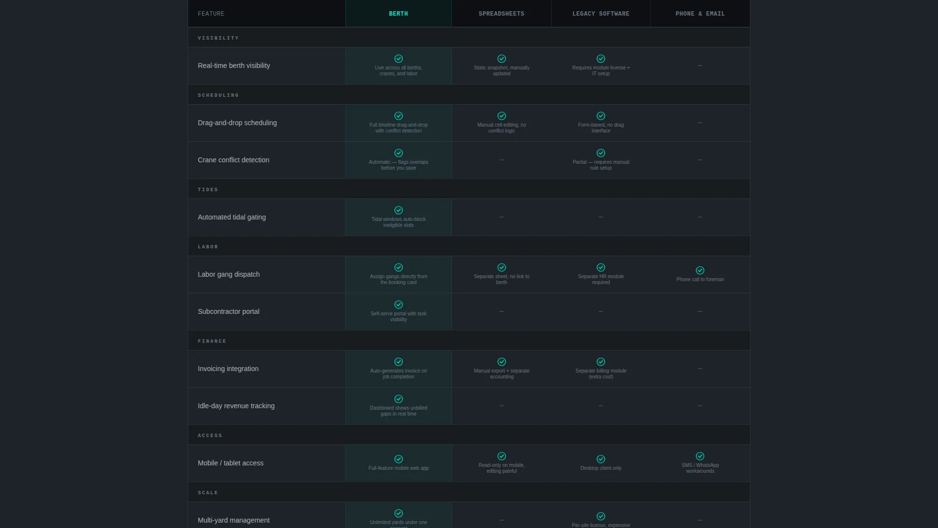
- A twelve-row comparison table pitting the platform against spreadsheets, legacy port software, and phone-and-email workflows
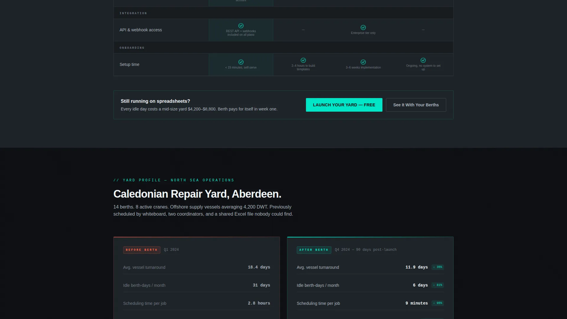
- A mini case study block with real tonnage and turnaround numbers
- A two-step freemium sign-up form and a secondary personalized demo path
Feature list
This template packages several carefully designed components that work together to move a skeptical yard operator from curiosity to commitment.
Angled Dashboard Hero with Parallax Drift
The header renders a booking timeline in action, showing six vessels stacked across berths and color-coded by job status. The camera angle floats slightly above the interface, and a subtle parallax drift makes the layout feel live rather than static.
Animated Stats Block
Three large metric cards animate into view on carbon-dark backgrounds as the visitor scrolls past the fold. The numbers, 37 percent fewer idle berth-days, 4.2 times faster quote-to-booking, and eleven minutes average scheduling time, are designed to let visitors calculate their own losses before reading further.
Twelve-Row Comparison Table
The core of the page is a structured feature comparison across twelve operational dimensions. Rows cover real-time berth visibility, crane conflict detection, automated tidal gating, subcontractor dispatch, invoicing integration, mobile access, and more. Teal checkmarks against gray dashes make the verdict immediately readable.
Mini Case Study Block
Below the comparison table, a single yard's before-and-after story is presented with real tonnage and turnaround figures. This section gives undecided visitors a concrete reference point before they reach the final call to action.
Two-Step Sign-Up Form
The primary conversion path opens a two-step form. Step one collects yard name, number of berths, and email. Step two is optional and skippable, asking for vessel capacity range and current scheduling method. The low-friction entry lowers the barrier for first contact.
Personalized Demo Path
A secondary call to action, labeled "See It With Your Berths," offers a demo seeded with the visitor's actual yard layout. This path captures buyers who want to validate fit before committing to a free trial.
Page sections overview
| Section | Purpose |
|---|---|
| Dashboard Hero | Show the scheduling interface in action with color-coded vessel statuses, a tidal bar, and crane gauge |
| Animated Stats Cards | Hit visitors with three performance metrics before they read a single feature description |
| Comparison Table | Compare the platform against spreadsheets, legacy software, and manual workflows across twelve dimensions |
| Mini Case Study | Provide a real before-and-after yard story with tonnage and turnaround numbers |
| Primary call to action Block | Prompt sign-up with the "Launch Your Yard" free trial form placed directly below the stats block |
| Pinned Table call to action | Repeat the primary call to action at the bottom of the comparison table to catch decision-ready visitors |
| Two-Step Form | Collect yard name, berth count, and email in step one; gather optional capacity and scheduling context in step two |
| Demo Request Path | Offer a personalized demo seeded with the visitor's own yard layout as a secondary conversion route |
Design & branding system
The visual identity follows a Carbon Fiber color system built around deep, industrial tones with a single vivid accent. The palette is designed to communicate precision and speed without relying on photography or illustration.
- Core colors: deep cockpit black (#0D0F12), woven graphite (#1E2328), and machined aluminum (#A8B2BD) for background layers and body text
- Accent: high-voltage teal (#00E5C7) reserved for live data points, toggle states, and all call-to-action surfaces
- No stock photography is used anywhere on the page; the product interface itself is the only visual hero
Mobile & speed optimization
The template is structured so that every section translates cleanly to smaller viewports without losing the impact of the comparison table or the stats block.
- The comparison table is designed to remain readable on narrow screens with horizontal scroll or condensed column treatment
- The parallax dashboard header degrades gracefully so the vessel timeline remains legible on mobile devices
- The two-step sign-up form is compact and thumb-friendly, keeping friction low for visitors who arrive from mobile links
How this template helps you convert
The page is structured as a closing argument, not a feature list. Each section is ordered to reduce doubt before presenting a decision.
- The animated stats block forces a mental calculation early. Visitors estimate their own idle-day losses before any call to action appears, making the free trial feel like a practical next step rather than a commitment.
- The comparison table removes the need for research. Twelve operational dimensions, each with a clear visual verdict, answer the "how does this compare to what I use" question on the page itself.
- The two-step form and optional demo path give visitors two different confidence levels to choose from, capturing both the ready-to-sign-up buyer and the still-evaluating coordinator in a single page flow.
Other information about this template
This template is built on the Startup Velocity theme, which emphasizes bold data presentation, dark user interface aesthetics, and fast visual hierarchy. It is part of a vertical SaaS category focused on niche operational software, where the buyer is a domain expert who expects the page to speak their language.
- The template style is a comparison table landing page, a format proven effective for vertical SaaS products where the buyer is already evaluating alternatives
- The Freemium/Trial conversion model is built into the layout, with the primary call to action, "Launch Your Yard, Free," placed at two deliberate points in the scroll flow
- The Stats-First Impact creative direction is central to the page logic; performance numbers appear before any feature description to anchor the value conversation early
- The Dashboard Preview header concept positions the product interface as the hero visual, replacing generic imagery with a functional, realistic render of the scheduling timeline
- This template is suited for teams building a go-to-market page for a shipyard booking system, a port scheduling tool, or any maritime operational SaaS product

Theme
Startup Velocity
Creative direction
Stats-First Impact
Color system
Carbon Fiber
Style
Comparison Table
Direction
Freemium/Trial
Page Sections
Angled Dashboard Hero with Parallax
Animated Performance Stats Block
Twelve-row Feature Comparison Table
Mini Case Study Section
Two-step Freemium Sign-up Form
Personalized Demo Request Path
Related questions
Who is this landing page template designed for?
Can I customize the comparison table rows?
Does the template include the two-step sign-up form layout?
Is the dashboard hero image included or do I need to provide my own?
What conversion model does this template support?



